TechRadar Verdict
A solid product for the money, but seems like a step backwards from last year's UP24.
Pros
- +
Sleek, stylish design
- +
Great app
- +
Week-long battery life
Cons
- -
Terrible charger
- -
Temperamental touchscreen
- -
Compatibility issues with Android
Why you can trust TechRadar
Putting the technical guts of a gadget into a newer, shinier body is a long-held tradition in the consumer technology industry.
While the new Jawbone UP2 looks a lot like the UP3 in terms of its wristband design, from a feature perspective it's almost entirely the same as the UP24 that it has replaced.
Just like the UP24, the Jawbone UP2 will track your steps and sleep and display your performance on the UP app, but lacks the more advanced sensors found on Jawbone's top-of-the-line fitness tracker.
That isn't necessarily a bad thing though. As we found in our UP3 review, there's still no obvious benefit from having those extra sensors yet, which allows the Jawbone UP2 to appeal to customers looking to get the fashionable fitness band, but not willing to spend the cash on the premium model.
Is that enough to put it above the Charge HR in our list of favourite fitness bands though? Erm… Maybe not. Read on.
Battery
The battery life itself is still respectable, with "up to 10 days" battery quoted on the box, or 5-7 days in real life. That's a big step down from the two weeks or so UP24 users are getting, though. On the upside, you do get a push notification on your phone when battery life is running a little low so you should never be surprised by an inactive tracker.
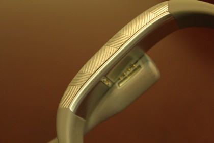
The charger, meanwhile, is a design nightmare. Like the UP24, the included charger is a short proprietary USB cable about four inches long. But unlike the UP24's cable, which featured a 2.5mm headphone jack to charge the device, the Jawbone UP2 has a magnetic attachment that lines up four pins with the underside of the wristband.
The first problem is that the cable is so short that if you connect it to a USB port on a laptop, you almost need to leave it hanging off the desk in order to fit given the band's fixed, rounded shape.

The second problem is that the magnetic attachment only goes one way, instead of connecting no matter which way you attach it to the charger. It means the act of charging the UP2 can take a few goes, countering the simplicity of the device itself with unnecessary frustration.
This new charger is also significantly slower than the UP24, requiring up to an hour to give the device a full charge. For newcomers to the Jawbone UP platform this may not seem like a big deal, but for upgraders from the UP24 – which would charge in the time it took to have a shower – it's a long time to go without the band on your wrist.
Strap, comfort and style

From the top down, it's hard to actually recognise that there's a difference between the UP2 and UP3, being almost identical in size and shape, and features the same touch sensitive interface.
In fact, just like determining the gender of some animals, you have to turn the UP2 upside down to realise it doesn't have the heart rate monitor or bioimpedance sensors of its premium sibling.
In typical Jawbone fashion, Yves Behar's design signature is all over this thing, from the contoured touch face to the same awkward side-clasp you see on the UP3.
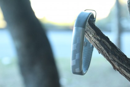
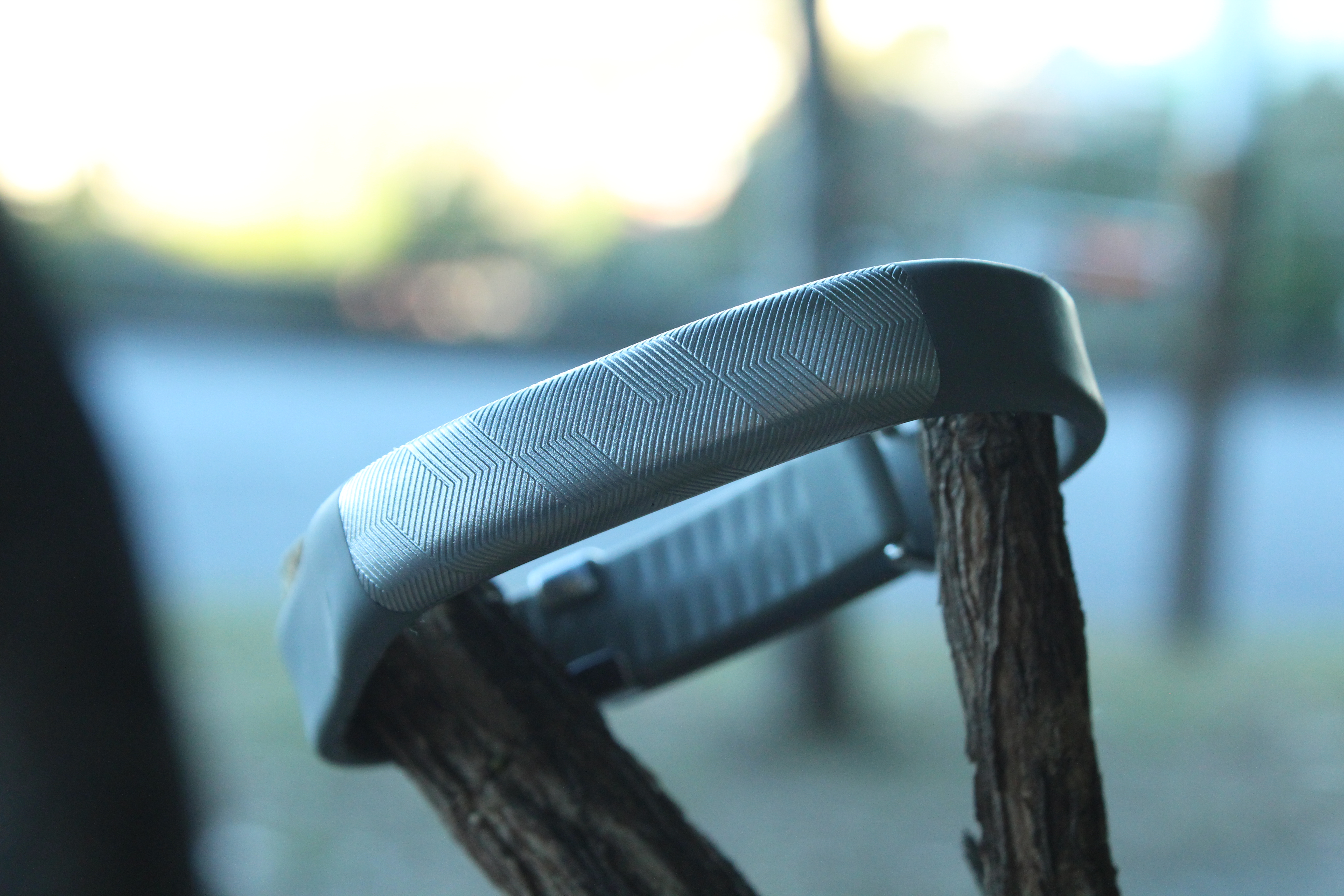
We tested the silver version of the UP2, and it truly did feel more like wearing a shiny silver bracelet than your standard step tracker.
Of course, those similarities with the UP3's design mean there are a lot of the same problems as the premium band.
It takes a while to get used to the side-clasp mechanism, and despite the "one-size-fits-all" approach, getting a perfect fit takes a bit of time. It's not a terrible design, by any account, but it doesn't exude the simple yet elegant design of some of the Apple Watch straps, for example.
Display
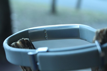
Back on top of the device, the touch display offers three LED lights to communicate different messages depending on the combination of flashing lights. So an orange man shows you're in active mode, a crescent moon means you're in sleep mode, and if the middle message light flashes with either one, it means you either need to get up and start moving (an idle alarm) or start the process of going to bed (sleep notification).

This touchscreen completely replaces the physical button of the UP24. In some ways, this is a good thing as fewer moving parts means fewer chances for the band to break.
But unfortunately it's far from perfect – you need to double tap the device to wake the screen, and then press and hold the screen to change modes. That sounds fine in theory, but the reality is that the tap-to-wake-up mechanism is temperamental at best, and almost never works first time when you're lying in bed.
On multiple occasions, we also somehow managed to switch the device from sleep tracking to active mode in our sleep, meaning our data was wrong on multiple occasions.
Admittedly, these are minor gripes. But compared to the Fitbit Charge HR, which automatically detects when you're in sleep mode without the need to manually switch across, the Jawbone UP2 feels like it's a step behind the competition.
Current page: Introduction, Battery, Design and Display
Next Page Step Tracking, Accuracy and Software