Why you can trust TechRadar
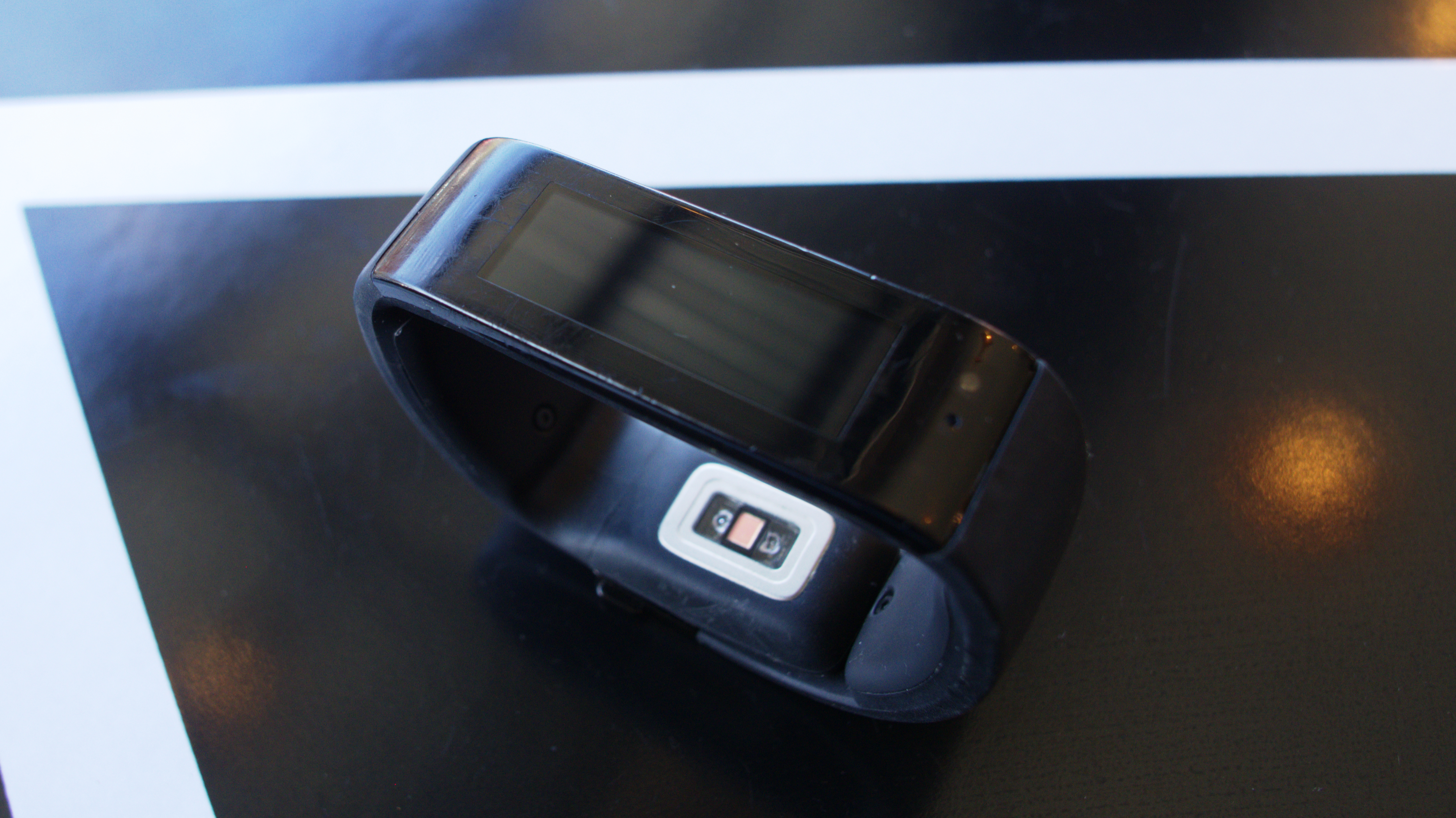
The Microsoft Band isn't going win any prizes for being the most attractive fitness tracker - the display is rigidly flat, while the band isn't - but it's not the most hideous either. It could just do with being a bit more comfortable.
However, despite the amount of tech packed inside and its 11mm x 33mm screen, the band retains a relatively slim form factor. It's a little thick where the clasp is, but it doesn't jut out too far. The Band also looks bulkier and feels heavier in the hand than it really is, mostly because of the sensors taking up a lot of space.
There are only two buttons on the device - a power button and an action button. I'm used to just tapping on the center portion or touch screen of other fitness trackers, so pressing the power button took some getting used to.
I found myself wishing that a simple tap could activate the band. The action button, however, isn't too bad. Basically, it starts or stops workout session timers, sleep tracking and the stopwatch.
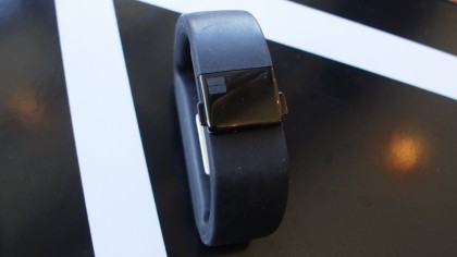
So far, the band only comes in black and isn't interchangeable. It's made of a thermal plastic elastomer material and is pretty comfy against the skin. The band can get a bit linty, and became annoying to dust off, while the screen can be easily scuffed up.
Unfortunately, the bezel around the display has taken most of the damage, and I honestly don't even know how. Despite that it doesn't feel delicate - it could probably survive a few drops.
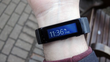
Almost all the trackers in the wild have their own unique way of fastening around your wrist, and the Microsoft Band is no exception. So far I've seen a simple wrap-around like the Jawbone, pinholes like the Misfit Flash and different variations of both. The Band has chosen a sliding clasp route that is both easy to use and easy to adjust.
Comfort
The Microsoft Band fits on the wrist like a Jawbone UP24 in the sense that both are a little rigid, and don't completely wrap around small wrists. But the adjustable clasp helps the Band fit better; people with larger wrists shouldn't have this issue.
There are three base sizes (small, medium, large) that fit snugly once you fiddle around with the clasp.
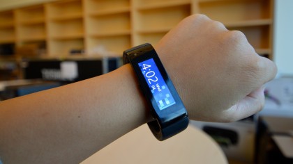
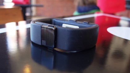
There are two ways you can wear the band, and I found myself switching between both. When typing at my desk, if I wasn't charging it, I would have the screen on top because I didn't want it constantly hitting the desk. When I wear it out and about, I like to have the clasp on top with the screen on the inside of my wrist.
Admittedly, I can see people feeling annoyed at switching, but I enjoy that you can wear it whichever way you want. For some people, wearing the Band on the inside is much more comfortable, though seeing the clasp on top isn't as visually appealing.
Current page: Design and comfort
Prev Page Introduction and display Next Page Specs, performance and interfaceCameron is a writer at The Verge, focused on reviews, deals coverage, and news. He wrote for magazines and websites such as The Verge, TechRadar, Practical Photoshop, Polygon, Eater and Al Bawaba.
