Why you can trust TechRadar
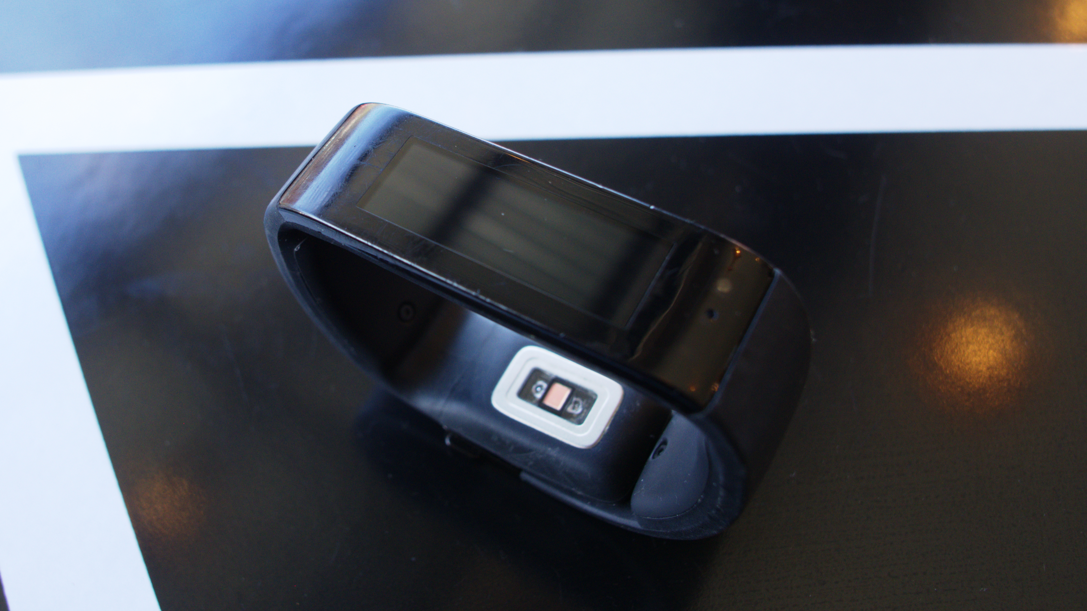
As I mentioned earlier, the Microsoft Band has a whopping ten sensors: an optical heart rate sensor, 3-axis accelerometer, gyrometer, GPS, ambient light sensor, skin temperature sensor, UV sensor, capacitive sensor, microphone and a galvanic skin response sensor.
To crunch the data from the sensors, the band has 64MB internal storage and an ARM Cortex M4 MCU processor.
Sadly, the band isn't waterproof, though it claims to be "splash resistant" meaning light rain and hand washing it is A-OK. Everything else, showering, swimming and submerging it in water is off the table.
Performance
The sensors are pretty self-explanatory, but accuracy is a whole other story.
The heart rate monitor has worked consistently for the most part. I've only experienced one occasion so far in which it randomly spiked from 75 to 140 beats per minute, then back down to 78. I wasn't doing anything but sitting on a stool watching the most boring concert of my life, so I'm not sure why it would have suddenly jumped.
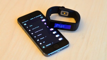
The sleep tracking has felt consistent as well. The first night I used it, my "actual sleep" was five hours and I woke up only twice. I felt great the next day despite the short duration. The next night I slept for eight hours and felt horrible. The app told me I woke up 10 times which seems like an accurate assessment of why I was so tired even though I had a full night of sleep.
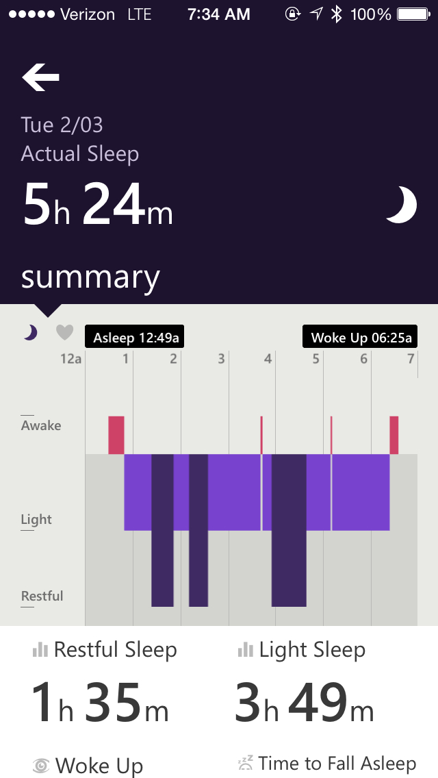
I think I would have to keep using it more and comparing the graphs - which incidentally are really easy to read - and all the metrics. The sleep function has now been updated to automatically track you without needing to push the button.
Step tracking, like the other pedometers in all the fitness trackers and smartwatches out there, is dubious at best. There were times when I felt like it wasn't tracking my steps because the counter wouldn't change. But for the most part, the band's sensor kept up with my mental calculations. I reset the steps and walked the same distance - one block - at about the same speed - two steps per sidewalk crack - with the resulting number remaining consistent every time.
On the whole, the band runs quite smoothly with its platform-agnostic operating system. Interestingly, Microsoft decided to use a wearable architecture that has been optimized for low-power micro-devices, instead of Windows 10 or a modified version of Windows.
There's been no lag, and the touchscreen is super responsive. At times, it was actually a little too sensitive; I would be scrolling through the apps and it would open one, falsely registering that I had selected it.
Two of the best features of Microsoft's wearable are the GPS and the band's ability to download workouts. This basically means you don't have to lug your phone around if you're exercising or going for a run. You still need a phone at the end of the day to sync your info though. Still, I liked how I didn't have to worry about carrying around a phone for the band to function.
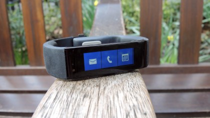
The second function allows you to "download" workouts from the Microsoft Health app to your phone over Bluetooth. Similar to the GPS, you won't have to carry around your phone to start exercising.
Interface
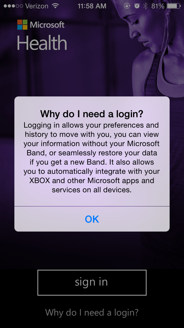
The set up is easy enough on the band, but you'll have to sign up for a Microsoft account right off the bat if you don't already have one. This made for extra faff, but it's necessary for Microsoft to glean all that Health data from you that will be constantly syncing with the Cloud.
It takes an extra five minutes or so and then another couple of minutes for the band to sync and pair up with your phone over Bluetooth. I used my iPhone 5S to start with, which worked perfectly fine. We also tried it with Android Lollipop - no problems.
If you don't like the thought of using anything remotely Lumia-esque or reminiscent of the Windows 8 tiles, you're out of luck. The interface of the Microsoft Band is essentially a simplified Windows platform. But instead of a bunch of resizable, colorful squares you get… a fixed number of small, non-resizable, colorful squares. It's not as awful as it sounds, though. The interface actually works really well with such a small amount of real estate.
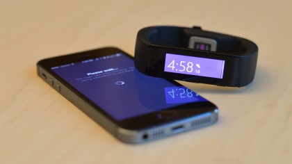
If you've enabled the always-on watch face, it will show the time and date. Pressing the power button takes you to the home tile which displays the time in color; you can replace the date by pressing the action button and customizing it to show your heart rate, steps taken, calories burned, or miles from the day.
You can also pick from 12 different wallpapers for the home tile alone, with 10 colors that will also deck out the tiles, plus three "discreet" options - or dark grey solid colors with three different font colors.
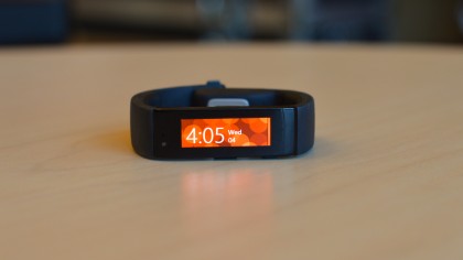
Scroll horizontally to go through the list of apps and vertically to read messages. Tapping on the main watch face (after pressing the power button) takes you to a list of your fitness goals, like steps taken, miles walked/run, calories burned and the heart rate monitor. Holding down the home watch face and pulling to the right will display battery life (no percentages though), show whether you've enabled the heart rate monitor and your Bluetooth connection.
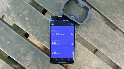
Notifications were easy to read, but if someone sent an extra long text message, you'd have to read it off your phone. You can't reply with non-Windows devices; all you can do is read social media messages, texts, calls and so forth delivered to your wrist, which I guess is sufficient enough for a fitness tracker.
Though a little unsettling at first, Quick Read has become a staple in my daily Microsoft Band usage. Essentially, any message you get can show up as fast one word messages on the screen so you can quickly eyeball without needing to scroll.
All you need to do is simply press the action button and incoming texts, emails and other notifications, like Facebook and Twitter, will be scanned and "read" to you.
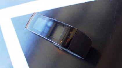
It's an extremely straightforward interface that isn't hard to grasp at all, which I appreciate since I find Microsoft's Windows 8 interfaces tend to be cluttered and difficult to figure out. The only change I'd make is to include the option for continuous scrolling.
It's a little thing, but it would have been ideal if I didn't have to scroll all the way back to the home screen to see the time or another feature. I can also see the perk of having vertical orientation like the Gear Fit but reading messages wouldn't work well on the band's small screen.
Current page: Specs, performance and interface
Prev Page Design and comfort Next Page Apps and fitnessCameron is a writer at The Verge, focused on reviews, deals coverage, and news. He wrote for magazines and websites such as The Verge, TechRadar, Practical Photoshop, Polygon, Eater and Al Bawaba.
