Why you can trust TechRadar
The first Moto 360 offered a lovely, circular design and the new Moto has continued with the popular round face and added more options for watch body finishes. Instead of the sole silver option offered with the original, you can now choose between rose gold, regular gold and black, as well.
The lugs sit a bit differently on the new Moto 360. The original band is flush with the body of the smartwatch and thus, not swappable. Now, it sits squarely on top and bottom, giving it the look of an authentic timepiece.
The crown - which still serves as a home and back button - sits higher on the bezel as well. The reason for this change could have been purely cosmetic, but the new button placement didn't dig into my hand –a minor squabble I had with the original model.
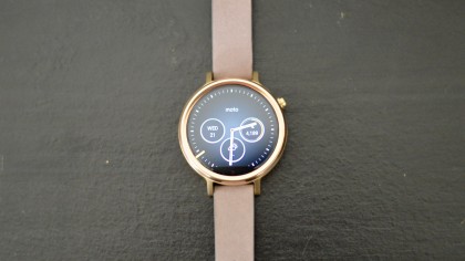
The first model of the Moto 360 we tested was the rose gold flavor paired with a "blush"-colored Horween Leather band. It's absolutely eye catching for all the right reasons. Alone, the gold body looks more yellow and dull but next to the rose gold, it gives the whole watch a quality that positively radiates "high-end."
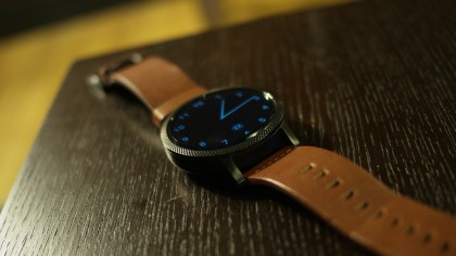
At the same time, it remains modest, since it's not decked out with jewels or sparkles. Rather, it's simple with a solid amount of sophistication thrown in for good measure, making it an ideal accessory for any setting.
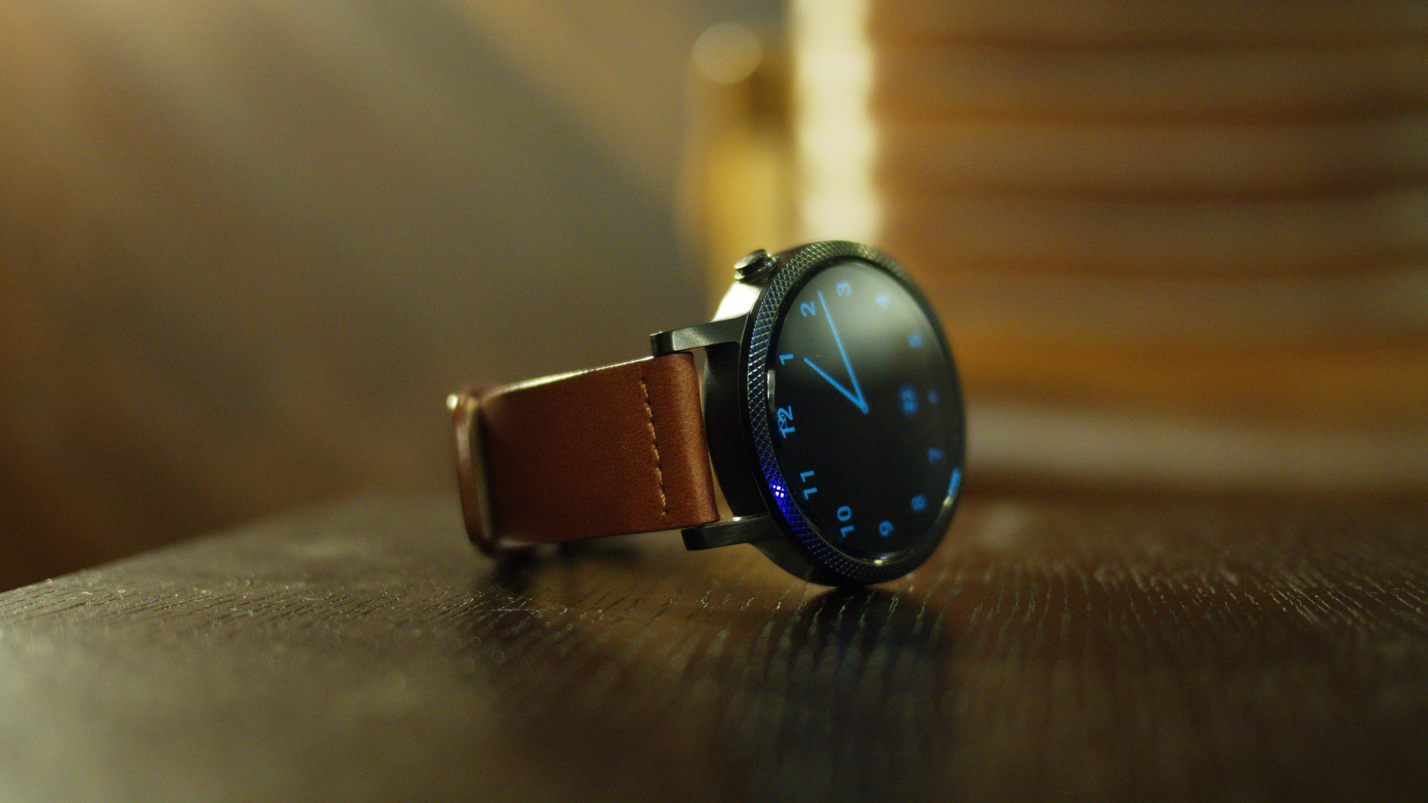
Next up, we tested the bigger 46mm model. Given the opportunity, we had to switch things up a bit, and went for a black chamfer around the glass, stamped with a black micro knurl texture. We selected a black case, which boasts a brushed metal look and smooth feel.
As mentioned before, there are three sizes you can pick from: a 42mm case that requires a 20mm band, a 46mm case that requires a 22mm band and the one I've tested out, a 42mm case with a 16mm band.
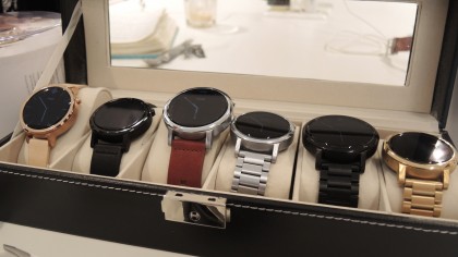
The designs in general are far better than the single option of last year. Horween is also a supple, comfy leather on the skin, but it ends up looking ragged over time. It does give it a weathered, worn-in look, but I suppose that may not be appealing to some. As for me, I enjoyed the effect.
If you think this will bother you, Moto has several band options, like mono link steel and metal, that obviously won't wear its age as much.
So far, it seems like you can't really go wrong with any of the new styles.
Comfort
Along with the Huawei Watch, the new Moto 360 is the most comfortable smartwatch I've worn. Our first tester had some issues finding the right fit due to her small wrists, but the 46mm model fits me just fine. The leather never pinched me and overall, I didn't feel like I had to sacrifice comfort for fashion.
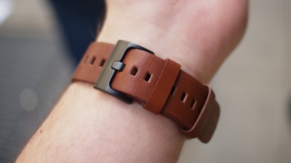
Saying a wearable actually fits well is high praise, considering our earlier lamentations over the bulky and ill-fitting smartwatches from the past year. Like many other second-generation smartwatches that have come out this year, Moto chose wisely in offering up a variety of sizes for a plethora of wrist sizes. This has greatly improved my experience with smartwatches as a whole since they actually fit around my arm now, instead of flopping around.
Don't let the "for Women" moniker scare you away from the watch you want. Each variation of the Moto 360 looks fantastic and you shouldn't feel like you need to make compromises to your taste or wrist size just to fall into your identity bucket.
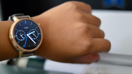
No matter the watch you choose, the designs are similar. The only differences found in the 360 "for Women" are the smaller lugs and the optional micro etch effect, which looks awesome and isn't available on the bigger models.
Current page: Design and comfort
Prev Page Introduction and display Next Page Specs, performance and appsCameron is a writer at The Verge, focused on reviews, deals coverage, and news. He wrote for magazines and websites such as The Verge, TechRadar, Practical Photoshop, Polygon, Eater and Al Bawaba.
