Why you can trust TechRadar
There's a lot to like about the refreshed Moto 360, which is a great sign that Motorola has taken our critiques (as well as yours) to heart.
It fits better and there are more options to customize it to individual taste. The same can be said of the Asus ZenWatch 2 - which also greatly improved on its first iteration as well. However, the old Moto was already a great smartwatch that needed only a few more tweaks here and there. The second Moto accomplishes that, but there's always room for improvement. Here's to hoping the third iteration will be even better.

We liked
The new size options give the Moto 360 the extra reach it needed the first time around. That, and the newfound comfortable fit (along with the added customization to the design), brings it all together as one of the most comfortable smartwatches of 2016.
The performance of the Moto 360 has also improved over the last-generation device. It's far snappier and responsive than before. The Moto Body app is nice addition to Google Fit since it gives you more choices between fitness apps.
As lackluster as Android Wear compatibility is on iPhone, it's a stellar selling point and convenient if I want to keep wearing the watch as I switch between phones.
We disliked
The battery life is still at the one-to-two day mark. This is average for today's smartwatches, but I was hoping Moto would prove itself above average here, as it's done in virtually every other department with the 360. This makes us even more excited for the Snapdragon Wear 2100 chipset, which will power the next generation of Android Wear smartwatches, with boosted performance and battery efficiency as its central improvements.
The compatibility is also a sore point for iPhone owners since they won't be able to fully utilize the Moto 360's features.
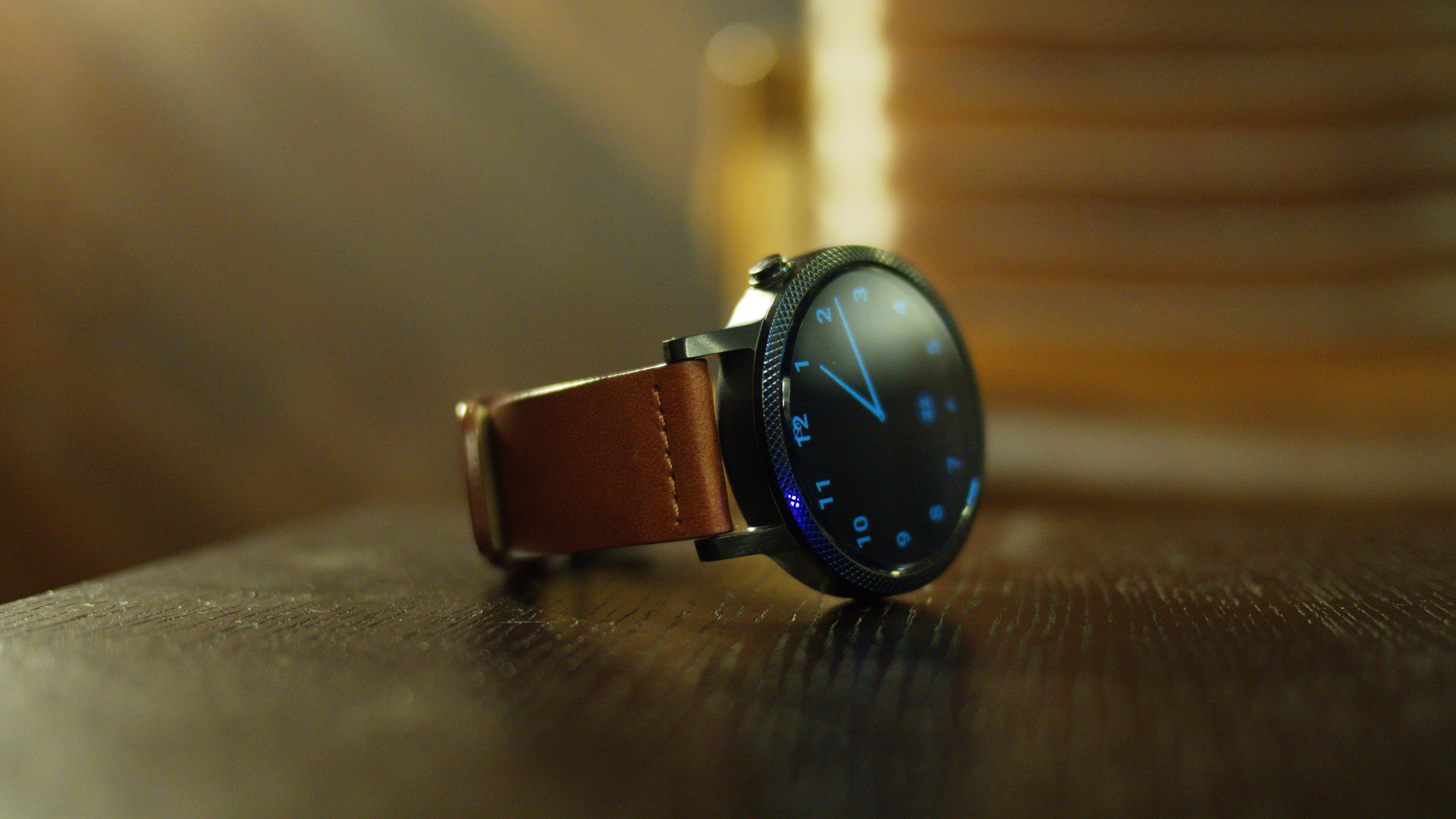
I already sang my praises for the design of the Moto, but the flat tire that hangs around the bottom of the screen is a bit of a low point. It doesn't get in the way of operability, but some of the watch faces cut off.
Final verdict
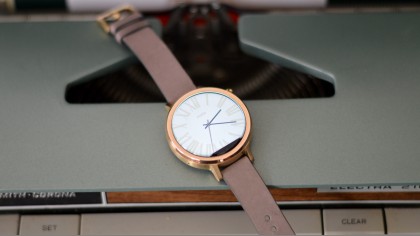
The new Moto 360 wins big as one of the best looking smartwatches to come out thus far. It's also among the most comfortable wearables I've slapped on my wrists since my days of wearing simple analog watches.
There's an impressive amount of customization here, with more watch bodies, bands and stylings that come at a fairly affordable premium – a welcome change from the limited first offerings from Motorola last year.
Apple Watch still dominates in terms of personalization, with its huge array of watch bands and body finishes. But, when it comes down to the wire, the Moto's round face is simply prettier, and the Horween leather is more snug.
At this point, though, it still has a hard time elevating itself above just that: a pretty face. The addition of Moto Body is a nice change of pace for fitness on Android Wear, but users wanting a little more functionality, like what was found in the Sony SmartWatch 3, will want to pay attention to the GPS-packing Moto 360 Sport.
For iPhone users, the Moto 360, as it stands today, is still primarily a notification machine. And an expensive one, at that.
On Android phones, the 360 does the job as a secondary tech gadget and looks fantastic while doing so. For $299 (£229, AU$329), or more if you opt for customizations, you're getting a lot of goodies. Though, I still feel that the price tag doesn't get you enough. Not at the fault of Moto, but Android Wear, which after a few years of availability is still searching for a killer app.
I do believe it's the best looking smartwatch out there and if you're determined to get a smartwatch, the new Moto 360 is as stylish as you can get for a wearable that offers more compatibility and affordable customization options than the Apple Watch.
Originally reviewed by Lily Prasuethsut
Cameron is a writer at The Verge, focused on reviews, deals coverage, and news. He wrote for magazines and websites such as The Verge, TechRadar, Practical Photoshop, Polygon, Eater and Al Bawaba.

