TechRadar Verdict
As a successor to the Pebble, the Pebble Time excels. As a smartwatch on its own, it feels like a digital watch with some extra tricks.
Pros
- +
Color e-paper display
- +
Timeline is snappy
- +
Impressive battery life
- +
Comfy
Cons
- -
Overall buggy UI
- -
Too much bezel
- -
Feels cheaply made
- -
Lacks impressive features
Why you can trust TechRadar
Update: Pebble released a major firmware update for both iOS and Android platforms. Better backlight options, font size, vibration settings and notifications were the focus of this update, along with longer canned responses for Android and general bug fixes.
Check out the rest of the details below under display, compatibility and apps.
Review continued below ...
The Pebble Time was controversially announced as another Kickstarter project, and still holds the crown for the most funded Kickstarter of all time (for now).
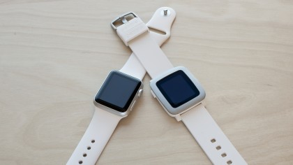
With over $20 million pledged, it was clear the little smartwatch hyped fans of the first Pebble watch. It seemed to be the answer for the anti-Apple Watch crowd, partly because of its plucky startup story. The Pebble Time was the answer for those who desired an affordable, cross-platform smartwatch – not to mention an iPhone-compatible wearable that wasn't the Apple Watch.
At $199 (£179.99, about AU$256), the Time isn't too pricey at all for a smartwatch. Now that it's finally out, how does it actually fare on the wrist? Not quite as well as I'd expect from the Kickstarter phenom, but it's certainly not all a wash.
Display
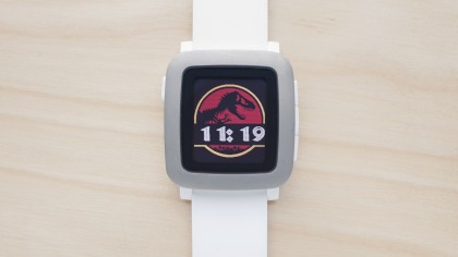
The biggest draw for the Pebble Time is its new always-on, e-paper display. Its predecessors, the Pebble and Pebble Steel, sported black and white e-paper screens that were sufficient. But the new 64-color screen brings a new depth to the smartwatch and gives it an almost retro feel that nerds should appreciate.

At 1.25-inches, the screen sucks up little battery life and, for the most part, is easy to see even in the sunlight – though the screen doesn't get very bright. There's also an ambient light sensor but since the display stays relatively low, it's hard to tell if the screen changes. It's also, of course, not as vibrant as the Apple Watch or Android watches, but it does have the advantage of being always on without killing the battery.
It seems like Pebble heard me (and likely others) lamenting over the brightness. A recent update from the company includes a new backlight intensity level called "blinding." It's definitely a step above the "high" setting and I can actually see what's on the screen better. However, there's a slight drawback in the fact that the colors still look muted and dull.
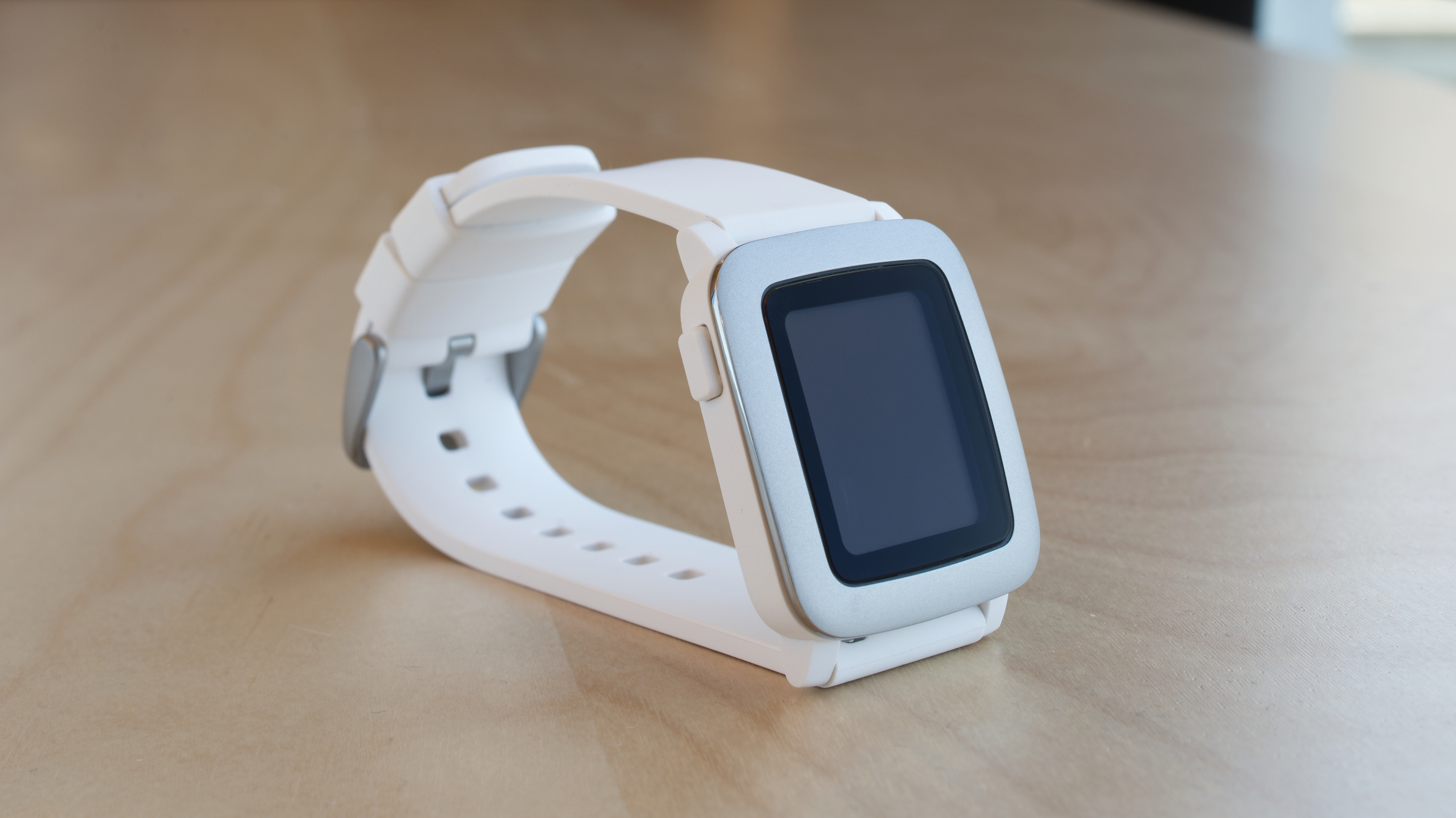
Unfortunately, the Gorilla Glass screen is surrounded by an excessive amount of bezel that detracts from the overall loveliness of the Pebble Time. Adding to the bulkiness of the already distracting bezel?
Hilariously, more bezel: the screen is surrounded by a black bezel frame and a stainless steel bezel. I'm not sure what inspired this poor design choice, but the first-generation Pebble was already bogged down by too much bezel. I had hoped the new Pebble would do away with it, but alas, the design instead doubled it.

The display is also not a touchscreen. Considering there is already such a small amount of real estate on smartwatches, this isn't a huge issue, but it leaves the experience a little too old school for a smartwatch. On the upside, the lack of a touchscreen does cut down on costs.
