Why you can trust TechRadar
One important element that sets the Pebble Time Round apart from most other smartwatches is how you interact with it. This watch does not have a touchscreen, but rather four buttons, one on the left and three on the right.
If you've not used a Pebble before, you may well find yourself prodding at the touchscreen to start with because, well, that's what we do with everything else isn't it?
Pebble has thankfully used the much softer-feel buttons seen in the Pebble Time Steel, rather than the stiff ones of the standard Pebble Time. They have a superfluous two-phase action a bit like a camera shutter button, but feel pretty good.
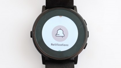
The interface is almost exactly what I saw in the Pebble Time Steel and Pebble Time. Everything is laid out as an up/down list, with some cute visuals to stop it seeming too dull and prosaic.
Looking at the right side of the Time Round, the top button takes you up the interface, the bottom one down.
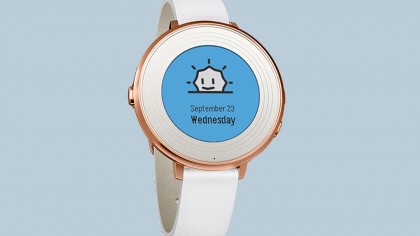
There are just two main areas to cover in order for you to get your head around Pebble OS. Use those up/down buttons from the clock face and you'll skip through a feature called Timeline. This knits together things like calendar events and weather reports to display what you're up to in the coming days, and have been doing recently.
This swings between being almost useless and totally brilliant, depending on whether you actually live your life through your phone, using Google Calendar effectively and so on.
I tend to organise social events on mental Post-It notes that swirl around like silver notes in the final round of The Crystal Maze, so I tend to spend more time in the apps menu of the Pebble Time Round.
Press the middle button from the clock display and you reach the apps menu. This lays out all your apps as a horizontal list, one per page. It can get pretty long once you install a whole bunch of apps, but the companion smartphone app does enable you to choose the order they sit in.
As the Pebble Time Round uses page-based software managed through buttons, it doesn't feel quite as smooth or slick as Android Wear or Watch OS at their fastest. However, its performance is also very reliable. You don't get weird geriatric pauses here, just predictable ones.
For example, apps that haven't been used before (or in a long while) take a few seconds to load, but after that it usually takes just a fraction of a second.
The Pebble Time Round's apps are exceptionally light, meaning the watch can use very modest hardware and get by just fine. It has a Cortex M4 CPU, 128KB RAM and just a few megabytes of storage.
You shouldn't really compare the Time Round to Android Wear rivals and the Apple Watch other than to say this is much, much less powerful; anything more definitive just isn't helpful.
You can still install loads of apps, and as they're all geared for the Time Round's hardware they all tend to run just fine.
However, having just 8MB of storage is a real limitation. While not many people play locally-stored music on a smartwatch, it's just not feasible at all here. And it further restricts what the Pebble Time Round can do without a phone. For example, an Apple Watch can sync photos so that you can, I dunno, look at them while on the toilet or something.
That a lot of advanced smartwatch features end up being superfluous to many is why I believe some detractors rule out Pebbles too quickly. It can't do loads, but it can do what a lot of people want from a smartwatch.
Notifications
It'll receive notifications and give you a buzz when they come in, acts as a music remote control and (with an Android at least) can be used as a way to bypass phone security.
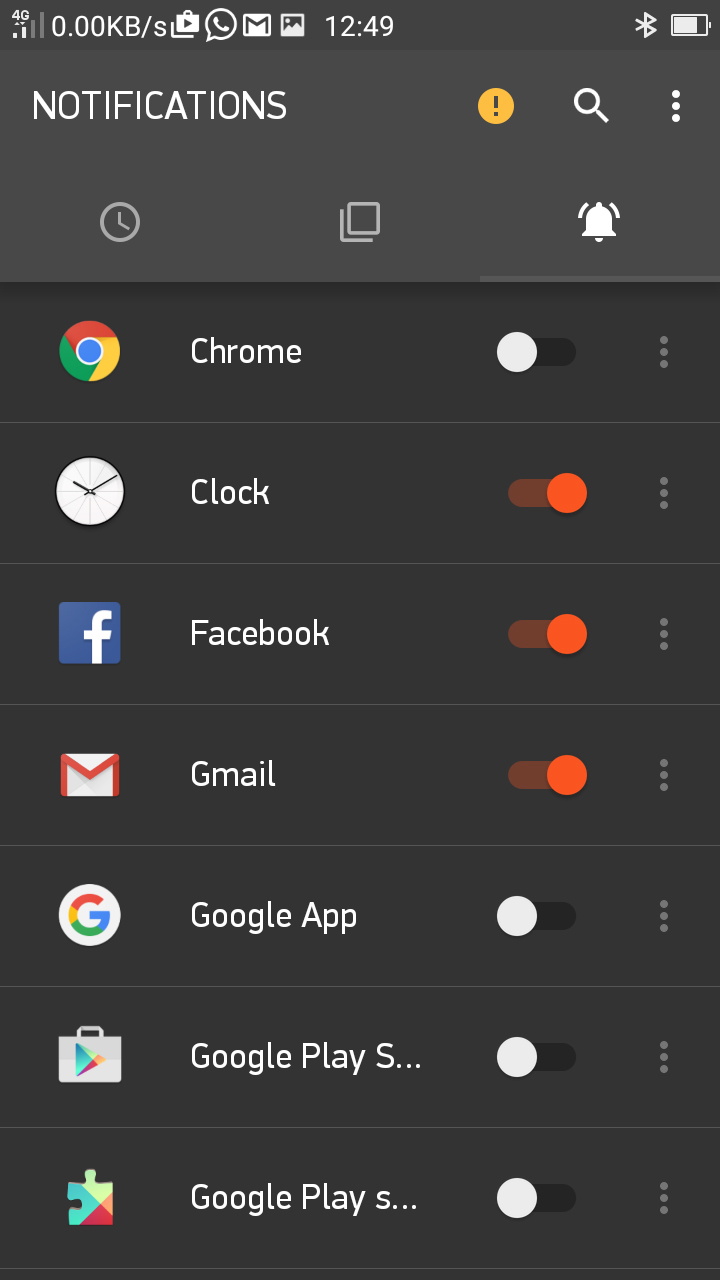
What I appreciate most is how notifications stick around on the Pebble Time Round. With most other smartwatches you have to really look at your wrist as alerts come in to avoid having to interact with the thing to actually bring them up again. But here the always-on screen means they'll be there five minutes later when you decide to check what that wrist-buzz actually was about.
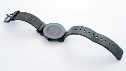
This is one of the key appeals of a Pebble for me. It sounds small, but it comes into play many times a day. With an Android phone you can also reply to messages and emails using – drum roll please – your voice. It'll send the voice recording from the Time Round's mic to the phone, where it's transcribed. It works reasonably well, and even works in beta form for iOS SMSs and iMessages.
If you're keen to really get stuck into smartwatch life, the Pebble Time Round feels very much like a smartphone accessory, though. It can manage step and sleep tracking without a phone, but that's about it.
I also find the step tracking a bit generous, to the extent that I wake up with 300-odd steps on the clock. And, fingers crossed, this isn't the Time Round diagnosing me with a sleepwalking disorder. It's likely the algorithm just doesn't really snip out those 'steps' that aren't really steps, just your arm flailing about a bit.
You can use different step-tracking apps, though. I've largely been using the default Pebble Health one for this review, but in the past I've spent weeks using the Misfit app with former Pebbles, and it works with the Time Round too.
Fitness goes further using the Time Round as a second screen for your phone. There's a Runkeeper app, for example, which offers a sports watch-style experience for your Pebble, even if it's still your phone doing most of the work.
Exercise obsessives after a smartwatch-like experience should also check out the Garmin Vivoactive as an alternative, though. It's way uglier than the Time Round, but lasts an awful lot longer, has full GPS tracking and still does notifications.
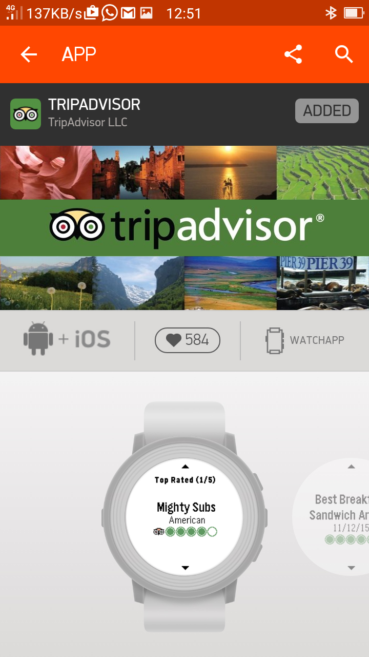
There are basic games for the Pebble Time Round, and apps like Nav Me and TripAdvisor leech data off your phone for turn-by-turn navigation and checking out nearby attractions and restaurants. This watch is best at the simple stuff, but there are some clever apps out there too.
However, having used Pebbles for well over a year now, I'm not finding a great deal of progress on the app front. After an initial flurry of apps were released, the Pebble OS catalogue looks familiar month after month. And that only gets worse with the Time Round.
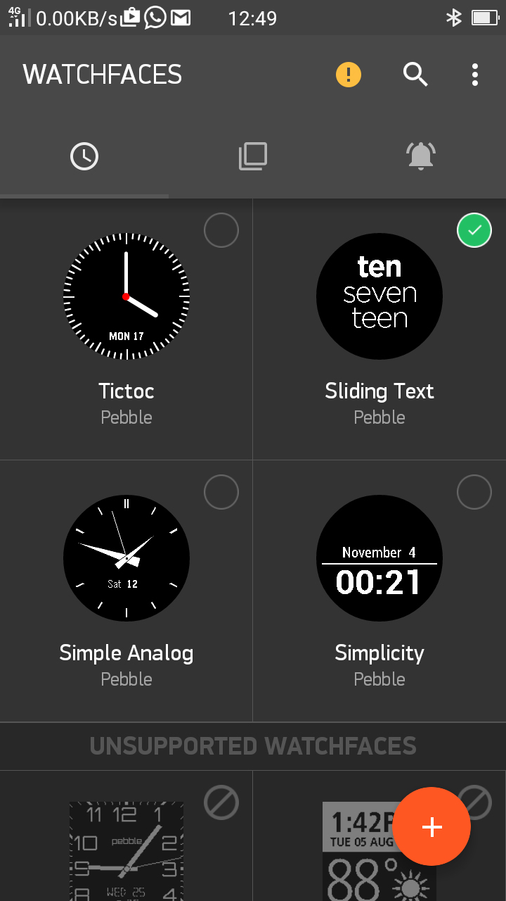
Firing up the Pebble Time companion app, it loaded up the 25 or so apps I last had installed when I used the Pebble Time. Almost exactly half of them don't work with this newer watch – it's likely because the round screen cuts off significant parts of the UI, given how similar the hardware and software otherwise are.
You can expect some of the ongoing projects to get an update, but a lot of Pebble apps seem to be released with few or no follow-up updates, so they'll be left in limbo. When Pebble OS apps are free and generally simplistic, you can understand why devs might lose interest.
Current page: Interface, specs and performance
Prev Page Introduction and features Next Page Companion app, compatibility and battery lifeAndrew is a freelance journalist and has been writing and editing for some of the UK's top tech and lifestyle publications including TrustedReviews, Stuff, T3, TechRadar, Lifehacker and others.
