Why you can trust TechRadar
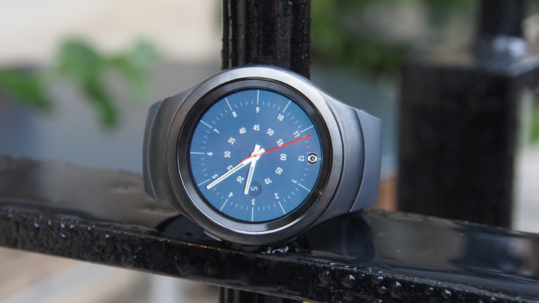
I'm pretty enthusiastic about the Samsung Gear S2 - unusually so for a wearable, which have rapidly settled into a furrow of competent sameiness. There's a lot to like here, even if it's by no means perfect. Here are my final thoughts on the device.
We liked
The rotating bezel is a true smartwatch innovation, it makes navigating Tizen OS a breeze, and reduces the amount of unnecessary swiping and tapping. It certainly improves the user experience, with a lovely smooth mechanism, which clicks when you turn it.
Tizen OS is also pretty decent, it clearly shows Samsung has taken a measured approach. There are some the best aspects from Apple's Watch OS, and Android Wear. It's simple to navigate, and customisable, so you can access the information you want quickly. Given time, we'd expect this to get even better with software updates.
The sAMOLED screen on the Samsung Gear S2 is also a real standout feature, it's incredibly sharp, vibrant, and fully circular.
We disliked
Although Tizen UI is one of the device's biggest advantages, it also introduces a few problems. Mainly, it lacks an established developer base, the app store has very few high-quality apps in. As Samsung is a relatively big name, we expect this to change, but right now app fans might be disappointed.
S Voice is also a let down compared to Google and even Siri. It's slow, and doesn't provide a good enough reason to use it on a regular basis. It certainly feels like this is something that can be worked on, though the saving grace is that the alternative control mechanism – the bezel – is the best to date.
Verdict
With the Gear S2, Samsung clearly learnt a lot from their previous attempts, and their rivals.
It's the embodiment of Samsung's tendency to iterate under the spotlight, the culmination of several attempts to nail a type of product that we collectively have only just begun to understand.
At launch the device really was a step forward in smartwatch design, with the rotating bezel, and Tizen OS proving to be genuinely useful innovations.
Of course, things have since moved on and Samsung's rivals are also advancing, with the likes of LG Watch Sport, Huawei Watch 2 and Apple Watch Series raising the bar. Not to mention Samsung's own repost, the Gear S3.
Though there are newer – and better – devices out there, the Samsung Gear S2 remains a solid smartwatch option for Android owners looking to snare a smartwatch on a budget.
First reviewed November 2015
Competition
Don't think the Samsung Gear S2 is for you? Here are some other watches we like.
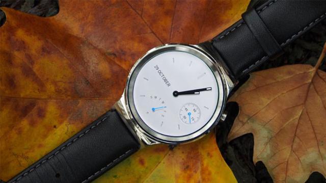
Huawei Watch

Starting with the Android Wear-toting Huawei Watch. In terms of internal specifications, the Huawei Watch is more powerful, with 1.2GHz processor against the S2's 1GHz processor. Is that noticeable? Not really, the Tizen OS seems just as slick as Android Wear, although opening apps can take a little time. The Huawei Watch has lower resolution screen than the S2, 304 ppi vs 286 ppi. Both are very good screens, vibrant, but the S2 edges it slightly (both are fully circular, unlike the Moto 360).
The design of the Huawei Watch is a little more chunky, but it feels well-made, solid, and more premium. That does come at a cost however, with the starting cost around £299 (US$349.99, around AU$549), a little more than the Samsung Gear S2 which starts around £249.99 ($299.99, around AU$428) - but can be found for as little as £200 online.
- Read the Huawei Watch review
Moto 360 (2015)

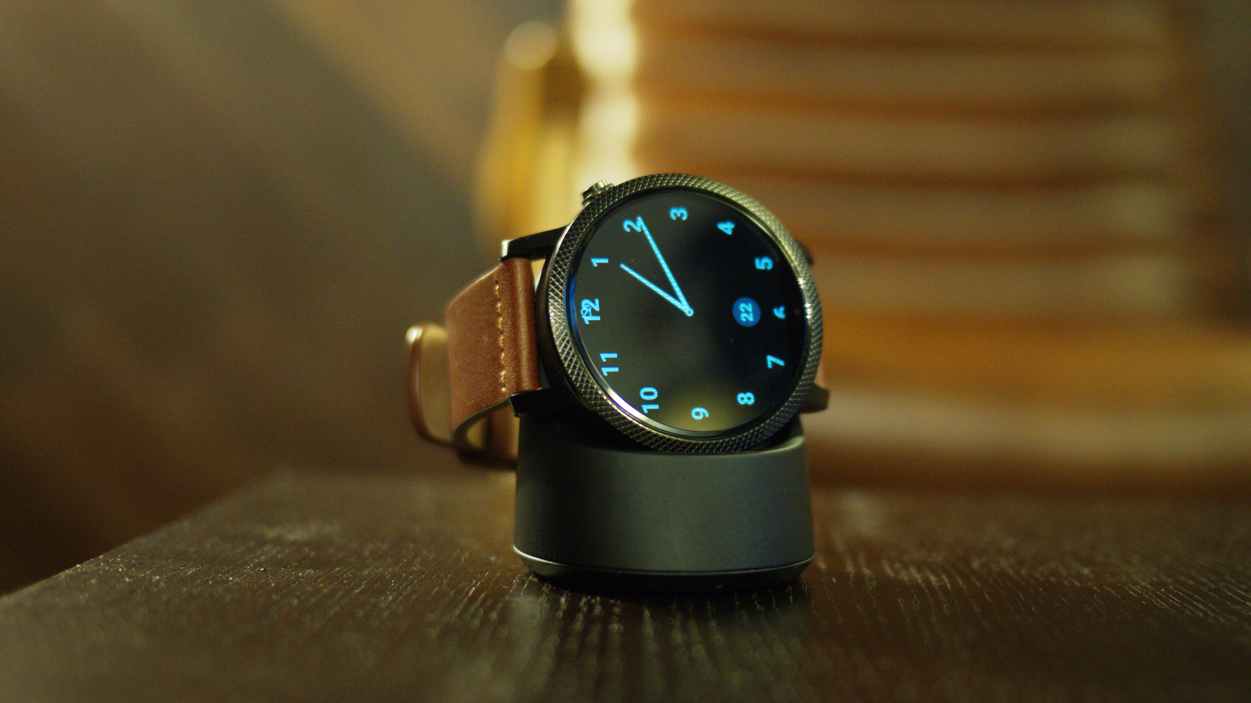
Also competing with the Samsung's Gear S2 is the Moto 360, which, like the Huawei Watch, also runs Android Wear.
The Moto 360 is beautifully designed smartwatch, the internal specifications are identical to that of the Huawei Watch's, but the screen is by far the worst of the bunch. It's an LCD panel with a ppi of 233. It's a desirable Android Wear smartwatch, but it's far from the best.
- Read the Moto 360 review
Apple Watch

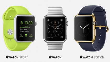
Although not a direct competitor, it's also interesting to compare the Gear S2 to the Apple Watch, because that rivalry is always entertaining.
Both of the screens have a pixel density of 304 ppi, both are vibrant, the difference being the Apple Watch is rectangular and the Gear S2 is circular. It's my opinion that circular displays look nicer.
The bezel and crown work the same way, but for me, the rotating bezel is more intuitive to use. The UI of the Gear S2 is easier to navigate, while the Watch OS 2 is more fiddly.
The Apple Watch feels more premium, has more strap options and a tonne more apps. That did come at a premium price, with the Apple Watch starting at £299 ($349, AU$499).
- Read the Apple Watch review
