TechRadar Verdict
The Redmi Y2 is a balanced smartphone. To be honest, this one looks like a better fit for Redmi Note 5. It has much better cameras, Mi A1-like handy design, and dated but reliable hardware inside.
Pros
- +
Good front camera
- +
Sturdy built
Cons
- -
Slightly bulky
- -
Difficult to use with one hand
Why you can trust TechRadar
Xiaomi recently launched the successor to Redmi Y1, which shares a lot of similarities with the Redmi S2 launched in China, but carries the Redmi Y2 moniker in India. Similar to its predecessor, the Y2 is also designed keeping the young smartphone users in focus.
When I first saw the Redmi Y2, it looked like a hybrid between the Mi A1 and the Redmi Note 5 Pro. It's priced close to Redmi Note 5, which has similar hardware but falls short in the camera department.
Even though Xiaomi has been at the top in terms of market share, we cannot ignore that users are now talking about the iterative design upgrades and ignorance towards Android updates. So, I tried to find out if the Redmi Y2 is an incremental upgrade over its predecessor or it's just another iterative upgrade.
Looking at Xiaomi's track-record, the company has assured that they are all ears to feedback from their users, but what do we learn from the Y2? We'll find out in the review.
Price and availability
The Xiaomi Redmi Y2 has been priced at Rs. 9,999 for the 3GB RAM variant and Rs. 12,999 for the 4GB RAM variant. It will be available in India in Elegant Gold, Rose Gold and Dark Grey color options exclusively from Amazon India and mi.com from June 12. The company will also sell the device at Mi Home stores.
Design and display

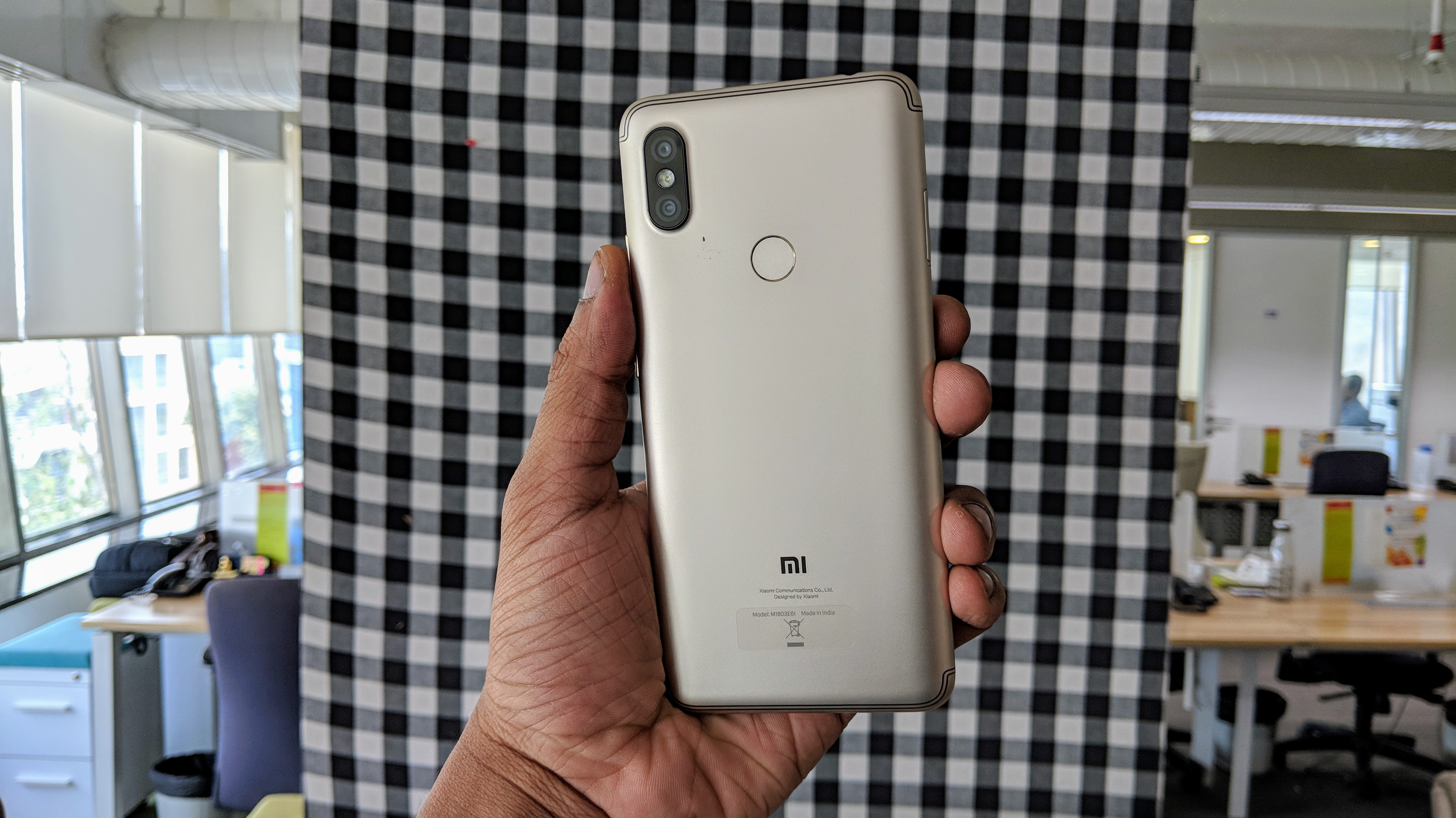
Like other Redmi phones, the Redmi Y2 is made out of metal. While in this case, the design language isn't the same as the Redmi 5 or even the Note 5 series. It's more like a Mi A1 having an 18:9 ratio in a longer form factor.
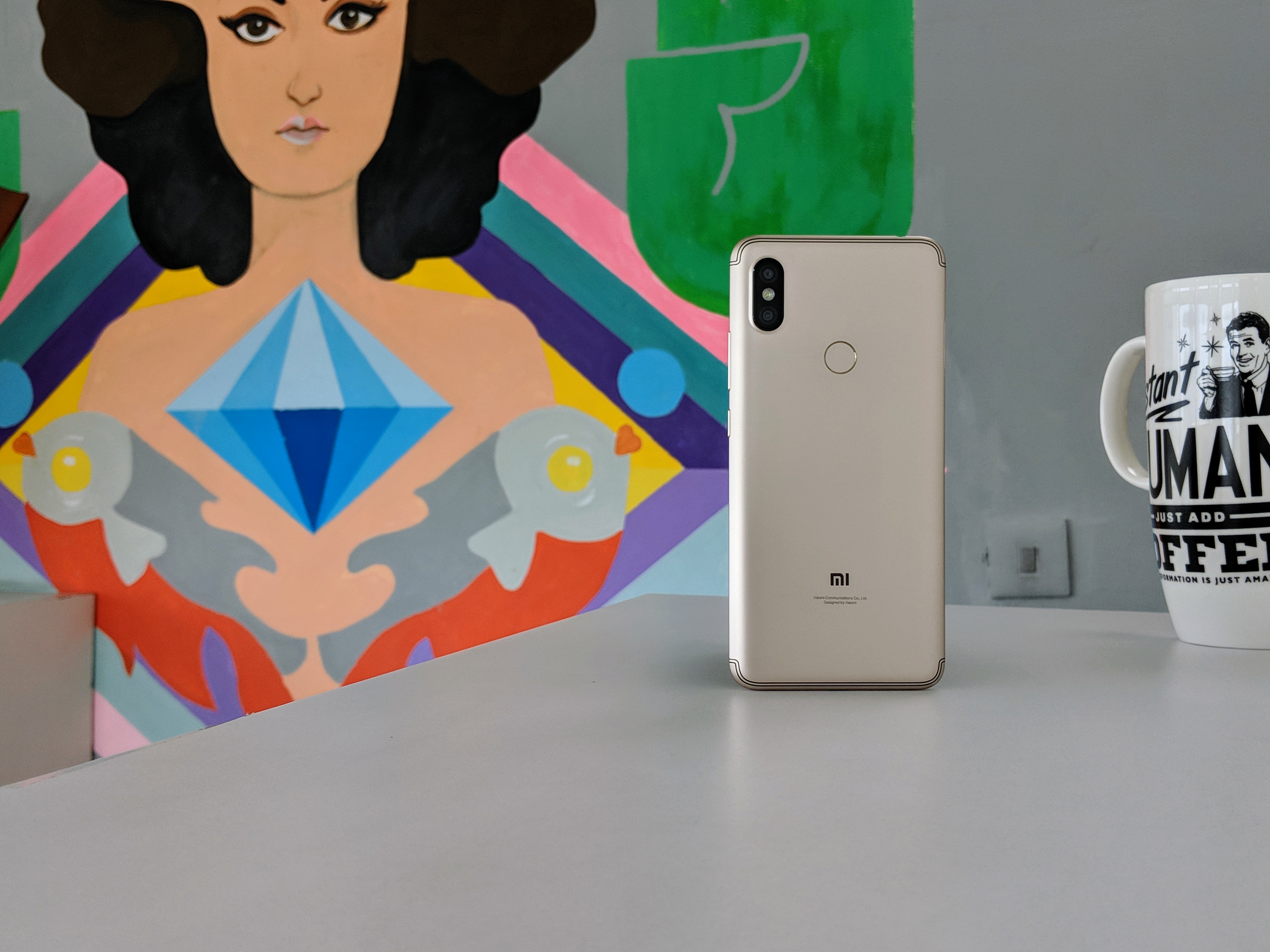
The major distinctive element in the design the vertical camera module and two shiny separation lines as the antennae bands as seen on Samsung phones most recently. Rest of the design is strikingly similar to the Mi A1 and the Redmi Note 5 Pro. It has the same gentle curves on all its sides. It does not dig into the palm, but it does feel slippery because of the smooth curvy finish.
The camera design at the rear is exactly what we've seen on Redmi Note 5 Pro. There's a slight protrusion. so considering a back cover would be a good idea to save it from scratches.
It is heavy at 170 grams and is big in size (thanks to the elongated 6-inch display), which makes it slightly difficult to operate with one hand. There is a one-handed UI mode for better accessibility, but to be honest, I haven't used or seen people using it very often.
The connectivity ports and buttons reside at the standard Xiaomi positions. That means the SIM and microSD slot is on the left and volume rocker and power/lock keys are on the right. A microUSB port, loudspeaker grill are at the bottom and there's an IR blaster and headphone jack on the top.
The finish on the smartphone is the same as what we have seen on recently launched Redmi phones, so no surprise there. It's sturdy to hold and looks like it can survive a few drops from reasonable height.

Dimensions: 160.7 x 77.3 x 8.1 mm
OS: Android 8.1 (Oreo)
Screen size: 5.99 inches
Resolution: 720 x 1440 pixels
CPU: Snapdragon 625
RAM: 3GB/4GB
Storage: 64GB
Battery: 3,080mAh
Rear camera: 12MP + 5MP
Front camera: 16MP
From the front, it looks like any other Xiaomi phones with 18:9 display in this form factor. The gold variant which I have has white bezels and if you're not a big fan of them, you can get the grey variant with black bezels around the display.

I've been repeating it but a lot of features of the device are iterative, including the display. The 5.99-inch HD+ unit looks good, and this is a consistent approach that Xiaomi follows with all their devices.
Colours are warm and it's sharp enough too. Touch response is good and sunlight visibility is good for a phone of this range. There's not much to complain about the display. We compared it with the Redmi 5 and the Redmi Note 5 side by side, and the similarity between the panels was clearly visible.
Sudhanshu Singh have been working in tech journalism as a reporter, writer, editor, and reviewer for over 5 years. He has reviewed hundreds of products ranging across categories and have also written opinions, guides, feature articles, news, and analysis. Ditching the norm of armchair journalism in tech media, Sudhanshu dug deep into how emerging products and services affect actual users, and what marks they leave on our cultural landscape. His areas of expertise along with writing and editing include content strategy, daily operations, product and team management.

