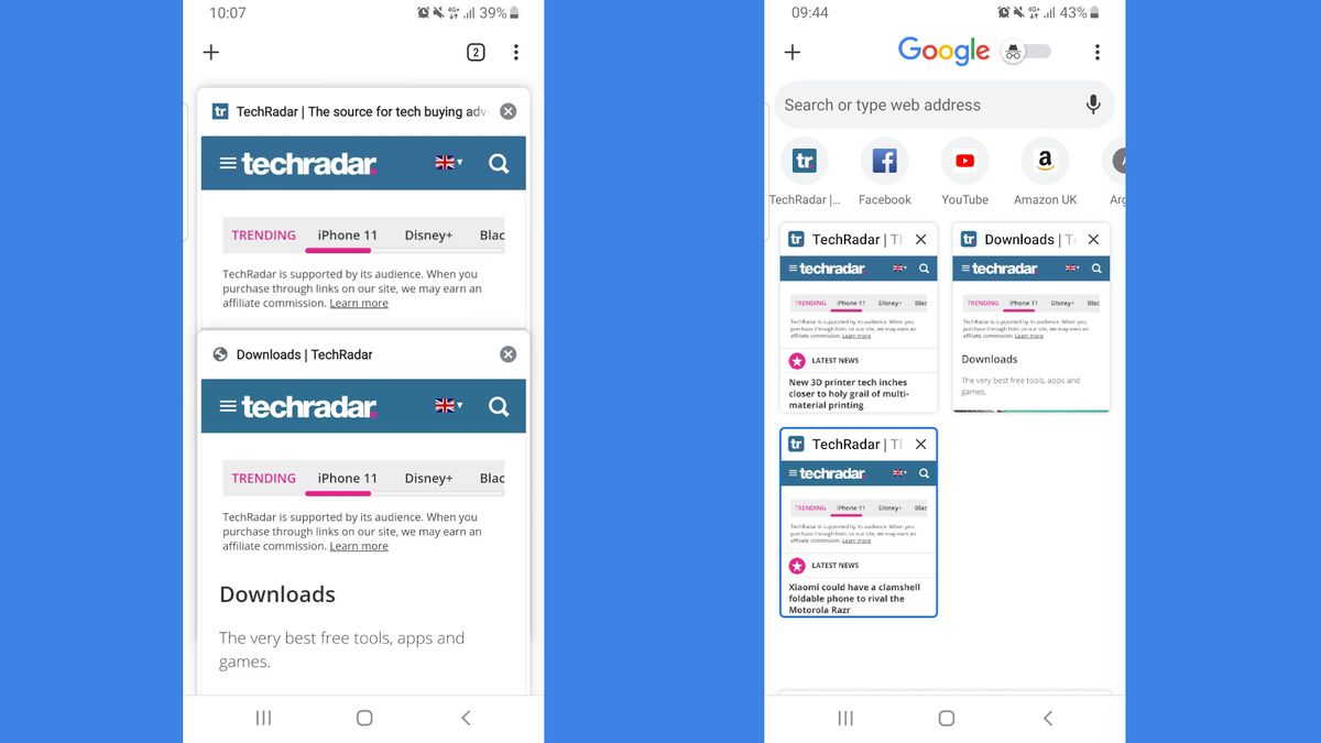
Google is testing an update for Chrome that might prove controversial: a new tab switcher that's packed with extra icons and options, eschewing the old minimalist look.
Rather than simply showing a set of large 'cards' that you can swipe through to choose the tab you want, the new design presents you with (take a deep breath) the Google logo front and center, an Incognito mode toggle, a set of links to recently visited sites, a search bar (complete with voice search option), an options menu, and a button for creating new tabs.
- How to enable dark mode for Google Chrome
- How to enable dark mode for Facebook
- We've rounded up the best browsers of 2019
The 'cards' for your current tabs have been replaced by much smaller tiles, similar to those used by Firefox.
The overall effect is rather crowded, with the Incognito toggle seeming like a particularly unusual addition, crammed right beside the Google logo.
Try it now
The new design is still in an experimental stage, and it's not clear when it might roll out to the release version of Chrome, but it's available to try now in both the Canary and Dev versions for Android.
As Android Police explains, whether the new tab switcher appears is rather hit-and-miss. It might appear by default the first time you try it, or you might need to visit chrome://flags and search for 'enable tab grid layout'. Change this flag's setting to 'Enabled' and re-launch the browser.
Get daily insight, inspiration and deals in your inbox
Sign up for breaking news, reviews, opinion, top tech deals, and more.

Cat is TechRadar's Homes Editor specializing in kitchen appliances and smart home technology. She's been a tech journalist for 15 years, and is here to help you choose the right devices for your home and do more with them. When not working she's a keen home baker, and makes a pretty mean macaron.
Most Popular


