Best fonts for websites of 2025: 40 top fonts for your site
Crystal clear communication with the best fonts for websites
The best fonts for websites help you communicate your message and your brand values in a way that's readable and recognisable across all sorts of devices and screen sizes. We took a look at the top website fonts to see which ones will work for your site.
it's impossible to underestimate the importance of typography in brand design. Website fonts say a lot about your business than just the words you use. They can be playful, professional, they can speak of heritage or hyper-modernity. they can show audiences who you are, what you do, and what you stand for - all by choosing the best fonts for your website.
You'll find plenty of different fonts loaded inside the best graphic design software and best logo makers (and yes, even the best free logo makers). The best website builders should also offer a range of fonts that are fully readable on the screen. Generally, it's best to opt for sans-serif fonts on websites - they're easier to read compared to the serif fonts found in print.
Having tried out all the best font resources, these are our top 40 fonts for your site and business.
- Best website design services: Get expert help to build your online presence
Best fonts for websites in 2025
1. Avenir
Available from: FontShop
Classification: Sans-serif
Designer: Adrian Frutiger
Are you a pro? Subscribe to our newsletter
Sign up to the TechRadar Pro newsletter to get all the top news, opinion, features and guidance your business needs to succeed!
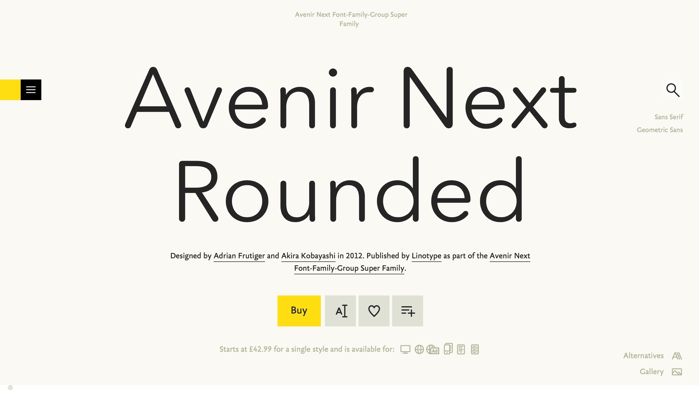
An eye-catching choice for best website font, Avenir's design is based upon the ubiquitous Futura (which was created as 'Die Schrift für die Neue Zeit' – 'the typeface for the New Time'). However, Avenir is described by designer Adrian Frutiger as having a more human touch.
Despite its popularity as a corporate typeface, it's a well-rounded geometric sans with a subtle personality that adds a friendly smile to serious content.
Several years later, Akira Kobayashi completed Avenir Next, which refined the original and added italics and small caps.
2. FF Kava
Available from: FontShop
Classification: Sans-serif
Designer: Yanone
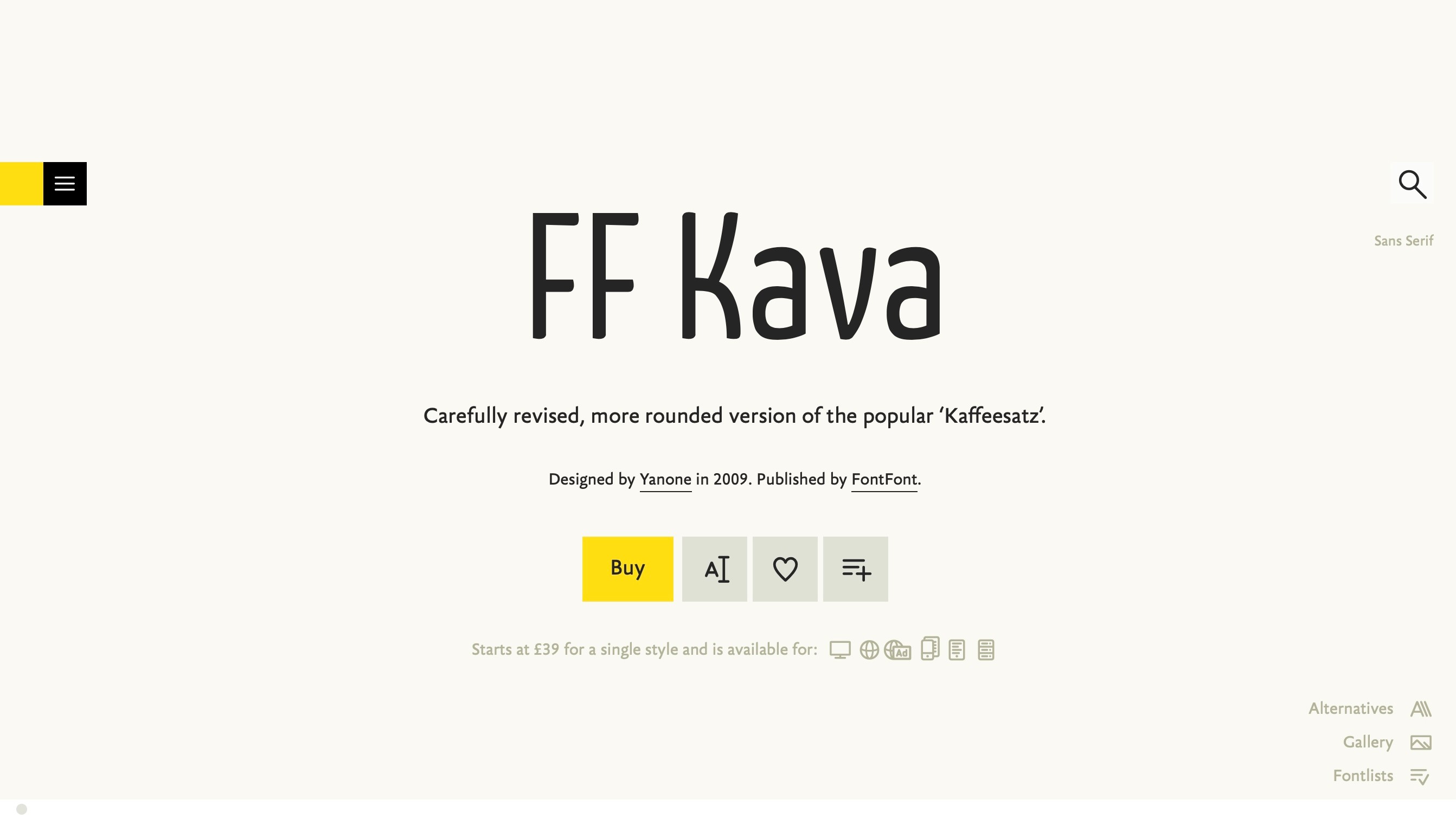
When Kaffeesatz was released for free around the time browser support for @font-face became more prevalent, it found popularity among many web designers and brought creator Yanone to the attention of FontShop FSI, who commissioned him to produce a professional version of the typeface.
Rather than simply adding extra glyphs to the font, it was completely redrawn from the ground up, keeping much of its character but including features such as a black weight, small caps and international language support. The result is FF Kava.
3. Times New Roman
Available from: FontShop
Classification: Serif
Designer: Victor Lardent, Stanley Morison
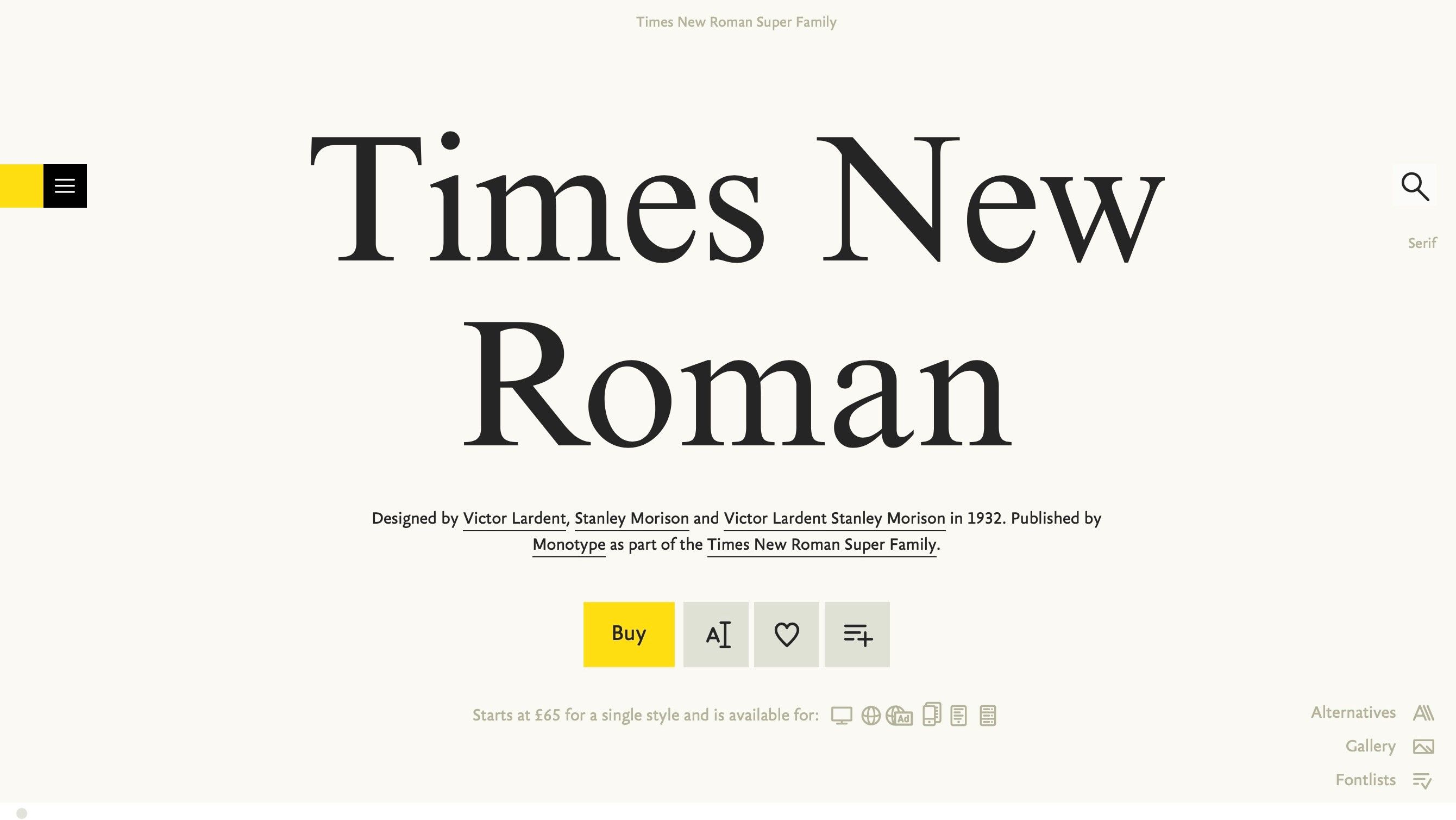
As strange as it may seem to list a system font associated with the world of Word documents and those who can't be bothered to change the defaults, Times New Roman is a surprisingly robust typeface when given a little TLC.
The 2008 Seed Conference website made particularly good use of Times by giving it the feel of a display face. Simon Collison, a designer known for his appreciation of Times's flexibility and use of it on his personal site, says that "it actually feels quite good to be taking a tired old typeface and trying to squeeze every possible ounce from it".
4. Bree
Available from: FontShop
Classification: Sans-serif
Designer: José Scaglione, Veronika Burian
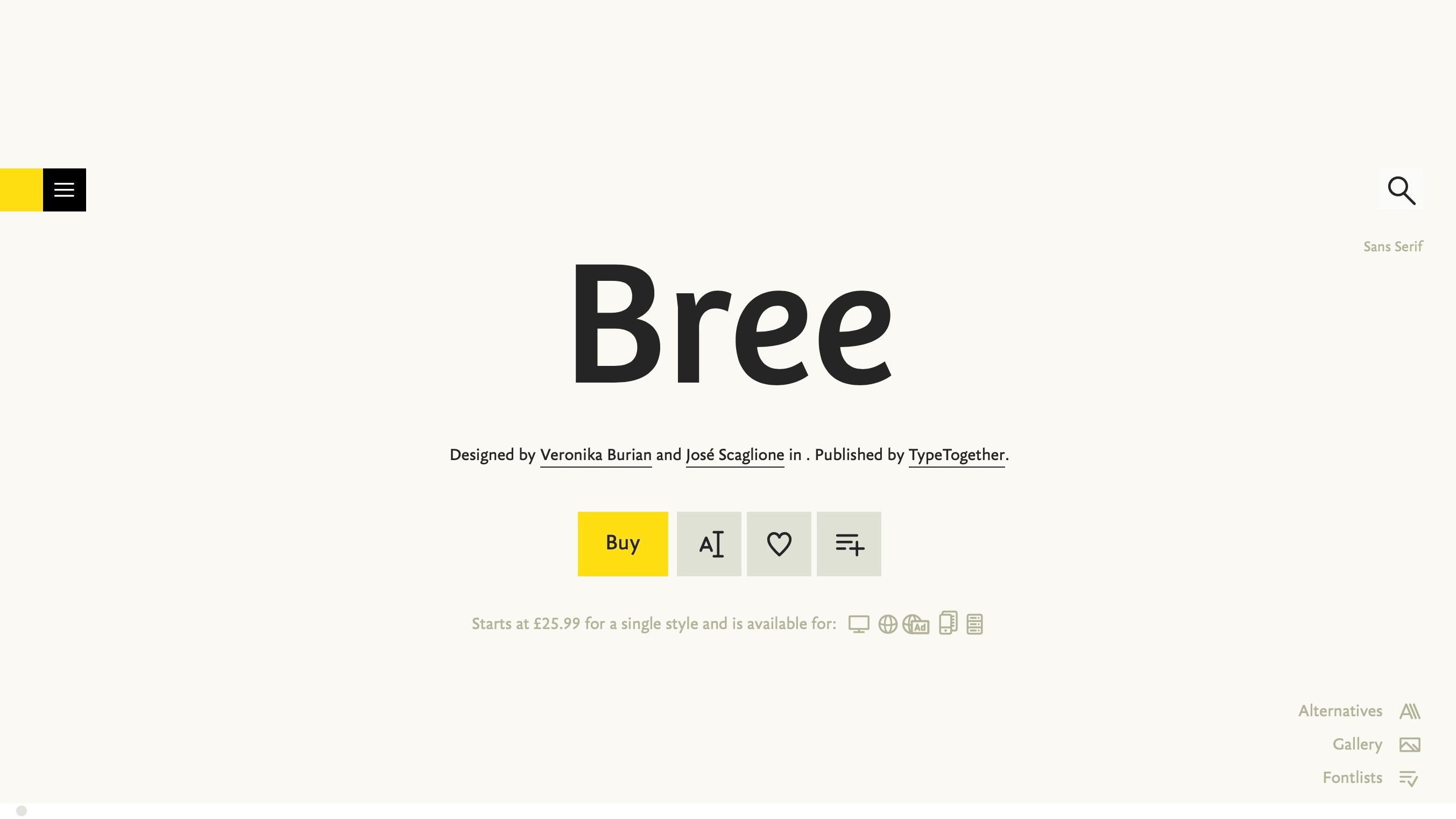
Full of personality and unashamedly casual, Bree might seem suited only to headings rather than body type, especially as it was born from TypeTogether's logo. However, a closer look reveals that, while headings are certainly its forte, Bree performs surprisingly well at smaller sizes.
It's also just one of the many beautiful typefaces to be born of the collective brains of José Scaglione and Veronika Burian, two type designers who met while completing the MA in Typeface Design at the University of Reading, a course widely considered to be one of the best in the world for aspiring type designers.
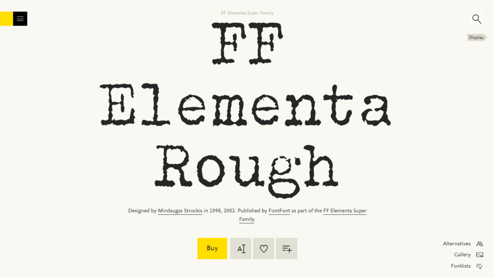
5. FF Elementa Rough
Available from: FontShop
Classification: Typewriter
Designer: Erik van Blokland
FF Elementa Rough is a truly versatile typewriter font, with regular, bold and italic styles, and an excellent choice if you're going for distressed headings. Simulating the aesthetics of ink being misprinted by a typewriter is no mean feat when the text also needs to remain totally legible, yet Trixie manages to succeed on both counts.
6. Lato
Available from: Google Fonts
Classification: Sans-serif
Designer: Łukasz Dziedzic
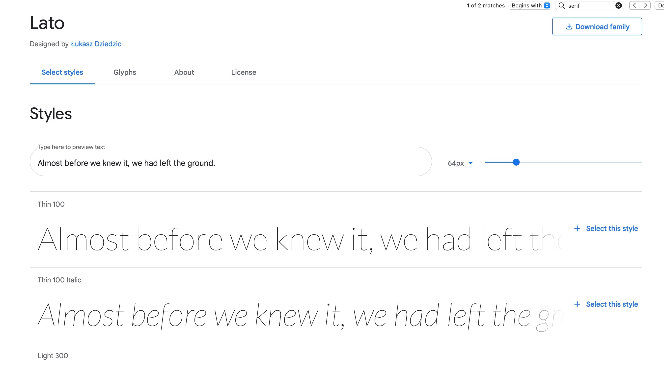
Lato originally started its life as a corporate commission. The client eventually decided to go in a different direction, so this font became available for a public release and is currently part of Google’s vast free library. The designer wanted to create a typeface that would be unobtrusive when used in a body of text, but could display some unique traits the bigger it got.
We’d say Łukasz Dziedzic achieved his goal, and created a simple, clean and elegant sans-serif font that looks great at any size, and comes with a large family of styles suitable for most needs. In other words, a flexible font that's ideal for websites.
7. Fedra Sans
Available from: Typotheque
Classification: Sans-serif
Designer: Peter Bil'ak
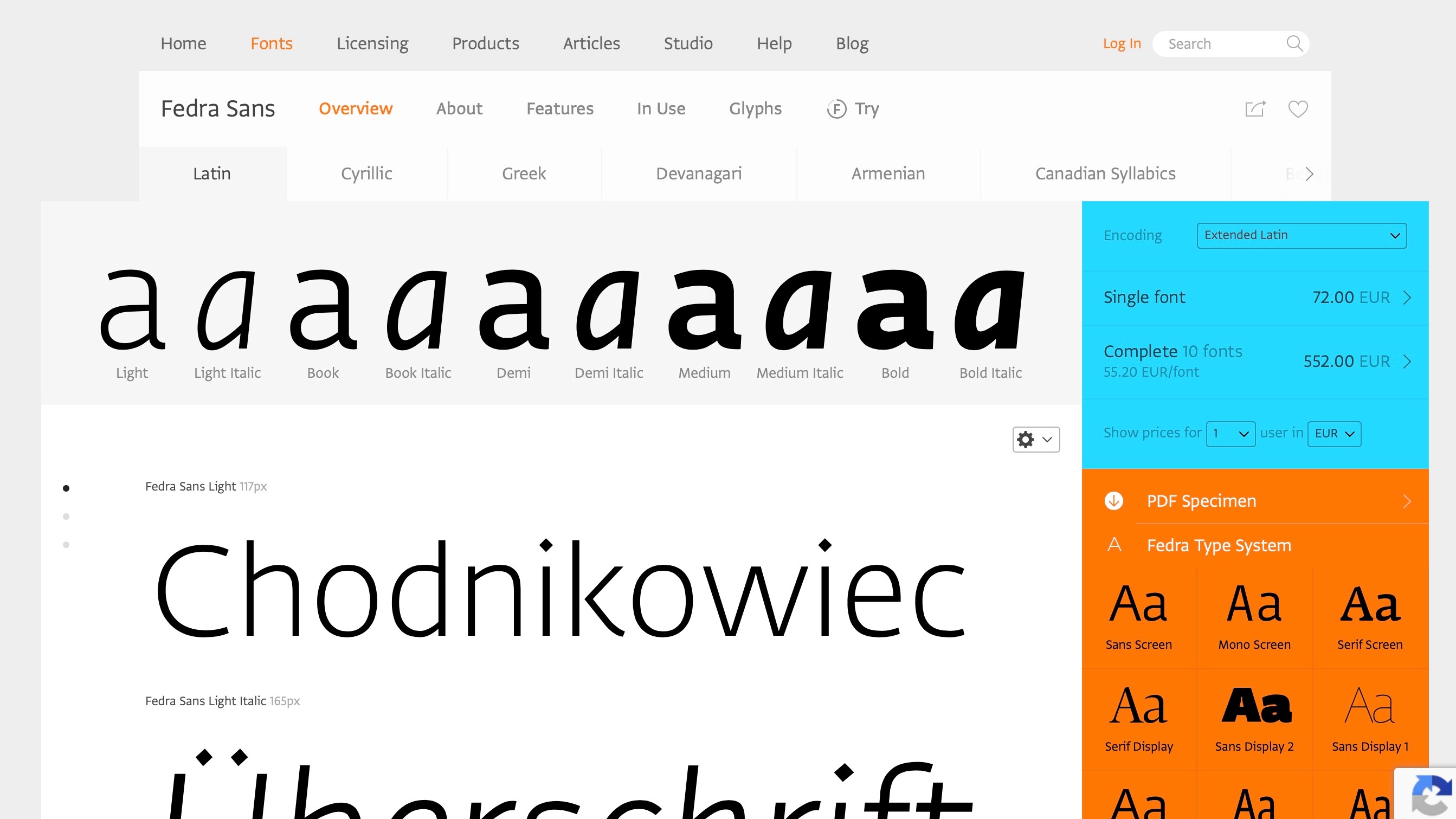
At the heart of Typotheque's font library, Fedra is a super-family that was designed to work just as well on screen as in print, and actually started life as a corporate typeface for German insurance company Bayerische Rück.
The design faced disaster when the client first acquired and then cancelled the project, then faltered again when Typotheque's office equipment was stolen. But, with designer Peter Bil'ak being forced to go back and re-examine the typeface, the final design was all the better for the set-backs, and the eventual result was a set of extremely versatile fonts.
8. Museo Slab
Available from: FontShop
Classification: Slab serif
Designer: Jos Buivenga
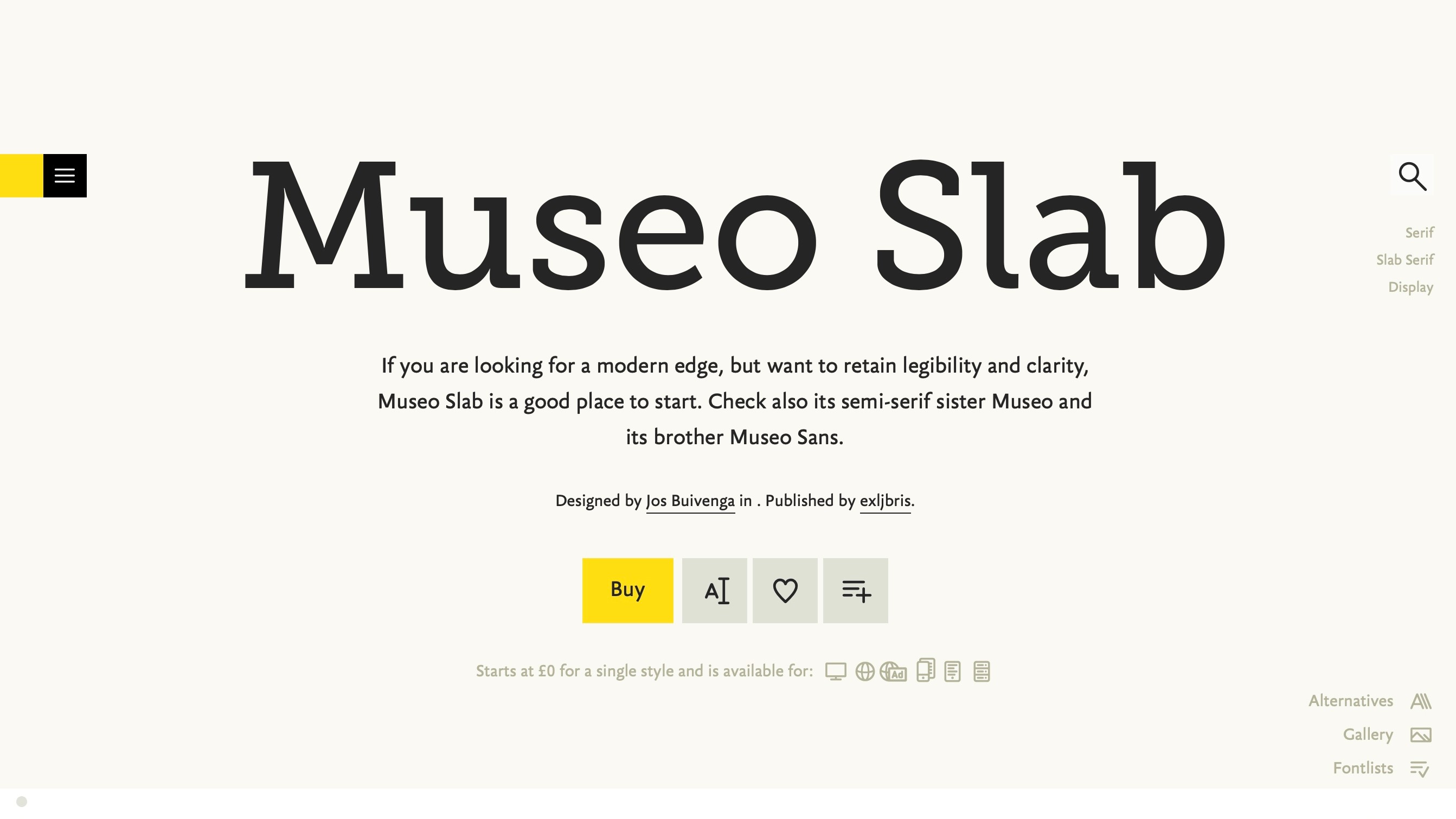
The original version of Museo has become extremely popular among web designers and is one of the few semi-free fonts (several of its weights are free) to make it onto this list. Its newer slab variant is a little less playful than standard Museo, and so offers a slightly more authoritative tone, along with a welcome element of variety, given how widely spread the original version has become.
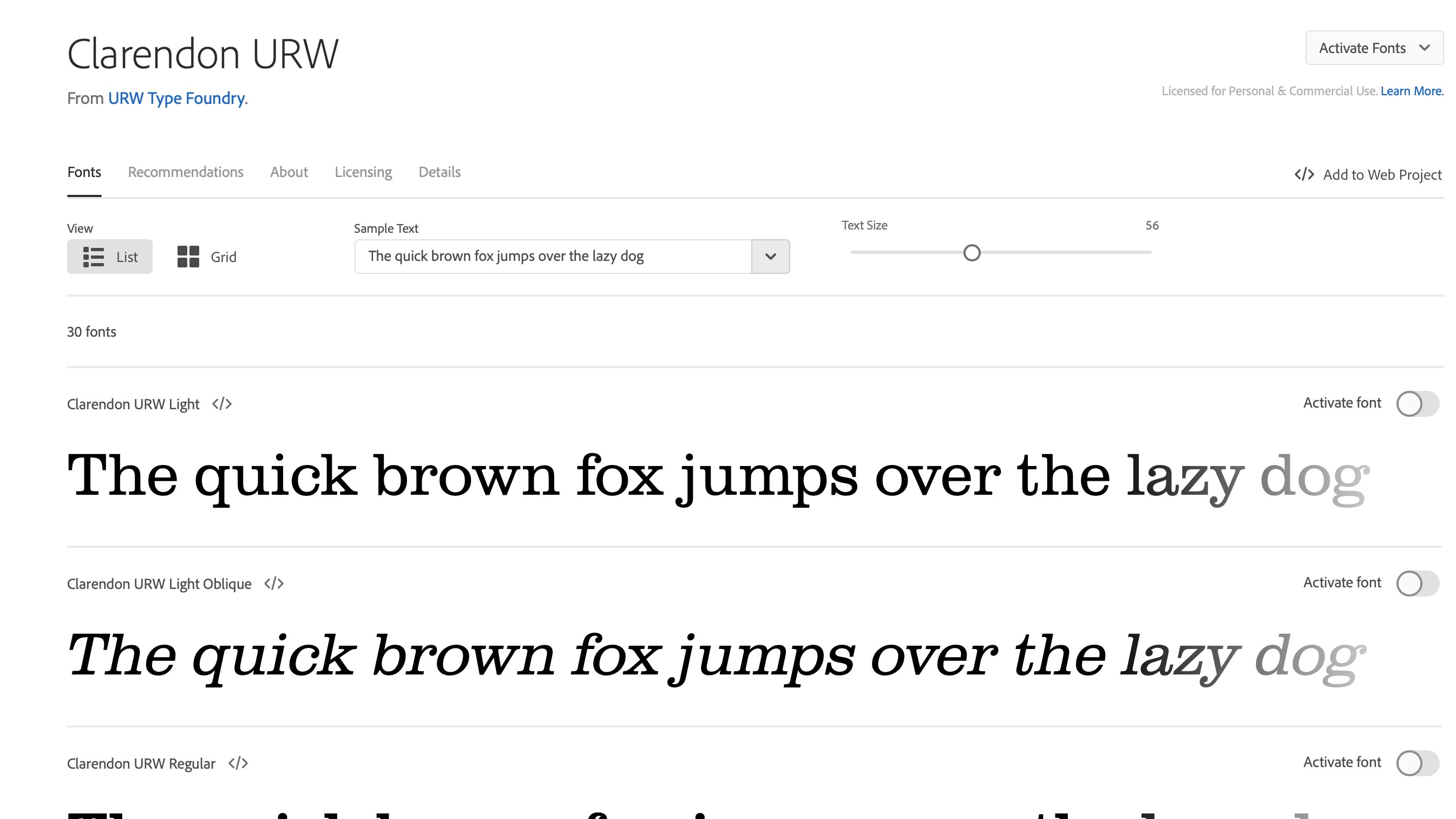
9. Clarendon
Available from: Adobe Fonts
Classification: Slab serif
Designer: URW
This classic British slab serif is a must-have on any 'top typefaces' list. Redrawn by Hermann Eidenbenz to include several weights and widths, Clarendon is offered as a web font by Adobe.
Also of note is Sentinel by Jonathan Hoefler and Tobias Frere-Jones. Their Clarendon-based typeface added true italics, and is available in different versions, including a web one from Hoefler&Co.
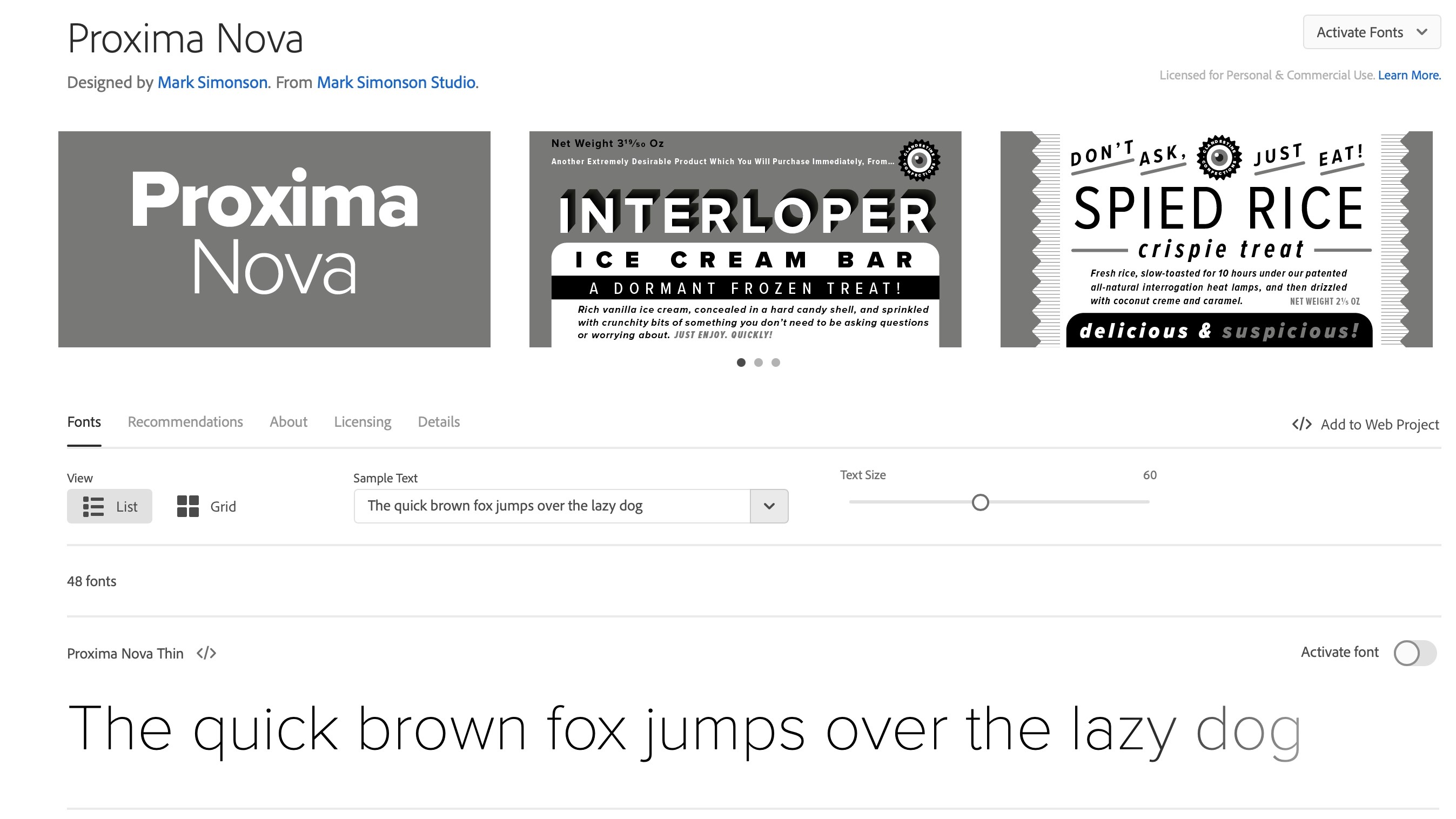
10. Proxima Nova
Available from: Adobe Fonts
Classification: Sans-serif
Designer: Mark Simonson
Described as a design that straddles the gap between typefaces like Futura and Akzidenz-Grotesk, Proxima Nova is remarkably versatile, and the family includes several weights and widths, bringing the total font count to an impressive 42.
Extremely readable thanks to its geometric clarity and humanist feel, it's a hybrid that works in a variety of scenarios.
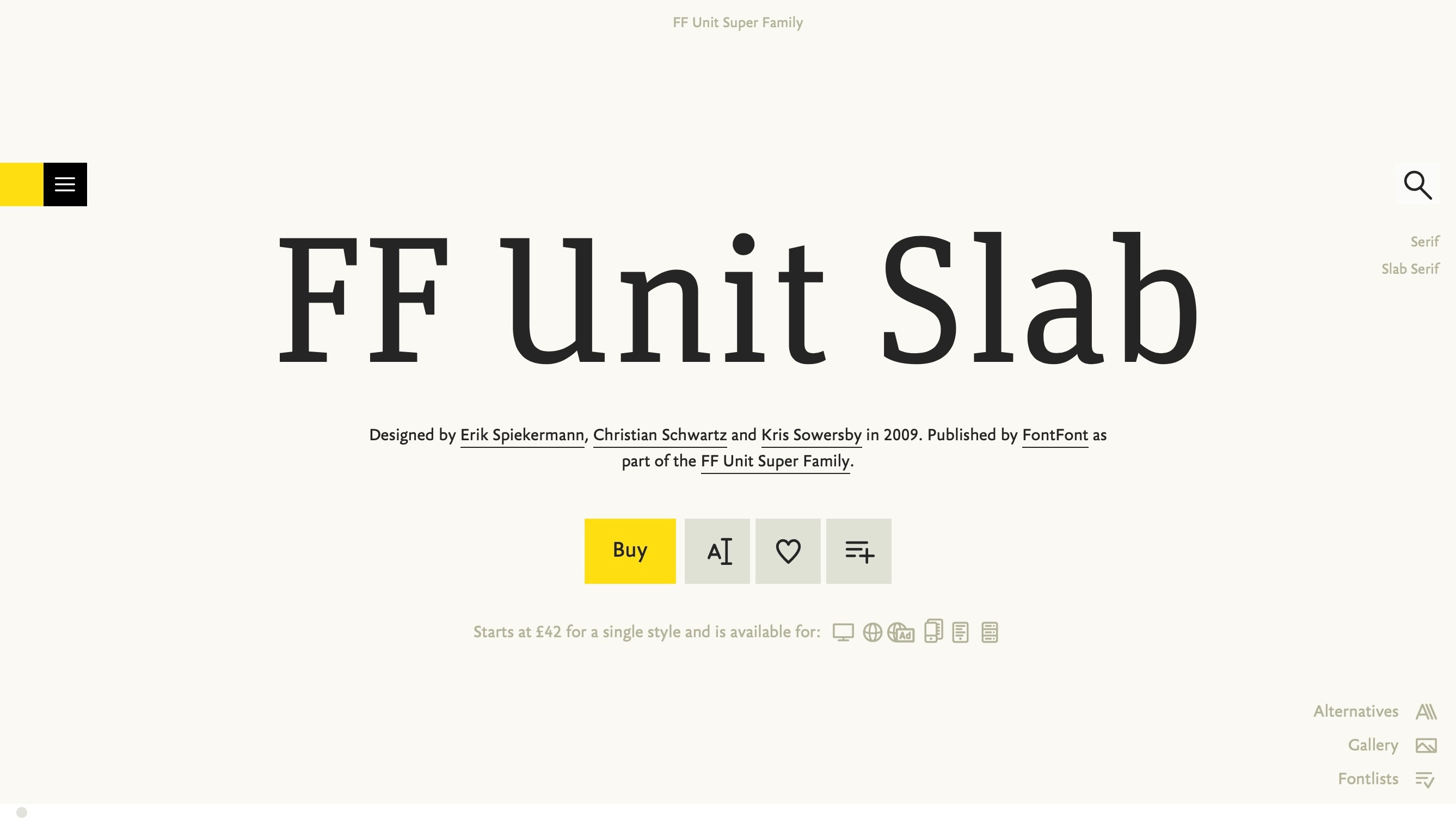
11. FF Unit Slab
Available from: FontShop
Classification: Slab serif
Designer: Erik Spiekermann, Christian Schwartz, Kris Sowersby
The slab style of the Unit super-family – which is often referred to as the grown-up sister of Meta – is a personal favourite of many.
It comes across as powerful and almost brutish at its heaviest 'Ultra' weight, yet can be seen as deceptively subtle at its thinnest 'Thin' weight – the typeface is a great all-rounder that's just overbrimming with personality.
A variation of Unit Slab – Espi – is used as Edenspiekermann's corporate typeface.
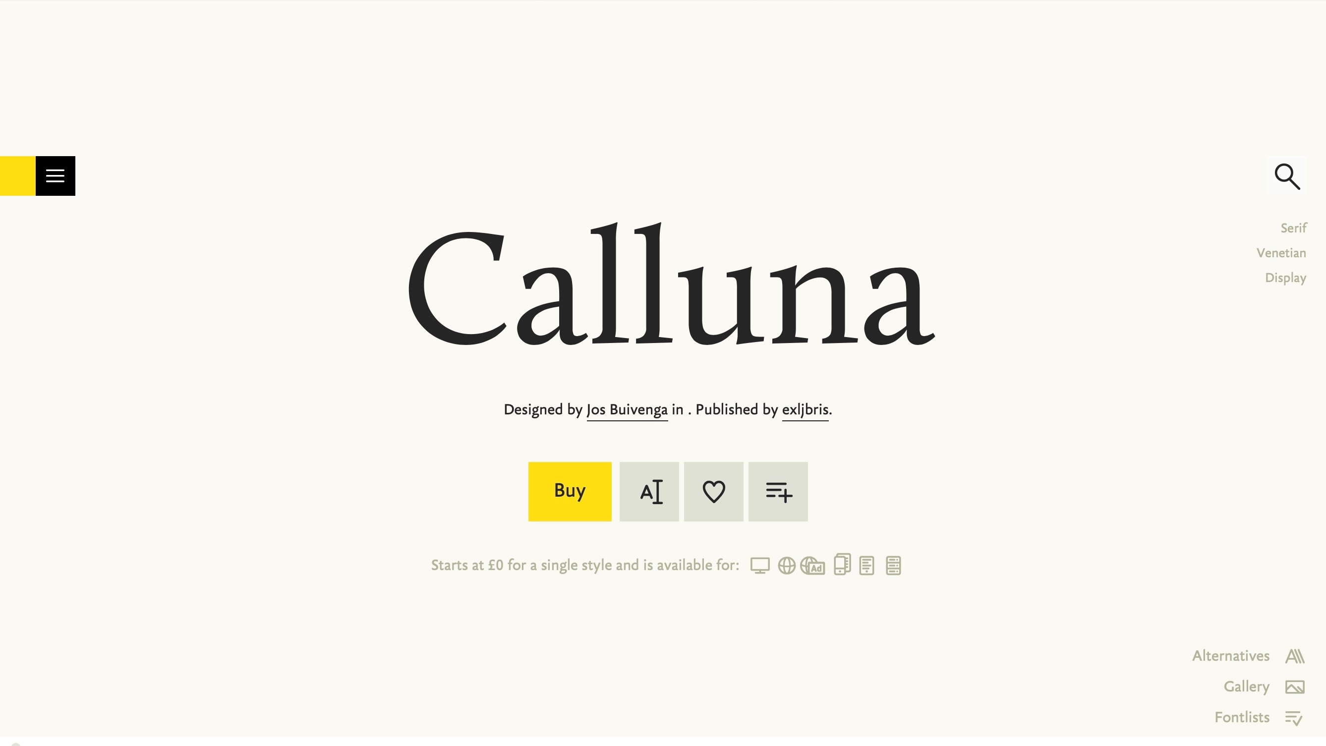
12. Calluna
Available from: FontShop
Classification: Serif
Designer: Jos Buivenga
Born as the result of an experiment designer Jos Buivenga was performing with an early version of Museo Slab, Calluna is actually his first serious text face. Much like Meta Serif, it manages to exude no small amount of personality even when used at smaller, body type sizes.
Like many of Jos's latterday fonts, there are plenty of OpenType features included, and the regular weight is available completely free.
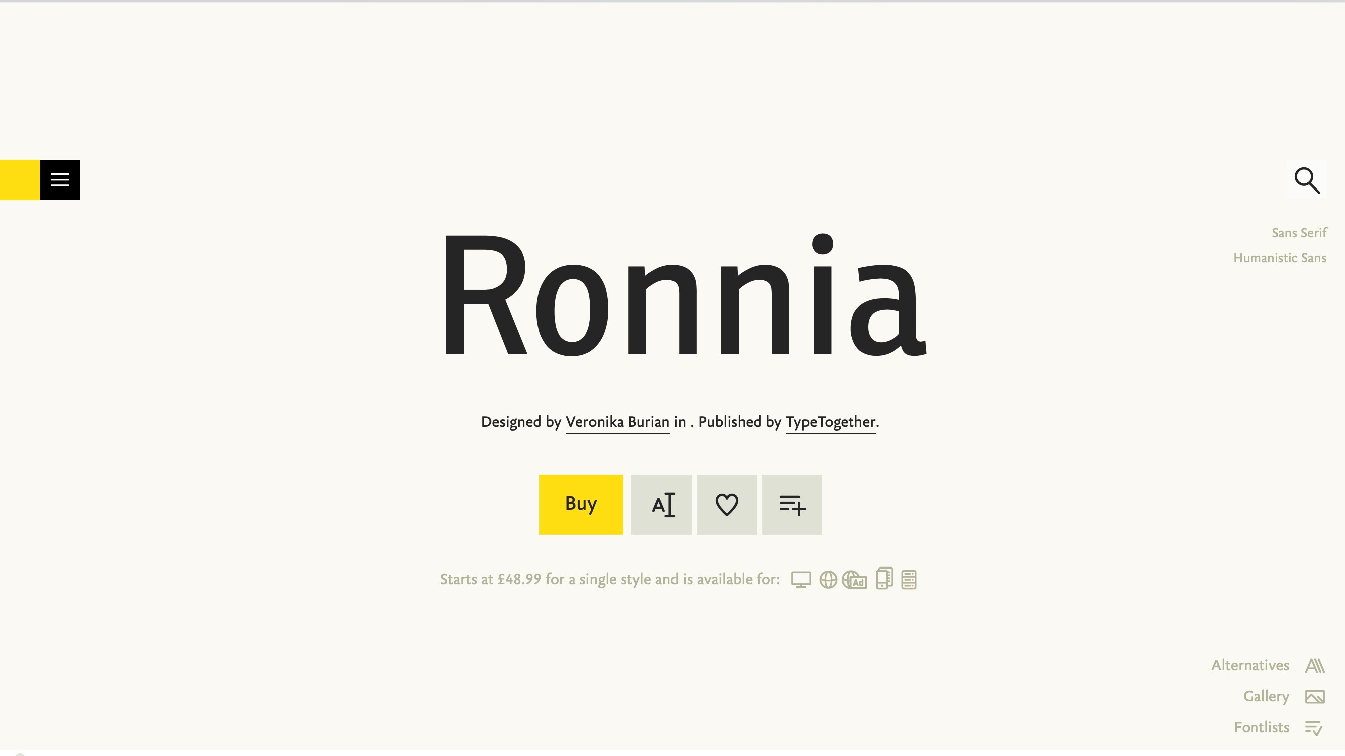
13. Ronnia
Available from: FontShop
Classification: Sans-serif
Designer: José Scaglione, Veronika Burian
Condensed faces are often used for attention grabbing headlines, and often we reach for hard, industrial faces such as Alternate Gothic and its ilk. Sometimes something a little softer is required, though, and that's where Ronnia's condensed flavour comes in.
Its gentle, playful form works well with Bree, although it comes across as a little more authoritative: a friendly face with some gravitas.
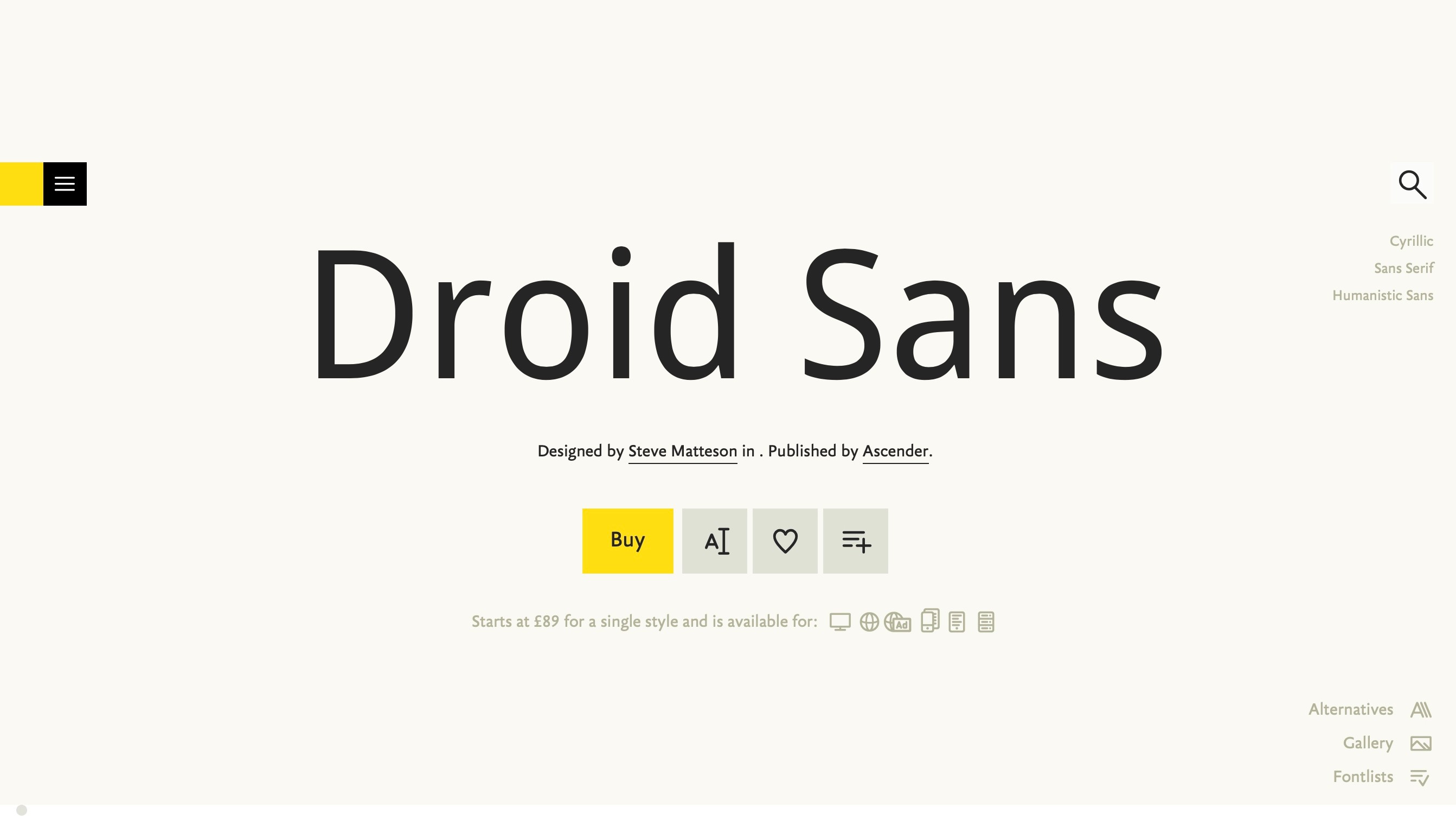
14. Droid Sans
Available from: FontShop
Classification: Sans-serif
Designer: Steve Matteson
A truly modern type super-family, Droid was designed by Ascender's type director Steve Matteson for use on mobile devices; its name is derived from the Android platform. The sans is a highly legible, friendly typeface with upright stress, open forms and a neutral appearance.
To make the most of type appearing on small screens, the letterforms are very slightly condensed. The entire family features multi-lingual support, making it well-suited to far-reaching websites and applications.
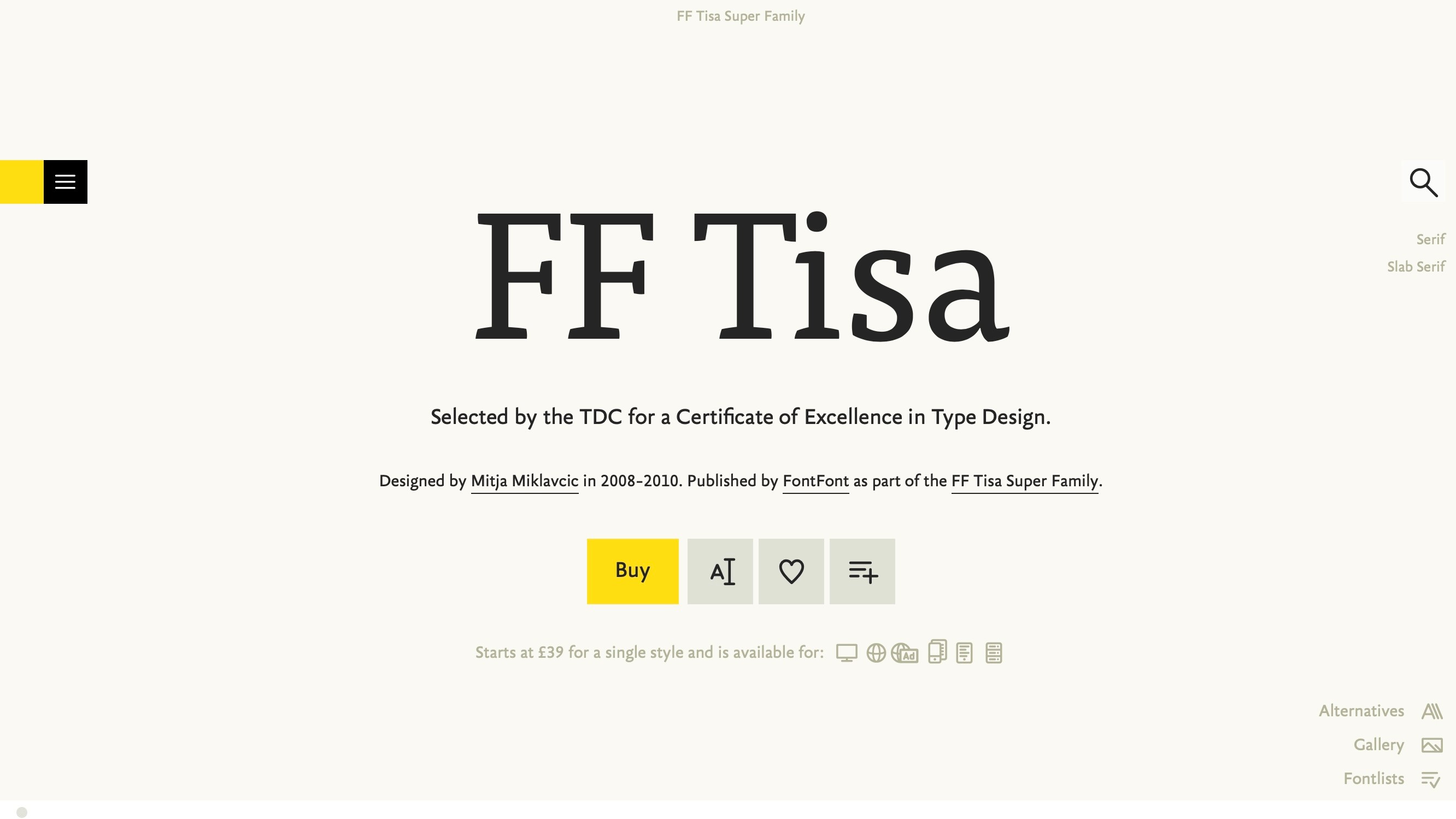
15. FF Tisa
Available from: FontShop
Classification: Serif
Designer: Mitja Miklavcic
Although initially designed for use in magazines, Tisa has become popular on the web, perhaps because – like the majority of typefaces here – its large x-height makes it highly legible as on-screen body type.
Taking slab serifs as an influence and then offering a softer, low-contrast end product, the typeface was originally designed by Miklavcic to fulfil the requirements for the aforementioned MA in Typeface Design at Reading.
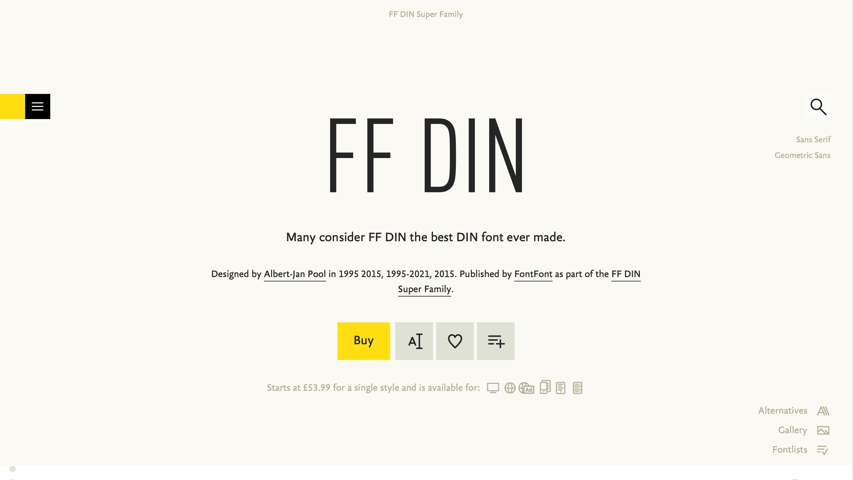
16. FF DIN
Available from: FontShop
Classification: Sans-serif
Designer: Albert-Jan Pool
DIN embodies the spirit of German efficiency (DIN stands for 'Deutsche Industrie-Norm' or 'German Industrial Standard') and has its roots in signage – everything from road signs on the Autobahn to house numbers.
It was celebrated for its no-nonsense geometric style and adorned German design for years in the form of DIN 1451: DIN-Mittelschrift and DIN-Engschrift, its condensed companion. It was updated and expanded into a family of five weights by Albert-Jan Pool in 1995 and has recently been given more stylistic variants, including DIN Rounded.
17. Helvetica
Available from: FontShop
Classification: Sans-serif
Designer: Max Miedinger, Eduard Hoffmann
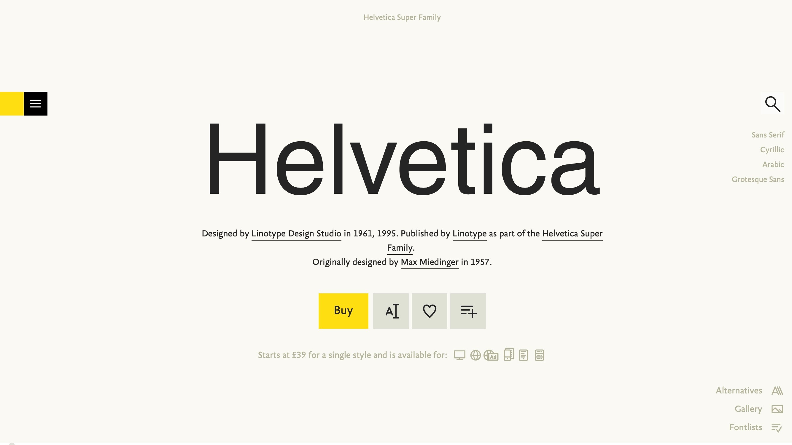
It seems almost impossible to discuss the subject of typography without mentioning Helvetica. The sans-serif typeface has long been considered one of the best fonts for websites, its confident lines offering a quiet but bold presence on the page. It's clean, and highly legible, even in small print, with good spacing
Thanks to its generous usage by what seems like every designer in existence, the typeface has achieved legendary status; its name and style known to the general public as well as type aficionados.
Originally named Die Neue Haas Grotesk and created to compete with Akzidenz-Grotesk, it represents the Swiss style of graphic design from the 1950s, but its widespread appearance in virtually every design context has resulted in the typeface becoming somewhat homogenised, and it has been re-imagined in various (inferior) forms such as Arial. Nevertheless, it remains a modern classic.
18. League Gothic
Available from: Adobe Fonts
Classification: Sans-serif
Designer: Tyler Finck
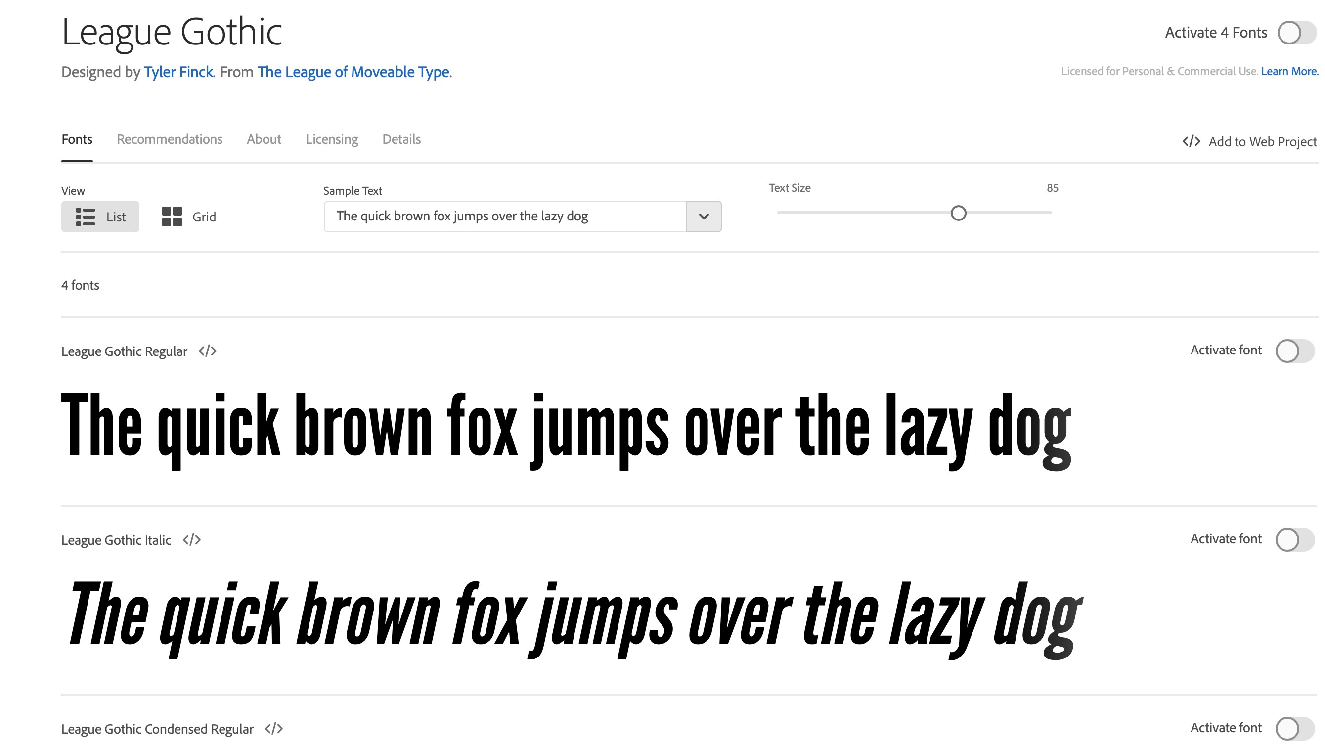
League Gothic is a revival and reworking of Alternate Gothic, released by The League of Moveable Type as an open-source typeface, after the original foundry went bankrupt.
An attractive typeface for website headlines, it’s a hugely popular choice for those in need of a hard-hitting, almost brazen typeface. Legible at relatively small sizes despite being condensed, it's a bold and formidable face; a slice of American industrialism performing magnificently in the digital age.
19. FF Meta Serif
Available from: FontShop
Classification: Serif
Designer: Christian Schwartz, Erik Spiekermann, Kris Sowersby
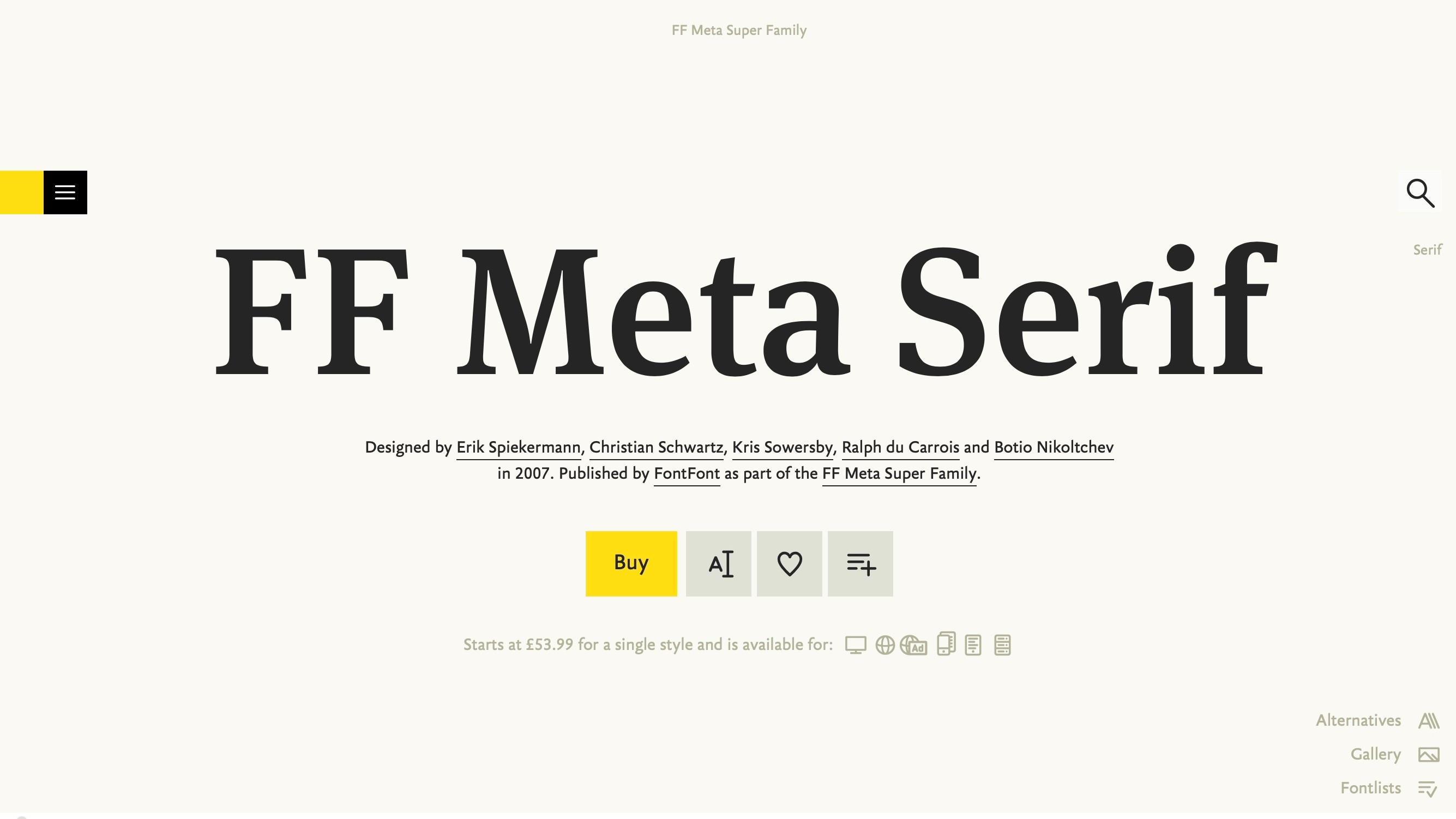
Erik Spiekermann describes his Meta family as, "the nearest thing I'll ever have to a classic," and he's being modest, because Meta really is a classic; especially its serif. It's an authoritative typeface that works well in a variety of scenarios and offers a logical upgrade to designers who have previously been using Times New Roman.
It works well with the other flavours of Meta and also with the Unit super-family. Support for international characters and a wide variety of glyphs for numerals, fractions and so on mark it out as a high-level professional font.
20. Georgia
Available from: FontShop
Classification: Sans-serif
Designer: Matthew Carter
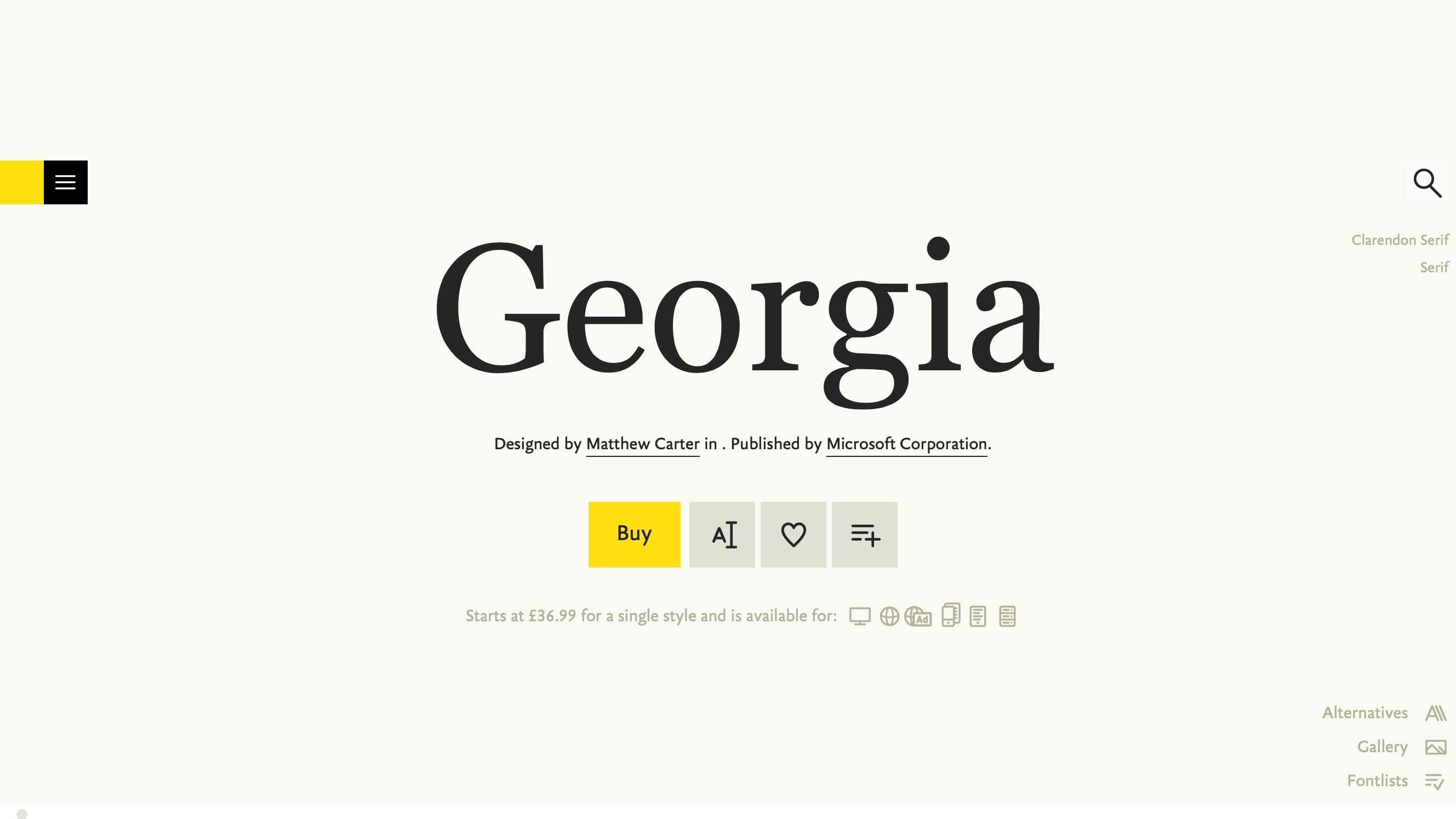
As hard as it may be to believe, Georgia comes up again and again as the people's favourite when talking about type that works well on the web. Perhaps it's because it was designed for screen rather than print; perhaps it's because it manages to offer timeless beauty in its simple, understated design; perhaps it's because it has Old Style Figures as default!
Extremely legible at small sizes and somewhat majestic in its italic form, Georgia proves its worth despite the new wealth of alternatives, and reminds us that sometimes the best tools are sitting right in front of us.
21. Abril Fatface
Available from: Google Fonts
Classification: Serif
Designer: TypeTogether
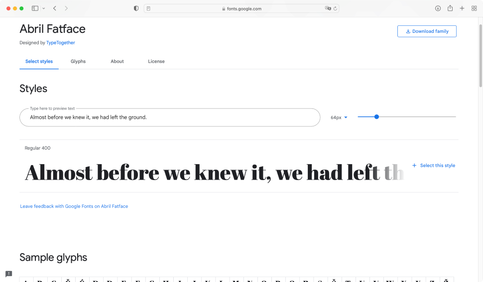
Abril Fatface was inspired by the 19th Century advertising posters that adorned cities in England and France. It’s a thin serif which feel pretty subtle, and is coupled with sharply defined edges, providing excellent contrast. You could use it for your headlines, and it would look great for the main body of your content as well. Even better, it’s not limited to the English alphabet and has support for over fifty languages, including those from Central and Northern Europe.
22. Raleway
Available from: Google Fonts
Classification: Sans-serif
Designer: Matt McInerney, Pablo Impallari, Rodrigo Fuenzalida
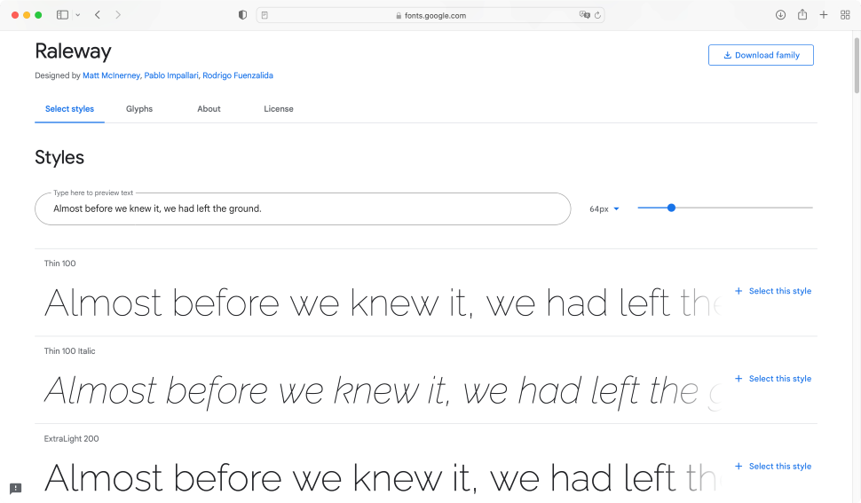
Raleway has evolved over the years, starting as a single thin weight designed by Matt McInerney, it was later expanded to a nine-weight family by Pablo Impallari, and Rodrigo Fuenzalida. Offering support for many languages, this sans-serif font comes with an extensive set of diacritics. The most recent addition was proper support for italics.
This is a nice and clean-looking font, with attractive rounded edges, making it one of the best fonts for websites, documents, and other graphic design endeavours.
23. Arvo
Available from: Google Fonts
Classification: Slab Serif
Designer: Anton Koovit
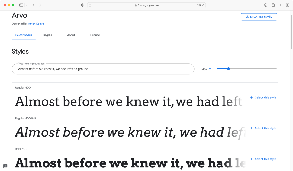
If you prefer a more angular feel to your font, then Arvo is well worth a look. Designed by Anton Koovit, this slab serif font was updated in 2013, adding support for Cyrillic languages, and polishing its design, making it sharper and cleaner at smaller sizes.
It comes as a family of four: Roman, Italic, Roman Bold, and Bold Italic, giving you enough versatility without overwhelming you with choices, and is a good choice for web and print alike.
24. Exo 2
Available from: Google Fonts
Classification: Sans-serif
Designer: Natanael Gama
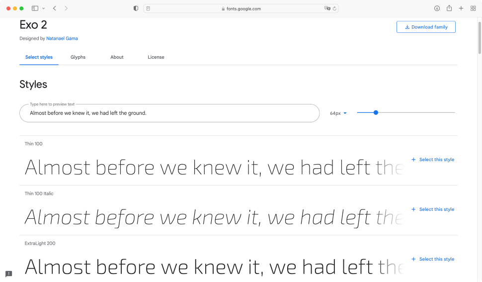
According to the font’s description, Exo 2 is “a contemporary geometric sans-serif typeface that tries to convey a technological/futuristic feeling while keeping an elegant design.” As its name implies, it is a complete redrawing of Exo, and comes with nine weights (the maximum allowed for a web font), with specifically designed italics for each.
You’ll find it works great at small sizes and its nice, rounded design makes it comfortable to read, even in the main body of an article.
25. Roboto
Available from: Google Fonts
Classification: Serif
Designer: Christian Robertson
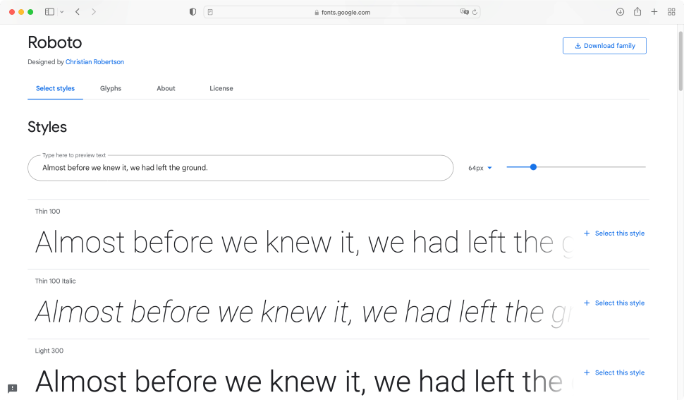
Roboto is an interesting font, being largely geometric in nature. The way it’s been shaped allows the letters to settle into their natural width, making it a great font to read. Its glyphs show support for numerous languages, which is a welcome addition. It’s little surprise that Roboto is consistently rated as the most popular design on Google Fonts. Obviously, this could mean you’re seeing it in too many places, reducing the potential uniqueness of your own work, but look at it carefully, and you’ll see its popularity is well deserved.
26. Brush Script
Available from: Adobe Fonts
Classification: Sans-Serif
Designer: Robert E. Smith
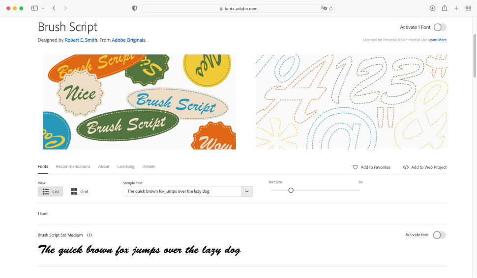
This is far from a new font, having been originally designed all the way back in 1942 by Robert E. Smith, but it has definitely stood the test of time. Perhaps it’s the fact that it looks like cursive writing with no excessive flourish. This is markedly seen when using lower case letters.
Obviously you wouldn’t want to use it for the main body of your work, but it does look great in moderation, particularly for posters, signages, titles, and notes that need a ‘handwritten’ feel.
27. New Paris
Available from: Swiss Typefaces
Classification: Serif
Designer: Swiss Typefaces
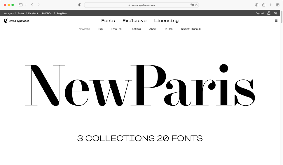
This serif design was inspired by traditional French typefaces, but modernised to meet contemporary needs. It is renowned for its high contrast between its thin and thick strokes.
New Paris comes in three collections and twenty fonts, the standard ‘g’ is probably our favourite design, with its unique and original curves. Each collection can be bought separately, and the design looks great whether it’s used for headlines or the body. The only downside is that it appears to only be limited to the latin alphabet (including accents, of course).
28. Lazer 84
Available from: Da Font
Classification: Sans-serif
Designer: Sunrise Digital
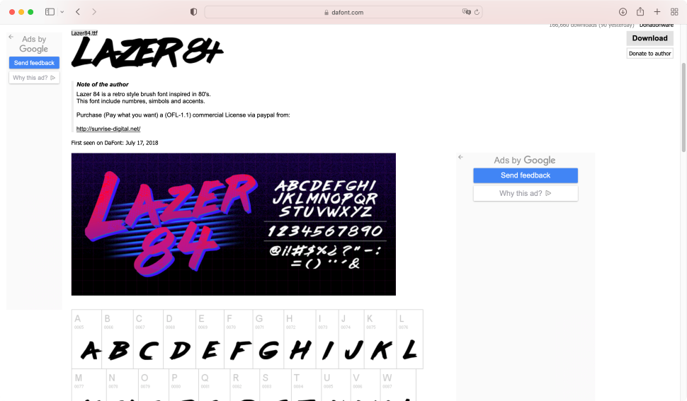
Fancy something a little different? Having a longing for the 80s? Then Lazer 84 might be exactly what you’re looking for. It’s a fun, quirky brushed font design, which you’ll undoubtedly have seen numerous examples of in the media of the time, and you can now apply it to your own work. Nice and nostalgic though it is, it doesn’t come with all the glyphs you’d need to fully support even English - the most notable omission is the cent symbol (¢), and, puzzlingly, backslash (\) and even square brackets ([ ]). But don’t let that dissuade you from using this donationware for headlines, posters, and 80s revival apps!
29. Bison
Available from: My Fonts
Classification: Sans-serif
Designer: Ellen Luff
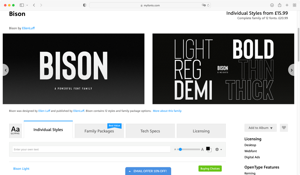
Bison is a very recent sans-serif font, making its debut on myfonts in 2018. Designed by Ellen Luff, it has a very angular yet pleasant feel to it. It’s very clean and readable, even at the thinnest weight (‘Bison Light’). Four outline families are also available, affording a lot of versatility to this design.
It’s advertised as working great for “any branding, logos, magazines, films”, and we feel it would also be most effective for headlines. It’s a lovely, authoritative font that’s definitely worth adding to your collection.
30. Rapor
Available from: My Fonts
Classification: Sans-serif
Designer: Oğuzhan Cengiz
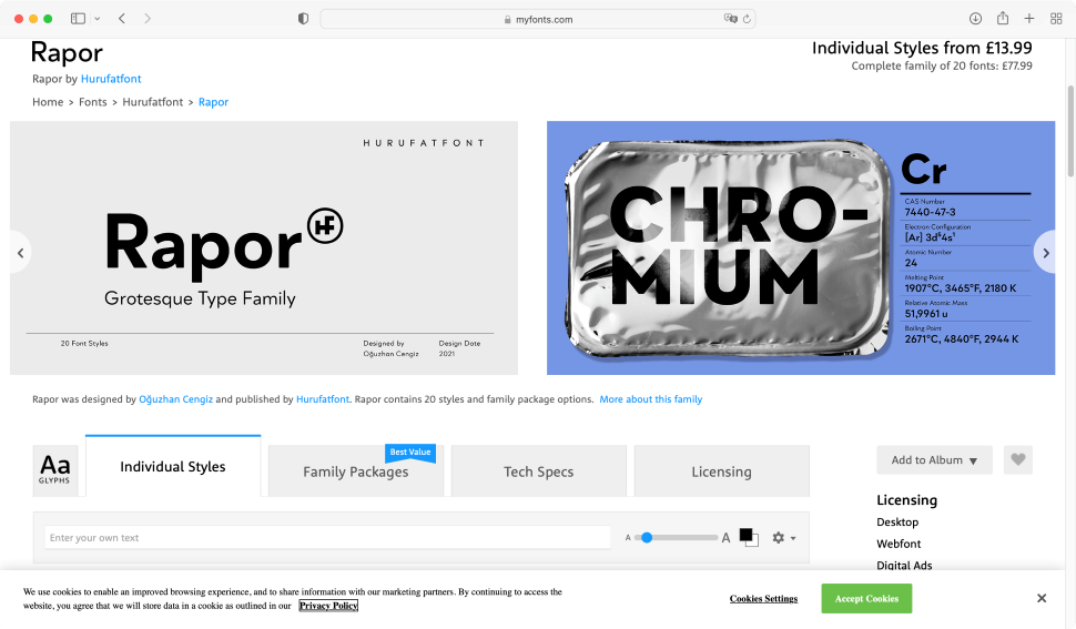
Even newer than Bison is Rapor, which debuted on myfonts in 2021. It’s made up of ten weights ranging from ‘thin’ to ‘black’, totalling twenty styles with matching italics.
Rapor supports numerous languages. Its sans-serif design was inspired by fonts like Futura, although its slightly softened diagonal corners make it truly distinctive and a pleasant alternative to use, whether it’s for the web, documents, or posters.
31. Montserrat
Available from: Google Fonts
Classification: Sans-Serif
Designer: Julieta Ulanovsky,
Montserrat was originally, and principally, designed by Julieta Ulanovsky, as an attempt to recreate and preserve the old posters and signs in Buenos Aires’ traditional Montserrat neighbourhood.
In 2017, the family was redrawn by Jacques Le Bailly at Baron von Fonthausen, giving it a full set of weights. Later that year, Julieta and others led the development of Cyrillic support.
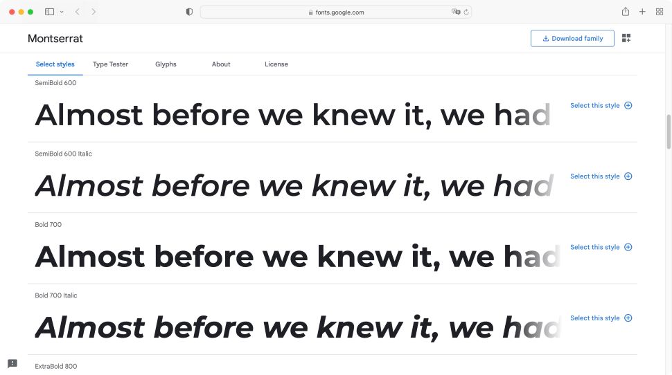
This elegant, easy to read sans-serif font currently boasts 18 different styles from Thin 100, to Bold 900 Italic, giving you a vast array of choices to cater for all needs.
32. Dancing Script
Available from: Google Fonts
Classification: Script
Designer: Impallari Type
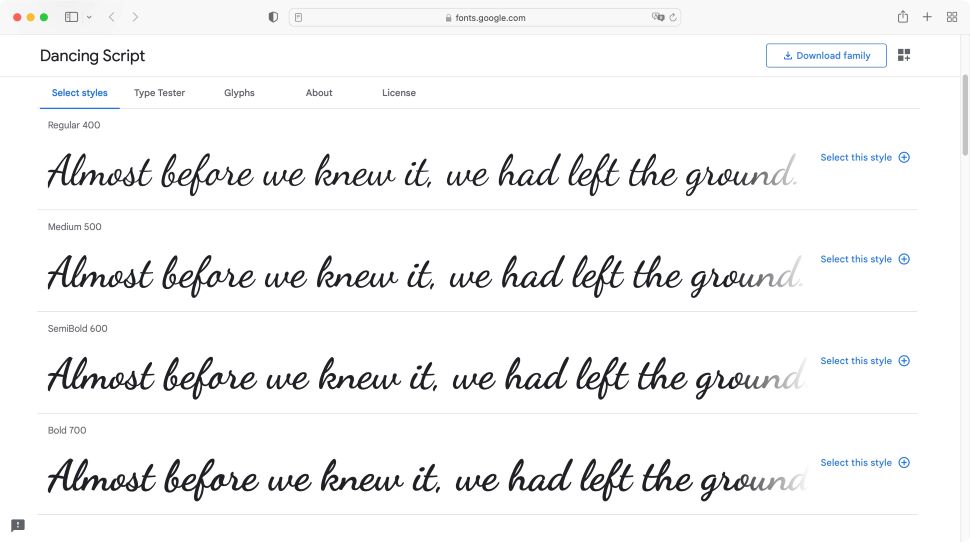
Designed by Impallari Type, this fun, hand-written font almost feels like someone actually wrote cursive text on your page. It references popular typefaces from the 50s, and can be a fun casual addition to any document, although it would obviously suit headings and titles far better than long bodies of text.
It comes with just four styles, which get progressively thicker. It also seems to cater for all accents found in the Latin alphabet, giving it great flexibility. However, as with most cursive scripts, it may be more difficult to read on-screen.
33. Merriweather
Available from: Google Fonts
Classification: Script
Designer: Sorkin Type
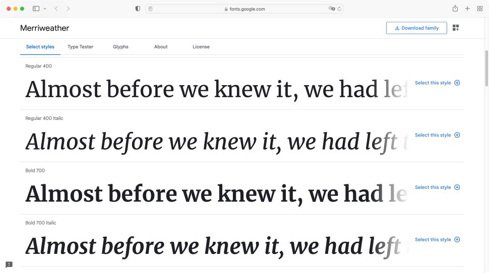
This serif family was designed with screens in mind, and its goal is to make it more pleasant to read on a computer, tablet, or phone. And we’d have to agree that it’s very gentle on the eye when staring at screens all day long. If you prefer your fonts to be sans-serif, you can get Merriweather Sans, also available through Google Fonts.
Designed by Sorkin Type, Merriweather boasts a large x-height, and slightly condensed letterforms, allowing you to squeeze a little more text on every line, without straining the reader’s eyes.
34. BoldPrice
Available from: Creative Market
Classification: Numbers
Designer: vatesdesign
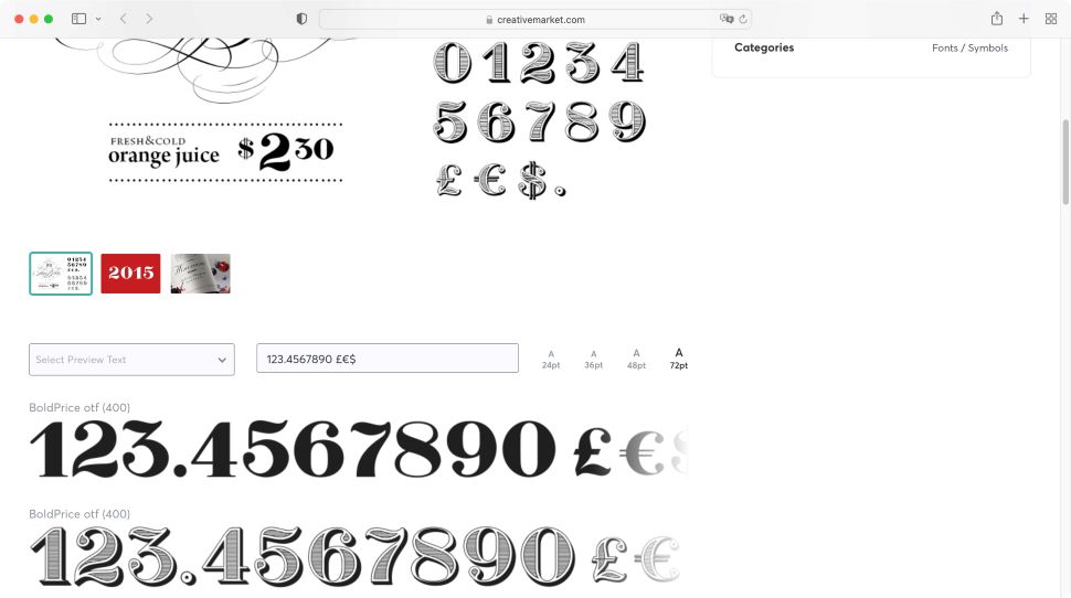
OK, this one may seem like an unusual choice, but we’re looking for originality here, as well as readability, style and effectiveness. As such, BoldPrice is only a numbers, period and common currency symbols font. And that’s it - although a comma would’ve been nice.
However, what it lacks in versatility, it gains in the sheer beauty of those numbers. It offers only two styles. One is black, the other has an engraved look that wouldn’t seem out of place in a Western. If you’d like your numbers to have that old nostalgia feel, check this font out. You’ll likely appreciate it.
35. FreeLine
Available from: Creative Market
Classification: Sans-Serif
Designer: Sentavio
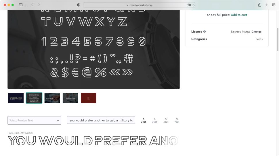
Creative Market hosts many interesting and original fonts, and FreeLine is a great example. Designed by Sentavio, it’s obvious at first glance that it is not designed as a standard font for general text. However, it can give a highly distinctive look and feel for titles, headers, logos and branding, and would certainly make your site stand out from the crowd.
It doesn’t support accents, but as it’s an all-caps font, it shouldn’t cause too many issues. It’s definitely bold and worth experimenting with.
36. Gazpacho
Available from: My Fonts
Classification: Serif
Designer: Santi Rey
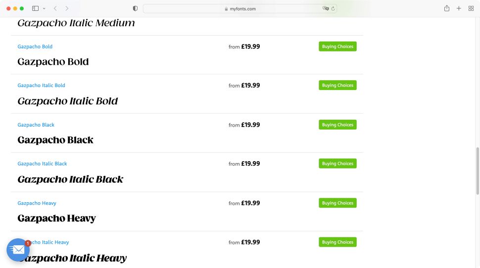
This font has been inspired by the typefaces used in editorial media from the 70s and 80s. It comes in 14 styles and 7 different weights, ranging from Thin to Italic Heavy. It has a large x-height which makes it ideal for headlines, however, it’s also a clear, sharp font with excellent contrast, meaning you could use it for small or long bodies of text. Its friendly, round design would certainly make your site stand out from the others.
37. TimeBurner
Available from: Font Space
Classification: Sans-Serif
Designer: NimaType
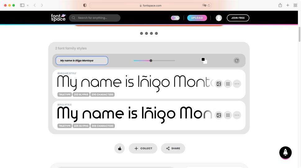
It’s always nice to find a clean and deceptively simple-looking futuristic font. It’s evident from first glance that a lot of work has gone into the design of TimeBurner, even though it only comes in two styles, Regular and Bold.
Some of the lettering was drawn to feel incomplete, like the lowercase e, g, and y, but that’s all part of its charm. It’s predominantly round, giving it a friendly, inviting feel. The font would work well in creating striking headings, titles, and banners.
38. American Captain
Available from: My Fonts
Classification: Sans-Serif
Designer: The Fontry
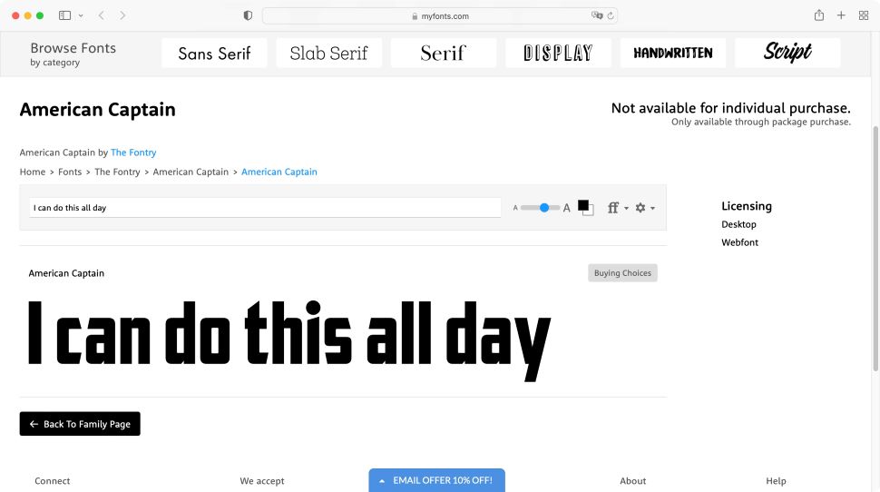
Just like its namesake, this is a bold font that stands out from the crowd. We like this one because you can use it both for headings and titles, but also for small amounts of text - although it might get a little too much if the body’s long. It also offers support for Latin, Cyrillic, Greek and Hebrew, making it incredibly versatile worldwide. It’s part of a six-font family package, and cannot be bought individually, but the other members do work well together, so it’s not a big issue.
39. Nathan
Available from: Be Fonts
Classification: Script
Designer: Vultype Co.
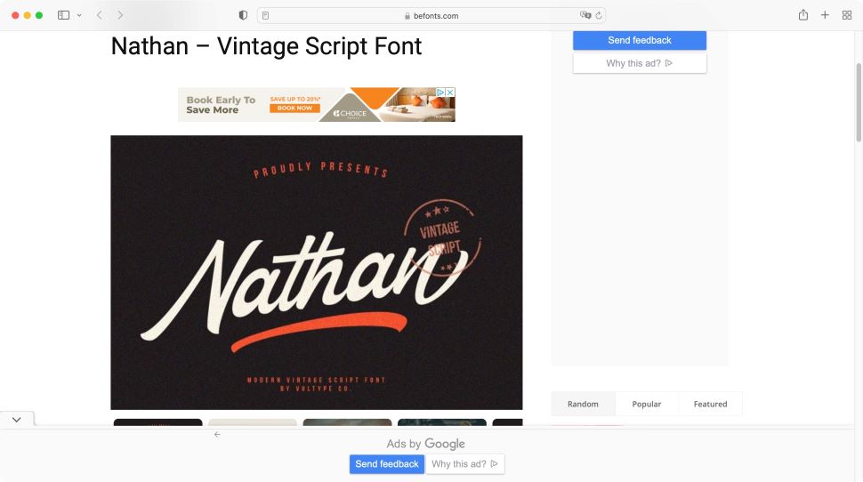
Not as elegant and seamless as Dancing Script, Nathan still brings an enjoyable quirkiness to the script style of fonts. Inspired by vintage designs, it feels like a natural script. It is versatile enough to make good titles and headings, and can look great when used for logos and posters, although this would depend on the combination of letters: ‘Nathan’, for instance, looks fantastic, but if a ‘v’ is inside a word, like ‘Love’, it does tend to break the flow (mind you, this is a problem with most script fonts).
40. Roman Grotesque
Available from: Bureau Brut
Classification: Serif grotesque
Designer: Bureau Brut
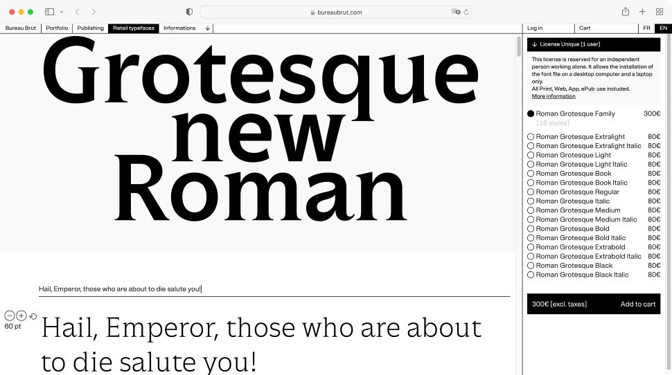
This font is available in eight weights with their italic equivalents. That flexibility makes it an ideal choice for most situations, from a heading to a body.
Designed by Bureau Brut in 2019, it was inspired by the visual identity created for the National School of Architecture Paris-Belleville, working to blend the serif and sans-serif categories into one organic whole. An ambitious goal, which we feel gives Roman Grotesque a bold and unique feel, wherever it’s used on the page.
- Best free writing apps: Bring your words to life
Best fonts for websites: FAQs
How to choose the best fonts for websites
When choosing which font is best for a website, readability comes first - crisp lettering with good spacing that scales nicely on desktop and mobile devices. The company’s identity will inform the choice, too. A future-thinking company might run with Montserrat; a laid-back firm might adopt Bree. There are no set rules here.
Range of styles is important. Fonts come in families, with multiple versions based on a single design - with light and heavy weighting, for example. The best website fonts feature a broad library of styles, for maximum flexibility across all your content.
Across the best font websites, you’ll find free options, as well as licensed ones. So, consider the budget (and what rights you get if you license a font). Licensed fonts are typically preferred by organizations, but it’s not essential.
Personal taste is absolutely a factor. But don’t let it cloud judgment on what works best for your readers. Ultimately, there’s no single best font for websites - it’s brand-subjective - but for neutral clarity, you can’t go wrong with Arial.
Why is it important to choose the right font for my website?
A website is one of the first places a customer or client will ‘meet’ you - and, in a competitive marketplace, first impressions count. If that customer can’t read your offering, or finds your use of Copperplate Gothic a jarring choice of font for a financial institution, that’s going to impact business.
This is why your font choice matters.
It’s the key to attracting and retaining visitors to your site.
The best website fonts are readable, come in a range styles, and fit your brand identity. With a well-chosen typeface (and engaging copy), visitors should recognize your company website just by landing on the page.
What’s the best font size for web?
The best font size for websites is 16 points.
However, this depends on a number of factors, including font type, hierarchy, page position, and the device. You’ll need to take each into consideration, feel comfortable with some trial and error, and include UI/UX testing for optimal results.
What types of fonts are there?
There are four main types of font:
Serif
Serif fonts feature small strokes at the tips of letters, and they’re typically easier to read in print.
Sans-serif
Sans-serif fonts are those without strokes on the lettering - ‘sans’ is French for ‘without’. Their clean, uncomplicated design makes them easier to read on screens.
Script
Script fonts are those designed to mimic cursive handwriting. They’re not typically good for readability without heavy modification
Display
Display fonts feature big, bold, marquee-style letting, so they’re suited to shop signs and posters. However, on a technical level, these tend to be stylised sans-serif fonts.
When choosing my website font, what mistakes should I avoid?
Want to make sure your font choice is a success? This is what to watch out for.
+ User needs
A typeface must meet the needs of site visitors. It’s easy to get swept up in the heady mix of art and graphic design - it’s an intensely subjective topic. But don’t forget the user in all of this. Because their opinions are the only one that really matter
+ Accessibility
Picking a font that may be inaccessible to a broader audience, such as one that troubles screen-readers is a major mistake - especially given the wealth of accessibility solutions out there.
+ Testing
One of the biggest mistakes is to go live with a new font before conducting proper testing. UI/UX teams will be able to assist here, with tests that let you see what users think of your chosen font, whether it causes issues or otherwise impedes web navigation. It’s a great way to understand users and their behaviors, and it’s a mistake to skip this part of the process.
+ Technical limitations
Some websites may not be set-up to change the font across a whole website - sometimes these things are hard-coded into the DNA of the site, making a complex job our of seemingly simple changes. Check the back-end are able to handle these.
+ Size
When it comes to typography, bigger isn’t always best. Studies suggest readers will skim larger fonts while focusing on smaller print. Make use of a hierarchy to help highlight what really matters to your web visitors, and use differently sized fonts to guide their eyes across the page.
+ Trends
Trend-chasing is a big mistake when selecting a font for the web. You may look modern and fresh for a moment, but that will soon pass - leaving your website looking outdated, and forcing you to invest in updating your site on a more frequent basis.
How we test the best fonts for websites
When testing the best fonts for websites, we review each typeface across a range of factors. First is legibility - whether a sans-serif or a serif font, it needs to be readable on the screen. During the testing process, we look at how broad the font family is and where you can download them all. With paid-for options, we keenly assess rights and licensing options - most of those looking for the best fonts for the web need a commercial license to use them on their sites. As part of this, we also explore value for money. In certain cases, you’ll find free alternatives that imitate high profile fonts (without infringing copyright, of course).
- Best ecommerce platforms: Invest in the best ecommerce platforms for your online store

Steve is B2B Editor for Creative & Hardware at TechRadar Pro. He began in tech journalism reviewing photo editors and video editing software at Web User magazine, and covered technology news, features, and how-to guides. Today, he and his team of expert reviewers test out a range of creative software, hardware, and office furniture. Once upon a time, he wrote TV commercials and movie trailers. Relentless champion of the Oxford comma.