TechRadar Verdict
The iPad Pro 12.9 (2022) is not a huge upgrade over the previous model, adding only more power (to an already extremely powerful tablet) and hover-detection for the Apple Pencil. The latter is a nice feature that’s been very well-implemented, and cements the iPad Pro as the drawing tablet of choice. These changes ensure it remains the ultimate tablet powerhouse, thanks in part to a screen that’s still best-in-class, and the range of software that’s better for the form factor than anything else on the market.
Pros
- +
Beautiful mini-LED screen
- +
Future-proof M2 chip
- +
The best range of tablet apps
Cons
- -
128GB is small for the price
- -
Battery life isn’t huge
- -
Steep price rise in some countries
Why you can trust TechRadar
iPad Pro 12.9 (2022): Two-minute review
The iPad Pro 12.9 (2022) lands as Apple's biggest and boldest iPad to date, with a new M2 chipset that serves up more power than 99% of us will ever need.
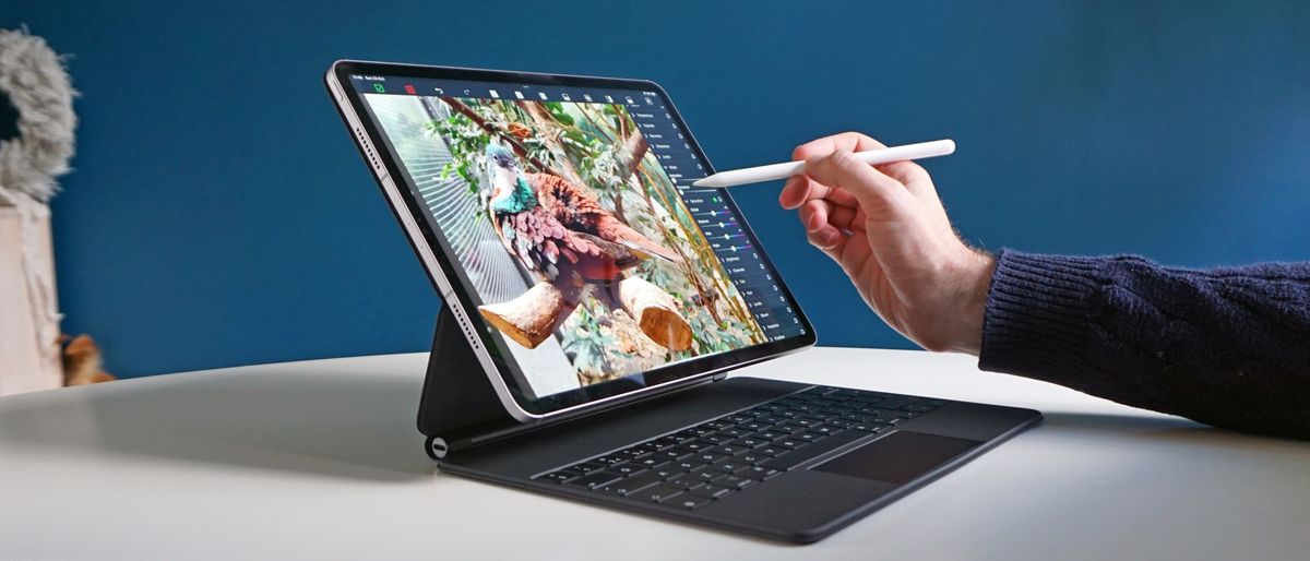
The previous iPad Pro was already simply the best tablet on the planet, through sheer shock and awe, and the new iPad Pro 12.9-inch (2022) just builds on that. You still get the stunning mini-LED screen with unmatched HDR contrast and 120Hz refresh rate, but now it can detect the Apple Pencil 2nd Gen when it's hovering above the display, which opens up some useful new interactions, as well as aiding precision for artists or note-takers.
You still get high-end laptop levels of power, now made even faster and with more capable graphics, plus faster memory access for high-end apps. Even with the list of additions, you still get a super-thin and light design, too.
But you don't get many other meaningful changes. It comes with iPadOS 16.1, but all recent iPads get that; it won't represent a very tempting upgrade from last year's model, except for the most serious of digital artists. It's a bigger upgrade compared to the model before that, however, since it upgrades you to the mini-LED screen, as well as adding the near-bottomless power of the M2 processor.
Is it the best iPad on the market today? Well, in terms of sheer capability, yes. The screen is better than any other iPad, the size of its canvas makes it better for productivity. But now that the iPad Air (2022) includes the powerful Apple M1 chip, the iPad Pro is pushed more and more towards being for niche needs only – and that goes double after price rises in some territories; including a steep 25% increase in the UK on the starting price. It may not be the iPad we'd recommend for most people, based on what they need, but in terms of simple spec superiority… hail to the king.
iPad Pro 12.9 (2022) review: Price & release date
- Released on 26 October, 2022
- Prices start from $1,099 / £1,249 / AU$1,899
The basic price for the new iPad Pro 12.9-inch starts from $1,099 / £1,249 / AU$1,899 – and that gets you 128GB of storage only, and no 5G wireless support.
That amount of storage is awfully low for a 'Pro' machine, but if you want more capacity or to add 5G for ultra-fast wireless connectivity anywhere, you'll need to account for further premiums.
You can get the Pro with 128GB, 256GB, 512GB, 1TB or 2TB of storage. Here's the full
pricing breakdown for the US, UK and Australia:
| Configuration | US price | UK price | AU price |
| 128GB, Wi-Fi | $1,099 | £1,249 | AU$1,899 |
| 256GB, Wi-Fi | $1,199 | £1,369 | AU$2,079 |
| 512GB, Wi-Fi | $1,399 | £1,599 | AU$2,429 |
| 1TB, Wi-Fi | $1,799 | £2,049 | AU$3,129 |
| 2TB, Wi-Fi | $2,199 | £2,499 | AU$3,829 |
| 128GB, 5G | $1,299 | £1,449 | AU$2,149 |
| 256GB, 5G | $1,399 | £1,569 | AU$2,329 |
| 512GB, 5G | $1,599 | £1,799 | AU$2,679 |
| 1TB, 5G | $1,999 | £2,249 | AU$3,399 |
| 2TB, 5G | $2,399 | £2,699 | AU$4,099 |
In the US, the starting price is the same as last year's model, which feels fair, given the limited number of upgrades overall (and the price rose in 2021).
However, in the UK and Australia, that's a price rise, and a very steep one in the UK, in particular. The previous model started from £999, so the new version is a full 25% more expensive, which is hard to stomach. In Australia, the price rose from AU$1,649 to AU$1,899, so a rise of 15%.
There have been iPad rises across the board in many territories, so it perhaps isn't a surprise, but in these countries, it certainly pushes the notion that the iPad with the biggest and best screen is only for Pros who'll write it off as a tax expense, and not home users who might like a more generous display for enjoying video or drawing.
For comparison, the 11-inch iPad Pro (which still doesn't include a mini-LED screen) now starts from $799 / £899 / $1,399, while the iPad Air (2022) starts from $599 / £669 / AU$999.
iPad Pro 12.9 (2022) review: Design
- No real design change
- Elegant and premium design
- Positioning of Face ID camera is poor
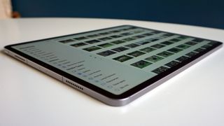
The iPad Pro 12.9 doesn't feature any significant design changes compared to the previous version… and, really, to the version before. It still comes in Space Grey or Silver finishes only – none of the fun colors of the iPad Air or the new iPad 10.2 (2022).
It's still a very nice design, of course. The large surface area and svelte chassis make it feel ultra-thin and sleek in the hands (when used without a case, at least), and the fit and finish is unimpeachable, as you expect from Apple.
There's a fairly slim bezel between the edges of the screen and the side of the device – it's thicker than the bezel on the iPhone 14, but that's fine with us, since having a little edge to hold is no bad thing on a large tablet.
The flat sides and right-angled edges look like they might be uncomfortable to clutch, but they're not at all, thanks to the corners themselves being ever-so-slightly rounded.
On one of the flat edges is a little oval that denotes where the Apple Pencil 2nd Gen attaches magnetically to charge, and there are volume button on that same side. On one of the shorter edges is a USB-C port for charging, plus two dotted vents for the stereo speakers.
On the other short edge is the sleep/wake button (though it can be woken by tapping the screen), and two more speaker vents.
On the front of this short edge is the forward-facing camera, which includes the Face ID system, and it's our only real gripe about the design here. The iPad Pro tends to be used in landscape mode the majority of the time, and having the camera on one of the shorter sides means that it finds itself under your hand the majority of the time when you want to unlock it while holding the tablet. That or it ends up hidden by the arm reaching over the touch the screen.
It works great when the iPad is in a holder, such as the Magic Keyboard case, on a desk, but the position is fundamentally flawed for other tablet use, and always has been. Inexplicably, Apple moved the camera on the new cheap iPad 10.2 (2022) to work better in landscape, but left it in the same place here.
On the rear of the iPad, you'll find a small bump for the camera (this is shallow enough that it doesn't matter much that it makes the iPad uneven when laid flat – it doesn't rock when you're drawing or writing on it), and the Smart Connector for attaching it to compatible keyboards.
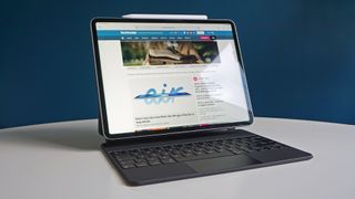
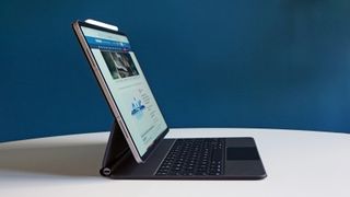
As ever, Apple's Magic Keyboard is the most obvious choice, if you don't mind spending as much as a whole (cheaper) iPad on a keyboard case. The Magic Keyboard is an extremely premium-feeling thing to type on, and holds the iPad sturdily at different angles (though we wish it offered a wider range of angles). But it picks up scuffs a little too easily on its outside in bags and the like, so can end up looking rather less premium over time, in our experience.
The Magic Keyboard is pretty thick and heavy, though; doubling the iPad's specs in both departments. Once you've added it, the iPads weight advantage over the MacBook Air (M2, 2022) diminishes majorly.
- Design score: 4/5
iPad Pro 12.9 (2022) review: Display & Apple Pencil
- 2732x2048 12.9-inch mini-LED display
- 1600nits peak HDR brightness; 1000nits fullscreen brightness
- New 'Hover Over' feature for Apple Pencil 2nd Gen
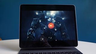
The mini-LED screen of the iPad Pro 12.9-inch remains unique in Apple's tablet range. Apple refers to it as an XDR Display, implying that it's like an HDR (high dynamic range) screen, but even more x-treme. And, to be fair, when compared to other tablet (or the vast majority of laptop) screens, they're not wrong.
The XDR Display is a bright and pin-sharp (2732x2048 resolution; 264 pixels per inch) masterpiece, delivering beautiful and accurate colors (with DCI-P3 support), and dazzling brightness in HDR applications – and more importantly, stunning inky black tones in all applications, in spite of the display technology at work.
The advantage of mini-LED is that it uses a dense, thin layer of tiny LEDs directly behind the LCD panel, and these tiny lights are grouped into 'dimming zones', each of which can turn down its light so that dark tones can look truly black, instead of the deep grey you tend to get from less-advanced LCD screens. There are 2,596 dimming zones on the iPad Pro, which means it's capable of stunning precision in how it conveys contrast.
The iPad Pro's screen is as close to OLED as you can get without actually using OLED… however, it's capable of going much brighter than even the best OLED TVs, let alone OLED tablet displays, by reaching 1600nits of peak HDR brightness, and 1000nits of fullscreen brightness in HDR applications.
In comparison, the Samsung Galaxy Tab S8 Ultra maxes out under 600nits. Its OLED screen is beautifully rich, but the iPad Pro manages to deliver the same kind of depth at the darker end, but the extra brightness really elevates the overall clarity.
This manifests when watching Dolby Vision HDR video, naturally – movies get an extra level of dimensionality from being able to render such a wide dynamic range – but any app can request this level of HDR brightness from the iPad. Fire up an image in Affinity Photo and the brightness is like almost no other screen on the planet, and yet this just slips in and out of your bag.
In non-HDR apps, the iPad Pro limits itself to 600nits of brightness, which is sensible in terms of battery life. However, I mentioned above that the way it handles dark tones is massively improved in all apps, not just in HDR. In everything from SDR video to writing apps, to the general interface, elements that are supposed to be black look truly black; and this also make brighter elements next to those black tones jump out even more too.
And yes, of course, it's a big screen compared to the other iPads. The canvas this gives you in drawing apps, or space for tracks it gives you in music apps, cannot be overstated, as well as being great for video and so on.
Despite Apple's best efforts (a fully laminated display with anti-reflective coating), it does still pick up reflections like point light sources.
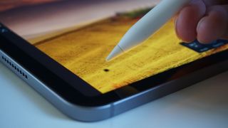
The screen's other big feature is Apple Pencil support, of course. The second-gen stylus is still supported here, which means it can connect magnetically to the edge of the iPad, where it also wirelessly charges, so it's always ready to go. This is a great piece of design that's trickling down to non-Pro iPads, like the Air series, slowly but surely.
The Apple Pencil itself remains accurate, and with useful tilt sensing and a good (though not outstanding compared to a dedicated drawing tablet) degree of pressure sensing. It also still feels a little hard compared to some options, drawing the solid plastic nib on the glass screen – I don't mind it, but some might.
The fancy new feature is 'hover over' sensing, apparently enabled on the new device thanks to a co-processor within the M2 chip.
The basic feature will not be a surprise to anyone who's used a drawing tablet – when you hold the Pencil close to the screen, the iPad can sense it and react. In an imaging app, such as Serif Affinity Photo, this manifests as a dot under the pen so you can see exactly where you're about to draw. ProCreate includes a smart feature that means you can change the size of your brush live while hovering, and even see color mixing results while hovering before you start drawing.
In other area of iPadOS, menu items highlight or enlarge when you hover the Pencil over them – a bit like they do when you move the mouse cursor over them when using the Magic Keyboard.
One nice touch is that context menus open automatically when you over them – an example is the Subtitles menu in the Apple TV app. No need to tap, just move over the options and more menus appear.
How essential this feels will depend on how well apps use it: the basic mode is a nice but hardly essential addition; but if you use apps that get clever with it, it may quickly feel like a feature you wouldn't want to go back from.
Time will have to tell to a certain degree, and it depends on your workflow, but I can say that it certainly works as intended.
- Display & Apple Pencil score: 5/5
iPad Pro 12.9 (2022) review: Specs, performance & camera
- Massively powerful Apple M2 chip
- Almost impossible to make it stutter
- Cameras are good, but no real upgrade
The M2 chip is obviously the main talking point here, and it's an absolute monster. It includes an eight-core CPU, featuring four high-speed performance cores and four energy-efficient cores.
That’s paired with 8GB of RAM in the 128GB, 256GB or 512GB versions, and 16GB of RAM in the 1TB or 2TB versions. And there’s a 10-core GPU that can access all that memory as its own, with a colossal 100GB/s of memory bandwidth.
As we covered in our M2 MacBook Air and MacBook Pro M2 13-inch reviews, this is just a ridiculous amount of power, and in the iPad Pro (2022), it’s fully realized, with no trimming or cutting back to squeeze it into a tablet.
With a Geekbench 5 score of 1884 in single-core testing and 8518 in multi-core testing, it performs like a desktop processor. There’s been nothing like it in a tablet so far – while the Microsoft Surface Pro 9’s Intel chips promise to bring some competition to Apple, at last, we’ll have to see how that goes in our full review.
But few of us will ever push the M2 remotely close to what it can do. Obviously, it’s lightning fast at just handling iPadOS generally – apps open faster than ever, and the software was perfectly slick and fast in all my time with it, never stuttering.
I don’t think I ever came close to making the M2 really struggle, despite working on multi-layered images with huge RAW photos in Serif Affinity Photo, and asking LumaFusion to deal with multiple tracks of 4K video with color changes applied. Any filter you apply in Affinity Photo is instant, even with 8K images, no matter if you just start playing with every tool just to try to get it to stumble. I just kept adding tracks to GarageBand until I couldn’t any more, and none affected playback performance.
It helps that my testing was using the 1TB model, that therefore has 16GB of RAM – the 8GB RAM limit is probably the thing it’d be easiest to bump against the limits of right now for pros.
Actually, that’s not true – if someone bought the smaller capacity models, that would probably the issue. 128GB as a starting size is very small for a ‘pro’ machine, especially for the price of an iPad Pro 12.9.
But all this was true with the M1 models too. Progress to introduce apps that truly take advantage of this power seems slower than expected. DaVinci Resolve and Octane seemed poised to actually require it for those who use them, but they weren’t available during our testing. And it’s notable that apps that are here still often have limitations – like the 32-track limit in GarageBand. On an M2 Mac, that limit is 256 tracks. It’s nice of Apple to keep throwing new chips at us, but it really isn’t where the change needs to come most.
The addition of Wi-Fi 6E is a nice touch, for those working in a wireless environment with support – this new faster Wi-Fi variant actually shields its traffic from the rest of the network, to ensure consistent and extremely fast speeds. And like 2021's Pro, there’s 5G support, which can reach hundreds of megabits per second, but obviously this will depend on support in your area. We’ve seen over 300Mbps down and 60Mbps up, though, for reference.
The camera is unchanged from the previous model, apart from adding the ability to record ProRes video for the first time here. On the rear, you get a 12MP wide-angle cam, plus a 10MP ultra-wide, paired with a LiDAR sensor that can help with fast auto-focus, but can also be used for 3D scanning in various apps.
This rear camera is absolutely fine – it’s good quality, delivering solid brightness to the images, pleasing contrast, nice colors, and reasonable detail. However, we are struggling to imagine that anyone thinking about ProRes video wouldn’t rather record it on the larger sensor of the iPhone 14 Pro to get as much image info as possible to work with.
The front camera is 12MP with an ultra-wide lens that’s used for Apple’s Center Stage feature. This means the camera actually crops into a portion of its total ultra-wide view, focused on you. If you move, the camera can follow you, as long you’re within the ultra-wide's view. It’s a clever and useful feature, and it adjusts automatically if there’s more than one person in view.
The front camera includes the Face ID sensor too, which means it can snap Portrait Mode photos (as can the rear camera), as well as unlocking your iPad.
The rear camera is capable of 4K 60fps video, but no Dolby Vision HDR – unlike recent iPhones. The front camera is limited to 1080p HD video at up to 60fps. Again, quality is good – the front camera looks great for video calls, especially compared to almost all laptop cameras – but the setup doesn’t feel as fully ‘pro’ as the iPhone Pro models.
- Specs, performance & camera score: 4.5/5
iPad Pro 12.9 (2022) review: Software
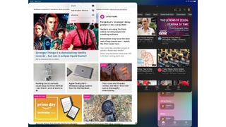
The new iPad Pro comes with iPadOS 16.1 – my review unit had the final release candidate version, so sported the full version of features, including Stage Manager.
Stage Manager is the biggest change to iPadOS, though before we talk about it, remember that it's entirely optional, and must be activated from the Settings > Home Screen & Multitasking menu; it's not yet the new default.
Stage Manager seems to be an attempt to bring something closer to the windowed multitasking of macOS to iPadOS, where apps aren't as locked in position and size as they are in the Split View and Slide Over; multitasking options that iPadOS previously used (or still uses, if you don't enable Stage Manager). Apps can live in windows that overlap and be resized – though only to certain sizes, based on an invisible snapping grid.
It's an interesting idea, but it's under baked in a few crucial ways at this stage. For a start, it's buggy, and often crashes or causes unexpected effects in apps – this will be a deal-breaker for a lot of pros on its own, assuming the apps you use don't mesh well with it.
It's also fiddly, especially when used with your fingers. You might open an app and find that it appears in a small window on a screen with nothing else on – resizing it to fill the screen just feels like an unnecessary extra step. There's a shortcut to do this with two taps, but if you don't know to look for the dots at the top of a window, you'd have to drag using the control on the bottom corner, which is slow.
I think it works better as a concept when used with a trackpad – especially for me, as a veteran(ish) Mac user. I live my life Command+Tab-ing through apps, and Stage Manager makes the iPad's app arrangement work much more like how I expect using that shortcut to respond, including the ability to have two apps overlapped on one screen, and Cmd-Tabbing between them. I do see potential for it here, in my case at least, and it'll be particularly interesting when Apple adds external monitor support for it (at some point in the future).
Personally, if a future version of Stage Manager could 1) fix the bugs, obviously; and 2) auto-activate when I attach the Magic Keyboard, and switch back to the more touch-friendly Split View when I detach it, I could imagine getting on with that version of it long-term. You can activate and deactivate it from Control Center, though, which is good substitute for the latter, at least.
Right now, though, it doesn't feel ready for prime time, for various reasons.
Outside of that, iPadOS 16 adds some great smaller features. The ability to send scheduled messages in the Mail app is massively welcome, as is the Weather app (and accompanying weather widgets selection). Rain prediction is very important in some areas, you know…
The ability to edit and unsend iMessages can also be really useful if you use the platform professionally, as well as personally.
iPadOS 16 also adds the 'Hover' support in Apple Pencil, of course, but we've already covered that. And in the future, Apple will launch an interesting new collaborative note-making app called 'Freeform', but that wasn't available at the time of writing.
Beyond all these, iPadOS continues to be an interesting mix of excellence in many ways, and frustration in others. Its app support is far beyond the competition, in terms of delivering apps that are both powerful as well as being usable with touch, and designed specifically for the space that the tablet screen gives you.
And iPadOS is still very slick and reliable (outside of Stage Manager's foibles). The integration with Apple's services and its other devices is excellent, through features such as Handoff (which makes it possible to move a task you're in the middle of between your iPhone, iPad or Mac) and Sidecar (which enables your iPad Pro to be a second display for your Mac, with touch controls).
But iPadOS has workflow issues – for pros, particularly – that it still hasn't overcome. This is especially evident when it comes to moving a file between applications – let's take an example that I have, of preparing an image to use on TechRadar.
There's no universally accepted handling of an existing file within apps, and this can cause workflows to break. So, I might use the Files app to import a photo from a USB drive, then I want to quickly edit it in my image editor of choice before uploading it to the website… but iPad image editors aren't predominantly designed for simply tweaking and saving over a file saved on the system. I need to add a new exporting step before I can think about uploading, and that can result in quite a few extra taps. That's okay for a single image, but what if I need to process a load of them for a review? Everything grinds to a halt.
This issue is specific to me… and yet it also isn't. Lots of people need to batch-edit pictures and pass them on. And more than that, it typifies the larger point, which is that iPadOS isn't as flexible as macOS. The concern isn't that you'll have the same issue as me; it's that you'll have a different one with the same root cause.
I still think iPadOS is a great overall platform, but you just need to go into it with your eyes open, if you're planning to use it for pro results.
One final thing: it's a real shame that the iPad didn't get Lock Screen widgets, when the iPhone did with iOS 16. They'd be pretty useful!
- Software score: 4/5
iPad Pro 12.9 (2022) review: Battery life
- Up to 10 hours, officially
- Around 6 hours of HDR video in our tests
- Any hard use will drop it much faster
As usual, Apple's claim is that the iPad Pro (2022) is good for up to 10 hours of battery life for simple tasks, like video and web browsing, and in the past we've said that Apple's predictions are conservative.
I'm not sure about that in the case of the new iPad Pro 12.9-inch, however. Based on our time using it for video, light work, and when pushing it with more intensive tasks, we are talking about up to 10 hours.
Let's start with video: when streaming a Dolby Vision HDR movie from Apple's own TV app, with the brightness set to maximum (that's 1000nits fullscreen, remember), I saw the battery drop by an average of 17% per hour, so you'd be looking at around 6 hours of total use.
When writing this review on it, I had the Google Docs app open with Safari side-by-side, just writing and researching, using the Magic Keyboard too. I checked the battery every 30 minutes while working, and it was dropping 11-14% each time. Even assuming the best case from that, that puts it at only about 5 hours of use in this scenario.
When pushing the M2 chip hard, it appears capable of dropping at 1% per minute. I saw this while running our benchmarks, for example, which caused a 4% drop in four minutes – but also when using Serif Affinity Photo and trying to push the M2 chip as hard as possible, which caused a drop of 8% in around 10 minutes.
However, while writing the Software section of this review, I spent an hour re-checking interface elements and apps, with the screen on the whole time, and during that time it fell by just 10%.
So 10 hours, sure – but a lot of the uses people will actually have for an iPad Pro will cause it come in under that, based on my experience.
- Battery life score: 3.5/5
Should I buy the iPad Pro 12.9 (2022)?
Buy it if...
You want the most capable tablet on the planet
When it comes to being able to tackle just about any task in a format that's actually made for tablet touchscreens, the iPad Pro is unmatched. It's not just about the power (but it helps) – it also works so well with a stylus, keyboard and trackpad.
You want the best screen
Whether you want to watch videos on a plane in glorious Dolby Vision HDR, or you need accuracy and clarity for image work, the iPad Pro stands head, shoulders and torso above anything else.
Don’t buy it if…
Money is an object
It's the best, but it's very expensive, and in some countries it's considerably more expensive than the last version. The iPad Air offers the vast majority of the features for a lot less.
You want a true laptop replacement
The iPad Pro can be used instead of a laptop, but iPadOS doesn't work like a desktop OS, and there will be some workflow cases for pros that it's just not suitable for.
How we test: TechRadar's Reviews Guarantee
First reviewed October 2022

Matt is TechRadar's Managing Editor for Entertainment, meaning he's in charge of persuading our team of writers and reviewers to watch the latest TV shows and movies on gorgeous TVs and listen to fantastic speakers and headphones. It's a tough task, as you can imagine. Matt has over a decade of experience in tech publishing, and previously ran the TV & audio coverage for our colleagues at T3.com, and before that he edited T3 magazine. During his career, he's also contributed to places as varied as Creative Bloq, PC Gamer, PetsRadar, MacLife, and Edge. TV and movie nerdism is his speciality, and he goes to the cinema three times a week. He's always happy to explain the virtues of Dolby Vision over a drink, but he might need to use props, like he's explaining the offside rule.
Most Popular


