Why you can trust TechRadar
Motorola made a big deal about the Moto X camera at launch, especially its use of RGBC. The C in RGBC stands for Clear Pixel, which in essence is part of the color filter sitting on top of the sensor.
The theory here is that with part of the filter being clear rather than filtering to a specific color, one of red, green or blue, Motorola can claim a 75% increase in light sensitivity.
This unusual filter sits atop a 10MP sensor which has 1.4µm sized pixels – relatively large, especially compared to the 13MP sensors found in many high-end cameras today.

Larger pixels means that more light can be captured and therefore better pictures produced in a wider range of settings.
There is a relatively fast F/2.4 lens sitting on top of the sensor with a 4.5mm focal length – equivalent to 30mm on a full-frame camera.
Despite an impressive array of imaging hardware, the Moto X struggles to take consistently high quality pictures. When the conditions offer any sort of challenge, the camera will typically disappoint and even in perfect conditions it is a little inconsistent.
This is not a camera that can compete with other flagship devices and it comes nowhere near the likes of the iPhone 5S or Sony Xperia Z1.
On the front of the Moto X is a perfectly serviceable and simple 2MP camera, which will take as good a selfie as you might expect. This front-facing unit is actually pretty decent, and shows that a simpler approach can bring bigger benefits.
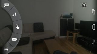
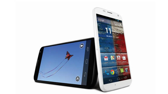
Motorola has given us a unique way of accessing the camera on the Moto X. Even with the screen switched off, a double flick of the wrist will cause the phone to vibrate and the screen to come on straight to the camera app.
It is a neat gesture that only sometimes makes you think the phone will fly out of your hand and across the room. In practice, I managed to hold on to it every time.
Once the camera interface is loaded, it is immediately clear how simple it is. Even tap to focus is something that needs to be switched on.
You swipe in from the left to view the settings which are limited to HDR mode (on, off, auto), flash settings, manual focus selection, slo-mo video, a panorama mode, location tagging, shutter sound and a setting for the flick gesture. Swiping from the right takes you to the gallery.
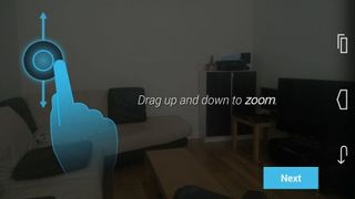
To take a picture, tap anywhere on the screen and the camera will choose where to focus. But if you activate the manual focus selection, then you can move a square around the screen to choose the focus point and then tap it to take the shot.
In practice, it is nice and quick and simple to use, but in reality, a bit more control would be nice.
Zooming is performed by dragging up and down on the screen, which is rather odd, pinch to zoom would seem to fit a little better.
Tapping the video icon in the top right starts video recording with no options at all. This can be quite frustrating but it does the job most of the time.
So while the hardware sounds great, the output is generally a little disappointing.
Image samples

Click here to see full-resolution image

Click here to see full-resolution image

Click here to see full-resolution image

Click here to see full-resolution image

Click here to see full-resolution image

Click here to see full-resolution image

The phone-sized Onyx Boox Palma 2 is the compact ereader I can't put down, even if it's not the upgrade I was hoping for

438 crypto masterminds are responsible for the majority of pump-and-dump crypto coin schemes globally, researchers find

We just got our first look at the eShop on the Nintendo Switch 2
