This OLED TV could have been perfect, if its smart TV platform wasn't so appalling
Everything matters on a TV

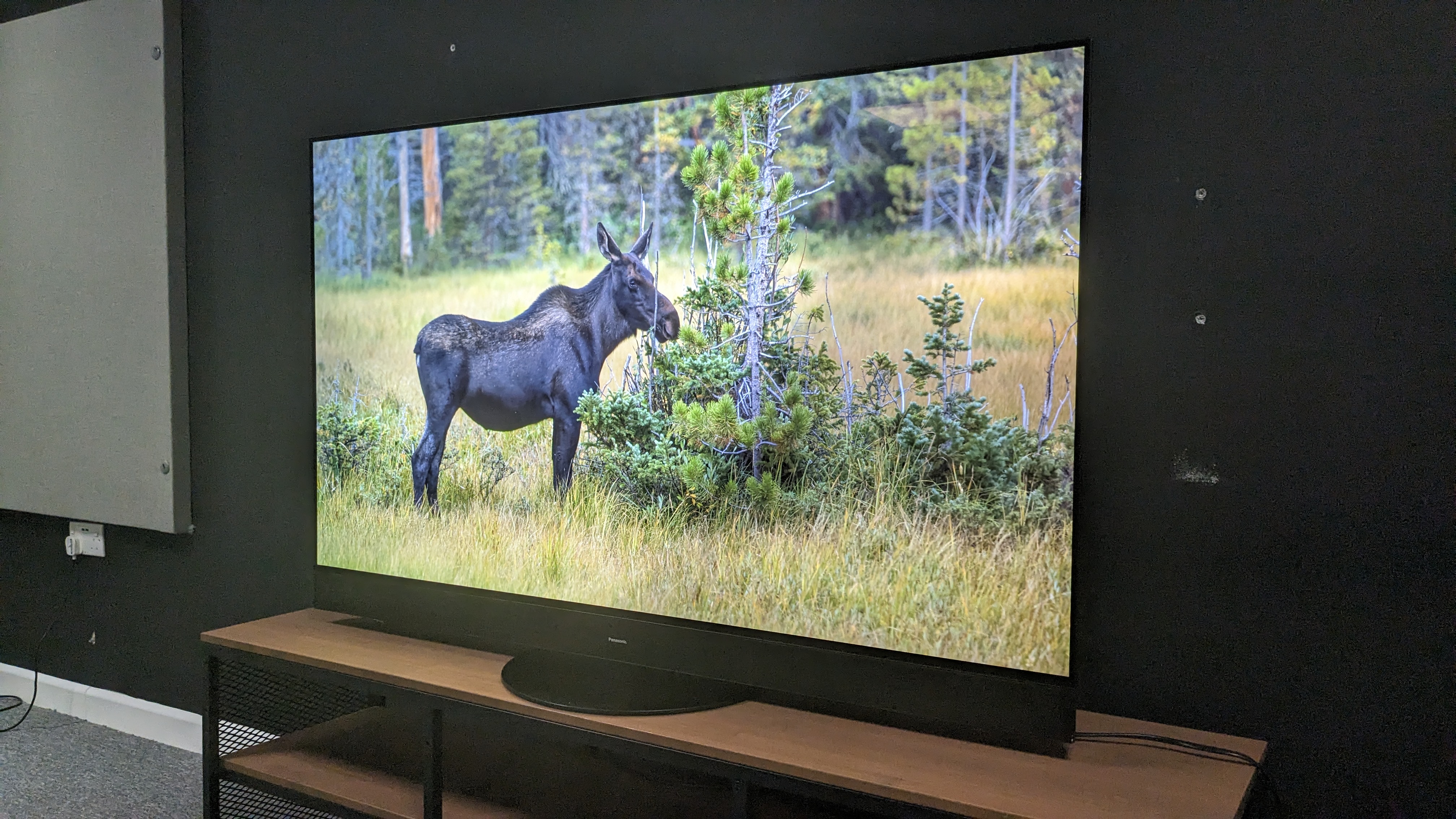
Panasonic’s range of OLED TVs often provide some of the best picture quality on the market, with stunning black levels, detailed contrast and dynamic colors and as a result, are often amongst the best TVs around. Not just beautiful TVs, Panasonic higher-end OLEDs have better built-in sound than most other TVs as well, really providing the complete package. Recently, I reviewed one of Panasonics’ 2023 OLEDs and was blown away.
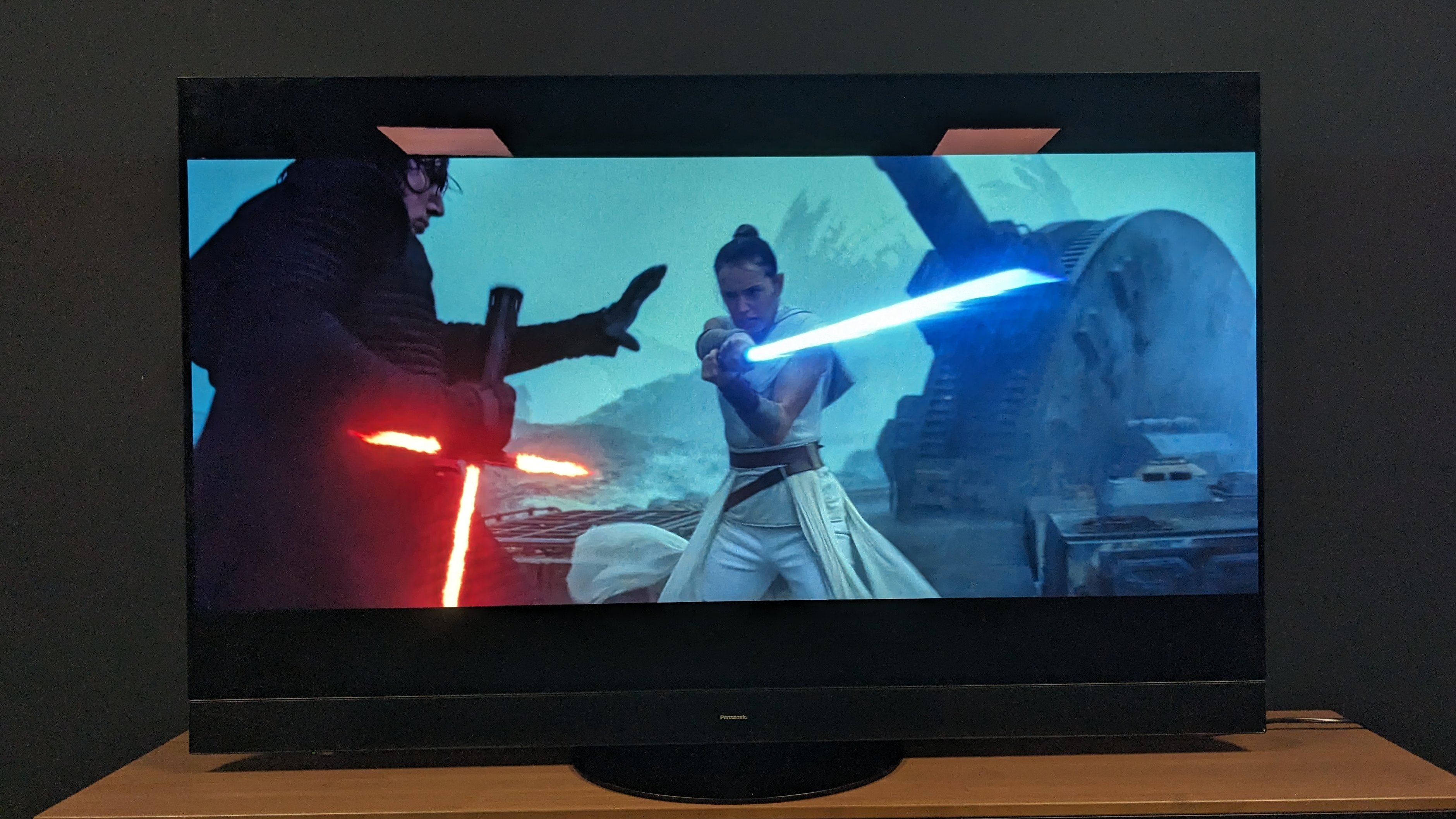
In my Panasonic MZ2000 review, I noted that the 2023 flagship OLED for Panasonic delivers some of the most outstanding pictures I’ve ever seen. I said that the Panasonic MZ2000 was "incredibly detailed" and when viewing The Batman for black levels, the MZ2000 "captured the dark, gritty tone of the movie perfectly". To add to this, the MZ2000’s built-in sound was staggering, feeling powerful, direct and immersive all at once.
As I continued my testing and reviewing of the MZ2000, I thought to myself ‘is this the best OLED TV this year?’ It was certainly shaping up that way – in fact, more than that, it was shaping up to be the perfect TV. Then, within a few minutes of delving further into the set’s inner workings, there was one gigantic let-down on it: the smart TV software.

The importance of being intuitive
My Home Screen 8.0, the smart TV platform built-in to the Panasonic MZ2000, stuck out like a sore thumb against the rest of the premium features. Navigating menus was clunky, awkward and sometimes downright maddening. When I pressed any buttons or tried to scroll up and down the menus, the delay between the command and when it happened on screen was noticeable.
Another thing I noticed was that the settings menus, which had a lot of settings to tweak, looked dated. Now, don’t get me wrong, I saw that there were lots of settings to adjust as a positive, because it meant anyone from the casual viewer to the cinephile could get the picture just right to how they like it. But, when people are adjusting these settings, staring at them for potentially hours, did they have to look so… ugly? It should be inviting to make these changes, not off-putting.
Upon further exploration, looking at other menus beyond picture and sound, things got even worse. I can only describe the network settings and connections menus as something that wouldn’t look out of place on Windows XP, maybe even Windows 98. It just felt and looked wrong. This is premium OLED and the menus looked completely out of touch compared to its standing as such, let alone others of the best TVs on the market.

Learn from the rest
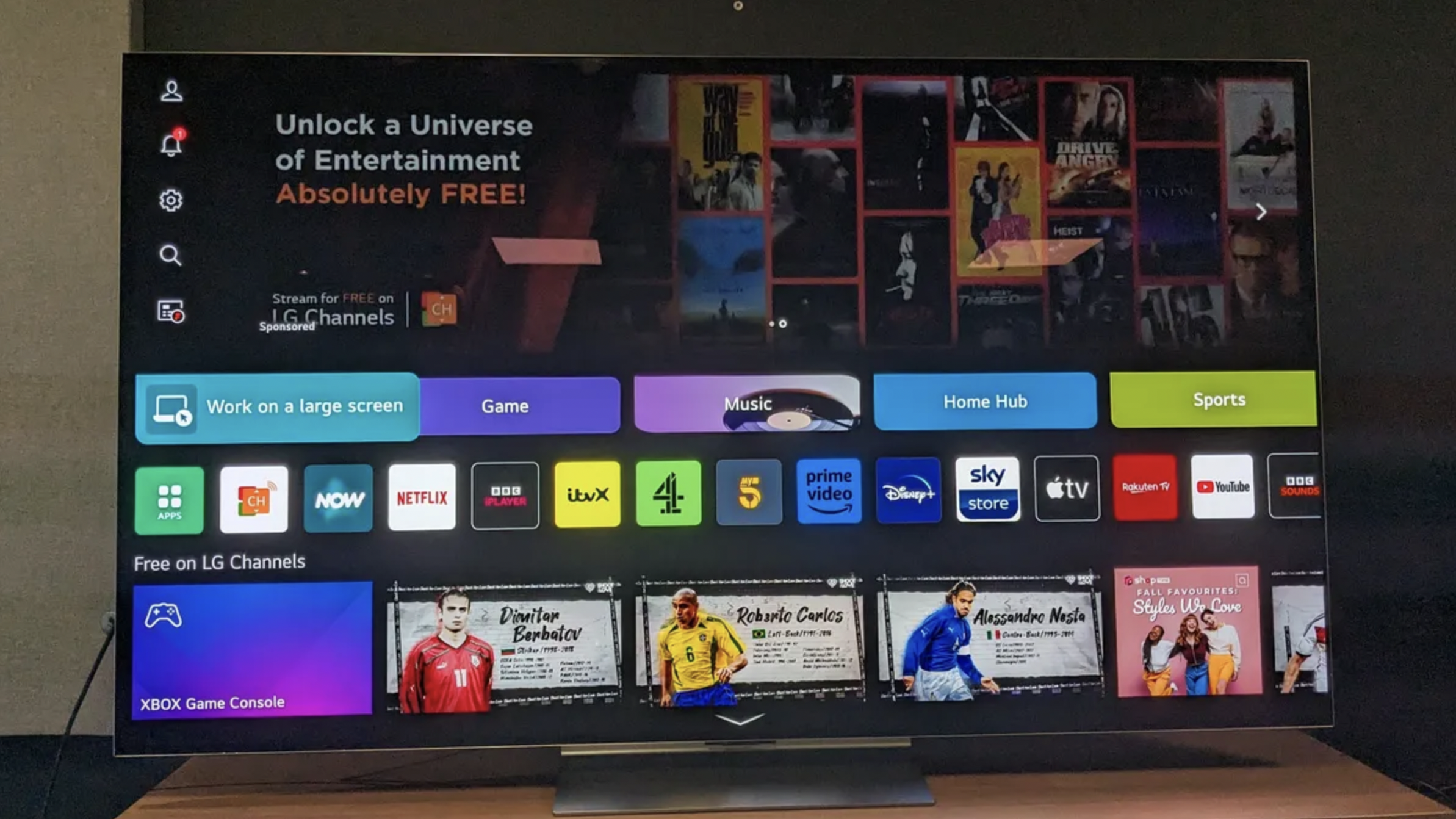
Admittedly, no smart TV platform is perfect but there are some that stand out from the crowd. There’s webOS 23 that comes with LG TVs, including the fantastic LG G3, one of the Panasonic MZ2000's closest rivals. webOS 23 felt user-friendly during my testing, with quick menus that appear live and enable you to change settings on the fly. You can organize your apps by type such as sport, music and so on using Quick Cards, allowing for easy navigation. As a smart TV platform, it's well-made and quick at processing any commands.
Another exciting smart TV platform is Roku TV. In our Roku Plus Series review – of a very budget set, keep in mind – we said that "everything was right up front and accessible" and this is something that should be a no-brainer is a smart TV. With the Panasonic MZ2000, customization was the focus, enabling users to put what apps they want front and center, which is great in principle, but if it feels too clumsy to actually bother with, the best intentions don't really matter.
Other smart TV platforms such as Tizen (Samsung’s own), Google TV and so on all have their strengths and weaknesses, but having tested nearly all of these through my work at TechRadar and my previous work in AV retail, Panasonic’s has always stood out as the worst.

Final thoughts
Let me be clear; the Panasonic MZ2000 is still a phenomenal TV. I am still blown away by its picture and sound quality, and suitably impressed with its gaming performance. It is so close to being the perfect TV, but its smart TV platform is such a nuisance, that it really does hold the MZ2000 back and it’s agonizing.
At the time of writing, the Panasonic MZ2000 is £2,699 for its 55-inch version and if it was perfect, it may well have justified that price. But, when you have TVs like the LG G3 priced at $1,899/£1,899/AU$3,695 at the same size, or the superb Samsung S95C at $1,599/£1,599/AU$3,995 for its 55-inch version, the MZ2000 really does have to nail everything to justify its much higher price tag, including its smart TV software.
If Panasonic can change the smart TV software it uses on its future OLEDs, it would be a real force to be reckoned with, combining everything into the complete package. Until then, the Panasonic MZ2000 is still a fabulous TV that should be picked up by those who like to fiddle around with settings… but have the patience of the saint.
You might also like
Get daily insight, inspiration and deals in your inbox
Sign up for breaking news, reviews, opinion, top tech deals, and more.

James is the TV Hardware Staff Writer at TechRadar. Before joining the team, he worked at a major UK based AV retailer selling TV and audio equipment, where he was either telling customers the difference between OLED and QLED or being wowed by watching a PS5 run on the LG 65G2. When not writing about the latest TV tech, James can be found gaming, reading, watching rugby or coming up with another idea for a novel.