Every iOS release from worst to best - ranked
From an App Store to Lock Screen widgets
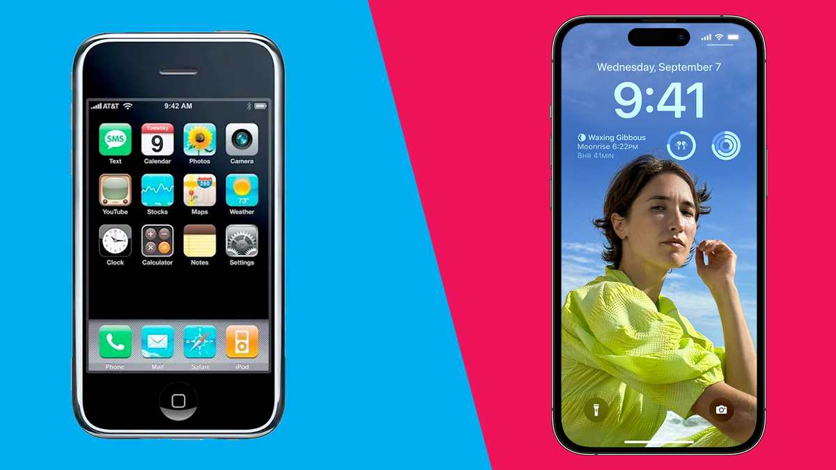
Since the debut of the iPhone in 2007, we've seen seismic changes to how we use Apple's device, from using our fingers to interact in the first version to adding widgets to our home screens.
We're currently up to iOS 16, released in 2022 which features a new lock screen, and a focus on personalization and more productivity enhancements.
Previous releases have seen refinements, big features, or under-the-hood changes that have been invisible to most users.
With this in mind, we've gone through every version to rank which one ranks the worst, up to the one we currently hold in high regard as we wait for the iPhone 14 and iPhone 14 Pro lines to be available to buy.
iOS 11
This is usually remembered as a buggy release, with a date bug crashing iPhone models, and battery life taking a hit once you updated your device. There were several improvements in this release, with Control Center being relegated to a swipe from the right corner, which is still there in iOS 15.
A subsequent release in iOS 11.2 also brought a bug to HomeKit devices, where access to your lights and other appliances would render them useless.
Overall this was a release that many derided, regardless of the improvements that it also brought to iPad devices, but iOS 12 arrived with a focus on bug fixes and improvements, something that eased the sting of iOS 11.
Get daily insight, inspiration and deals in your inbox
Sign up for breaking news, reviews, opinion, top tech deals, and more.
iOS 7
Released in 2013, this brought a major redesign to iOS, from the skeuomorphism that had been present since iOS 1, to a flat design that felt like one step forward in looks, and two steps backward in function.
This was when Scott Forstall, in charge of iOS since its inception, had been replaced by Jonny Ive, who was in charge of the design of most of Apple’s products. His mark was covered in iOS 7, where reflections and brighter colors were all around. But there was the addition of Control Center, which appeared from a swipe-up from the bottom, allowing you to access Wi-Fi, Bluetooth, Airplane Mode, and other functions without going to the Settings app.
Yet there were glaring errors that made some aspects of iOS 7 hard to use. The new light 'Helvetica' font made text hard to read in some places, such as Messages and Music, while solid buttons were not obvious as an option in this update, causing users to guess where the cross icon would be to close a notification for example.
iOS 6
iOS was starting to look stale by the time the iPhone 5S arrived, especially compared to Android and Windows. iOS felt as though it was busting at the seams, and any additional features would cause other aspects to break.
In a sense, this happened to iOS 6, and Maps was the catalyst for what would become iOS 7.
This was Apple's attempt to stop relying on Google's Maps app, and for it to be done in-house, but this proved to be a release that should have arguably been for iOS 7.
Maps went offroad as soon as the update came out in September 2012, with incorrect labels, bendy landmarks when viewing maps in satellite mode, and more. This prompted Apple's CEO, Tim Cook, to fire Scott Forstall after he allegedly refused to sign the apology letter for Maps.
Alongside this, iOS 6 brought Passbook, which is now Wallet, alongside Do Not Disturb. While it was a small release in 2012, the buggy Maps was a frustration for many, and it arguably wasn't fixed until iOS 9.
iOS 13
This update is the most unique out of all iOS releases so far, in that the first version to be publicly released for users was iOS 13.1, due to the bugs that weren't fixed in time once the iPhone 11 series arrived.
This was an example of too much announced at WWDC this time, and Apple announced that a bunch of features were to be put back. But what did arrive, made it a release to remember.
From system-wide dark mode, a Street View feature for Apple Maps, Notes and Reminders seeing major redesigns, and iPadOS being introduced with external file support, made it a big, but buggy release.
However, iPad Pro was given a new way to be interacted with, as the addition of a mouse cursor was enabled with 13.4. You could use an external mouse, wirelessly or connected to the tablet, and browse through iPadOS like a laptop. But apps were slow to adapt to the cursor, and while it was useful, it had confused some users as to what the iPad was to them, especially compared to a regular laptop.
It wasn't until iOS 13.5 that we saw everything announced at WWDC in 2019, finally arrive on iPhones and iPad, such as the ability to share iCloud Drive folders with a link, similar to Microsoft OneDrive and Google Drive.
iOS 10
The theme for this update was interoperability - apps were given the ability to talk to one another. But the user interface of iOS was beginning to look stale, so with iOS 10, new animations and ways to delete stock apps such as Stocks and Weather were now possible.
Building on the theme of interoperability, you could use a new feature called Universal Clipboard for example, that could copy text or an image on an iPhone, and you could paste that to a different Apple device, such as a Mac.
The iMessage Store first arrived with iOS 10, enabling you to download a bunch of stickers, although the first iteration of the Store was confusing at best, due to it only being accessible in Messages, above the keyboard.
Siri also gained access to third-party apps, where you could launch WhatsApp or ask it to send you a Lyft without going into the app, but its server-side requests would be slow to respond to these when iOS 10 first launched.
Overall, it was a substantial release that helped lower the walled garden of Apple's software to third-party apps. Still, there was a feeling that more should be done for a major release, and the iPad was starting to look more like an enlarged iPod Touch, with no exclusive features given to the tablet.
iOS 9
Much like iOS 12, this was a year of taking iOS into the garage and refining it with bug fixes and speed and stability improvements. Low Power mode was added to iPhones, while Picture in Picture first appeared on iPads, where you could have a window play a video of your choice, wherever you were in iOS 9.
It was a simple, muted, solid release, where you could tell that almost every area of iOS felt speedy, and it wasn't in danger of buckling under eight previous versions.
Looking back, it seems as though it was another release to set new foundations for what was to come in subsequent iOS versions.
iOS 5
This was a major release that's still being felt today. Siri made her first appearance in iOS, alongside a Notification Center to more easily handle those notifications, and the idea of being 'PC Free'.
This meant that you could finally activate your iPhone or iPad wirelessly, without having to plug these into iTunes.
iOS 5 also heralded the debut of iCloud, something that was showcased in Steve Jobs' last appearances at WWDC. Being able to manage your content wirelessly was possible before, but Apple had stumbled with this with MobileMe a few years previous.
iCloud was the successor, and it worked well. Taking a photo on your iPhone 4S, then seeing it magically appear on your Mac without you doing anything, was ahead of its time, and it arguably caused Microsoft and Google to take notice of this.
iOS 12
After the buggy release of iOS 11 and its subsequent releases, the software still felt buggy, which meant that this release heralded a bunch of stability and performance improvements across the board.
But it also brought three new features to the fore, with Shortcuts, grouped notifications, and ScreenTime arriving for this release in 2018.
Shortcuts were previously called Workflow until it was bought by Apple the previous year. This allows someone to create automated actions to launch apps or features within apps through a command. These have been a big benefit to power users, allowing them to create automations in iOS that weren't previously possible.
With notifications being tidied up in groups, and ScreenTime allowing users to limit their time in certain apps, it was a release that was heralded as being stable, speedy, and bringing useful features to help with different workflows.
iOS 14
There's usually a theme for major iOS releases every year, but for iOS 14, this was different. Instead, it was a bunch of new features and refinements that appealed to different users.
The home screen saw its biggest redesign in years, with widgets and an app library to better manage your apps. Picture in picture mode arrived to iPhones, previously having been exclusive to iPad and Mac devices, alongside spatial audio for AirPods, better privacy features, and the ability to set certain apps as the default web browser and email apps.
That's only a third of what was made available in its debut back in 2020, with many being able to rethink how their home screen could benefit them more with different widgets while cutting back on the number of home screen pages, thanks to App Library.
iOS 8
There was a muted reception to iOS 7 in 2013, mainly due to some inconsistencies with its flat redesign and a lesser focus on function.
But iOS 8 was the comeback tour for iOS, and WWDC 2014 was the showcase for it all. Third-party keyboards had finally arrived, and ApplePay made its debut for the USA to start with, HomeKit to enable your home appliances to be controlled through iOS, the debut of Apple Music, and big improvements to iCloud.
After nine years of iCloud, users wanted more from a service they were paying for, and iCloud Drive was the answer to this. This was as close to a file system, similar to Explorer on Windows as you would get for iOS. You could save a bunch of files to this app and export them to Mail or Photos.
The user interface also saw some refinement, mainly in taking a slight step back in message boxes and fonts. There were bolder fonts and better icons when looking at notifications for example.
Overall, it was a solid sequel to iOS 7, and if this was Apple's way of showing its users that iOS 8 was where the company was heading, it was a great showcase.
iOS 3
It's hard to imagine that by the third year of iPhone, there was no way to copy and paste text, or send a multimedia message. But iOS 3 solved copying text in an intuitive way.
You would press and hold on text, which would make a small menu appear. You could copy or cut the text, then paste it into a completely different area of the iPhone. The days of manually typing out text was no more, and it opened the doors into how email could be used on an iPhone.
Yet there were other major features that arrived, such as spotlight search, enabling users to swipe to the right, and a search bar would appear. As the iPhone 3GS model arrived with iPhoneOS 3, you could finally record video in the camera app, removing another wish from users.
iOS 4
This was back when iOS releases would be announced in April as a preview, then released in June at WWDC, alongside a new iPhone.
iOS 4 was monumental for many reasons - not only as the name changed from iPhoneOS to iOS, but mainly due to it being a showcase for the iPhone 4. Everything had been redesigned to take advantage of the Retina Display, so every icon, color, and font was remade in high-resolution.
Alongside this, folders had arrived on the home screen, which allowed you to store nine apps at once, and multitasking. With two presses of the home button, you could access a menu at the bottom of the screen, and switch between a bunch of apps.
But not only that, there was FaceTime, a feature that's become its own service in its own right on Apple devices.
With the debut of the iPad in the same year, it wasn't until iOS 4.2 that it was made available on the tablet, also bringing multitasking features and folders to the tablet.
All of these 'finally' features made iOS 4 an update to remember by many, helped by the massive success of the redesigned iPhone 4 that year.
iOS 1
It's worth watching the above video in its entirety, as this was the first version that started it all, especially if you were one of the first iPhone owners in June 2007. The seismic change that iOS, known back then as iPhoneOS, was so huge, that once you tried it out, you didn't want to go back to your Nokia or Sony Erricson phone with buttons.
Everything worked as it should, and the appeal of having a 3.5-inch screen to manipulate with your fingers was nothing short of futuristic in 2007.
Even before the App Store, multitasking and copy and paste, there was plenty to enjoy in iPhoneOS. The iPod had been transformed into an app, and you could find your way thanks to the Google Maps app.
It was revolutionary and laid the foundation for what's still being used today - not just for the iPhone, but for Android devices and Windows tablets.
iOS 2
After praising the ability of web apps, Steve Jobs was eventually convinced to approve a way for developers to create native apps that could be installed onto iPhones, and thus, the App Store arrived with iPhoneOS 2.0, alongside the iPhone 3G in July 2008.
While there were improvements to Mail with the ability to add Microsoft Exchange accounts for work reasons, and a GPS option in Google Maps, the App Store was the second half of the story for the iPhone in its conception.
The App Store gave users a way to customize their home screens with games, utilities, and more. The early days of the App Store were like a caveman discovering fire - you could create a game that could take advantage of what the iPhone offered, and reap the benefits through an integrated Store.
Before in-app purchases and other ways of streaming video were commonplace on iPhones, being able to simply download and update an app that could catch your attention during your commute, or as you sat in your bed, was immensely appealing. And you didn't have to do anything else to look for new apps - everything was available from the iPhone.
Indeed, there's been redesigns and new features to help developers and users alike for the App Store, discovering that there's a new way to use a revolutionary device, just one year after its release in iPhoneOS 2.0, was something that's still unparalleled to this day.
iOS 15
Released in October 2021, it was another theme this time, based on productivity. While iPadOS 15 also gained the ability to use widgets, 'Focus' was introduced as a way to make certain apps be silent at certain times of the day, which could also make the home screen change, depending on the type of Focus that was enabled.
FaceTime finally had some improvements to help it stand alongside Zoom and similar apps, with the ability to send links to other users to join in a call, and better quality improvements to FaceTime Audio calls.
SharePlay was also introduced as a way of watching or listening to content with friends and family, across Apple devices. This could allow virtual watch parties to occur, and any apps can have the ability to use this feature - they just need to be updated to enable it.
Overall it was a stable release for both iPhone and iPad, which brought fewer issues than previous releases, and features that helped in your workflow, while making it easier to share content and calls with one another.
iOS 16
The latest release for the iPhone which landed on September 12 in 2022, finally brought a redesigned Lock Screen, alongside plenty of smaller features that many had been asking for.
For example, Photos finally shows you duplicates of your images and videos, while Recently Deleted and Hidden albums can only be viewed with FaceID or TouchID.
But the Lock Screen is the tentpole feature here, where you can place multiple widgets around the time and date, and customize it to however you want - from the fonts to the colors, no Lock Screen is going to look the same on multiple iOS 16 devices.
With the iPhone 14 and iPhone 14 Pro lines available to pre-order, it's going to be interesting how the Dynamic Island is used by developers, alongside the 'Live Activities' widget, allegedly coming in iOS 16.1.
When you consider the number of improvements scattered across iOS 16, it is one of the best updates that's come to the iPhone in years. Customization and fun have finally come back to Apple's device, something that's arguably been missing since the pre-iOS 7 days of skeuomorphism.

Daryl had been freelancing for 3 years before joining TechRadar, now reporting on everything software-related. In his spare time, he's written a book, 'The Making of Tomb Raider'. His second book, '50 Years of Boss Fights', came out in 2024, with a third book coming in 2026. He also has a newsletter called 'Springboard'. He's usually found playing games old and new on his Steam Deck, Nintendo Switch, and MacBook Pro. If you have a story about an updated app, one that's about to launch, or just anything Software-related, drop him a line.
