Apple exec defends MacBook Pro notch calling it ‘smart’ and ‘seamless’
Controversy is still bubbling away on the subject of the notch
The new MacBook Pros came with a somewhat controversial addition – namely the notch, as previously seen on the iPhone – and an Apple exec has been defending this particular design decision.
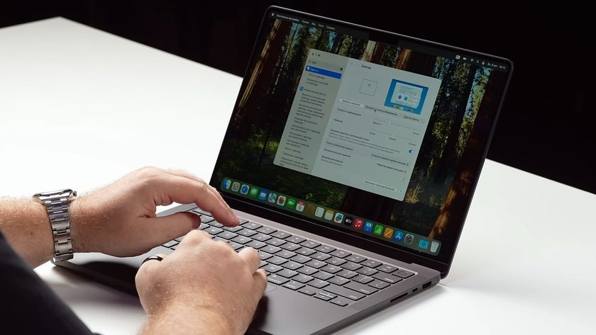
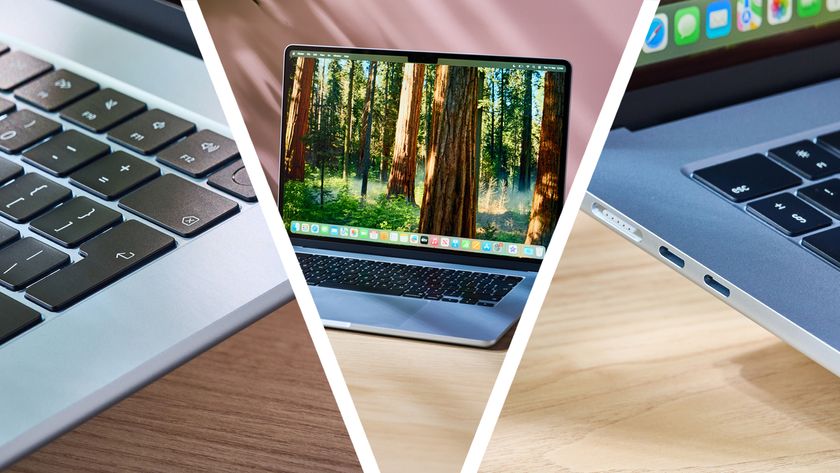
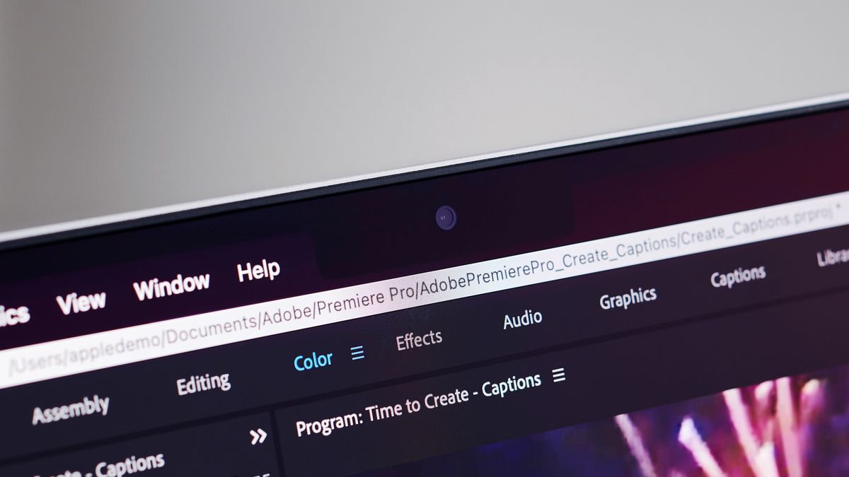
The notch is in both the new MacBook Pro 14-inch and 16-inch, with the webcam situated in the notch atop of the display. As MacRumors spotted, in an interview in the Same Brain podcast, Apple’s Shruti Haldea, who is Product Line Manager, Pro Mac, made it clear why the notch is a good idea from the MacBook maker’s point of view.
- Check out all the best laptops around
- And the best Macs to buy this year
- How to update a MacBook
Haldea said: “What we’ve done is we’ve actually made the display taller. Like on the 16-inch notebook, you still have a 16.0 active area on the diagonal in that 16:10-inch window, and we just grew the display up from there and put the menu bar up there. We just kind of moved it up and out of the way. So it’s a really smart way to give you more space for your content, and when you’re in full-screen mode, you have that 16:10 window, and it looks great. It’s seamless.”
Other opinions aired around the new notch have, shall we say, not been fully convinced on the ‘seamless’ front, of course. It’s fair to say that the notch has caused consternation from the first moment it popped up as a last-minute (and seemingly unlikely at the time) rumor, and more so now it has been confirmed as an element of the new MacBook Pros.
Analysis: A reasonable design decision? Or a strange almost arbitrary one?
Some of the arguments on the topic of the notch have focused on not just how seamless a solution it might be, but what indeed it’s a solution for: what problem has it been introduced to tackle exactly? When the rumor first floated, folks were asking that if there’s no Face ID tech coming – which speculation indicated – then why the notch?
The answer, presumably, if there is a pain point on the hardware side, is the need to fit in the upgraded 1080p webcam (which is a definite plus point for the new laptops). Perhaps the notch allows Apple to get that improved camera in, while still having much slimmer bezels all-round (as MacRumors points out, Apple has said that the top bezel is 60% thinner now, having the same width as the side bezels at a svelte 3.5mm).
Of course, arguably, Apple could be expected to fit that 1080p cam in without the need to resort to this design change – other manufacturers happily run Full HD webcams in thin bezels, fully notch-less – but we don’t know the full story behind the camera upgrades. Another possibility here, too, is that making this move now paves the way for the introduction of Face ID in the future (which would require a notch).
Get daily insight, inspiration and deals in your inbox
Sign up for breaking news, reviews, opinion, top tech deals, and more.
At any rate, with the notch, no screen real-estate is lost, anyway, as Haldea points out in her statement above: you still have the full 16:10 screen, the notch and the display space either side are above that, and can be effectively hidden (or appear more ‘seamless’ as mentioned) using black bars either side to match the black of the notch. Those little bars can also be used to fulfil a useful function in playing host to the menu bar. Or specific running apps can actually actively use the space, if the developer wishes (and takes care not to place any content where it’d be obscured by the notch in the middle, naturally).
As far as we’re concerned, we agree with Apple in the main, and don’t feel that the notch is going to be a huge issue for most folks. Sure, it might take a little getting used to the actual look of the thing, but acclimatization will likely happen quickly enough. And remember, it doesn’t actually cut into screen real-estate, by which we mean that if you buy the new MacBook Pro 16-inch, you’re still getting the same 16:10 screen space as ever, just with an additional touch of extra space at the top (it’s actually a 16.2-inch display because of this).
And what’s more, as time goes on, there’s the possibility that more Mac software will increasingly use the notch space actively, so its benefit to users could grow.
All that said, there are still folks out there who see this as an almost arbitrary design decision – Haldea’s explanation will doubtless do little to assuage these folks – and one which just looks clunky to them (at least when the top bars aren’t black and hidden). Furthermore, that perception could be seriously compounded if the MacBook Air runs with a notch, as well as its rumored off-white bezel color, in what could be a more glaringly unappealing combo (but let’s not get carried away with the rumors here, as the latest leaks around the Air are far from certain it’ll get the notch anyway).
- Shop all the latest MacBook Pro deals and sales
Darren is a freelancer writing news and features for TechRadar (and occasionally T3) across a broad range of computing topics including CPUs, GPUs, various other hardware, VPNs, antivirus and more. He has written about tech for the best part of three decades, and writes books in his spare time (his debut novel - 'I Know What You Did Last Supper' - was published by Hachette UK in 2013).
