Everything wrong with Amazon Prime Video
Hint: It's the UI
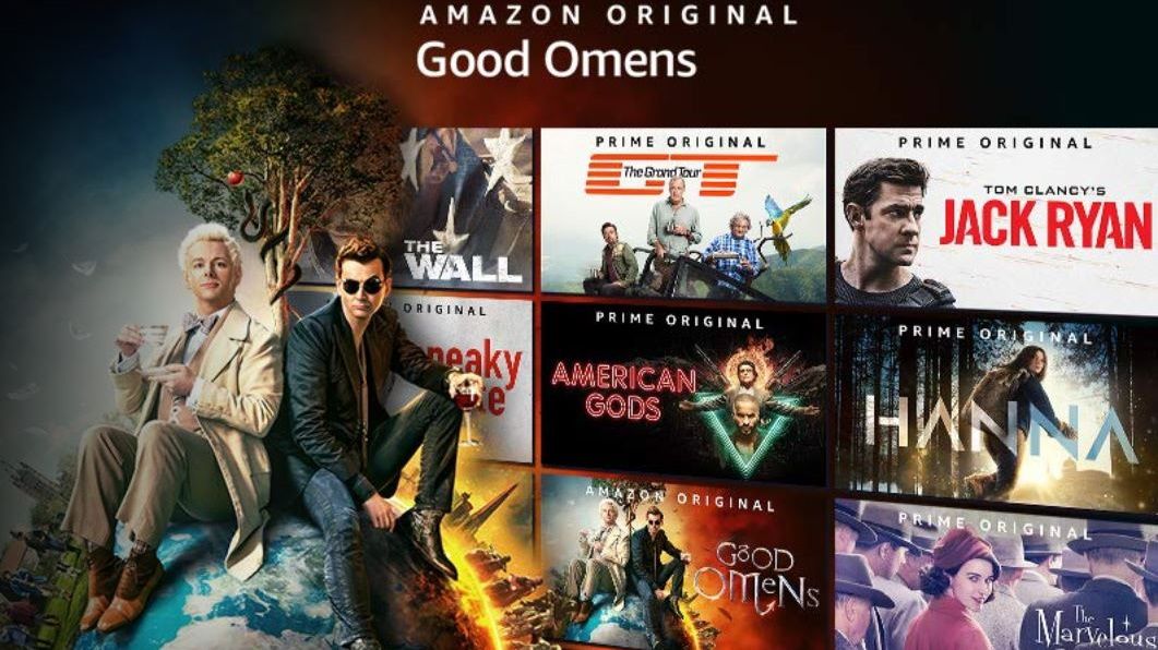
Amazon Prime Video is a success story in many ways. As a competitor to the leading TV streaming service Netflix, and a perk of an Amazon Prime membership – thrown in with one-day delivery, Amazon Music Unlimited, and more – the on demand TV service has taken a firm hold of our eyeballs in recent years.
With exceptional Amazon Originals such as The Boys or The Marvelous Mrs. Maisel, along with high-profile titles like The Farewell or The Handmaiden, it’s not hard to see why viewers have been drawn to the service – especially when a subscription will include all sorts of exclusive retail offers and faster delivery advantages alongside it. But there’s still a lot that needs to be improved in how users are forced to navigate the platform.
The main problem with Amazon Prime Video is that it was so clearly developed as an offshoot of the main Amazon Prime retail website, rather than a TV platform in its own right.
That’s led to a host of user experience issues, including the way that TV seasons are listed separately in Amazon search results, rather than being under a single banner – a continuation of the days when Amazon was shipping DVDs rather than streaming hit series.
Titles are still treated as one-off purchases, rather than entertainment experiences that viewers expect some level of fluidity to. To even find titles in the browser app, you have to go to the search bar and select ‘Prime Video’ in between ‘Premium Beauty’ and ‘Shoes and Bags’.

As a result, searching for Buffy the Vampire Slayer (or any Amazon TV show) is a visually confusing experience, and the platform can’t even manage to list seasons in consecutive order. On browsers, search results are also kicked off with ‘Sponsored’ items from the retail section of the site, meaning that, even if you’re specifically searching through Prime Video, you’re presented with other purchase options instead.
Our Entertainment Editor, Samuel Roberts, seconds this design mentality: “They think you see Prime Video as a perk of being a Prime member, rather than as a standalone service.”
Get daily insight, inspiration and deals in your inbox
Sign up for breaking news, reviews, opinion, top tech deals, and more.
You may resume
Several members of the TechRadar team have vouched for issues with Amazon Prime Video app resuming TV shows where they left off, too. I’ve had sitcoms ‘resume’ in the wrong episode, the wrong season, and even in the wrong part of a new episode (skipping the pre-credits scenes in Parks and Recreation, for example).
These are small, irregular issues, and easily fixed by searching for your relevant episode manually. There are also plenty of things Amazon Prime Video is doing right, as with its unique X-Ray feature, which mines IMDb's production database to tell you which actors are onscreen at any one time, inform you of the soundtrack playing, and just tell you general tidbits about the show.
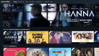
One facet that’s plagued the service since its inception has been the muddy divide between the video content included or not included in a Prime membership. There are many titles available to rent or buy, and it’s fairly easy to be flicking through content rows on the website and settle on a title only to find you’re going to need to pay a surcharge.
This was largely improved by the addition of a ‘Free to me’ tab listing titles free to view with a Prime membership – as distinct from the ‘Store’ where rent/buy titles are still listed.
However, Amazon has a big financial incentive to draw users towards additional purchases, and it’s telling that the homepage still mixes these titles liberally, along with films and shows that require add-on Amazon Channels subscriptions such as HBO, Showtime, Cinemax, or MUBI. Showing all available content, and then throwing up the paywall once you’ve decided on a title, consistently feels misleading.
Sana Rao, the former Head of User Experience at Deliveroo, tells us that Amazon Prime Video is “optimized purely for conversion, rather than user experience.”
“The e-commerce mindset is very different from the streaming mindset,” says Rao. “The website is very much designed from an e-commerce mentality: you go to the site, you know what you want, you search for it, you get it.”
If you don’t have a personal preference for you purchase, though, the lack of curation is a stumbling block that makes navigating and choosing what to watch far too difficult: “Everything’s presented to you like you’re in a Walmart aisle, looking at 200 different types of detergents, and none of them are presented as any better for you.”
For a Prime subscriber, or someone enticed by Amazon exclusive films and shows, there’s plenty reason to use it. But it’s clear that the Amazon Prime Video UI doesn’t put the user experience (and, by extension, the users) first.
- What are the best Amazon Prime movies? Find out here
Henry is a freelance technology journalist, and former News & Features Editor for TechRadar, where he specialized in home entertainment gadgets such as TVs, projectors, soundbars, and smart speakers. Other bylines include Edge, T3, iMore, GamesRadar, NBC News, Healthline, and The Times.


