Google Chrome 100 update arrives with a new icon - and that's all we need
Bug fixes but, there's a new icon!

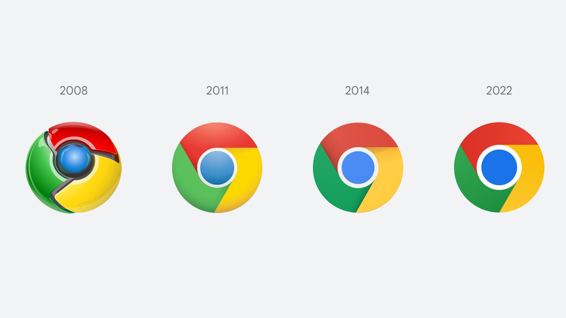
Google Chrome has been updated to version 100, bringing with it bug fixes, the removal of lite mode, and most of all, a new icon.
In the 14 years since the web browser was released, Chrome has become an app that many use for anything else other than browsing the web. Partly thanks to the Chrome Web Store, you can play games, complete your school report and watch Moon Knight all without checking a web page.
Google has made a fun look back on 100 web moments since 2008's arrival of Chrome, but while this is a fun read, the more pressing matter is the new icon that version 100 brings.
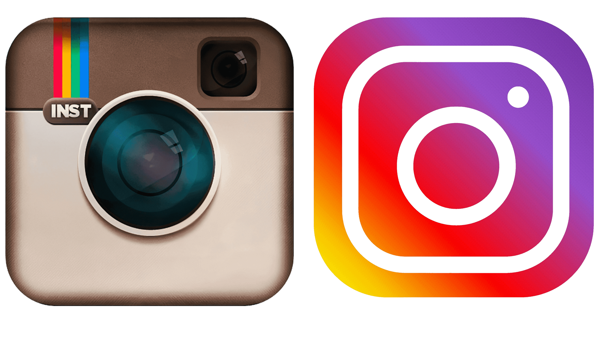
It made me want to look back on another logo change from Instagram, and how its change in 2013 was so major.
An iconic icon

Logos need to match the style of the time, and one example was when iOS 7 arrived in 2013. The design changed from skeuomorphism, which is a way of reflecting real-world objects, to a flat design that you use today on your Apple device.
This meant that the majority of apps had to change to fit this style, otherwise they would stick out sorely. The most prevalent for me was Instagram, which could have changed its logo from a camera to something that reflected part of the camera in a flat design. But instead, there was a change that set it apart from the other social platform apps at the time.

While the revamped logo reflects a camera, the colors were striking at the time, and still are today. When Instagram was celebrating its birthday in 2020, it added an easter egg to its app to bring back the classic icon.
Get daily insight, inspiration and deals in your inbox
Sign up for breaking news, reviews, opinion, top tech deals, and more.
Very smart Instagram. pic.twitter.com/6Wicd0JUWGOctober 6, 2020
Oddly, the old icon fit in the world of iOS 14, so it was a shame to see it go in quick succession soon after.
But Google's efforts with Chrome's icon have been progressive. From something that looked like an evil Pokéball in 2008, to one that looks pseudo 3D for version 100.
While its other icons have brought controversy, such as using the same color schemes for its other apps in 2021, Chrome has been consistent, almost being the template for these apps.
But as tastes and trends change in technology, we may see a cross between skeuomorphism and flat design converge, with another major icon change by the end of this decade. And for me, I'm all for it.

Daryl had been freelancing for 3 years before joining TechRadar, now reporting on everything software-related. In his spare time, he's written a book, 'The Making of Tomb Raider'. His second book, '50 Years of Boss Fights', came out in 2024, with a third book coming in 2026. He also has a newsletter called 'Springboard'. He's usually found playing games old and new on his Steam Deck, Nintendo Switch, and MacBook Pro. If you have a story about an updated app, one that's about to launch, or just anything Software-related, drop him a line.