iPhone 14: five reasons why the notch is clearly staying
Opinion: it's time for a new take on the cutout
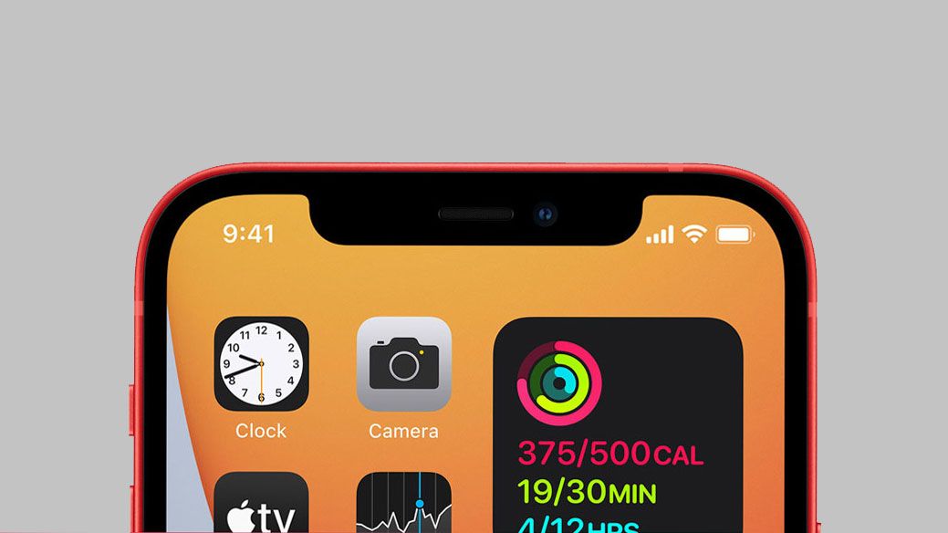
I've been thinking hard about the notch over the last few days, ever since I saw the news that the iPhone 14 might get the old 'pill and punch' design.
I don't mean the notion that the new iPhone will remove the notch altogether - we've heard that rumor for a few years now, ever since it appeared on the iPhone X in 2017 - but that Apple might go for the 'pill and punch' design instead.
I wrote something about this yesterday, but I've been ruminating on it since - and I've had another thought on why it's going to stick around, despite trying to think about what could cause Apple to drop the notch altogether.
There are just so many reasons why losing the little cutout at the top makes little sense for Apple... not least because it needs a place to house all the sensors and cameras that allow for its Face ID to function.
Don't misunderstand what I'm trying to say though: I desperately want to see the notch, and every little thing that interferes with a smooth screen, to be gone from all smartphones. It's a necessary evil, sure, but I cannot wait for the year when having any kind of notch or hole in the screen of any phone launched is really weird.
But I just can't see it happening in 2022. Perhaps I'll be wrong. Maybe the iPhone 14 and 14 Pro will come with the notch and the iPhone 14 Max will have something different. Maybe Apple will tear up its own design rule book.
But having covered every iPhone launch since the 3G, we've rarely seen anything massively change in this way - the notch, surely, is staying.
Get daily insight, inspiration and deals in your inbox
Sign up for breaking news, reviews, opinion, top tech deals, and more.
A necessary notch
Apple doesn't do anything it doesn't have to. When talking about the very early days of the iPhone, it didn't allow you to copy and paste things between apps. It didn't have a good camera for years.
Only with the iPhone 13 series did it finally offer decent battery life - sure, that likely was a by-product of needing more power to allow for the 5G connectivity, but I was shocked, when I tested the battery life, that Apple hadn't made a huge song and dance about this big increase to battery life in the iPhone 13 launch.

The notch houses a few key things for the iPhone: a variety of sensors, the IR emitter that allows Face ID to function, and the front-facing camera.
These are bigger sensors than you find in most Android phones because Face ID needs them - they have to have a home in the chassis somewhere, so when making the iPhone X this was the best compromise Apple could come up with.
So anything that replaces the notch needs to achieve the same functionality, and I'm not seeing technology on other phones that could do so right now.
The alternative to the notch is ugly
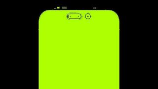
OK, I've instantly lied. I can think of a few things, and one of them is heavily rumored for the new iPhone... but I can't see it happening.
The punch hole and pill-shaped opening have been used in a few phones recently, and do allow for more screen to spill around their edges, giving a bit more screen real estate.
But they still sit there, mildly ruining movie watching or internet browsing, so it's hard to see how they're any better than the notch.
There's also the bigger issue: the implementation of these two differently-shaped holes, by nature, is asymmetrical. I can't see a company that's so obsessed with design (did you know that the edge of the seats in in the new Apple stores have the same curvature as the iPhone 11?) would put something so ugly on there.
I mean, Apple could go for a pop up sensor, but they can fail and also don't allow for the smooth viewing of notifications where you just hover your face over - hugely unlikely given that's a fan-favorite feature.
Face ID is going nowhere
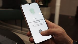
This is a key one - the iPhone isn't going to bring back the home button, as it's keeping that exclusively for the iPhone SE range (and there are strong, strong rumors that the iPhone SE 3 will keep that design).
So the only option would be to get rid of the sensors needed to enabled Face ID - use the front-facing camera? Less accurate, less secure. Not going to happen.
Therefore the only option is to add in an under-display fingerprint scanner. Now, this one has legs as an idea: Apple could do it well. It's a technology that's flickering on the edge of viability, as brands like Samsung have implemented it pretty well on things like the S22 Ultra - but is still prone to weird execution, as this piece on the Pixel's in-screen scanner sadly shows.
Apple could definitely drop Face ID in favor of the tech if it upgraded its capability (and I'm sure we'll see it as an option in the near future), but it would require the camera to disappear to a smaller level to totally shed the notch - and, as we're about to see, that's so unlikely.
The 'true' technology isn't ready
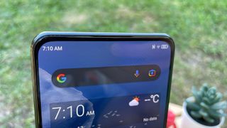
Of course, the true 'all display' iPhone is the goal here. Something that doesn't have anything getting in the way of the screen at all, where the sensors are there but hidden somehow.
That could only, realistically, be achieved in one of two ways: either move the earpiece and put the sensors in the frame, or put them under the display.
Sure, we've seen multiple Android phones trying the same thing, and they're getting pretty good - the ZTE Axon 30, for instance, does a pretty good job of selfie images without a visible front-facing camera.
But 'pretty good' won't wash for Apple, which is hell-bent on talking up its camera prowess at every given point. Having a camera under the screen is also, by nature, covering the sensors slightly, which means that Face ID will likely be slower and / or less accurate.
The only way this will work is when screen tech evolves to let enough light in that Apple's image processing can do its thing, and the IR sensors for security can be miniaturized enough to sit in the frame... but we're not there yet.
The notch is iconic, and people don't really mind it
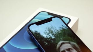
I'm sat here in a canteen, tapping out some thoughts on the notch and whether it's going to continue... and I can see three people in my immediate vicinity all using recent iPhones that pack the cut-out screen portion at the top.
The truth is that, while the notch isn't the ideal solution, Apple has embraced it and users aren't that bothered. Reports of the iPhone 13 being a record-breaking model - hitting around 40 million sales - suggest that there's not really an issue with the notch in the eyes of those considering which iPhone to buy.
That's not to say that people like it, as it's still something ugly and in the way, but a discussion over on the r/apple forum on Reddit, when discussing if the notch should stay or go, goes some way to explaining the sentiment:
" I have no issues with the notch. My brain ignores it… just like my eyes see my nose at all times, but again, my brain ignores it."
People just don't see it any more. Another thread commenter breaks it down in an even easier way:
"Yes, [Apple] tried to make [the notch] part of the design the best they could. Yes, they’ve exploited this "design anomaly" for their branding, it has a very singular "icon" translation. Yes, it’s not necessary [sic] ugly or aberrant.
"But. It’s not a feature in any way. It’s...a design compromise"
As referenced here, Apple has leaned into the notch. It's taken it from eyesore to emblem.
It's made the notch the icon for the phone, rather than pretending it's not there. People see a smartphone logo with a cutout, and they instantly see an iPhone.
Apple has gone so far with the notion, that it's able to put it in the MacBook Pro last year and it seems to (sort of) makes sense, even though it clearly doesn't when compared to multiple rivals not resorting to the same thing.

So... it seems likely that we'll still see the notch on the iPhone 14. I can't see a way that Apple drops it.
But, then again, I couldn't believe that the brand would have lost the headphone jack in the iPhone 7, even though people wanted it then (and still want) it. I'm sitting opposite someone with the Lightning headphone jack adaptor in, and yet Apple has been unyielding in its shoulder-shrug attitude to the cries to bring it back.
So perhaps I'll be sitting here, writing another piece of analysis in September, talking about how Apple has found a way to stack the pill and punch design in the middle of the screen in an 'elegant' way.
Or that it's completely scrapped the notch and spent a fraction of its massive R&D budget on figuring out how.
Or... maybe the notch will just be 7% smaller, a tiny bit taller and that'll be enough for another year to encourage iPhone sales and upgrades.
And if you don't care, maybe it's time to bite the bullet and go for the iPhone 13. We're still far enough away from the iPhone 14 launch that you'll get a decent deal, and it's too long to wait until August to get the best prices - take a look at the latest prices and see what you think.

Gareth has been part of the consumer technology world in a career spanning three decades. He started life as a staff writer on the fledgling TechRadar, and has grew with the site (primarily as phones, tablets and wearables editor) until becoming Global Editor in Chief in 2018. Gareth has written over 4,000 articles for TechRadar, has contributed expert insight to a number of other publications, chaired panels on zeitgeist technologies, presented at the Gadget Show Live as well as representing the brand on TV and radio for multiple channels including Sky, BBC, ITV and Al-Jazeera. Passionate about fitness, he can bore anyone rigid about stress management, sleep tracking, heart rate variance as well as bemoaning something about the latest iPhone, Galaxy or OLED TV.
