Microsoft should be bold with Windows 11 and overhaul the Ribbon interface
The last remnant of 2007
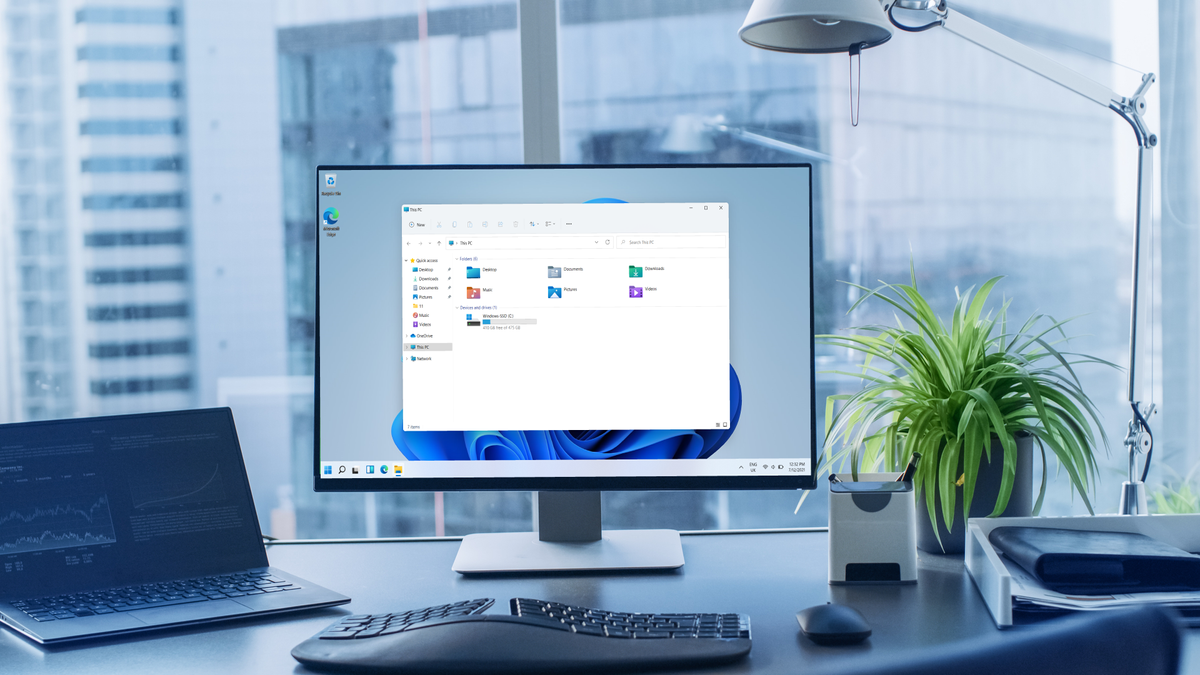
Recently, we’ve been seeing the fruits of what Microsoft has been working on these past few years, with Windows 11 and the redesigned Microsoft Office.
Both bring a new look for users, finally shaking off a user interface that has been around since Windows 8.1.
However, as we delve deep into the early builds for both, there’s a huge opportunity for Microsoft to make an even braver clean slate with the visual design. For years we’ve seen applications and windows that have stayed in Windows 95 colors and designs - so it’s time for a fresh coat across the board.
This is why now couldn’t be more of a perfect time to rethink the Ribbon feature that’s been present ever since Microsoft Office 2007, and which has been a bugbear for many.
- Check out the best laptops you can buy
- Windows Vista is the evil twin of 10 - here’s why
- You can downgrade from Windows 11 to 10, but be quick
Bow Ties aren’t cool here
Ever since 2007, we’ve seen the toolbars in Windows products go from simple menus to icons and tabs. With every new feature introduced in subsequent versions of Office and Windows, more icons would be added to these tabs and icons.
This is what’s known as the Ribbon interface, Microsoft’s way of grouping up almost-all the features of an application into a new toolbar. While the aim of this was to better help users find certain tools more quickly, as the years pass it’s become very bloated, especially when you look at applications such as Windows Explorer.

Microsoft Office is even more reliant on Ribbon toolbars, with every application having at least four tabs available to choose from, further overwhelming users with options, when they may only want to add a new column to a table in their school report.
Get daily insight, inspiration and deals in your inbox
Sign up for breaking news, reviews, opinion, top tech deals, and more.
This is another example of a feature from Windows that’s a remnant of versions that were meant to be a sure-fire way to solve an issue for many. However, similar to the Tiles of Windows 8 or even Windows RT, it’s another example of form over function.
If you know of someone that has a PC that's used once a week, a change like the Ribbon interface would have been incredibly jarring to particular age groups, and cause more frustration than what Microsoft envisaged.
The middle-ground compromise?
Windows 11 is in the midst of a big redesign, one of its biggest in years, for the user interface. It already gives the impression that it’s a look that’s much better suited to users who have Windows on machines that have touchscreens. From selecting the centered Start menu to swiping from the left to display the new widgets, everything seems much easier with a finger, much more than Windows 8 did.
This also applies to the new Explorer, where the Ribbon has finally been replaced by icons that represent the functions that are most commonly used. Any extra options are now grouped into the ‘...’ category to the right on the toolbar.
While this is still a work in progress, it’s definitely less overwhelming for users, and it shows that Microsoft is listening to feedback. Sometimes it’s just not needed for one feature to be across the whole operating system.
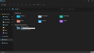
With regards to the new Microsoft Office, Fluent design (the name for the new user interface) can also be found there, taking cues from Windows 11, but the Ribbon interface is still hanging around. However, it’s early days, and perhaps the middle ground that’s showing in the new Windows Explorer could be a hint as to how Ribbon could be heavily reduced in the Office apps.
With a huge redesign coming to two of Microsoft’s biggest products, there’s an opportunity here to make a user interface that’s not only elegant, but also functional for almost everyone.
A design should be easy to use for all kinds of people, from someone who uses a PC every day, to someone who only uses it once a week to check their email.
Essentially, it has to be modern but usable. It's why products like the iPod looked simple, but you could play a song in no less than three presses.
We’ve already seen some promise with Windows 11, but it’s time to see this turn into a fully-formed design language across all of its products, and something that can be used by anyone, no matter how computer savvy they are.

Daryl had been freelancing for 3 years before joining TechRadar, now reporting on everything software-related. In his spare time, he's written a book, 'The Making of Tomb Raider'. His second book, '50 Years of Boss Fights', came out in 2024, with a third book coming in 2026. He also has a newsletter called 'Springboard'. He's usually found playing games old and new on his Steam Deck, Nintendo Switch, and MacBook Pro. If you have a story about an updated app, one that's about to launch, or just anything Software-related, drop him a line.

