TechRadar Verdict
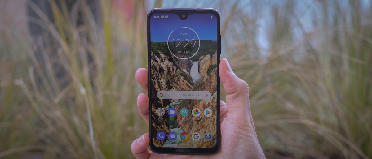
At first glance, the Moto G7 looks like a much more expensive phone than it actually is. It may not offer top-end power or an incredible camera experience, but if you’re on the lookout for an affordable phone that works well and reliably, you’re sure be a fan of what Motorola’s G series flagship can do.
Pros
- +
Well-built design
- +
Huge, clear display
- +
Great performance
Cons
- -
No NFC on US version
- -
Camera lacks excitement
- -
Middle of the road battery life
Why you can trust TechRadar
The Moto G name has become synonymous with quality on a budget. Time and again, Motorola has got this price point right with relatively high spec handsets when compared to the competition at the same price.
This time, the company has taken a lot of what made the Moto G6 a solid handset and gently refined it into an even more premium feeling product.
We liked the Moto G6 a lot when it came out in 2018 – TechRadar gave it a 4.5 star review – so there isn’t much that needed improving on this new handset, but that’s not such a huge issue either.
While you may not want to instantly upgrade your Moto G6 to this phone, the G7 still stands out as one of the best budget phones on the market.
The Moto G7 isn't alone either - it launched alongside three other phones that are well worth your attention. The cheapest is the Moto G7 Play, while the best battery life comes from the Moto G7 Power.
Then there's also the Moto G7 Plus that comes with an improved camera and better performance than the standard Moto G7.
- Meet the rest of the family: Moto G7 Plus | Moto G7 Power | Moto G7 Play
Moto G7 price and release date
- Costs £239 in the UK, $299 in the US and AU$399 in Australia
- Available from March 1 in the UK and April 2019 in Australia
- Those in the US will have to wait a bit longer
You’ve been able to buy the Moto G7 in the UK since March 1, 2019 where it's exclusive to Amazon if you want to buy it SIM-Free.
The Moto G7 price is set at $299 / £239. That’s more than the starting price of 2018’s G6, but that's a lot more fair when you realize this handset comes with double the storage of the last generation.
Since launch the device price has dropped, but not by much, however when the anticipated Moto G8 launches that could change.
In the US it’s set to cost $299, which is $50 more than last year's phone. Again, this does come with more storage so that’s likely a big part of it but it’s still quite a price hike even when you take that into account.
Retailers for the US include Walmart, Best Buy and B&H Photo, and it's coming to affordable carriers Google Fi, Republic Wireless and Ting down the line. Unlocked, it'll work with AT&T, Verizon, Sprint and T-Mobile.
Australians could find the handset on shelves come April 2019 with a price tag of AU$399.
Design and display
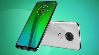
- Features a 6.2-inch display with a Full HD+ resolution
- It's a 19:9 aspect ratio that makes it longer than other phones
- Glass front and back with metal edges
If you’ve seen the G6 in the flesh, you’ll know a lot of the design language here in the Moto G7. It’s a similar style, but with some wildly differing dimensions and a couple of changes you should know about.
The most important thing to know is this feels like a more premium phone than you may expect at this price. Early Moto G handsets were built from materials that felt cheap, but the company now uses glasses on both sides of the phone with a metal body that feels more high end than it actually is.


That’s not to say the design is perfect – tapping on the rear of the handset will show it’s not the most premium material. The rear of the Moto G7 is curved on either side so it sits comfortably in the palm of your hand.
We did find the design could be particularly slippery when on some surfaces though, so be warned this may gently slip off the arm of your sofa.
On the rear is the camera, which sticks out from the handset a few millimeters. It’s not dramatic enough to become a nuisance when your phone is in your pocket though.
Below that sits the fingerprint scanner, which is an easy to reach position. Previous Moto G handsets have had the fingerprint scanner below the display, but that’s not the case for this generation.

When you’re holding the Moto G7, the fingerprint scanner is easy to use but it can be annoying when your phone is laying on a desk or somewhere where you don’t have quick access to the scanner.
The right hand edge of the phone features a volume rocker and power button in an easy to reach place. Both of these feel tactile enough that they’re easy to find and use, plus the left hand side of the handset is bear giving your fingers a comfortable place to land if you're right handed, mind you.
The top edge of the phone has the SIM card slot, so you’re unlikely to be using that edge much but there’s lots of tech hiding in the bottom edge of the phone. On the far left is the phone’s single speaker next to the USB-C port for charging and data transfer.
Then on the far right you’ll find the 3.5mm headphone jack. That’s stuck around for another generation of Moto G handsets, and it’s likely something people will be overjoyed to hear about as Motorola has previously lost the tech from its flagship Moto Z series.


The phone isn't waterproof, but it is splash resistant that should mean you're able to use this in a rain shower without any concerns of breaking the device.
Much of this is the same as the G6, but the big changes come when you get back around to the front of the phone and the new display.
The screen on the Moto G7 is a new aspect ratio. It’s 19:9, which means it looks more stretched out and taller than other handsets you may have used in the past.
It’s a 6.2-inch display with an impressive 81% screen-to-body ratio. That’s not the best we’ve ever seen on a phone, but considering the price of the Moto G7 it’s an impressive look. To achieve that and still keep a front-facing camera, the company has adopted a notch.


Motorola has opted for a teardrop notch on the Moto G7, which means it’s much smaller and gives you even more screen than a wider notch would offer. That allows your notification bar to sit around the notch so you can see all of your stats along the top line.
The display itself is a Full HD+ resolution at 1080 x 2270 pixels. That’s 405 pixels per inch, which is actually less than the Moto G6’s 424 ppi. That’s not noticeable in everyday use though, and we found the display to be bright and clear.
Clarity on this display was good enough for most. You may sometimes find it a struggle to use one-handed if you have smaller hands as the display is so tall, but we really like how the phone looks in the hand.
We think it's worth the odd struggle top reach the top bar in trade to get that extra bit of screen.
James is the Editor-in-Chief at Android Police. Previously, he was Senior Phones Editor for TechRadar, and he has covered smartphones and the mobile space for the best part of a decade bringing you news on all the big announcements from top manufacturers making mobile phones and other portable gadgets. James is often testing out and reviewing the latest and greatest mobile phones, smartwatches, tablets, virtual reality headsets, fitness trackers and more. He once fell over.




AI doesn't belong in the classroom unless you want kids to learn all the wrong lessons

I wasn’t a Bob Dylan fan until I watched the Oscar-nominated A Complete Unknown in a 29-channel, 14,500-watt McIntosh home theater

'Power Book III: Raising Kanan' season 4: How to watch the epic crime saga from anywhere in the world
