The new iMac isn't pretty, it's badly designed
Opinion: Apple should have copied Microsoft

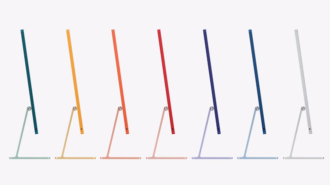
As expected, Apple has announced a new iMac. Apple fans are absolutely delighted. It's thin, it uses the much-adored M1 chip and COLORS! Just like the old days when Apple was young and funky and sold colorful computers that looked amazing next to the sea of boring beige and black boxes Windows PC makers were known for.
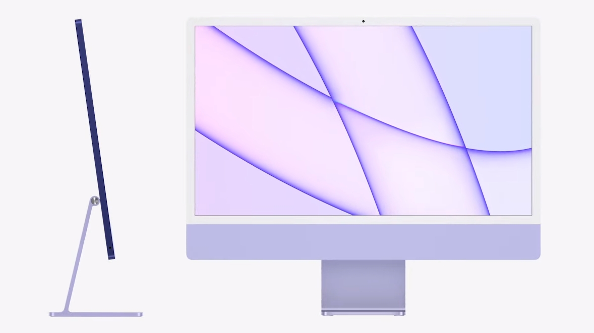
But, where Apple once led the industry in design, it now can't even follow properly. I didn't watch the event, I haven't heard any of the spin and the self-congratulatory commentary that all such events are known for. But the first time I saw the new iMac I wasn't impressed, I was disappointed.
There is still a clear leader in design when it comes to the all-in-one computer. It's Microsoft, not Apple.

Apple, iMac and an obsession with thinness
Why does it truly matter how thin the new iMac is? Does it provide a false sense of superiority? There are reasons you might want a thin computer, but given that Apple has switched to using its ARM processor over Intel's hotter, more power-hungry alternative, being thin was a given. ARM chips are cooler and more efficient, and you don't need to strap big fans and copper heat pipes to them.
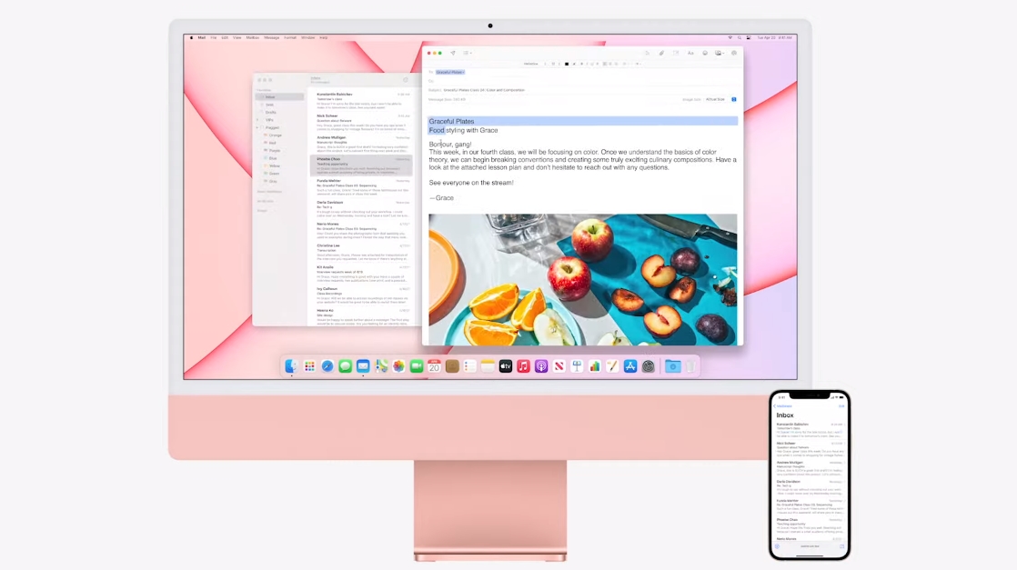
But why does the iMac have a massive chin instead of more display real estate? Why does it have white bezels trimming the display on some colors? The cutaways show just how little hardware is inside the new iMac, and it's actually remarkable and a true showing of how far technology has advanced.
It's just a bad design. So what if it's thin? The part you look at is terrible.
It isn't the only all-in-one with a big chin, but usually, those are packing traditional desktop PC hardware, maybe even dedicated GPUs. But Apple had an opportunity to really stand out, but for some reason, it didn't copy Microsoft.
Get daily insight, inspiration and deals in your inbox
Sign up for breaking news, reviews, opinion, top tech deals, and more.

The Surface Studio is a true icon of design
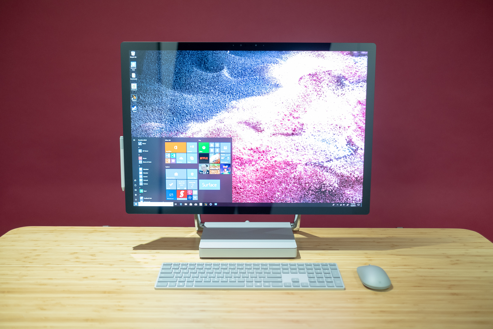
The Surface Studio. It's big, it's expensive, it has a crazy hinge that folds the display down like the biggest, most beautiful drawing pad you ever touched. As a piece of design, it's everything the new iMac should be. Slim bezels, a huge display, and most of the important bits hidden away in the base.
Packing the hardware into the base has practical implications, too. It makes actually using the PC much easier, cables much neater, and you don't have to fumble around the back of the display just to plug in a USB flash drive. Sure the base is bigger and thicker, but who cares? You don't use the base for anything other than propping up the display. Why wouldn't you use it?
What it also means is a larger display, and on the Surface Studio is also means a taller, 3:2 aspect ratio. You just get more. It's glorious.
The Surface Studio has its drawbacks, but from a pure design perspective, Microsoft is running away with it.

Apple needs to get back to leading the way
Over a decade ago I was first drawn to the Mac because of its design. The combination of the exterior looks and the OS made a refreshing change to the clunky, stagnant Windows PCs I'd been using for years previously. Apple was absolutely cutting edge, leading the way on every front.
Now, I just feel like Apple is lazy, and tries to cover it up with things that don't really matter, like a super thin computer or painting it yellow. The move to ARM provided a clear opportunity to completely reinvent the iMac and get back to the front again, even if it did mean ripping off Microsoft in the process.
Of course, what I say won't stop Apple fans lapping up the new iMac in their droves, and I hope they enjoy it very much. But let's not pretend Apple is a leading designer anymore.