Twitter rolls back another terrible feature update in new speed record
Opinion: Let's not see this again Twitter, please

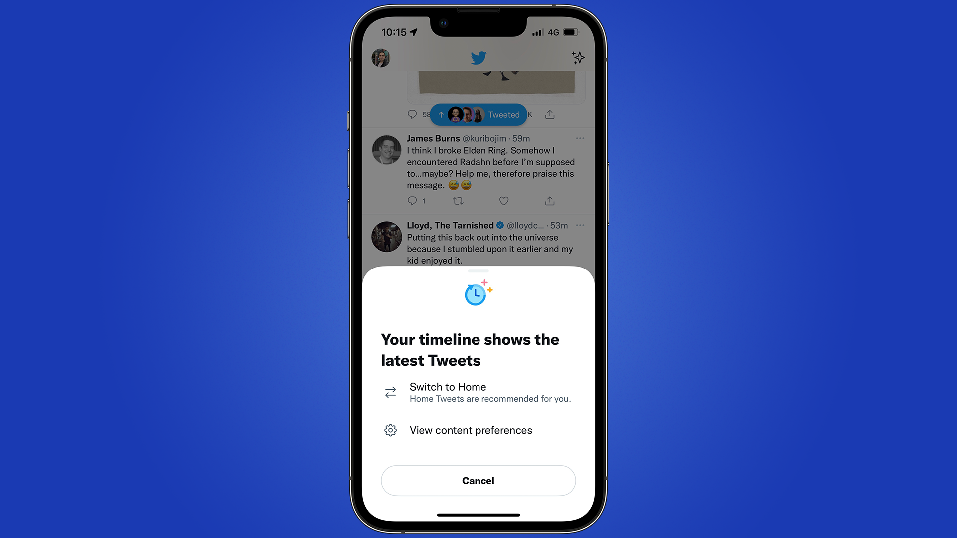
In record time, Twitter has rolled back a feature that would force you to either look at two timelines or only view the 'Top Tweets' timeline, to the scorn of users.
For almost a week, users would have to switch between two timelines as they would scroll to see what new tweets were there from their brands and friends - myself included.
But it got to the point where I would be scrolling for five minutes, not realizing that I was on the 'Top Tweets' feed, not the 'Latest Tweets' feed.
It's a ridiculous design decision that didn't go down well with its many users. While there were some self-congratulatory tweets from designers at Twitter praising this reversal, I can't help but wonder if this was a feature purposely designed to annoy users for a short time, or communication of what users want in features at the company, has hit a new low.
Leave our feeds alone Twitter
I had spoken before about how much I hated this new feature, and I wasn't alone. Executives at Twitter were replying to others in how they were working on an alternative to this change in the feed, and we didn't have long to wait.
The alternative turned out to be Twitter reversing its decision to push 'Top Tweets' as if nothing happened. But it's an example of a feature that shouldn't have been there in the first place. Its change made no sense, and from a usability angle, it didn't give any benefits to the user.
We heard you –– some of you always want to see latest Tweets first. We've switched the timeline back and removed the tabbed experience for now while we explore other options. https://t.co/euVcPr9ij6March 14, 2022
Having two timelines was confusing, and the added fact that the 'sparkle' icon on the top right, would give you the option to show one feed that no one wanted, was another baffling decision.
Get daily insight, inspiration and deals in your inbox
Sign up for breaking news, reviews, opinion, top tech deals, and more.
Every user on Twitter has different feeds from everyone else. It's what makes the social platform unique - its algorithm and the people you've decided to follow shape your interests while discovering new voices.
But features like this hinder the experience massively, and I'm not aware of anyone who likes to use the 'Top Tweets' feature. Twitter is a platform that many folks use to catch up on the latest news, regardless of the topic - it's not a magazine highlighting the last few days.
Hopefully, when the company realizes this, we will see less of these useless features and others that we can benefit from, such as an edit button.
- Our pick of the best smartphones in 2022 so far

Daryl had been freelancing for 3 years before joining TechRadar, now reporting on everything software-related. In his spare time, he's written a book, 'The Making of Tomb Raider'. His second book, '50 Years of Boss Fights', came out in 2024, with a third book coming in 2026. He also has a newsletter called 'Springboard'. He's usually found playing games old and new on his Steam Deck, Nintendo Switch, and MacBook Pro. If you have a story about an updated app, one that's about to launch, or just anything Software-related, drop him a line.