Twitter just made a big change to our timelines, and I hate it
Opinion: Yet again, Twitter adds a feature nobody asked for

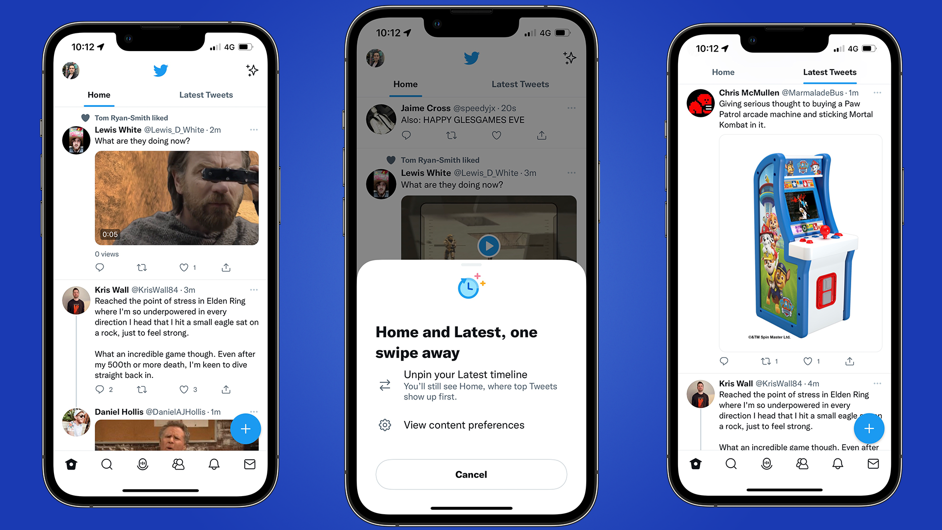
It appears Twitter has just flicked a switch to let you slide between two feeds on iOS, where you can decide between a feed of top tweets or chronological tweets.
However, this feature has been available for a while, thanks to the star icon on the top-right corner of your screen. You could switch between the feeds through here, and one feed would display on the app instead.
But there's now an additional swipe required to go to your profile if you're on the 'Latest Tweets', and none of this makes sense. While it's rolling out to iOS for now, Twitter has said that it's soon coming to Android and the web in the coming weeks, but I'm hoping this change is rolled back and forgotten about as soon as possible.
An additional swipe is an additional annoyance
Twitter is the social platform I use the most. Granted, there's some tweets that are written just to drum up pointless discussion, or as an attempted joke to try and go viral, but in the majority of my time there, I've found it to be a good place, and I've met a lot of great people through it.
Toward the end of 2021, the company brought out a feature to display your top tweets - this meant that any tweets with the most interaction at that time, whether it was likes or replies, would be shown at the top of your feed. But Twitter was adamant that the choice between this and a chronological feed would remain.
Overnight, it looks as though that train of thought has gone off the rails.
The Home and Latest timelines are now just a swipe away for everyone on iOS, and soon on Android and web.Tap the ✨ icon to pin (or unpin) the Latest timeline to your Home tab for easy access. https://t.co/cj7ofY3CZq pic.twitter.com/XR0ALOQ5Y6March 10, 2022
Not only does it add an additional step to decide between two feeds, but I've already found myself to be confused as to which feed I'm looking at.
Get daily insight, inspiration and deals in your inbox
Sign up for breaking news, reviews, opinion, top tech deals, and more.
Not being able to unpin the algorithmic timeline feels backward, and puts the user into a corner, where you have to abide by Twitter's design, whether you like it or not.
The company has been trying different features and refinements in the last 18 months, with Fleets being a great example of something that didn't work, and it was soon scrapped.
I'm hoping the same repeats here, where Twitter will soon realize how irritating this change is, as I don't see how this benefits the user when the choice was already there, and had been designed in a better way for months anyway.
- Our guide of the best iPhone model to pick in 2022 so far

Daryl had been freelancing for 3 years before joining TechRadar, now reporting on everything software-related. In his spare time, he's written a book, 'The Making of Tomb Raider'. His second book, '50 Years of Boss Fights', came out in 2024, with a third book coming in 2026. He also has a newsletter called 'Springboard'. He's usually found playing games old and new on his Steam Deck, Nintendo Switch, and MacBook Pro. If you have a story about an updated app, one that's about to launch, or just anything Software-related, drop him a line.