We've used iOS 15 public beta for a day, and it’s already better than iOS 14
All the cool new things in the iOS 15 public beta

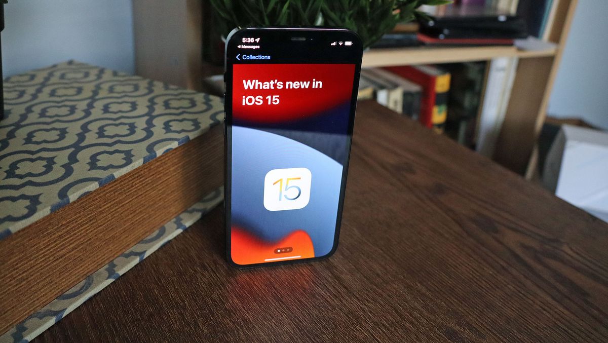
The iOS 15 public beta is live, and anyone with a compatible iPhone can download it. So, naturally, we did – and we’ve already experienced some of the exciting new features coming in the next big iOS update, with several offering novel quality-of-life improvements that make iOS 15 already feel like a big upgrade over iOS 14.
Don’t expect iOS 15 to be a huge overhaul of the iPhone experience – not that you’d get that idea given what we saw when Apple teased the update at WWDC 2021. As with many of Apple’s annual updates, the improvements are limited to a handful of apps, and some subtle refinements that you might not notice if you weren’t looking for them.
It's not the only Apple public beta live right now, as iPadOS 15 and watchOS 8 betas kicked off at the same time.
We aren't yet seeing all the features promised to come in iOS 15, but that’s to be expected, as Apple typically introduces more features in each additional beta release. (Confusingly, Apple labeled this one Public Beta 2, but it should be the first that's available to non-developers.)
But the new features in iOS 15 really sold us on several new features that we can’t wait for everyone to see. We’ve probably missed several things, but here’s what jumped out to us on the first day of using the next version of iOS.

Live text
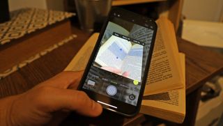
This was probably the neatest feature – Apple’s own Google Lens, of a sort. At WWDC 2021, Apple showed off iOS 15’s ability to use AI and machine learning to find text and search for it online. Using it ourselves involved a little finagling, but we got it to work: just open your camera app, point the viewfinder at text, wait for four yellow corners to frame the text, and tap the triple-line icon that appears. This will take a snapshot image, and you can then tap-to-highlight text to look up online.
It’s neat, like a visual Siri search, but it’s a tool people will probably forget they have; I know I’ll have to make an effort to remember that it's there. The feature isn't perfect – it doesn’t always seem to recognize words at different angles, and it really struggles with stylized logos – but once it recognizes text you can paste it into another app; for example into a text message, or the Safari search bar.
Get daily insight, inspiration and deals in your inbox
Sign up for breaking news, reviews, opinion, top tech deals, and more.
There’s also a translate function along with the ‘Look Up (online)’ option, which likewise seemed to work well enough, translating a passage in a French book we happened to have on hand – and there’s the option to read the translation aloud, too. It's obviously a nice thing to have when you're traveling, or reading menus that aren’t in your own language. Thus far, the languages available for translation are: Arabic, English (UK and US), French, German, Italian, Japanese, Korean, Mandarin, Portuguese, Russian, and Spanish.
Messages
You can long-tap a link to pin it to any conversation, including with Android users. But iMessage convos get an extra feature: the ability to translate a message if sent in a different language. Will more such features be coming? We hope so.

Safari
Safari also sees a few notable changes. The biggest is that the search bar has been moved to the bottom of the screen, a nigh-blasphemous move in terms of search engine tradition, but one that puts it helpfully within reach of everyone’s thumbs.
To the right of the search bar is a triple-dot icon for opening a menu into which all the options have been bundled, and the usual button for opening your tabs, which has been revamped too, changed from a revolving stack to simple flat thumbnails; you can see about 6 at once. Best of all (or worst, depending on your perspective), when you view your tabs at a glance you'll also see the number of tabs in the bar at the bottom.
If you just want to switch between your current tab and the previous or next one, you can tap-and-hold the search bar and swipe it left or right, respectively.

Notifications
Of course, notifications aren’t sexy, and they’re hardly at the top of anyone’s most-anticipated iOS 15 features list. And yet, they’re so central to using an iPhone that anyone with the beta will immediately notice the refinements here.
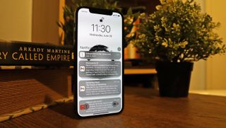
For starters, the notifications are leaner – trimmed down, with less empty space around the text, and with what seem like more vibrant and noticeable icons. There’s a bit more space between different notification groups, which are lumped together by app – and it’s now easier to tell those groups apart, too, with a shaded effect that makes them appear stacked together.
You can also choose whether notifications are allowed to break through Focus modes (the new name for Do Not Disturb, Sleep, and the new Personal and Work modes). It’s handy for those apps that you absolutely need to pierce the veil – and people, too, like partners, family or friends, that you want to be able to call you at any time. This feature is deeply customizable, allowing you to set times when the Focus Mode automatically activates, set whether certain apps pop up on the home or lock screens, and notify contacts if you’ve got a Focus Mode active (don’t bother me, I’m working!).

Maps
Okay, we didn’t see too much of the more exciting Maps refinements promised for iOS 15, like much clearer highway interchange visuals and driving conditions, and we haven't yet had time to set up a favorite transit route so that Maps can predict where we're at on our route, even when underground or out of signal range.
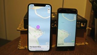
But we did see the more subtle changes coming to Maps, like more refined 3D building models, and color differences between smaller side-roads and main roads. More noticeable are a couple of new tweaks when you input directions: your route now snakes out from your position to your destination, which is neat to see, and if Maps recalculates a better route it will re-slither out. You can also change your departure time.
- Stay on top of tech news with the TechRadar newsletter
David is now a mobile reporter at Cnet. Formerly Mobile Editor, US for TechRadar, he covered phones, tablets, and wearables. He still thinks the iPhone 4 is the best-looking smartphone ever made. He's most interested in technology, gaming and culture – and where they overlap and change our lives. His current beat explores how our on-the-go existence is affected by new gadgets, carrier coverage expansions, and corporate strategy shifts.
Most Popular


