TechRadar Verdict
Nokia has successfully made a luxury phone, with a high-end build, generally decent specs and no software bloat, but the Nokia 8 Sirocco seems slightly dated in too many areas to fully recommend.
Pros
- +
Luxury design
- +
Clean software
- +
Lots of storage
Cons
- -
Uses a 2017 chipset
- -
P-OLED screen has issues
- -
Camera doesn’t match the best at the price
Why you can trust TechRadar
The Nokia 8 Sirocco is the luxury model in the 2018 Nokia phone range. It has a curvy front, is very slim and feels denser than even a lot of expensive phones, including the LG G7 ThinQ and HTC U12 Plus.
It’s not quite as successful as the more all-embracing Nokia 7 Plus, though.
The Nokia 8 Sirocco doesn’t have the 18:9 screen a phone needs to look modern these days, the display does not suit the curved design, the chipset is from 2017, and while the camera is good, it doesn’t challenge the best.
This is a solid phone, but not quite strong enough to earn a top score at its relatively high price.
Nokia 8 Sirocco price and availability
- Out now
- Costs £699 / AU$1,199 (around $940)
- Not coming to the US
The Nokia 8 Sirocco is the second ‘Nokia 8’ phone. The first appeared in August 2017. This one was first shown off just five months later in February 2018.
They’re not directly comparable, though, The Nokia 8 Sirocco is significantly more expensive, raising the ceiling of just how fancy Nokia’s new phones can get.
It costs £699 / AU$1,199, making it roughly $940 in a direct currency translation, though it’s not officially available in the US. The Nokia 8 Sirocco is not cheap by any standard, though some stores are already offering it at a slight discount if you shop around.

Key features
- Durable, stylish design
- 128GB of storage but no microSD card slot
- Dated chipset
At this price we have a right to expect some pretty special features. In some areas we get them, in others we don’t.
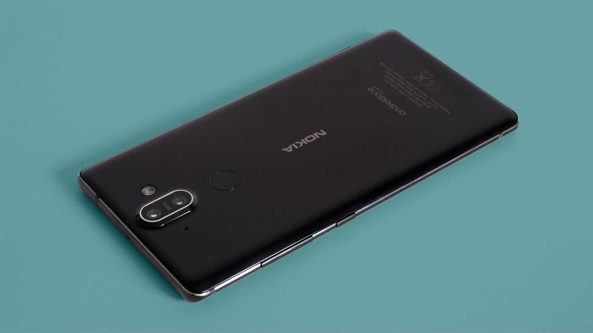
Design is a highlight. The Nokia 8 Sirocco has an impressive Gorilla Glass 5 and steel frame, with an eye-catching curved front. Few phones feel as expensive as this.
Not every part of the design is a hit, though. As the phone has a 16:9 screen rather than the now more popular 18:9 (or even 19:9) style, it already seems dated. There’s also no memory card slot or headphone jack, sure to grate with some of you.
128GB of storage should be enough for most, mind, and other extras include a rear fingerprint scanner, triple microphone array and wireless charging.
The Nokia 8 Sirocco performs well generally, but does not have a cutting-edge chipset. It uses 2016/2017’s Snapdragon 835 CPU instead of the newer Snapdragon 845. This may be fast enough for just about any purpose, but cheaper or similarly priced phones have the newer version, including the OnePlus 6 and LG G7 ThinQ.

Its camera also struggles a little against the best around. The Nokia 8 Sirocco has a high-quality 12MP main sensor with a 13MP secondary one for 2x zoom images.
This combination opens up more compositional scope, but doesn’t offer the best low-light or HDR images among top-end phones.
It’s all powered by a 3,260mAh battery with fast charging. While not as large as that of the Nokia 7 Plus, it’ll see you through a day’s use easily, with some charge left for the second day if you can’t plug-in overnight.
The Nokia 8 Sirocco doesn’t sink rivals with its hardware, and does not offer the value of the Nokia 7 Plus. In some ways it lags behind that cheaper phone.
A lot of the appeal therefore boils down to the pretty design.

Design
- Curved front and steel frame give the phone a high-end look and feel
- Seems a bit squat and a bit heavy
Next to every other top smartphone of 2018, the Nokia 8 Sirocco looks oddly squat. Perhaps our eyes have seen one too many 18:9 screen phones, but this model’s combination of a 16:9 screen and fairly small borders above and below the display leaves that impression.
That was the Nokia 8 Sirocco first impression vol. 1. Things change once you pick the phone up and start using it. Few seem as conspicuously made of glass and metal as this.
The Nokia 8 Sirocco is extremely dense, its glass rear feels much more like glass than many other phones with a glass and metal design. Some you could almost mistake for plastic. Not here.
A band of metal that sits around all its sides is stainless steel rather than aluminum, too. Steel is harder. And while you might not be able to tell this with your hands, the Nokia 8 Sirocco immediately feels like a luxury phone.

However, it’s also a little severe. Most current designs try to smooth out the seams between their metal and glass parts, but the beveled steel here sticks out a little.
We wouldn’t call these edges sharp, but they are far more noticeable than most. It’s Nokia saying “we spent a lot on this stuff, you’re sure as hell going to notice it, okay?”.
Steel also makes the Nokia 8 Sirocco a little heavy for its size. It’s 177g, the same as the OnePlus 6, which has a larger screen and is a good 15mm taller. It’s not truly heavy, though, so this ends up adding to the sense of high build quality rather than seeming like a burden.

There’s a glass fingerprint scanner on the back too. It could be contoured a little more and doesn’t let you bring up the apps or notification screens with a gesture, but is fast and reliable.
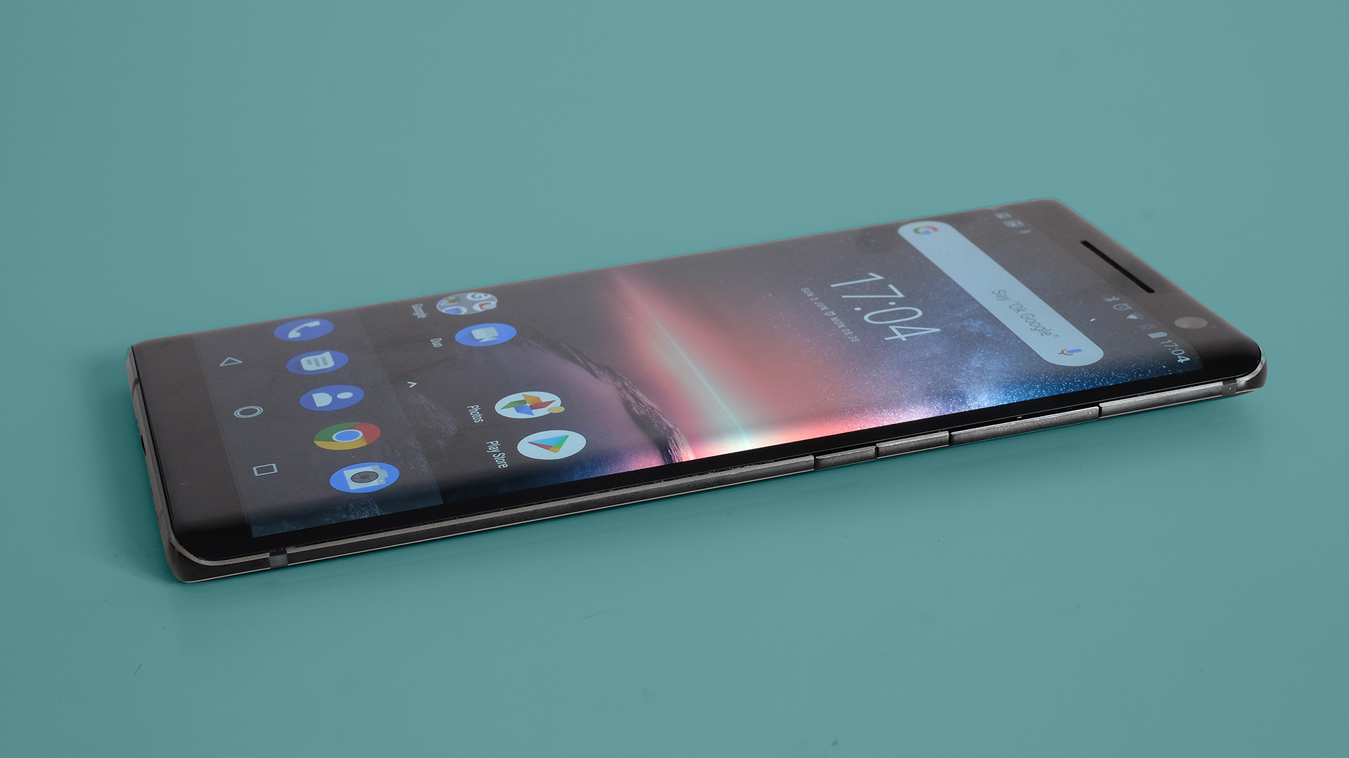
The Nokia 8 Sirocco’s curved front is probably the most alluring part of the design. Similar to the Samsung Galaxy S9, it gives the phone front-on contours that simply look great.
Both panes of glass use Gorilla Glass 5, which as of mid-2018 is the latest version. It’s a highly scratch-proof and shatter-resistant glass only normally used by expensive devices. Like this one.
Screen
- 5.5-inch screen with 534 pixels per inch
- P-OLED panel suffers from color shift
- Lacks customization options
The 5.5-inch 1440 x 2560 P-OLED screen is a bad match for these curves, though. Samsung’s latest OLED panels are just about perfect: great contrast, viewing angles, color and brightness.
We get an LG P-OLED panel instead here, as used in the Google Pixel 2 XL. Color shift is the issue.
At an angle, the Nokia 8 Sirocco screen’s whites turn blue. When you look at a website or, say, the white settings menu, the curved edges of the display appear blue rather than white.

We assume Nokia knows about this. The effect is pretty obvious. It’s likely a suitable Samsung OLED panel was not available, or not cost-effective, but this color shift spoils the screen's impact.
The Nokia 8 Sirocco’s screen is bright and color-saturated, but it also lacks the customization options common among high-end phones. You can’t tame the ultra-saturated reds, which make the YouTube logo look very bright.
For a pro-style calibration, the display also needs to be slightly warmer. Again, you can’t do this.
That said, we’re fairly happy with how the Nokia 8 Sirocco’s screen looks aside from the blue border issue. Oh, and that the 16:9 aspect will look more dated by the week.
Andrew is a freelance journalist and has been writing and editing for some of the UK's top tech and lifestyle publications including TrustedReviews, Stuff, T3, TechRadar, Lifehacker and others.

