TechRadar Verdict
While Apple's brighter and bolder 15-inch MacBook brings immediate benefits the second you turn it on, it has its quirks and feels like a laptop that will become much more useful down the line.
Pros
- +
Luminous display
- +
Innovative Touch Bar
- +
Four USB-C ports
- +
Loud and clear speakers
Cons
- -
Touch Bar not fully-realized
- -
Trackpad feels too big
Why you can trust TechRadar
The new MacBook Pro (late 2020) is powered by Apple's first laptop processor, the M1. Benchmarks show that it makes a wonderful mobile workstation, a jaw dropping music production notebook and a groundbreaking video editing laptop.
The 15-inch MacBook Pro has always been the go-to computer for creatives and media enthusiasts. Need quad-core processors, dedicated graphics and a big old screen that's only slightly smaller than your monitor? If so, Apple’s 13-inch laptops probably haven’t cut the proverbial mustard for you in the past.
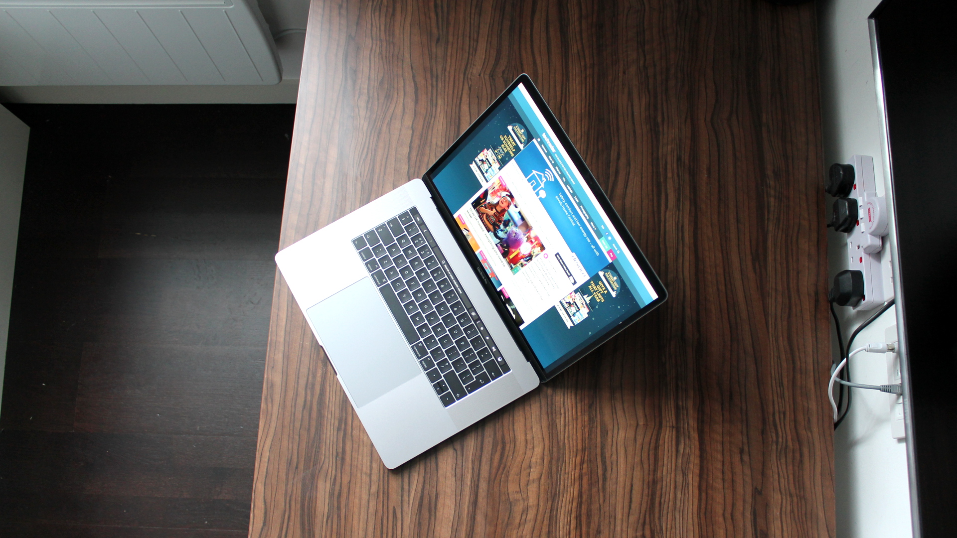
Like the new 13-inch MacBook Pro, Apple has given its larger model a complete redesign. Not only has the company shaved thickness from the last-generation Pro’s sizable chassis, this new model also gets a fancy tactile Touch Bar strip in place of the function key row.
It also benefits from an upgrade to Intel’s sixth-generation Skylake processors, versatile USB-C ports with speedy transfer rates, a brighter and more color saturated display, faster graphics and booming speakers.
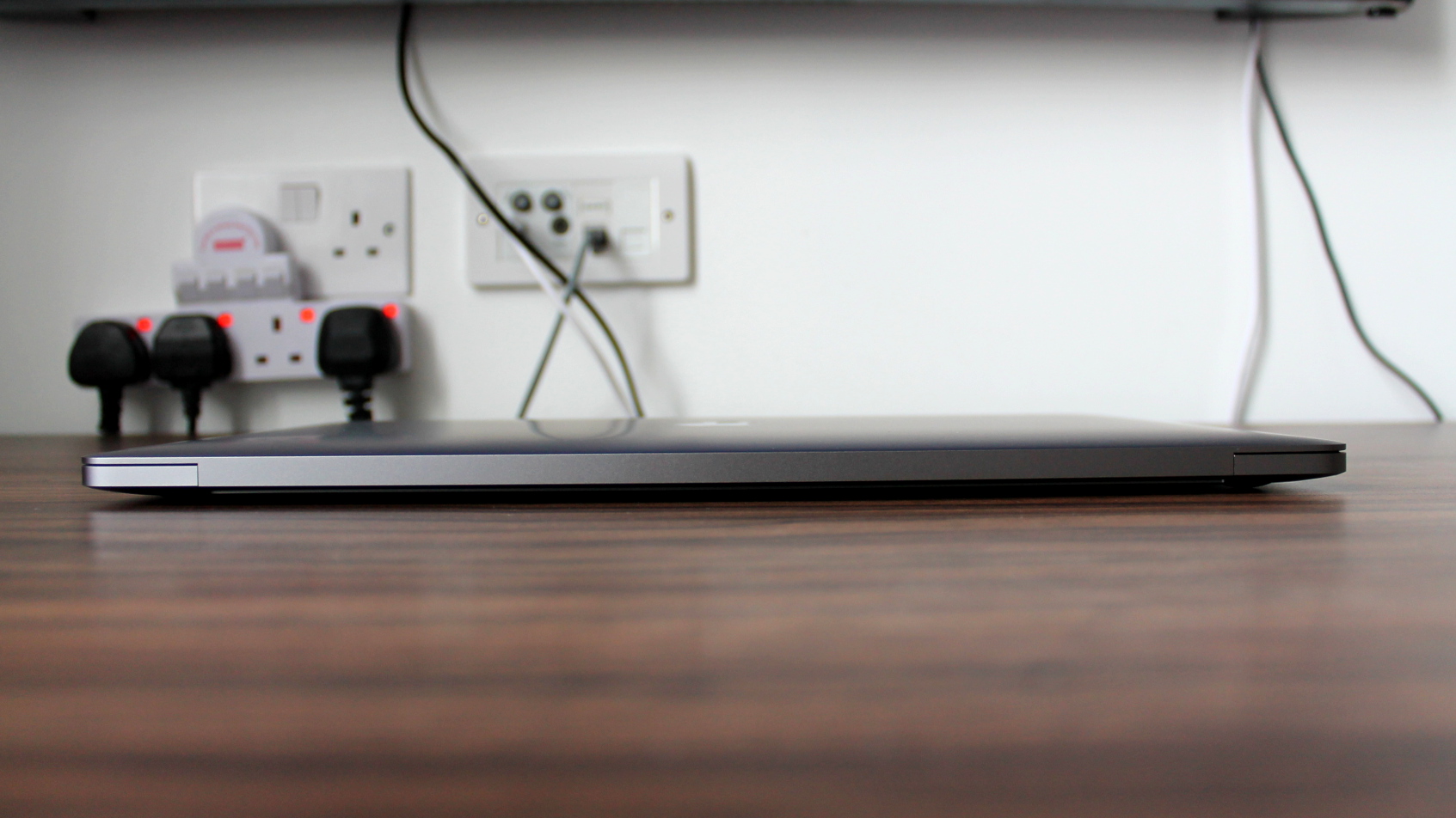
However, as Apple aficionados are used to by now (and not just in the computing space either), when the Cupertino company giveth, it usually taketh something away. Traditional USB ports? A built-in SD card reader? A glowing logo on your lid? That startup chime that wakes everybody around you when you thought you'd muted your Mac? For better or worse, they're all gone.
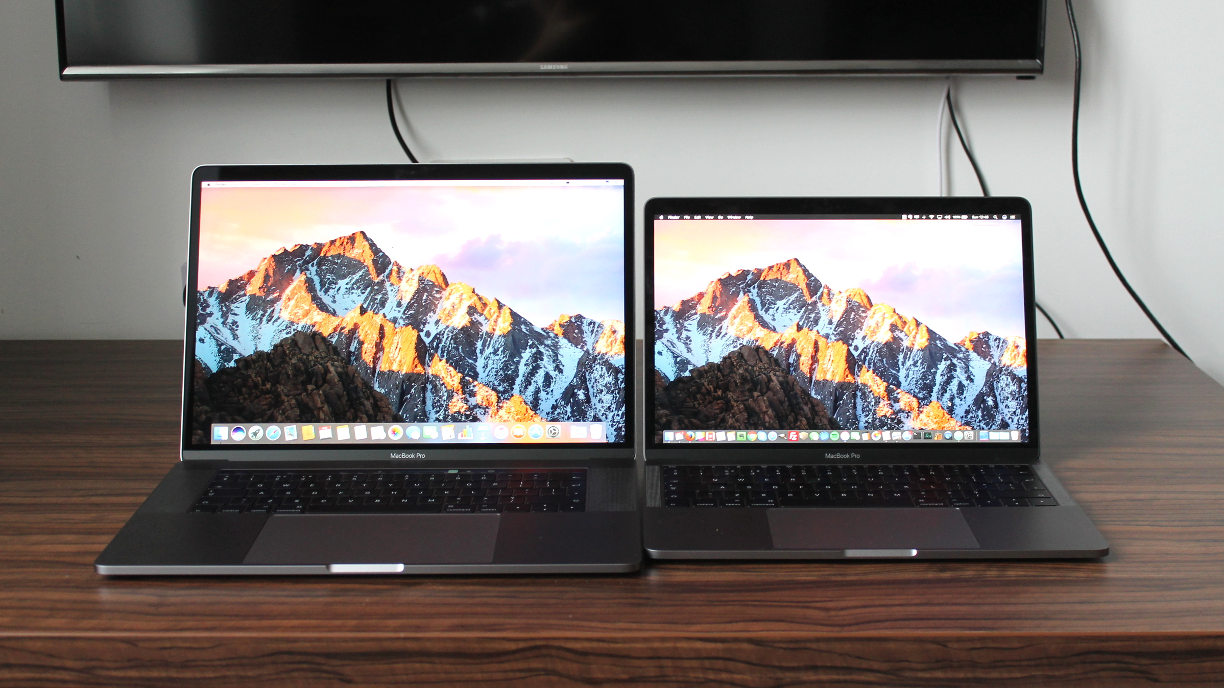
CPU: 2.7GHz quad-core Intel Core i7 (up to 3.1GHz)
Graphics: Radeon Pro 455
RAM: 16GB LPDDR3 (2,133MHz)
Screen: 15.4-inch Retina (2,880 x 1,800) LED-backlit IPS
Storage: 512GB PCIe SSD
Ports: Four Thunderbolt (USB-C) ports with support for charging, DisplayPort, Thunderbolt (up to 40Gbps), USB 3.1 Gen 2 (up to 10Gbps)
Connectivity: 802.11ac Wi-Fi; Bluetooth 4.2
Camera: 720p Facetime HD webcam
Weight: 1.83kg (4.02 pounds)
Size: 34.93 x 24.07 x 1.55cm (13.75 x 9.48 x 0.61 inches; W x D x H)
So, who might want to buy this new 15-inch MacBook Pro? Anybody considering an upgrade from a MacBook Air, or the older 13-inch MacBook Pro to the equivalent model, perhaps has an easier decision to make than more cautious last-generation 15-inch MacBook Pro owners looking to make the leap.
In addition to the disruption posed by a move to USB-C, the 15-inch MacBook Pro remains the most expensive laptop in Apple’s line-up. It now starts at £2,349 ($2,249 or AUS$3,140), rising to £2,699 ($2,599 or AUS$3,481) for the high-end version.
Both models can be further configured with faster processors, additional memory and beefier graphics cards for extra cost.
Dazzling display
One of the brightest points about the new MacBook Pro (quite literally) is its new Retina display. Rated at 500 nits brightness, it’s one of the most luminous and color-saturated displays we’ve seen on a laptop, and the best we’ve seen since first laying eyes on the Dell XPS 15.
With a pixel-resolution of 2,880 x 1,800, it's not the most pixel-packed display out there. In fact, the resolution is the same as the previous 15-inch MacBook Pro.
However, like Apple's Retina 5K iMac, it has received a vibrancy boost and now supports the P3 color space. That's a boon for photographers who shoot in RAW format and need to view files shot in the widest possible color gamut available.
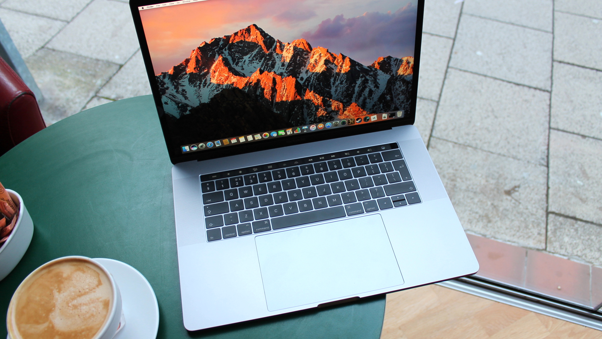
In one sense, that means that unless you're a pro who shoots on the regular, you don't need the new display in your life. But, even so, there is a tangible difference between the screen quality on this year's 15-inch MacBook and the last-gen model.
It's simply brighter, more color saturated and pleasing to the eyes. Even wallpapers take on a new vibrancy, and once you've clasped eyes on it, it's hard to go back.
Magic touch
From Retina displays to Force Touch trackpads, new features provide talking points for successive generations of MacBooks. This time around, it’s the Touch Bar – an OLED strip located above the keyboard, which provides a long, thin touchscreen used for tactile input. Handily, you can log into the MacBook using TouchID and your fingerprint much like on an iPhone. It can also be used to pay for goods and services on Apple Pay-enabled websites.
Opting for a strip of glass, rather than a full touchscreen, is a move that makes sense for several reasons. While laptop displays used as touchscreens can prove practical on machines running Windows 10, which has been sculpted into a touch-friendly operating system since Windows 8, macOS is far from optimized for touch input.
Moreover, pawing at the screen leaves fingerprints, and doing so for long periods of time makes your arm ache. Interacting with the Touch Bar, on the other hand, can be done while your hands are closer to their natural resting position on the keyboard.
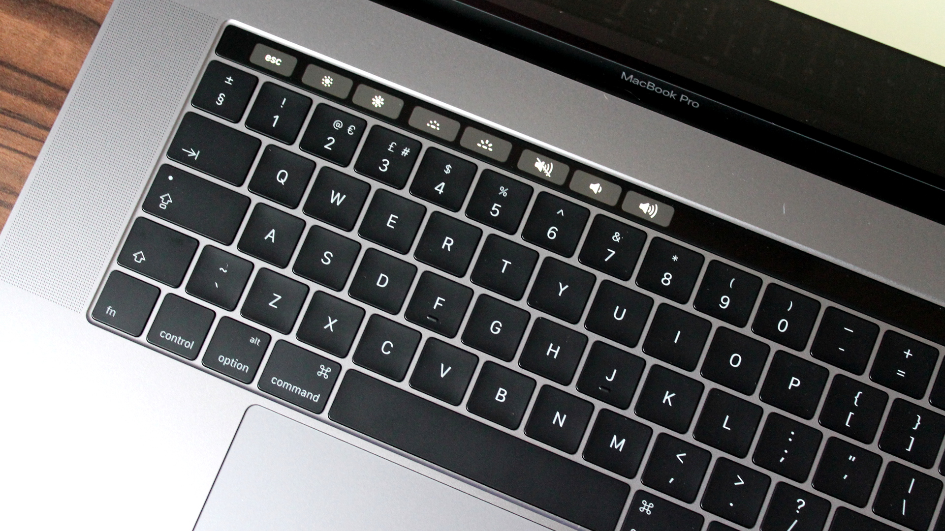
The obvious limitation here is that, while sufficiently long enough to cram in various icons and buttons, which change depending on the app that’s open on the screen, the Touch Bar lacks vertical space.
As a result, even with the ability to interact with all 10 fingers, interaction is limited to tapping and dragging in the space the size of a tape measure.
There is, at least, a good level of customization when it comes to which icons are displayed on the Touch Bar. By delving into System Preferences, you can drag and drop system functions onto the bar in any order required for fast access.
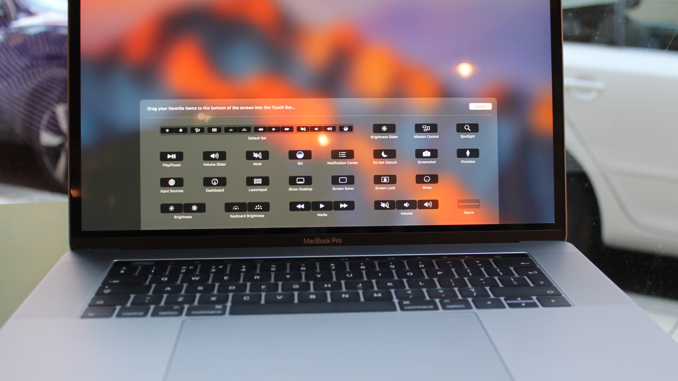
Its usefulness is going to be entirely dependent on the creativity of developers who can maximize the use of space. After turning the MacBook on, the Touch Bar displays system icons such as brightness, volume and an escape key.
Loading up an app shifts those icons to the right-hand side of the Touch Bar, making room for contextual commands specific to the app you’re currently using.
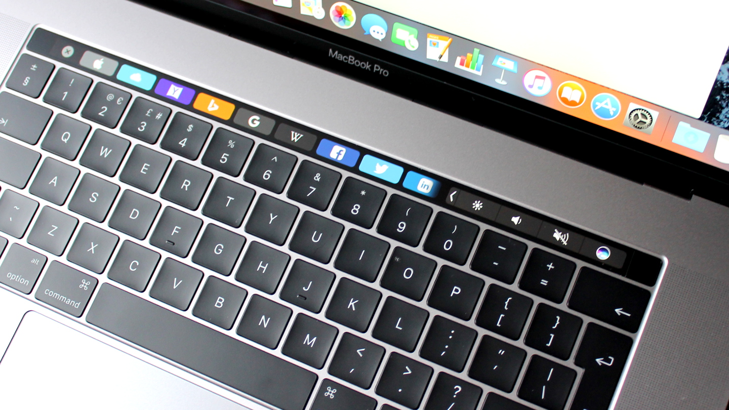
In Safari, for example, a row of bookmark icons appears, allowing you to load various websites with a tap. Tapping an arrow on the right-hand side brings the system icons back.
Touch Bar support is mainly limited to Apple’s own, rather than third-party apps.
Beyond Apple's library, apps that currently support the Touch Bar include djay Pro, Pixelmator, 1Password and OmniGraffle. Those with support in the works include Photoshop (by the end of the year), Microsoft Office/Outlook/Skype, Affinity Designer, Day One, Coda and Blogo.
Keyboard and trackpad
Both the new 13-inch and 15-inch MacBook Pro models use Apple's second-generation Butterfly key switches. Apple claims that it's four times more stable than traditional scissor mechanisms, and prolonged typing sessions certainly prove that to be true.
The new keys have a larger surface area than those on the previous generation MacBook Pro and Air models, and at 0.5mm key travel, are much reduced in comparison. The new Butterfly switch makes for a curiously satisfying typing experience, with each key eliciting a sharp "snap" under the fingers.
They do not, however, aid typing speed. We found ourselves typing slower overall on the new keyboard than the one on Apple's 13-inch MacBook Air, which remains the gold standard for typing, thanks to its deeper travel keys.
The 15-inch MacBook's keyboard is superior to the one found on the 12-inch MacBook, which possesses first-generation Butterfly keys and lacks the satisfying snappiness of the larger model.
The biggest problem the 15-inch model faces, which was curiously absent on the 13-inch model, is that its massive trackpad causes the cursor to glide across the screen when you're typing more often than we would like. On the 13-inch MacBook, palm rejection kicks in effectively, but the sheer size of the trackpad on its larger cousin means that we often found ourselves having to manually position the cursor back into the sentence we were typing.
On the plus side, the trackpad's roomy surface area makes it perfect for executing swipes and gestures to navigate around macOS.
- 1
- 2
Current page: Introduction, design and Touch Bar
Next Page Specifications, performance and verdict