Why you can trust TechRadar
The Nexus Player's design acts as an almost faux-Rorschach test because the design is painfully simple. At a cylindrical 120 x 120 x 20 mm it most resembles a hockey puck, flat on the top and stockey in the middle. But you wouldn't be far off if you said it looks like a shrunk-down roomba, miniature frisbee or Mrs. Fields cookie. What's important is the fact that it sits flat on your shelf.
If displaying the discus isn't your bag, you can hide it behind your media center without worry. The remote connects via Bluetooth instead of infrared sensor, which means it won't need direct line of sight to transmit commands to the main box.
Flip it over and you'll find a sync button, power LED indicator and the three ports - power, micro-USB and HDMI. Missing, you might notice, is an ethernet port. Unfortunately, without one, connection speeds can be sporadic. One minute you'll be watching your favorite cooking show, the next you'll be caught in a never-ending buffer screen. Trust me. It happens. It does however support 802.11ac, so at least you're working with the latest radio inside.
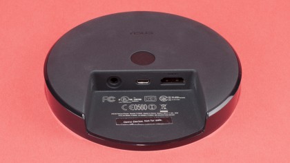
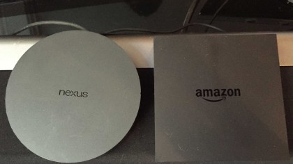
Also MIA are an optical audio-out port and a second HDMI port for pass through functionality. Optical audio-out isn't something you'd see on any one of the streaming sticks, but because both Amazon Fire TV and Apple TV support it, it would've been nice to see the Nexus Player follow suit. The same could be said for HDMI pass through; it's not necessary, but its addition could've helped secure the Nexus Player a spot on my media shelf.
Interface
The interface is actually the Player's shining jewel. It's clean, well-designed and accessible.
It achieves this by dividing content into four rows - recommended video, installed apps, games and settings. Each icon has large, easy-to-read font without cluttering the screen with too much to see. Recommended content leverages your past viewing habits to create a personalised playlist from your installed apps and videos it thinks you'll like from YouTube and the Google Play Store. It can be hit or miss, but when it's hit you'll be glad it's there.
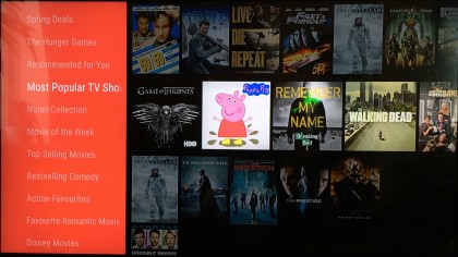
If you can't find what you're looking for there's always the safety net of the voice search button to fall back on and, unlike the Fire TV, it works 99% of the time. The only problem here is that search, for now, is limited to the Google Play Store and YouTube. That means if you search "Frank" a film you know is on Netflix, you won't see that option appear in the results. Searching a film, though, brings up pertinent information like its cast and similar films. These too look polished. The art here looks marvelous, and almost like it's been hand-selected for large screens.
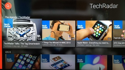
Transitioning from one app or video to another is lightning quick except for the times when it fails completely. That sounds contradictory but the system either works or fails miserably without any rhyme or reason. Some early adopters have even claimed Netflix is wholly broken, as they're unable to login or get past the initial credential screen. While I didn't run into this problem myself, Netflix did crash once or twice and encountered an endless buffering screen a handful of times.
Remote and controller
Asus and Google could've easily saved some money by ditching a remote. Thankfully, they chose not to.
The remote, while a bit plastic-y and light, greatly improves the usability of the system. And, like the interface itself, the remote makes more sense after you use it for a few hours.
You'll find three control buttons beneath the circular directional pad: back, home and play/pause. In practice each button is useful and fairly self-explanatory. At the top of the remote is the voice search button, which we've already covered in detail. It's a bit light and therefore may feel a bit flimsy, but it's functional and aesthetically pleasing.
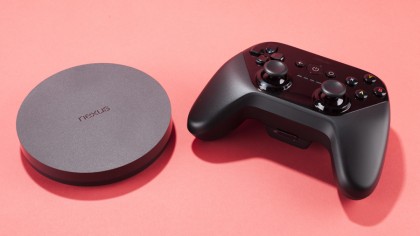
The controller, as stated on the first page, looks and feels like an Xbox 360 controller, despite having in-line control sticks. Buttons have a great tactile feel and the d-pad, while a little mushy, is serviceable. Even the triggers feel good.
It's weightier than it looks, and that's a very good thing. It feels well-built, like you could toss it around a bit without fear of it snapping in two. The only complaint I have is that there's nothing really to use it with yet; the only games I found worth their cost were two Telltale games, The Walking Dead and The Wolf Among Us, Real Boxing and Asphalt 8, a staple on Android.
Good games, at this point at least, remain few and far between.
