TechRadar Verdict
The Moto E5 Plus scores good marks for performance and battery, but limited purchasing options pit it against Motorola’s other budget contenders. Despite having a bigger screen, it lacks the increased resolution, upgraded processing power, and premium-feeling design of the Moto G6, and those prevent it from being the budget champion it was bred to be.
Pros
- +
Premium look at a glance
- +
Adequate performance
- +
A big, big battery
Cons
- -
Feels cheaper than it looks
- -
Awkward market positioning
- -
Slow loading
- -
Non-US model downgraded
Why you can trust TechRadar
The Moto E5 Plus draws inspiration from costlier flagship phones with a large 18:9 screen and massive battery at an affordable price, but it also draws too much influence from Motorola’s other big budget challenger, the Moto G6.
It’s an Android Oreo phone with a hefty 5,000mAh battery, an expansive 6-inch display, and an upgraded octa-core processor that’s fast enough for most tasks. All that combined with a low price point makes it a fair option for almost anyone looking for a cheap phone.
Here’s the rub: right now, the Moto E5 Plus is available in the US through Sprint and Cricket Wireless. But, things immediately get complicated, as Sprint prices the phone at $288, while Cricket prices it at $179. In the UK, the Moto E5 Plus isn’t available yet, but will be coming with a chipset that’s slower than the the US model. Confusing? We think so, too.
So, for now, US consumers have the option of the Moto E5 Plus as a big, budget smartphone with credentials for TV and movie viewing. But, there are other more compelling Moto phones, leaving the Moto E5 Plus in an awkward place.

Design
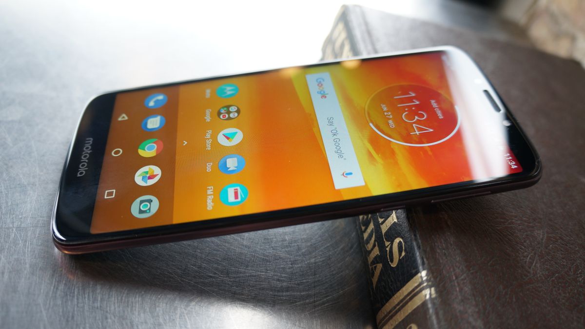
The Moto E5 Plus has hints of a premium, almost flagship smartphone. The display takes up a substantial portion of the phone, with thin, though still present, bezels on the sides.
At 161.9 x 75.3 x 9.35mm, it’s a large phone, but not overly so. However, at 200g, it has considerable heft. But, we think that’s likely because of the big battery it’s packing.
The Moto E5 Plus is built to have the look of a metal frame and glass back, but it instead uses plastics and polymers that don’t feel quite as premium. On the plus side, the plastic back panel is less likely to shatter than a real glass one. It also has Motorola’s water-repellent coating, for protection from splashes and light rain, and Gorilla Glass 3 guarding the front against scratches and cracking.
For all the flagship look, that appearance quickly vanishes. The rear of the phone is one of the strongest smudge magnets we’ve ever come across. We tried wiping it on our shirt to see if we could get it looking pretty again for a second, but that didn’t work, and would have been re-smudged in a matter of moments anyway. Dust seems attracted to it as well. The rear also houses a fingerprint scanner and what at first appears to be a dual-sensor camera, but is awkwardly just one camera and a laser auto-focus sensor.
The bottom of the phone houses only a micro-USB port and a microphone, while the top has a second microphone and a 3.5mm headphone jack. Wondering where the speakers are? The main earpiece speaker also serves as the primary loudspeaker for watching or listening to media, and it does a good job putting out sound while also being hard to accidentally cover up with your palm while listening.

Display
The display is the main selling point for the Moto E5 Plus, because it packs a big one in for a low price. It has a 6-inch IPS LCD display with an HD+ (720p) resolution. For a second, we were almost fooled into thinking it had an AMOLED display, because at low brightness settings, it manages to stay fairly black when Motorola’s ambient display comes on. But, with the brightness set to a more reasonable level, it was clearly an LCD screen.
While the screen is plenty big for media viewing, it’s not perfect. For an IPS display, the viewing angles aren’t the best. In landscape, viewing from the sides quickly loses brightness. At HD+, it doesn’t always appear the sharpest either.
The display’s default color mode, “neutral,” also feels a bit cold and overly blue. Switching to the warm color mode felt like it dirtied the image, but eventually grew on us.
Motorola has a screen autowake function that’s equal parts useful and annoying. Useful, because it doesn’t take much effort to have the screen show you the time or date at a glance. Annoying, because it doesn’t take much to accidentally make the screen light up. Just leaving it sitting on a small table and bumping the table will bring it up. Thankfully, you can turn this off in the Moto features menu.

What it's like to use
With a Snapdragon 435 octa-core chipset and 3GB of RAM running Android 8.0, the Moto E5 Plus isn’t challenging any high-end phones, and falls short of some mid-range phones. That said, it performs adequately enough for most people looking for a big budget phone.
From browsing to launching apps, it was quick and smooth. We didn’t notice many hiccups with simple tasks. We ran Geekbench 4, and it earned a multi-core score of 2,319, which puts it on par with last year’s Moto G5S, but it’s still well behind the new Moto G6 and Moto G5S Plus.
One area the performance seems to really suffer those is in the speed of the storage. The model we tested came with 32GB of storage, expandable via microSD card up to 128GB. Loading up large games like PUBG Mobile or Harry Potter Hogwarts Mystery was slow. And, the screen would annoyingly timeout while loading, which in turn cancelled the loading.
Opening up a large movie file is similarly slow. Fortunately, there isn’t too much else slow. Most of the gaming experience is even fairly smooth, though we have to keep PUBG on the lowest settings and aren’t very satisfied with the low resolution.
One thing that helps the Moto E5 Plus run as smoothly as it does on its limited hardware is the particularly clean version of Android it’s running. There’s very little software bloat, and no crazy UI changes.
The only serious extras thrown into the software are Motorola’s gestures, such as the chop to turn on the flashlight, or the wrist twist which activates the camera and switches between front and rear cameras. And, these fan-favorite gestures work smooth as well.
The fingerprint scanner is even snappy, though not as quick as higher-end device’s scanners, and a bit too easy to only partially touch on the first try.
Over the last several years, Mark has been tasked as a writer, an editor, and a manager, interacting with published content from all angles. He is intimately familiar with the editorial process from the inception of an article idea, through the iterative process, past publishing, and down the road into performance analysis.
