TechRadar Verdict
A shiny behind, svelte design, modern chipset and an interesting array of specifications mean the Moto E6 Plus makes a great first impression. But with frequent bugs, a passable cameras and a lack of NFC, the picture isn't completely rosy.
Pros
- +
Reliable battery life
- +
Solid design
- +
Quick fingerprint scanner
Cons
- -
No NFC
- -
Stutters and crashes
- -
Only okay cameras
Why you can trust TechRadar
It isn’t too long since Motorola was the king of budget smartphones - the reign of the Moto G line was a long one. But things have changed since 2013.
In 2019, the competition at the bottom of the market is fiercer than ever, with a slew of entrants from Asia making a host of compelling options available to buyers.
A storied name, or a compelling list of specifications, is no longer enough - consumers want the feel of their device to be the same as something at the high end. This means that hardware and software need to blend together in just the right way, which is no easy feat - even when money is no issue.
Motorola has managed to carve out and hold a position in the increasingly premium £200/$250/AU$350-ish segment of the market, but has yet to find significant success at lower price points.
With this in mind, does the Moto E6 Plus do enough to beat off the competition and earn our recommendation? Read on to find out.
Moto E6 Plus price and availability
- Out now in the UK
- Costs £99.99 (roughly $130 / AU$190)
- US and Australian availability TBC
The Moto E6 Plus is available in the UK from £99.99 (around $130 / AU$190) and is also being made available in Europe.
Availability in the US and Australia is yet to be confirmed. Just one variant (32GB / 2GB) is available in the UK, with silver and red color options offered. However, some regions will be getting models with 4GB of RAM and 64GB of storage.
Key features
- Dual-lens camera
- Reasonable, splash-resistant design
- A fingerprint scanner but no NFC
Typically, an asking price of £99.99 means certain trade-offs have been made, that certain bells and whistles have been cut out. The challenge for a manufacturer is to cut enough to remain profitable per unit, but not so much that the user experience is hampered.
Motorola, with the E6 Plus, is certainly attempting to show that it is dedicated to providing something of a luxury experience - at least when compared to rivals.
While the back plate is plastic, this is a mirror-finish, smooth plastic which feels pleasant in the hand. A case is provided, and it is possible to swap the back plate out for other color variants should you so wish. Each unit is also treated with a splash-resistant coating, meaning that they should survive an impromptu rain shower.
Beyond the shiny back, there is also the presence of a secondary camera. The primary unit is 13MP and has an aperture of f/2.0, which is much larger than is typically found at this price point. It is flanked by a 2MP ‘depth sensor’, which is essentially used to capture more accurate portrait shots.
On paper it's a decent setup for the money - head to the camera section of this review to see how successful it is.
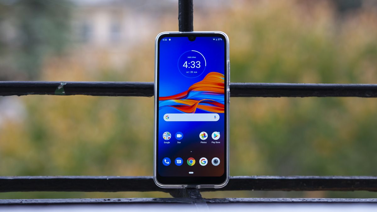
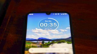
On the design front, Motorola goes to great pains to emphasize the ‘ultra-wide’ display on the front of the Moto E6 Plus. It has a small notch hiding the selfie camera, but despite this the panel is certainly expansive, reaching 6.1 inches on the diagonal.
It is also worth mentioning the inclusion of a fingerprint scanner, which is not always a given under £100, but certainly always welcome. Sadly, the omission of NFC means that you can't make contactless payments.

Design
- Swappable back and battery
- Feels durable
As mentioned, the Moto E6 Plus goes a little further than most budget handsets in its quest to impress on the design front.
The shiny plastic rear is a case in point. However, although it is eye-catching, it is also a magnet for finger grease. Five minutes in the naked hand leaves it looking as though it has had a bath in a deep-fryer - as such we wholeheartedly recommend slapping on the included case.
Interestingly, as well as the rear plate of the handset being swappable, it also hides the battery, which is removable. As well as being a blast from the past, this makes ‘hot-swapping’ of charged spare batteries possible, a real boon for frequent travelers.
This phone also takes microSIM cards, not nanoSIM cards - though luckily there is an adapter in the box. This might be a tactic to attract users from feature phones.
Regardless, the whole package feels light and well assembled, our review unit displayed only a little flex under pressure, which coupled with the removable back plate also speaks to the potential durability of this design.
The front hosts the 6.1-inch HD ‘ultra-wide’ display and the 8MP selfie snapper, the right houses the volume rocker and power key, the bottom holds the mono speaker and power port, and the rear hosts the Moto logo, the fingerprint scanner and the camera housing.
As an overall package, it certainly seems as though the Moto E6 Plus should cost more than its actual price. It feels well built (though no more so than competitors such as the Xiaomi Redmi 7A) and is pleasant to use either one or two handed. This is a phone which most people will find very comfortable to use on a daily basis.

Screen
- 6.1-inch 720 x 1560 LCD screen
- Resolution is fine at this size
- Colors can be a bit blue
No matter how comfortable it is to hold, every smartphone lives and dies by the prowess of its screen.
The panel on the Moto E6 Plus is 6.1 inches across, and is roughly the standard resolution for the price point, that being 720 x 1560.
Focusing purely on the resolution, this may seem like a compromise, and on a larger panel remaining at 720p certainly would be. At its relatively svelte size however, pixelation is just not an issue. Only those holding the device an inch from their nose will find cause to complain.
The situation isn’t quite so rosy when it comes to the issue of color reproduction, however. Typical to those displays using LCD tech, this screen tends more to the blue than we would like.
This is unfortunate given that there is no screen calibration tech inbuilt, as other devices at this price point have sometimes included. A slightly hacky workaround is to enable always-on ‘Night mode’, however this is far from an ideal solution.
Brightness too is okay at best, with the panel not getting so bright that it can compete with the sun, nor so dim that it can be comfortably used in bed at night.
One real positive however is the itty-bitty notch at the top, which is so small that it is really quite difficult to become annoyed about. In person it is even smaller than in photos, so only the most committed of notch-phobes need worry.
The panel on the Moto E6 Plus isn’t the best available at the price point, and yet they are often so similar that it is difficult to meaningfully tell them apart. Suffice it to say, that it never gets in the way of enjoying the device, and this, for the price point, is a significant achievement in itself.
Sean is a Scottish technology journalist who's written for the likes of T3, Trusted Reviews, TechAdvisor and Expert Reviews.
