TechRadar Verdict
The Moto G6 Play is the most basic model in the G6 range but still has plenty going for it, including a long-lasting battery and a decent screen. If you're on a tight budget it's easy to recommend.
Pros
- +
Good battery life
- +
Surprisingly good screen
- +
Great value
Cons
- -
Camera a touch slow
- -
Mediocre night photos
- -
Scrolling software bug
Why you can trust TechRadar
The Moto G6 Play is a cheaper alternative to the Moto G6 and Moto G6 Plus. It trades away advanced features like 1080p resolution and a glass back to knock the SIM-free price down to a level budget buyers will be more comfortable with.
What do you lose? The Motorola Moto G6 Play doesn’t take great photos at night and the fingerprint scanner is slower than most. However, it’s still stunning value and is also one of the best-looking phones in this class.
Moto G6 Play price and availability
- Launch price: $199.99 (£179.99, AU$329)
- Current price: $189.99 (£159.99, AU$329)
- Release date: May 2018
The Moto G6 Play price was $199.99 (£179.99, AU$329) SIM-free at launch, making it one of the cheapest 18:9 screen phones you can buy.
It's only been a few months since its May 2018 arrival, but if you shop around you can find the Moto G6 Play a touch cheaper in the US and UK, with SIM free prices starting at $189.99 (£159.99).
Key features
- A big 4,000mAh battery
- 32GB of storage and a microSD card slot
- Fast charging
Weight: 175g
Dimensions: 154.4 x 72.2 x 9mm
OS: Android 8.0
Screen size: 5.7-inch
Resolution: 720 x 1440
CPU: Snapdragon 430
RAM: 3GB
Storage: 32GB
Battery: 4,000mAh
Rear camera: 13MP
Front camera: 8MP
There are two important areas to cover in the Moto G6 Play’s features. We need to check out what we miss buying this instead of a Moto G6, and appreciate the neat extras Motorola has managed to fit in at the price.
Let’s start with the parts that deserve some applause. The Moto G6 Play has 32GB of storage, which is excellent for the price. There’s a memory card slot if that’s not enough, but there’s plenty of room for some of your favorite games and thousands of photos.
Battery life is the real standout here, though. A 4,000mAh unit lets the Motorola Moto G6 Play plough on through a full day of intensive use, including, for example, an hour of YouTube streaming along with the usual messaging, browsing and camera use.
The Moto G6 Play is also one of the cheaper phones to have true fast charging. It’s a huge selling point if you want a low-maintenance phone. Its 13MP rear camera takes very pleasant shots in daylight too.

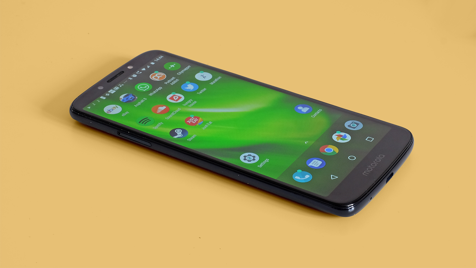
The missing parts? It has a micro USB charge socket rather than the newer USB-C and while the back looks a lot like that of the Moto G6, it is made of plastic rather than glass. It will pick up light scratches in your pocket quickly if you’re not careful. That said, Motorola includes a protective cover in the box.
Screen resolution takes a step down from the Moto G5’s 1080p too. It’s a 720 x 1440 screen, although we’re pleasantly surprised by how well it holds up next to its more expensive brothers.
The chipset is also the same as that of last year’s Moto G5, a Snapdragon 430. It’s not a super-powerful chipset but does get you more-than-acceptable performance in all areas, including high-end gaming.

Design
- A plastic back with reflective elements
- Surprisingly compact and easy to handle
This latest generation of Moto G phones marks the first time Motorola has used glass in this series. Well, aside from the front panel, which has been glass since the very first Moto G.
The Moto G6 and G6 Plus have curved Gorilla Glass rear panels. In the step down to the Moto G6 Play you lose this glass. It’s replaced by plastic. However, we’re pleasantly surprised by how close it looks and feels to the higher-end design. It’s just slightly tackier and doesn’t get that cool-to-the-touch feel of glass or aluminum.
There are a few important elements that make the plastic seem quite classy. First, the Moto G6 Play’s back doesn’t perceptibly flex under hand pressure. And it has the same reflective elements under the top layer as the more expensive models in this range.
When they catch the light, you’ll see a lovely S-shaped pattern of bright blue snaking across the rear. It looks great.

It’s also much subtler than it may appear in some of our photos, because we’ve deliberately used light to bring out the effect. Use it indoors and the Moto G6 Play just looks like a very dark blue glass-backed phone.
It is not all-plastic, either. The sides are aluminum, although they are coated to keep the finish consistent.
Size is one other important aspect you’ll need to get your head around. From the spec list alone, you might imagine the Moto G6 Play is huge. It has a 5.7-inch screen. However, it isn’t huge.
Width is the main element that determines how large a phone feels. And at 72.2mm, the Moto G6 Play is actually less wide than the 73mm Moto G5. It’s easy to handle, and while around a centimeter longer than the Moto G5, this is because of its significantly taller screen.
Classier than the Honor 7A and more affordable than the Honor 9 Lite, the Moto G6 Play is one of the most pleasant phones you’ll find at the price.

There are a few compromises, though. It doesn’t have the water repelling nano coating of the higher-end Moto G6 models and there’s a micro USB on the bottom, not a USB-C.
The difference? As we get fast charging anyway, it’s all about the ease of putting in the charge cable. USB-Cs can be jammed in either way, micro USBs can’t.
It has a, hallelujah, headphone jack, too. This sits on the top edge. All the Moto G6 models have one, though, so it’s not a reason to pick this cheaper model. Lower cost is.

There’s a fingerprint scanner on the back too. Motorola told us it lives here because it’s cheaper to implement a rear sensor than a front one, as seen in the Moto G6 and G6 Plus, especially in a phone with fairly narrow surrounds like this.
The scanner works fine but is far from the fastest around. Huawei’s P9 Lite is quicker, and the Motorola Moto G6 Play is a little more picky than most about your finger position. However, it’s worth highlighting what the real difference is.
You’re looking at a standby to home screen time of about one second (or slightly under), where the quickest take about 0.3 seconds. It’s slower, but still quicker than using a passcode.

Screen
- 5.7-inch 18:9 screen gives you lots of space
- 720 x 1440 resolution is lower than the rest of the G6 range
The screen shows off both the Moto G6 Play’s most important upgrade, and one of its notable budget compromises. It’s a 5.7-inch 18:9 aspect screen. Until late last year all affordable phones had less 'tall' 16:9 aspect screens. This phone proves such a display is no longer just for more expensive mobiles.
Benefits include more space for your fingers while playing console-style landscape orientation games and more lines of text on-screen when you read an article. You’ll notice this all the more when the on-screen keyboard pops-up. It takes a lot of a 16:9 phone’s screen. Not so with an 18:9’er like the Moto G6 Play.
Resolution is the compromise. 720 x 1440 pixels may sound like quite a lot still, but this is just a stretched take on 720p. The Moto G4 Play is last time we saw a Moto G phone with this class of resolution, back in 2016.
If you currently have a 1080p phone, you’ll probably notice the phone isn’t quite as sharp within the first few minutes. However, we were quite surprised by how quickly our eyes bedded in.

Android uses font aliasing (smoothing) these days, and there’s no 'screen door' effect, which is where pixel density is so low you can see the light gaps between pixels. The Motorola Moto G6 Play still has a 282ppi pixel density, after all, which isn’t bad.
Color performance is only very slightly worse than the Moto G6 too. Vivid reds look just a hint less saturated when using the Vivid mode.
You can choose between this mode and 'standard', which is intended to look more natural but also loses some richness. Color temperature is customizable too. There are warm, neutral and cool settings.
Use 'vivid' color and 'warm' temperature and the Moto G6 Play looks great, more inviting and luxuriant than the Honor 7A. This is a very nice screen for the price, although the higher pixel density of the Moto G6 does get you closer to the look of an ultra-high-end phone thanks to its smoother fonts.
Out on a sunny day, the Moto G6 Play holds up about as well as the Moto G6, with enough brightness to make the display contents comfortably visible.
Andrew is a freelance journalist and has been writing and editing for some of the UK's top tech and lifestyle publications including TrustedReviews, Stuff, T3, TechRadar, Lifehacker and others.
