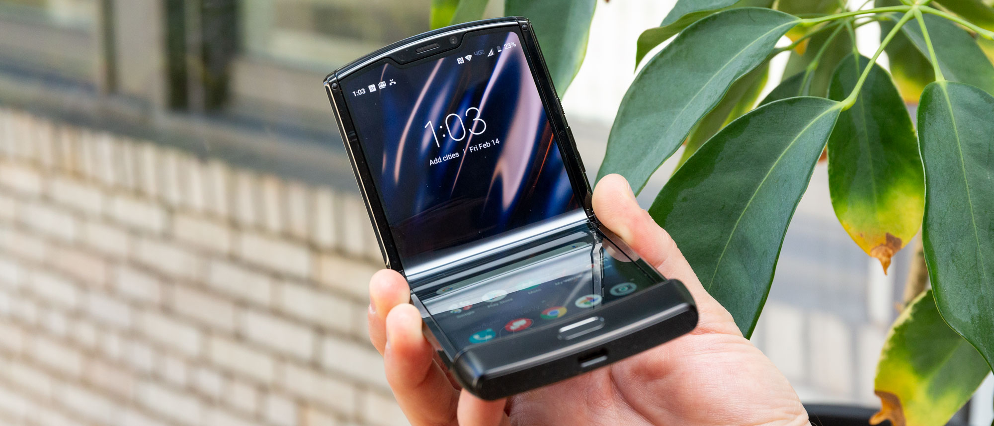
TechRadar Verdict
The Motorola Razr is an inspired effort to liberate the world from the boredom of the dominant glass rectangle phone design. While it does offer a foldable form factor that minimizes its footprint and allows it to fit in smaller pockets, and pulls off some awesome selfies, the phone cuts corners to achieve its diminutive size, with less power, onboard storage, and battery capacity. All told, this would be a serious challenger for the budget flagship crowd; however, it costs 50% more than the leading flagships, putting it beyond all but the most deep-pocketed early adopters.
Pros
- +
Working, eye-catching foldable design
- +
Neat front mini screen
- +
Disappears in pockets
Cons
- -
Far too expensive
- -
Poor battery and storage
- -
Middling camera setup
Why you can trust TechRadar
Two-Minute Review
The Motorola Razr is a great design concept, but its execution leaves several things to be desired. The ambition and potential are there - and perhaps it will be realized in a successor device – but for now, it’s tough to recommend the Razr at its current high price.
You can say this for the phone: both its perks and its drawbacks are extreme. On the plus side, it’s the first clamshell foldable to market, with an unprecedented format that halves the smartphone’s footprint and cashes in on nostalgia with a design that evokes the legendary original Razr V3, while unfolding to reveal a display the size of a modern smartphone’s.
But the drawbacks are equally apparent, with underwhelming specs and cameras, an older operating system (Android 9) out of the box, and questionable design choices that make the phone somewhat cumbersome to use.
Ergo, this Razr feels like a serious leap forward in phone design, but it treads water in terms of user experience – which would be fine if the phone was priced for the latter, but with a price tag that’s half as much again as that of a flagship phone ($1,500!), its cost is pegged to its novelty, and given the arrival of the slightly cheaper Samsung Galaxy Z Flip, that’s something it no longer has a monopoly on.
Given the Razr's release in early 2020, the clamshell foldable might see some discounts in the upcoming deals season leading up through Black Friday on November 27 and Cyber Monday after.
For the original model, it’s tough to recommend this Razr to folks who aren’t completely smitten by the physical flip phone flow. We’re looking forward to seeing a refined interface, display, and specs that match this phone’s design promises in a later phone – and while its successor, the Motorola Razr 2020, has design improvements, it doesn't innovate much and even packs the same display.
Something to important note in case you plan on popping your old nanoSIM card into this phone: the new Razr doesn’t have a SIM slot, instead relying on an eSIM which is eternally locked to Verizon. This also means that we weren’t able to use it as a primary phone during our short testing period, getting the usual influx of emails and texts from our contacts.
Price analysis
The Motorola Razr costs $1,499 (around £1,350, AU$2699, AED 5,999) and in the US it’ll be available exclusively through Verizon, which offers a $62.49/month payment plan for 24 months. It’ll cost you a lot more if you’re in the UK, where it’s exclusively through EE, and only on contract starting at £94/month with an upfront fee of £100 – all told, that’s £2,356 over 24 months, and that's only the cheapest option.
The Razr will retail for AU$2699 in Australia and go on sale February 24 from JB HiFi, as well as Telstra, according to News.com.AU. It is already on sale in the UAE for AED 5,999.
The Razr is now available to buy in the US and preorder in the UK, with an unannounced shipping date for the latter. It comes in an introductory ‘noir black’ color and, soon, a ‘blush gold’ hue.
While that price at least makes it more affordable than the Samsung Galaxy Fold ($1,980 / £1,800 / AU$2,999 / AED 6,999) with its more expansive display, the Razr is no longer even the cheapest clamshell. The Samsung Galaxy Z Flip has debuted at $1,380 / £1,300 / AED 5,499 (around AU$2,050), and packs a bit more than the Razr in nearly all categories.
Well aware of the Galaxy Fold’s display issues, Motorola has reaffirmed its confidence in the Razr’s screen in publicly-released statements. Further, it’s pledged that a ‘world-class service package’ will be available to every Razr buyer.
In the US that includes 24/7 chat support or 14-hour-per-day direct access to customer service, and should the device or display fail, Motorola guarantees 24-hour turnaround to exchange it. Should defects occur during normal use, Motorola will repair or replace the device free of charge. For anything outside the warranty – which lasts one year in the US – the device's display can be swapped out for $299.
Non-US service plans will be announced later.
Design
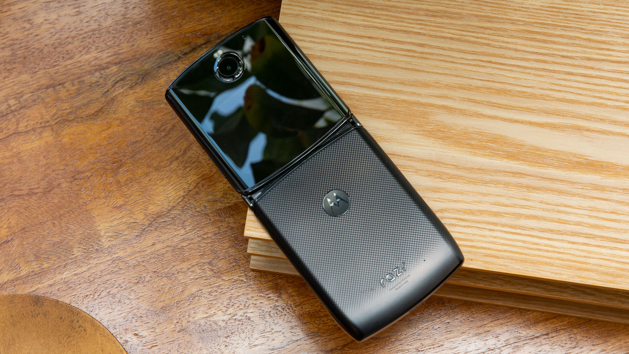
The Motorola Razr’s design is a mostly great execution of an idea that’s so ludicrous it’s either laughable or genius: bring back flip phones for the smartphone era. Of course, this was shrewdly pitched as an homage to the Motorola Razr v3, one of the most instantly-recognizable phone designs ever.
The result is a foldable that bears a strong resemblance to its famous predecessor, retaining its iconic flip-open-and-closed mechanics while allowing for an interior display as big as that on most flagship phones. When closed, it’s a thick sandwich, but with a footprint half the size of most handsets.
Design-wise, it’s a success… mostly. The hinge works wonderfully, which is welcome to hear after the only other foldable released to most world markets, the Samsung Galaxy Fold, ran into issues with its display and concerns over its durability.
When we first saw the Razr back in November 2019, the screen left a gap over the hinge when it unfolded, but it’s seemingly been refined to make the screen sink inward. There’s still a concern over whether dirt or particles will fall into the phone and muck up the gears. We haven’t noticed this in our short review period, but we’ll stay vigilant.
But the big concern here is the display: in the week or so that we’ve had the device it’s started to make audible creaking noises while bending inward. There aren’t any creases yet (more on that below), but the sound is disquieting.
Another annoyance is actually flipping the phone open from its closed position – it is a bit tough to do. The handset is denser than expected, and its width combined with a resistant hinge (to keep it shut) make it difficult to open one-handed… which sort of defeats the whole point of a flip phone. Given the hard-to-grip sides, which narrow to a sharp edge, you have to stab a finger in between both sides and pry it open.
Furthermore the volume rocker and lock buttons have been slimmed down to fit this narrowed edge. They’re subsequently hard to tell apart and tough to press, both when the phone’s open and folded closed. This is especially annoying when it’s closed up, as the buttons are to prime controls for media and selfie photos.
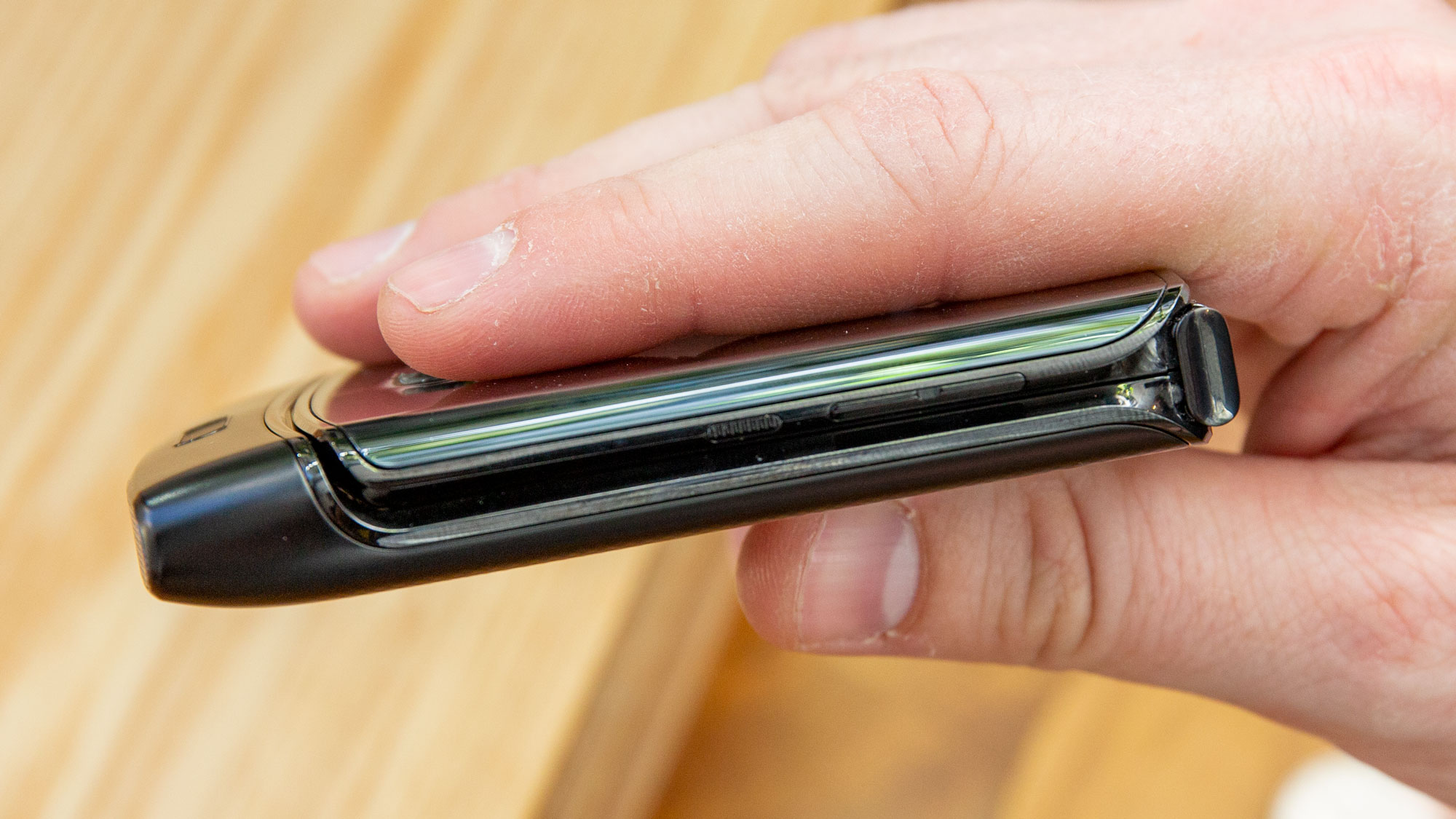
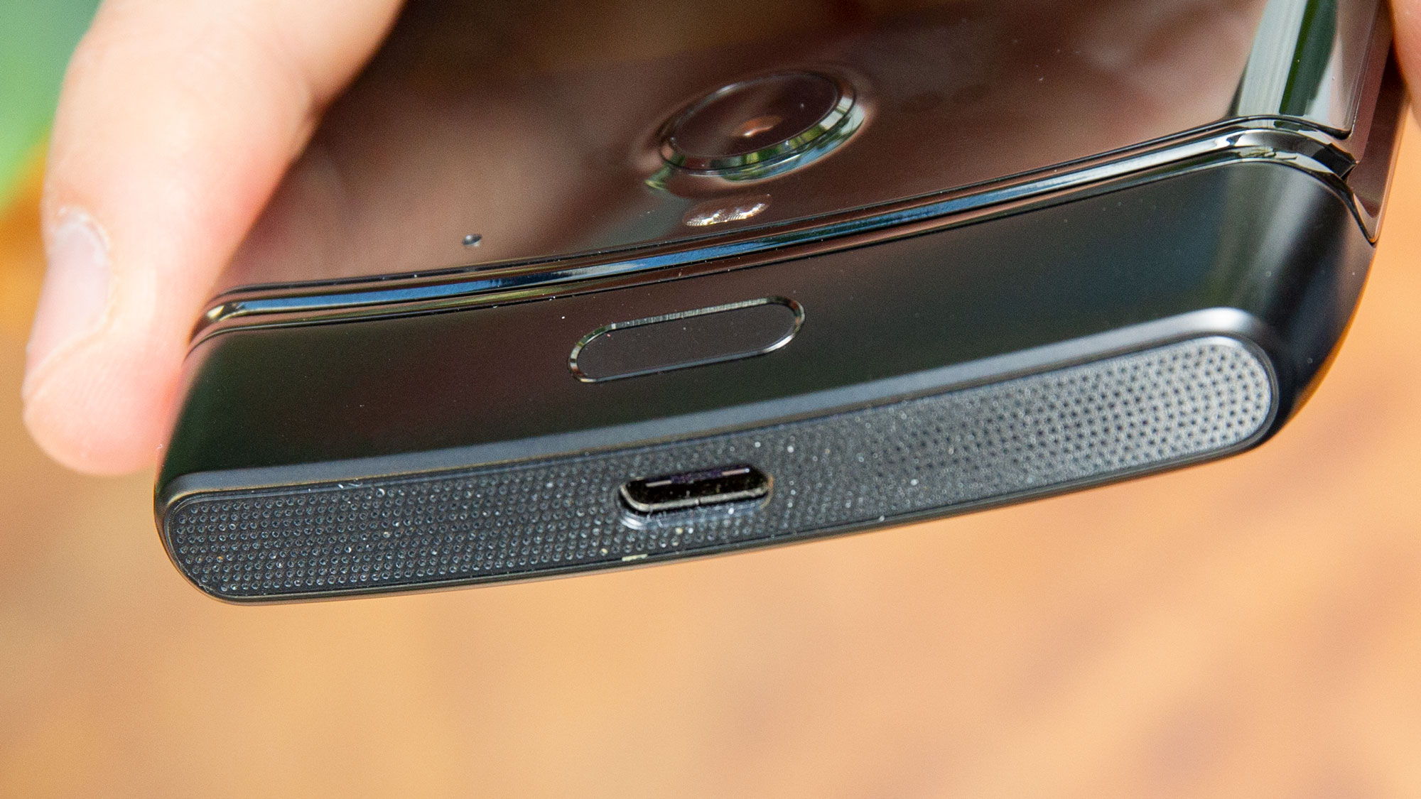
As a recreation of the old Razr v3, the new Razr deserves praise, with the same scalloped top edge tucking seamlessly into the fat chin. That chin is where you’ll find the USB-C port, poking out the bottom and flanked by speakers, which Motorola says uses the chin as an audio resonance chamber (we couldn’t tell whether or not it made a difference).
The thick chin does have its drawbacks, as you’ll have to dig to the bottom edge of the display to access navigation (either the standard 3-button nav or the Moto bar, a gesture control bar). On the chin’s front is an ovoid fingerprint sensor which doesn’t read fingers in any orientation but upright, and even then it’s a bit finicky.
Sadly, all this tight design has required the trimming of perks like a 3.5mm headphone jack or, more importantly, a microSD slot – you’ll have to make do with eSIM and the one-size-fits-all 128GB of onboard storage.

On a last note, we initially predicted the Razr’s smaller footprint would encourage consumers to buy it. We found it small enough when folded up to fit nicely among keys, wallet, AirPods/Galaxy Buds cases, and the like.
But as iFixit’s breakdown on the Razr’s pocketability illustrates, it’s too thick for some pockets (especially in legwear traditionally marketed to women) to be that much more comfortable than a standard flat smartphone. It’s less of an advantage than we thought.
Display
The Motorola Razr’s P-OLED display is another crux point for the phone, with Motorola compromising on some features in order to pull off the folding design.
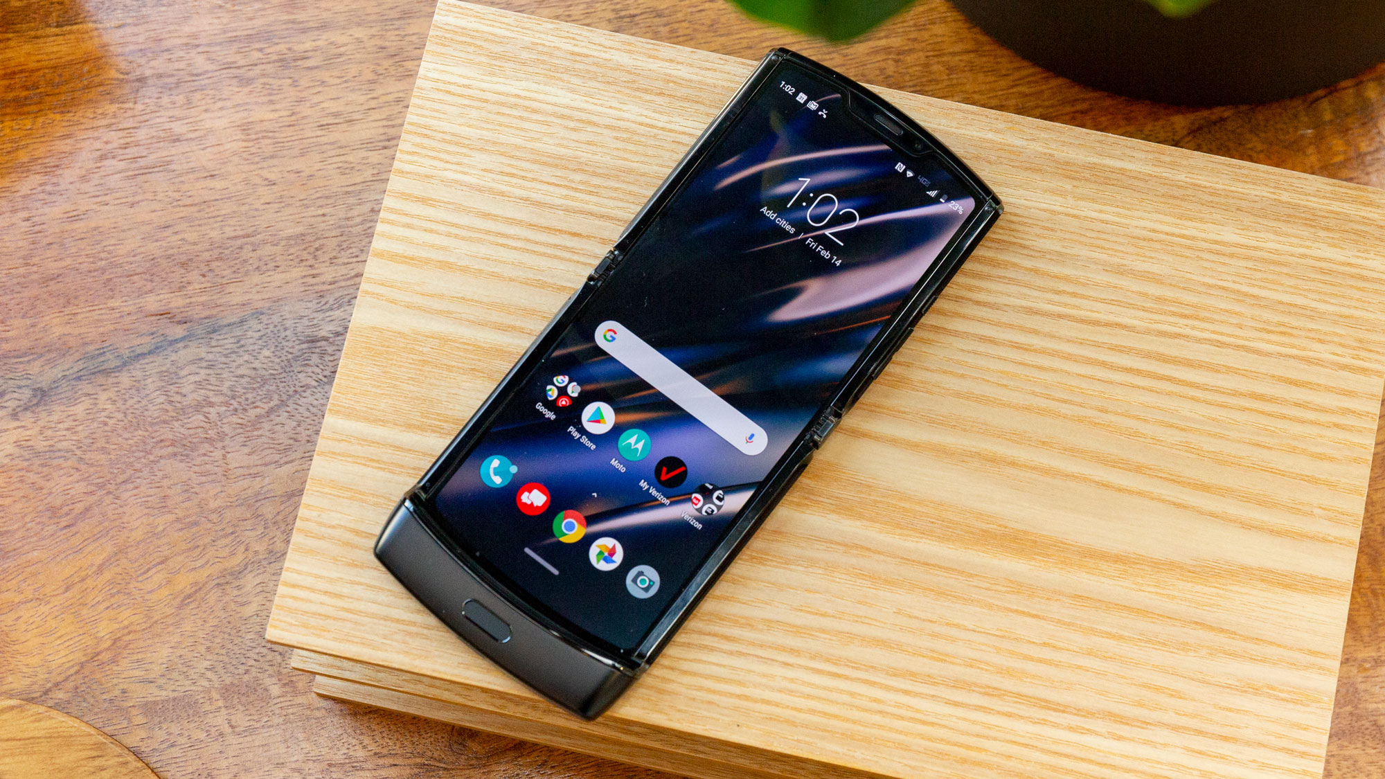
The Razr does, indeed, fold – and thanks to some design wizardry, its display doesn’t crease in the middle. Instead, the screen is cleverly positioned to tuck into the hinge gap, bowing in a semi-circle instead of a sharp angle. Again, we haven’t had the phone for too long, but we don’t expect a crease to form based on our experience so far.
Nor would we be worried about the display wearing down… if it weren’t for the creaking sounds that are emitted when we open the phone. It’s audible and, while we can’t see any evidence of accelerated wear and tear, just a little concerning – no other phone screen creaks.
Even when unfolded completely, the screen isn’t quite a flat surface. Like the Galaxy Fold, the Razr has a plastic display, which means it’s pretty thin. You can feel the hinge and other ridges as you run your finger up and down the screen.
You probably won’t slide your finger across the display as often as you’d think, since you’ll typically be typing or scrolling on the bottom half of the screen. But when the display feels notably not totally flat, it’s a bit disappointing – that may sound like we’re nitpicking, but we’d argue that it’s a reasonable complaint at this price point.
Which brings us to the value discussion: for a 25% discount, you get half the screen real estate of the Galaxy Fold. The two devices serve different purposes, but it’s worth reiterating what you’re getting: if your only metric for value is display size, you’re getting a main screen no bigger than a typical flagship phone’s display and a smaller mini screen.

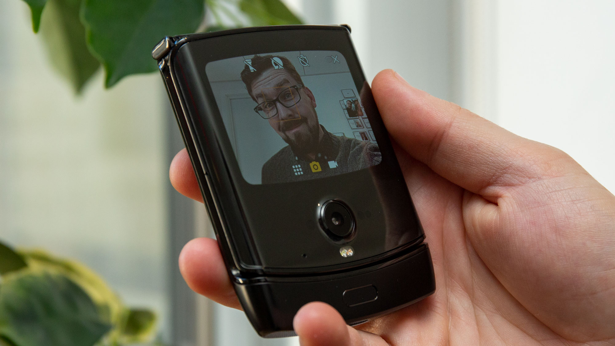
Of course, a smaller footprint means it’s easier to pull out the handset – which makes the Razr’s front-facing 2.7-inch OLED mini screen (800 x 600 resolution) arguably more useful than the 4.6-inch front screen on the Fold. It’s good for checking the time and basic notifications, though the interface for replying isn’t great. Bottom line: it’s a lot easier to pull out and check the mini-screen than it is to pull out and check on a regular phone.
Returning to the main display, the HD+ (2142 x 876) resolution is fine, showing clear video and visuals, although not the crispness we’re used to from sharper displays on phones in this price tier. It could be due to the type of plastic used here, but we can’t be absolutely sure.
In our side-by-side comparisons with the Google Pixel 4 (which has a comparable-resolution 2,280 x 1,080 display) and even the iPhone 11 Pro Max (2,688 x 1,242), the Razr’s screen displays similar hue palettes in video tests, though only after switching from the default ‘Boosted’ to ‘Natural’ colors. But note the Razr’s narrower width, which led some video platforms like YouTube to cap resolution at 720p. That might explain why video is blurrier on the Razr compared to watching video on other flagships.
This blurriness doesn’t quite extend to games – Call of Duty: Mobile, for example, had roughly the same graphical fidelity as when played on an iPhone 11 Pro Max. But play a few rounds and you’ll notice that while the top half of the main display is flat, the bottom half is slightly raised, and pressing into the screen to perform in-game actions feels a bit like pressing a controller button. It’s not an indicator of quality, just something you’ll notice while playing or using the phone in landscape.
In another example of the Motorola Razr’s design outpacing its execution, the camera setup is fine but not exceptional.
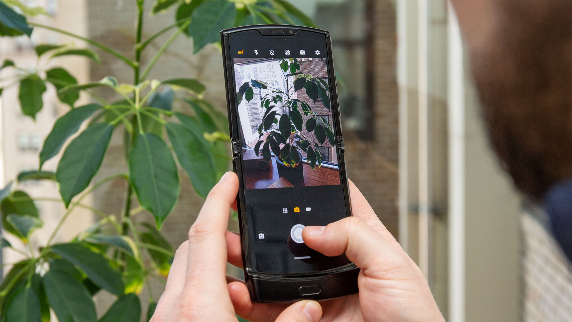
The main 16MP central camera is positioned just below the mini screen, which means you can use it for both regular shots (with the phone flipped open) and for selfies (with the phone closed). It shines in the latter case: combined with the Moto Gesture to trigger the camera (twist twice) and the mini-display previewing the shot, this is by far the best implementation of the Razr’s minimal design philosophy.
Or at least it would be, if clicking the shutter button was easy: you’ll either have to hit either volume button (good luck telling those apart from the lock button) or tap the screen, which is a little awkward.
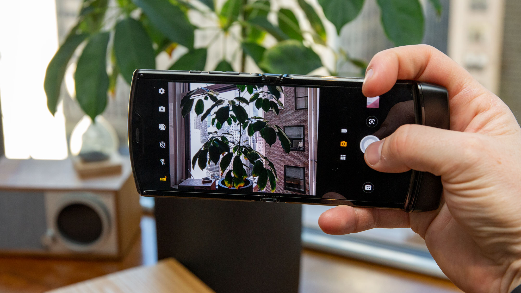
We also found ourselves shooting a lot more in portrait orientation than landscape. Why? Because the bottom of the phone is heavier, that's where we're gripping it, so it's a bit cumbersome to hold it horizontally.
When the rear camera is used for daylight photography, the results are good. Motorola’s decision to drop a second display and amp up the software in the Moto Z4 pays dividends here, as the Razr relies on a single lens for all of its prime photography. Sure, it has a lower megapixel count compared to the Z4 (16MP versus the Z4’s 48MP), but the sensor is much larger (1.22 microns versus 0.8 microns), and the photos are more vibrant with better contrast.


Shooting without Night Vision...

...and with Night Vision.

Likewise, an interior shot without Night Vision...

...and with Night Vision.
This vibrancy makes daylight images shot on the Razr rival those taken on flagship phones. It’s night photography that suffers somewhat, although the Night Vision mode helps, especially in close-up shots around dinner tables or in bars. Out in the street with mixed light, however, the mode blows out illumination sources for a less natural-looking photo.
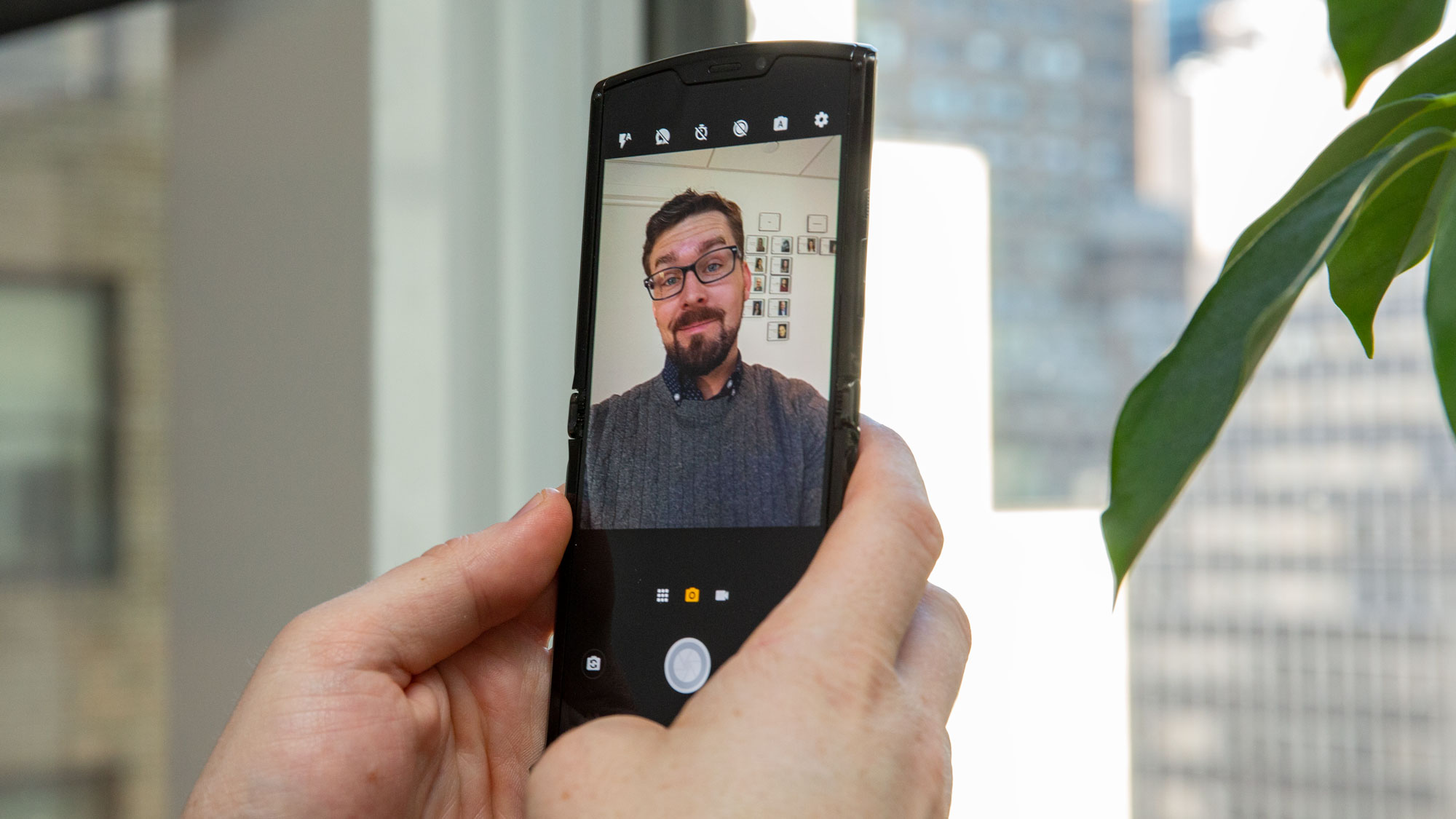
The middling camera quality isn’t a big surprise, as Motorola phones have never focused on photography. The interior 5MP selfie lens, should you want to take a photo with the full display open (for video chatting, say), is fine, but obviously less impressive than the main lens; although it does offer more precise focus control (like tap-to-focus) than the main lens, should that be more important.
The Razr packs the assortment of camera modes common to Motorola phones, with software-assisted portrait, spot color, and the brand-labeled Cinemagraph mode among the stronger offerings. Given the lack of zoom, ultrawide or other lenses, this smaller assortment is what you’ll have to rely on for photo variety.
Performance
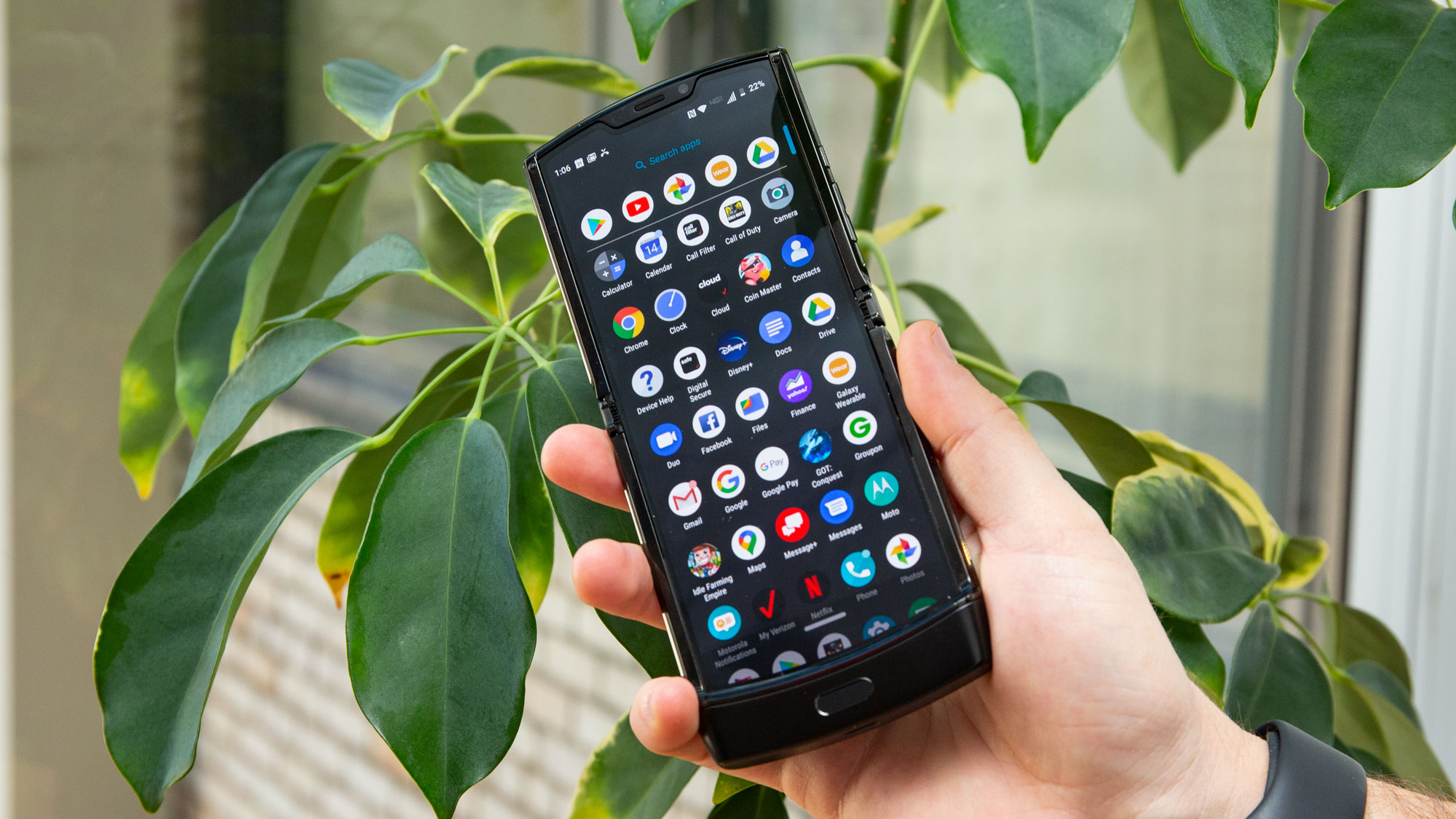
The Motorola Razr is pricier than flagship smartphones, yet is less powerful. While it doesn’t hang or stutter with basic navigation or media watching, its Snapdragon 710 processor and 6GB of RAM are more suited to mid-range phones.
It’s far from inadequate for basic tasks, and even typical games like Call of Duty: Mobile and PUBG don’t struggle. But more intensive tasks will tax the chipset: the phone scored a 1,522 on Geekbench 5’s multi-core test. For comparison, last year’s Samsung Galaxy S10 scored a 2,056 in the same test, while the OnePlus 7 Pro hit 2666. The Razr is far from the fastest on the block.
Where the Razr falls short is the 128GB it packs as the one and only retail storage option. Nor can it be expanded, since the handset doesn’t have a microSD slot. Unless you funnel your overflowing data to cloud options, those who like to shoot a lot of photos and video might run out of room.
The other drawback, performance-wise is the operating system version: the Motorola Razr ships with Android 9 Pie. While it’s not a dealbreaker, it’s an odd choice on Motorola’s part to launch this phone without the latest version, Android 10… which was released in September 2019.

You’ll theoretically miss out on some app compatibility along with universal Android 10 features like the gesture navigation bar and dark mode, though Motorola has its own version of both of those – you’ll just have to get used to its take.
As expected, Moto-brand extras include Moto Gestures, which run the gamut from helpful to niche appeal. Two of them skyrocket in usefulness in this particular Motorola handset, specifically when it’s folded closed: the double-chop flashlight, which is easier to point with the smaller footprint, and the twist-for-camera – the latter is wildly helpful to quickly take selfies.
Battery
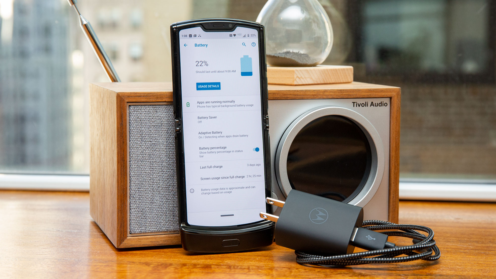
When Motorola released the spec sheet for the Razr, we immediately honed in on the 2,510mAh battery. In this day and age, where mid-range phones typically launch with a baseline of 3,000mAh, and many flagships are breaking 4,000mAh, we wondered how long the Razr would last.
Our standard battery-drain test – a 90-minute video at full brightness – dropped the battery from full charge down to 84%, and a 16% battery loss isn’t that extreme, as most flagships run through the same test lose 15-20%. With a day of moderate which included some Google Doc word processing, gaming, and watching videos, it did manage to last through the day before recharging. But any more intense use will surely drain the battery faster.
When a single Call of Duty: Mobile multiplayer match (about eight minutes of gameplay) docks 4% off the battery, you’ll need to police your habits accordingly. (For comparison, a similar match uses 2% of the 3,969mAh capacity of an iPhone 11 Pro Max.)
There’s an argument that the mini front display saves more battery, given that you’re illuminating a much smaller screen to check the time or notifications than on a typical smartphone. That doesn’t really play out, however – you’ll still need to yank open the phone to interact with it meaningfully.
The upside of having a small capacity is that the phone recharges rather quickly, even with the 18W maximum charging speed of the in-box charger. There’s also a battery saver mode for eking out a bit more life when you’re running low.

Buy the Motorola Razr if...
You’re a fan of cutting-edge design
Yes, this phone looks rather good, and will turn heads when you pull it out in public. It’s slimmer than the Samsung Galaxy Fold, and has a much more satisfying snap-to-close feel to it. The Razr feels like a throwback to the days when phones were more than identikit black rectangles, and it’s functional to boot.
You have small pockets
This might be the demographic that modern phones least appealto by: folks who don’t want their phone to take up so much space in their pockets. The Razr tucks in where other phones do not, though its thickness when folded closed exceeds that of conventional phones – you have been warned.
You loved flip phones
There’s no shame in missing a phone design that really, really worked. Flip phones were the future when Motorola unleashed the StarTAC on the world back in 1996, and the Razr v3 cemented the phonemaker’s reputation as an innovator in consumer gadgets. The new Razr is a great reminder that phones used to be physically small yet loud – both in terms design and volume, when you snapped it closed to hang up on some fool.
Don't buy the Motorola Razr if...
You want a true flagship for the price
This is likely obvious by now, but there are plenty of cheaper phones that blow the Razr out of the water in terms of performance. Don’t assume that the exorbitant cost also delivers a powerhouse handset. The OnePlus 7T, iPhone 11 or even the Samsung Galaxy S10e can outpace the Razr at half the price.
You need a big phone battery
One of the Razr’s biggest flaws is its short battery life compared to other phones. You can easily find a handset with nearly twice the Razr’s capacity at much lower cost, like the Samsung Galaxy Note 10 Lite.
You love phone photography
The Razr’s exterior camera is fine but not great, and its night vision mode trails behind the best low-light photography offered by the likes of the Google Pixel 4 and iPhone 11 suite. It also lacks a telephoto or, more glaringly, ultrawide lens, while the 128GB of onboard storage could be limiting if you prefer to store your photos locally.
David is now a mobile reporter at Cnet. Formerly Mobile Editor, US for TechRadar, he covered phones, tablets, and wearables. He still thinks the iPhone 4 is the best-looking smartphone ever made. He's most interested in technology, gaming and culture – and where they overlap and change our lives. His current beat explores how our on-the-go existence is affected by new gadgets, carrier coverage expansions, and corporate strategy shifts.
