Early Verdict
Nothing on the Nokia 3.1 is set to blow you away, but it seems to be a solidly built phone with an interesting design and suitable specs. Plus the price looks to be affordable as well.
Pros
- +
18:9 screen
- +
Low price considering spec
Cons
- -
Plastic design
- -
No USB-C
Why you can trust TechRadar
HMD Global is back with a refreshed series of new, updated Nokia branded handsets and one of the new bunch is the Nokia 3.1.
It comes alongside the Nokia 2.1 and Nokia 5.1 with the former running on basic spec with Android Go software on board, and the latter being a bit more impressive and expensive than the Nokia 3.1.
An exact release date for the Nokia 3.1 hasn’t been made clear yet, but it’ll be coming to market before the other two handsets from Nokia.
We’ve been told it’ll be at some point in June, but we don’t know for certain whether it’ll be available in the US, UK or Australia.
We know pricing for the phones in Europe, so we can make some assumptions about how much it’ll cost around the rest of the world. The most basic version comes with 2GB of RAM and 16GB of storage, which will be €139 (about $160, £120, AU$215).
The larger storage version has 32GB and 3GB of RAM and will cost a touch extra at €169 (about $200, £150, AU$260) but looks to be the far more useful version of the phone in our testing.
Watch our hands on video of the Nokia 2.1, Nokia 3.1 and Nokia 5.1 below
Design and display
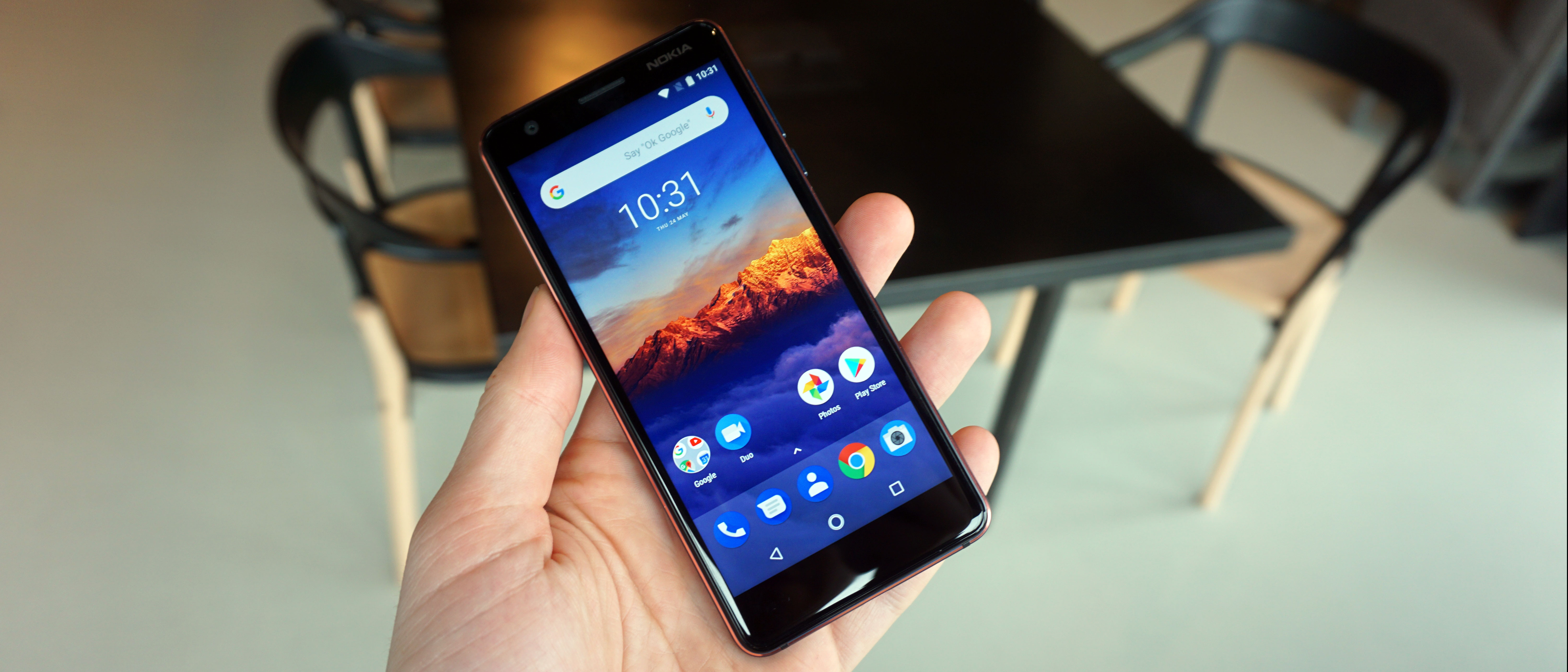
Nokia’s aim with the 3.1 is to bring a premium feel device experience to the affordable price point, but that’s difficult to do right now when we’re surrounded by devices like the Moto G6 that offers a far fuller experience.
This phone is much cheaper than that Motorola handset, and while the design may not stand out as much it still looks attractive from the front and back.
The back of the phone is a colored polycarbonate, but it doesn’t feel particularly premium especially when compared to the Nokia 5.1.
We got our hands on the Black/Chrome version, however the new Nokia 3 will also come in Blue/Copper and White/Iron color variants.

Around the edges you’ll find an aluminum frame that’s comfortable to hold in the hand and does give the phone a bit more of a premium look and feel.
At 146.25 x 68.65 x 8.7mm and weighing 138g, the new Nokia 5 also fits well in the palm, and is easy to use one-handed.
The display on the Nokia 3.1 has an 18:9 aspect ratio, which is a trend for a lot of phones in 2018 and means the screen is taller than it was on the Nokia 3. It has allowed the company to make the screen bigger - it's now 5.2-inch rather than 5-inch - without increasing the size of the phone.
It's only a 720p (HD+) resolution, and when you start looking at the quality of the screen you'll start to notice it's not Full HD. That said, for the price point we thought the screen looked suitably bright and clear.


Camera and battery
Don’t expect a stunning rear camera experience here on the Nokia 3.1. This time around it’s a 13MP auto focus camera that we expect to perform quite well in good lighting but is likely to struggle a little more when in darker conditions.
We found it easily blurred images quite easily when we tested out the camera on the back of the phone, but that’s something we’ll dive into further during our final review.
On the front is an 8MP wide-angle (84.6-degree field of view) camera so you can fit lots of your friends into selfies as well as get high quality shots of your face as well.

Inside the Nokia 3.1 is a 2,990mAh battery, which the company feels will last you a solid day with normal usage but it likely won’t last two days like the Nokia 2.1 and its much bigger battery.
We’ve yet to have the phone for any significant time so we haven’t been able to judge the battery yet but we’ll be sure to put it through its paces in time for the full review.
There’s also no fast-charging or wireless charging tech on this phone. It also doesn't use USB-C, and instead you'll be pumping it up via the microUSB port at the bottom of the phone.
Performance and interface
Inside the Nokia 3.1 is a MediaTek 6750 1.5GHz chipset, and the company claims it’s 30% faster than the original Nokia 3. Performance was one of our main problems with that phone, so we’re hoping the improvement in the new Nokia 3 is a suitable fix to those problems.
In our limited testing time we found the phone ran well, but we’ve yet to really put it through its paces so it may struggle when we put its performance under a microscope.
There are both 2GB of RAM and 3GB of RAM versions of this phone, so we would likely lean toward buying the more expensive yet more powerful handset with 3GB inside. In terms of storage, you’ll have the choice of 16GB or 32GB, and while there is microSD support if you’re planning to fill this phone full of video, apps and photos we’d recommend opting for the higher one anyway.
The Nokia 3.1 comes running Android Oreo software straight out of the box and is guaranteed to be upgraded to the new two versions of the software too, so that means it’ll get Android P when it’s released.
Nokia also promises to keep monthly security updates coming to the phone for three years since its release, so that’ll give you peace of mind that you’re buying a secure handset if you opt for the Nokia 3.1.
Early verdict
Don't expect top end performance or photos from the Nokia 3.1. The additional screen space and attractive design look to compete with products like the Moto E5, but this is still a much more low end device.
We'll be putting the battery, performance and camera through its paces during our full review and we'll be able to give you a fuller picture of the phone's highlights then.
James is the Editor-in-Chief at Android Police. Previously, he was Senior Phones Editor for TechRadar, and he has covered smartphones and the mobile space for the best part of a decade bringing you news on all the big announcements from top manufacturers making mobile phones and other portable gadgets. James is often testing out and reviewing the latest and greatest mobile phones, smartwatches, tablets, virtual reality headsets, fitness trackers and more. He once fell over.
What is a hands on review?
Hands on reviews' are a journalist's first impressions of a piece of kit based on spending some time with it. It may be just a few moments, or a few hours. The important thing is we have been able to play with it ourselves and can give you some sense of what it's like to use, even if it's only an embryonic view. For more information, see TechRadar's Reviews Guarantee.
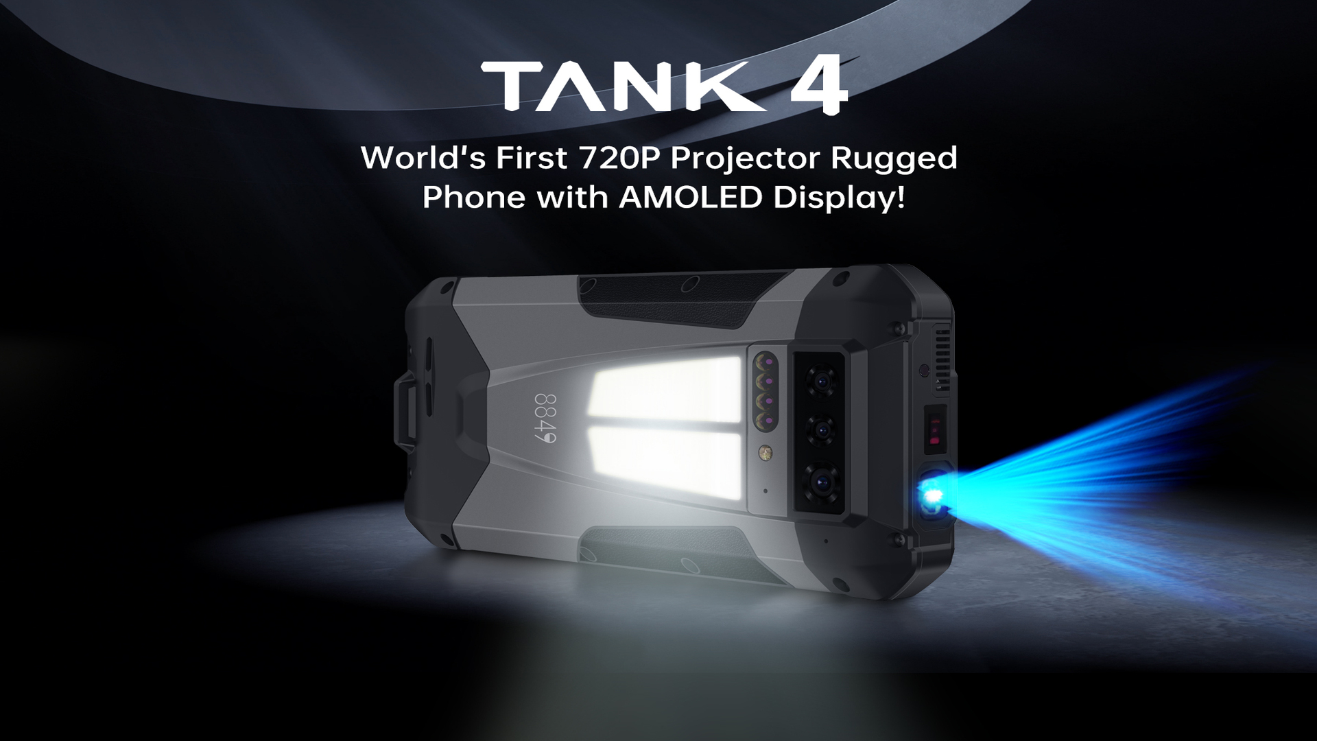
This smartphone puts a 100 lumens HD DLP projector in your pocket, a powerful camping light and even a low-light camera for nocturnal excursions
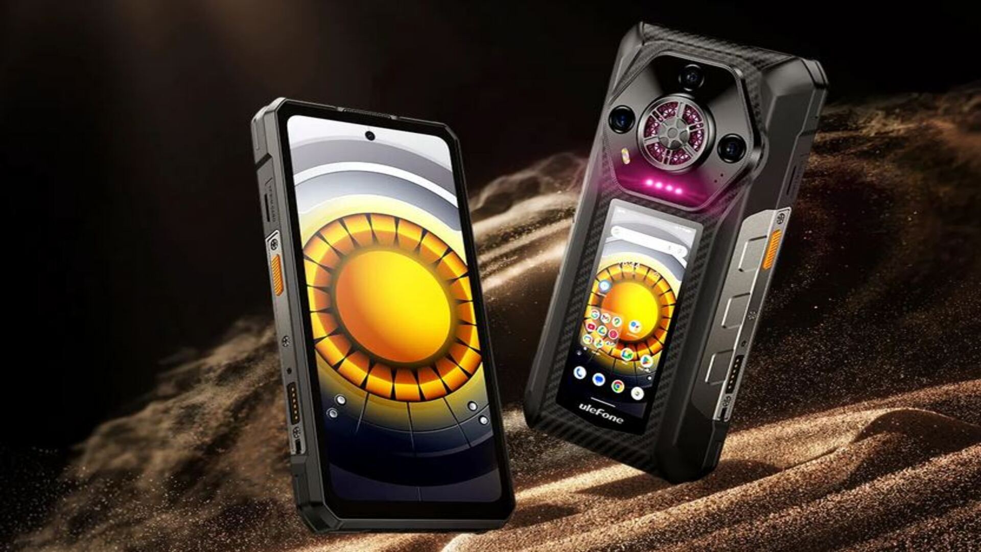
I can't believe I had to wait so long to see the first true dual-screen smartphone, and it even has a waterproof loudspeaker
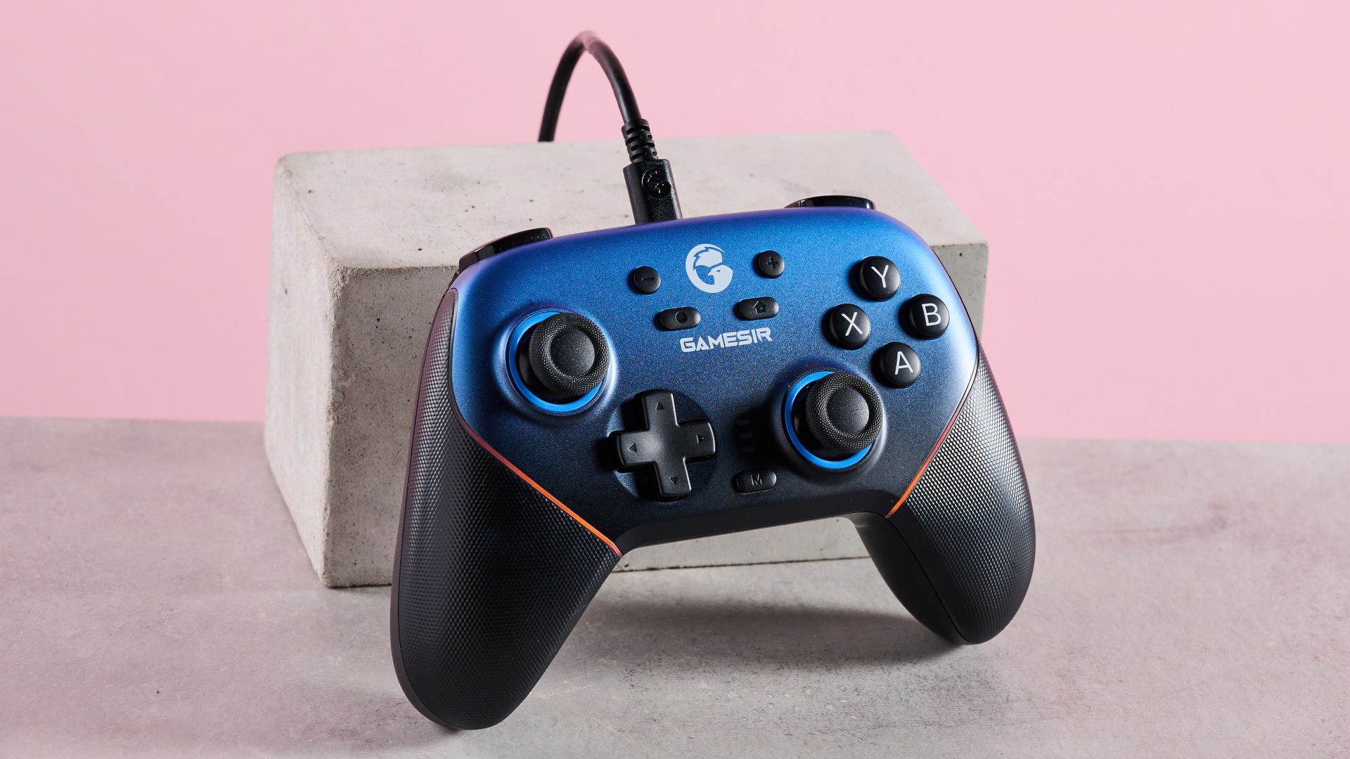
I can't quite believe how many customization options there are for the GameSir Super Nova, but it’s not without a few faults
