TechRadar Verdict
A migraine in phone form, the Nokia 3.1 will test your patience with its poor performance and paltry storage. And only the truly monastic will pass.
Pros
- +
Sharp-looking aluminum edges
- +
Decent screen image quality
- +
Effective (if slow) camera HDR
Cons
- -
Very limited storage
- -
Terrible performance
- -
Slow, unreliable camera autofocus
Why you can trust TechRadar
The Nokia 3.1 is an affordable phone for those who want to buy outright, or pay very little for their contract.
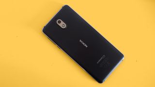
From afar it seems the perfect mobile for this audience. It may not have high-end specs, but the Nokia 3.1 still looks smart enough and has the long-aspect display a phone needs to seem current.
It's a bust, though. Terrible performance makes the Nokia 3.1 the phone equivalent of a migraine. We strongly recommend buying the superior Moto G7 Play or Vodafone Smart X9 instead, but if you're still curious read on for a full account of the Nokia's failings.
Key features
- Basic specs and features
- Compact build
- Aluminum edges look good
The Nokia 3.1 seems well-positioned for someone who wants to buy their phone outright. It costs $159 / £149.99 / AU$248. The Moto G7 Play is one of its key rivals. Spoiler: the Moto is much better.
The Nokia 3.1's features are stripped back to the basics. There's no fingerprint scanner, a low-end MediaTek chipset, and just single cameras on its front and back.
Its main camera has a budget-favorite 13MP sensor, the front an 8MP one. All of these seem like sensible choices. 16GB of storage does not leave you with much room for apps, but the Nokia 3.1 is clearly not a phone made for enthusiasts.
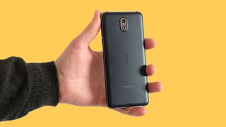
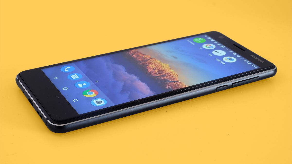
Small size is one of the Nokia 3.1's top benefits. It may have wider surrounds than some, but this is one of the few Androids whose size is comparable with the iPhone 8.
There are some nice surface-level touches too. Beveled aluminum gives the Nokia 3.1 a visual personality front-on. This is not a given in cheap phones. And while the 5.2-inch screen's specs are not dazzling, image quality is good.
On paper the Nokia 3.1 makes perfect sense, but this does not translate to a satisfying experience in the real world.
Design
- Mixed glass/aluminum/plastic build
- Clever use of beveled aluminum
- No fingerprint scanner
Years ago, we used to think of Nokia as the brand that made plastic 'cool'. Its cheery colorful plastic phones were highly recognizable, even if they looked just like blocks of plastic.
In the last couple of years the Nokia range under HMD Global has taken to using beveled aluminum to get a distinctive look. The Nokia 3.1 has aluminum sides. They are, for the most part, black. But HMD Global cuts into the edges to give the phone's front and back a bright silver outline.
It’s a great way to advertise the use of metal and avoids the 'brick of black' effect you’ll see in most entry-level phones.
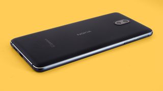
There are other clever touches too. The Nokia 3.1’s front is covered with Gorilla Glass, with a lightly curved 2.5D edge. A little rounded border of plastic also sits between glass and metal, appearing to continue this curve. Well, until you look closely.
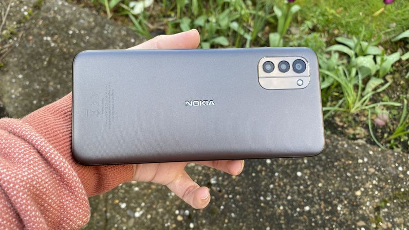
The phone’s back is plastic with a light soft-touch finish. This phone looks fairly cheap straight-on from the rear, but the glint of silver does give it something extra.
The Nokia 3.1 is otherwise very basic, though. It uses an aging micro USB charge socket, and there’s no fingerprint scanner. To get that you have to upgrade to the Nokia 3.1 Plus. It’s a much larger phone, an entirely different prospect.
There’s a good chance those upgrading to a Nokia 3.1 may have never owned a phone with a fingerprint scanner, though, and storage is the most grating limitation.
Screen
- 5.2-inch 720 x 1440 LCD screen
- Flaky auto brightness
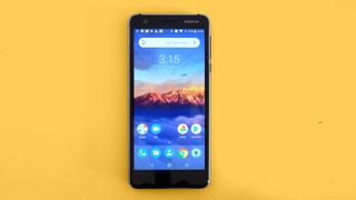
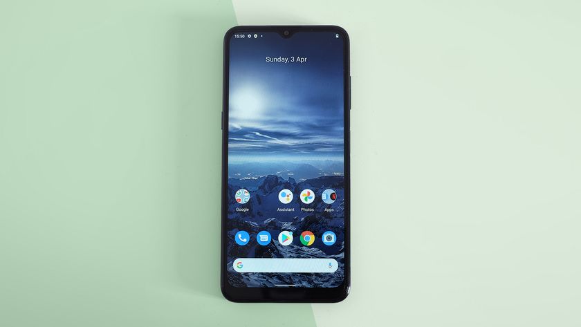
There are several big issues with the Nokia 3.1, but the display’s image quality is not one of them. This is a petite 5.2-inch IPS LCD screen with sharp edges and relatively large surrounds, but it still has an 18:9 aspect ratio. It looks 'current'.
Resolution is only 720 x 1440, well below Full HD. However, as the Nokia 3.1's screen is fairly small, the lower pixel density is a non-issue.
Color is fairly vivid, contrast good and top brightness is high. Phones like the Nokia 3.1 prove there’s very little of interest to say about many mobile displays. They are almost all universally good, barring the few that aren’t sharp enough for their asking price.
There is an issue, though. The Nokia 3.1’s auto brightness mode is bad. This should brighten the screen to deal with sunny days and dim it when you go back indoors.
However, far too often it just doesn’t work, leaving you with a near-invisible image preview when you go outside to take some photographs. You can fix it manually, but then have to turn it back down when you head back home. This is exactly what auto brightness is there to avoid.
Andrew is a freelance journalist and has been writing and editing for some of the UK's top tech and lifestyle publications including TrustedReviews, Stuff, T3, TechRadar, Lifehacker and others.
Forget AI – WhatsApp is planning a simple messages feature that could be its most useful upgrade in years

I cloned my voice in seconds using a free AI app, and we really need to talk about speech synthesis
Sony officially announces new Astro Bot PS5 bundles and they're available from PlayStation Direct right now for bargain prices we can barely believe
