TechRadar Verdict
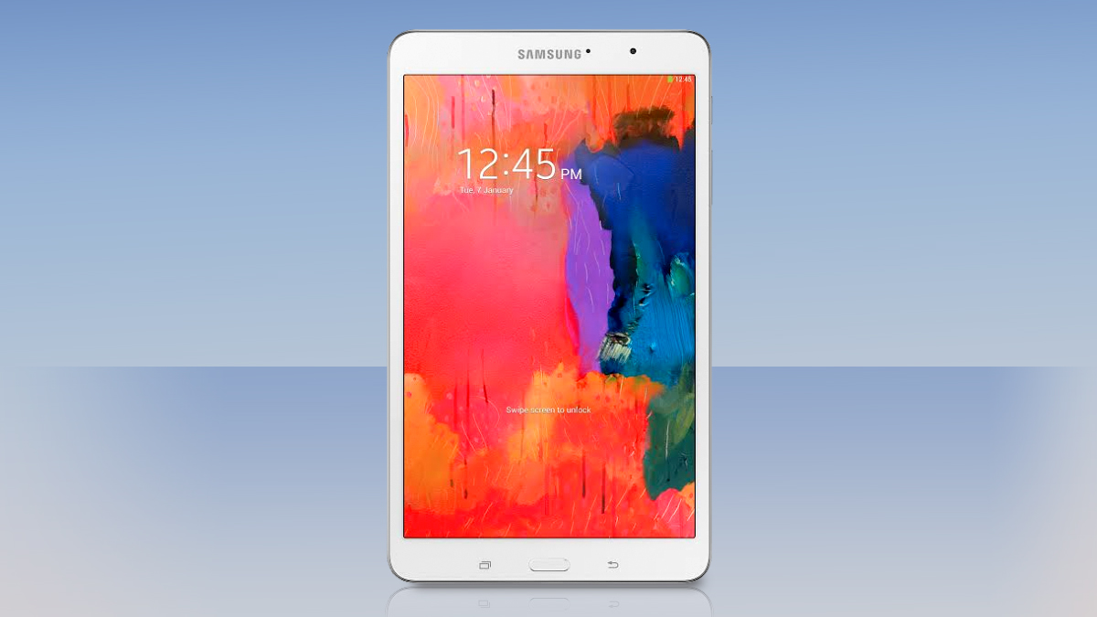
By packing a super-sharp display, a powerful processor and a much-improved UI into a compact shell, the Galaxy Tab Pro 8.4 is one of the finest tablets the company has ever produced.
Pros
- +
Stunning display
- +
Lightweight, nice proportion
- +
Impressive performance
Cons
- -
Expensive
- -
Cheap design
- -
Speakers poorly positioned
Why you can trust TechRadar
A charitable sort might call Samsung's approach to tablets comprehensive, but it could just as easily be described as scattershot. The past few years have seen the launch of 7-inch, 8-inch, 10-inch, and now 12-inch devices aimed at a full range of budgets.
This focus on quantity has arguably come at the expense of quality for Samsung, with no single outstanding tablet coming from the world's largest consumer tech company.
The company's new Pro range shows signs of the company re-applying its considerable resources to produce something a little more special.
While the Samsung Galaxy Note Pro 12.2 is expensive and a little creaky, it's an undeniably powerful piece of kit with a much improved custom UI.
The Samsung Galaxy Tab Pro 8.4 takes many of the stylistic cues and components from that super-sized powerhouse and packages it in a decidedly more compact and versatile shell. The result is one of Samsung's best tablets to date.
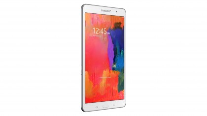
But with a formidable rival in the iPad mini 2, is that enough? Starting from £349 ($400 or around AUS$440) for the 16GB model, the Samsung Galaxy Tab Pro 8.4 is more expensive than Apple's class-leading compact tablet.
It's going to have to offer something extra if it's to justify that difference, however slight.
The spec list reveals several areas in which the Samsung Galaxy Tab Pro 8.4 might excel. Its 8.4-inch LCD display isn't just bigger than the 7.9-inch iPad mini 2, it's also sharper, with a 2560 x 1600 resolution.
Samsung has gone with a quad-core Qualcomm Snapdragon 800 CPU, clocked at 2.3GHz. I'll discuss this processor choice a little later.
This is backed by 2GB of RAM. In addition to internal storage of either 16GB or 32GB, Samsung has also included a microSD slot for up to 64GB of additional capacity - something no iPad has ever offered.
Add in an 8MP camera, and you'll see that this is clearly a tablet operating at the top end of the spectrum. The question, as with any Samsung tablet, is how all of these impressive components hang together.
Samsung has stuck with the same design language we've seen in pretty much all of its larger devices, starting with the Samsung Galaxy Note 3 and moving right up to the Samsung Galaxy Note Pro 12.2.
You get the same straight edges, tightly curved corners and dead-flat surfaces. Unfortunately, you also get the same choice of materials.
The Samsung Galaxy Tab Pro 8.4's all-glass front feels fine, but the metal-effect plastic rim and faux-leather back (complete with stitching effect) ensure that the predominant impression is one of
cheapness.
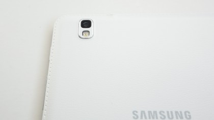
The tablet is just 7.2mm thick and weighs just 325g, which makes it slightly slimmer and lighter than the iPad mini 2, but it feels a lot less premium with it.
Still, the Samsung Galaxy Tab Pro 8.4's more compact dimensions ensure that it feels a lot sturdier than the larger devices in the range. There's a lot less of the flexing and creakiness that I've detected in Samsung's recent 10- and 12-inch tablets, that's for sure.
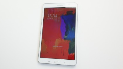
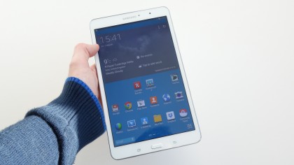
Indeed, it's a very pleasant tablet to hold. That rear cover might be a little tacky, but it is pleasantly grippy. Meanwhile, the Galaxy Tab 8.4's lightness and 128.5mm span ensures that it's extremely comfortable to wield one-handed in portrait orientation.
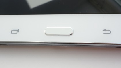
Interestingly, this is the one device in the Tab Pro range to be designed with this orientation in mind. It's evident from the positioning of the home key (flanked as ever by capacitive multitasking and back keys), front-facing camera and Samsung branding along the shorter sides.
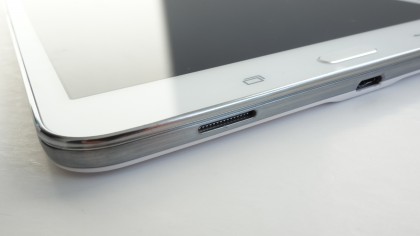
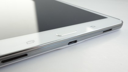
It's also clear by the positioning of the stereo speakers, which are both situated on the bottom edge. This doesn't lead to the excellent stereo separation of the larger models, but it does mean that the speakers will be unobstructed when holding the tablet as intended.
Of course, when you flip the Galaxy Tab Pro 8.4 into landscape mode to watch a movie, the sound will be all wrong - but that serves you right for not plugging in a set of headphones, doesn't it?
Elsewhere, the placement of the power and volume keys is decent, sitting up high on the right-hand edge. I found that they were a little awkward to access with my natural holding-hand (the left one), though I could at a push use my left middle finger to activate them.
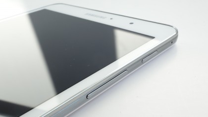
Right-handed holding will free up your right thumb for the task, though again you'll probably need to bring your other hand (or your chest) into the mix to steady the tablet for the job.
Port placement is logical enough, with the microUSB slot on the bottom, between the speakers, and the very-welcome microSD port on the lower left-hand side.
The 8MP rear camera is situated on the top left-hand corner as you use the tablet in landscape view, and I frequently found myself covering the lens with the fingers of my left hand.
Samsung has obviously done this so that the camera is positioned naturally for portrait pictures - that being the tablet's intended orientation.
But I'd argue that this is usually not the natural orientation for those who like to frame pictures properly - which is usually in landscape.
Positioning the lens in middle of the device (we're back in landscape here), as the company has with the Tab Pro 10.1 and the Tab Pro 12.2, might have looked and felt a little odd here. But it would undoubtedly have been better for photo taking.
Considering this is the one tablet in the range that didn't make me feel like a complete idiot for whipping it out and using it as a camera, that's a bit of a shame. I wouldn't call this camera placement a design flaw, though - just an understandable compromise.
