TechRadar Verdict
With a superb camera, lovely screen and smooth performance, the Lumia 950 XL is an easy sell for the Windows faithful. But with few apps, many areas in need of polish and inconsistent battery life, it isn't for everyone.
Pros
- +
Great Screen
- +
Fantastic camera
- +
Strong performance
Cons
- -
Inconsistent battery life
- -
Lack of quality apps
- -
Many bugs still present
Why you can trust TechRadar
Lumia flagships are a rare breed, not just in terms of new models, but on the street as well. Almost four years have passed since the Lumia 900 line began, and a lot has happened in that time – not least the evaporation of Windows Phone's already paltry market share.
The Nokia Lumia 930, nominally the last flagship-class device in the WIndows Phone era, was released back in mid 2014, but the world has moved on.
Now, a QHD screen and a powerful 64-bit processor is the bare minimum that an elite-tier handset needs in order to compete. And with quality imaging also becoming the norm rather than the exception, there's little room for compromise at the top.
Against this, everything that once made the Lumia brand special no longer has such lustre. Optical imaging stabilisation is one such example – the thing that Nokia once did best is now commonplace.
Dreams of making smartphones for everyone and seeing Windows 10 Mobile conquer the world with coloured tiles have been replaced with a more modest ambition: making devices to reward fans who stuck with the OS through the lean times.
Enter the Microsoft Lumia 950 XL, alongside the Lumia 950.

The Lumia 950 XL is, as the name suggests, the larger device of the two, and it boasts some hefty specifications too, meaning that on paper it looks to be a smartphone geek's dream.
But with the Android and iOS competition now so incredibly strong, is it really enough to restore consumer confidence in Microsoft's mobile vision?
Design
Over its years as a smartphone maker Nokia built up a considerable design pedigree, and the Lumia line was no exception. With the handsets defined by the use of colourful matte polycarbonate, even a punter on the street could recognise the likes of a Lumia 920 at a distance.
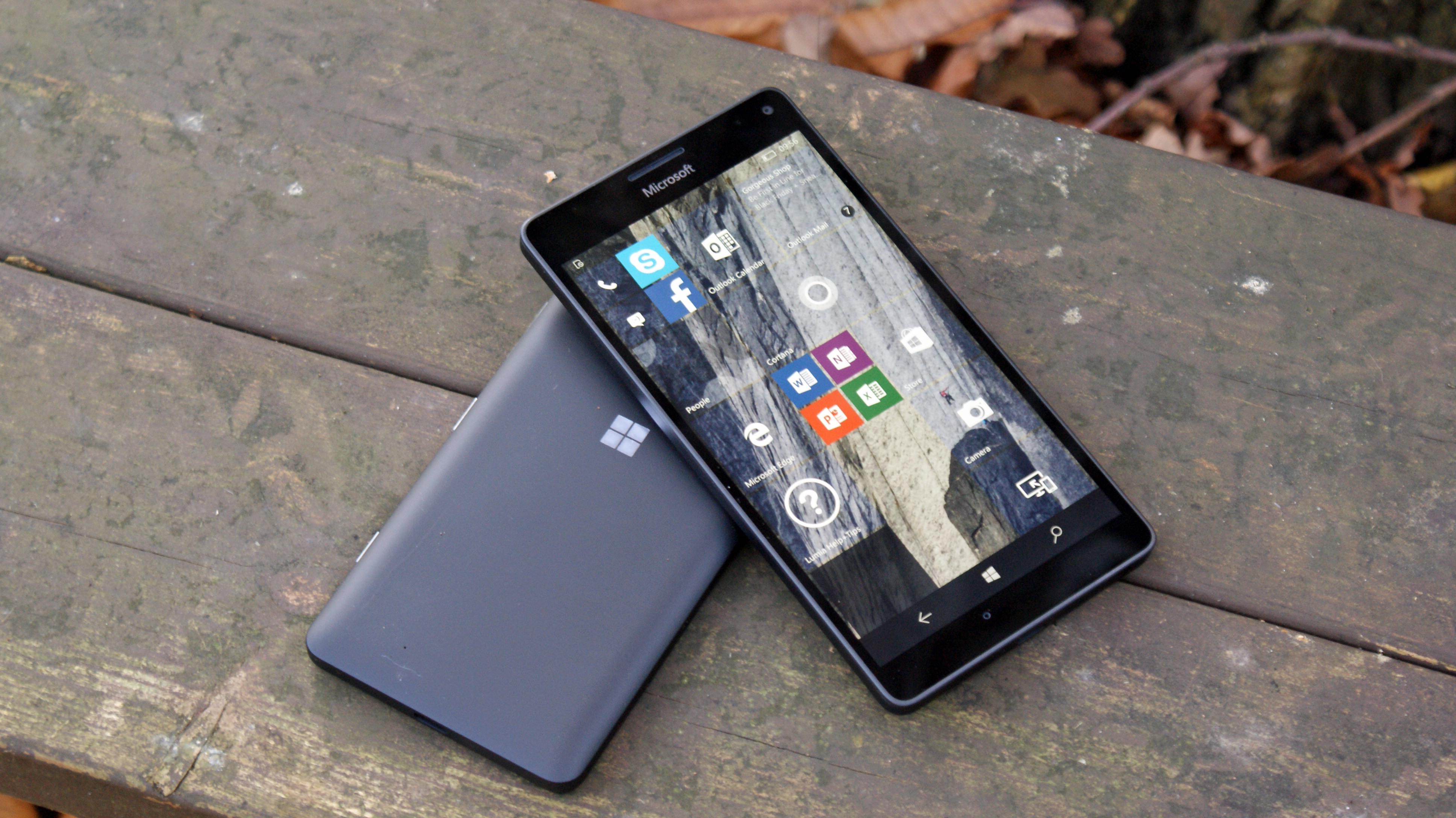
Things have changed under the bean counters at Microsoft, and at first glance the Lumia 950 XL is almost totally unremarkable, at least from the front. The 5.7-inch AMOLED display, covered with a sheet of Gorilla Glass 4, takes up most of the faceplate, with only a small, minimalist 'Microsoft' logo adorning the top.
The rear of the handset also tends towards a corporate look and feel. A vast expanse of featureless black matte polycarbonate houses just two notable landmarks – a large, silver-ringed camera 'oreo', and a small Windows logo.
The power button and volume keys are on the right side, as you'd expect, but their layout is odd and confusing. Whereas the power button normally stands alone, on the Lumia 950 XL it's flanked by separate volume up and volume down keys.
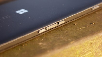
This may sound like a minor detail, but as someone who's used Lumias on a daily basis for years I found the new button layout jarring throughout my review period. Moreover the buttons themselves, while nicely clicky, are quite sharp, making them feel unfinished.
On the same side you'll also find the two-stage camera shutter button, always a nice inclusion.
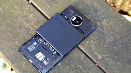
Thankfully, one trend that began a while back – the abandoning of removable backs – has been reversed here. The rear of the Lumia 950 XL is user-removable and replaceable, giving access to the microSD card slot and to the removable battery.
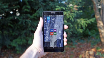
As the 950 XL is a phablet, using it in one hand was always going to be something of a challenge, but thanks to the weighting of the device it's not as bad as I feared it might be. Even at 8.1mm thick and 165g, and with my spindly little mitts, using the handset was never uncomfortable.
Overall, the design of the Lumia 950 XL is unremarkable. In a budget smartphone, I'd list that as a positive, especially given some of the weird-looking units that are occasionally trundled out; but in a 2015 flagship device that costs the best part of an iPhone, it's a different story.
When you're spending the sort of money on a handset that could buy you a week's holiday for two, the experience has to reflect that, and that experience starts when you first pick up the device.
Buy an iPhone 6S and the jewel-like feel is an instant reward, and the same goes for the Samsung Galaxy S6 or even the Google Nexus 6P. These devices are distinguishable and special, whereas the Lumia 950 XL is unfortunately reminiscent of its less-upmarket brother, the 640 XL.
Earlier Lumia devices gave the user a sense of identity in the hand, something unique, and that has been lost. Whether the diehard Windows faithful will care has yet to be seen, but other potential purchasers are unlikely to be blown away.
The genesis of a new operating system that prioritises a unique and cohesive design should be honoured in the hardware carrying it, such as with the Dell XPS 13, and in this respect Microsoft has failed with the Lumia 950 XL.
Display
The screen is another story altogether, and clear signs of Nokia's display heritage can be found in the Microsoft Lumia 950 XL. Outdoor visibility is pretty good, although it would be nice if the screen could become just a tad brighter. The 2K resolution of the 5.7-inch panel equates to a 518ppi, making text lovely and crisp, and enabling the Windows Live Tiles to really stand out.
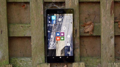
As might be expected with an AMOLED screen, contrast is excellent. Colours have a very nice 'pop' to them, while blacks are pleasingly deep. Viewing angles are great, with no drop-off in either brightness or colour from any angle.
Somewhat unusually for an AMOLED display, the colour accuracy is also very good. Microsoft claims to have calibrated the panel exactly, and to my eyes I could find nothing wrong, although you have the option to change the white balance in the settings menu.
The device also supports a popular and somewhat mislaid feature in 'Glance', which enables the display of information when the phone is asleep. Double-tap to wake has been discarded, however.
Sean is a Scottish technology journalist who's written for the likes of T3, Trusted Reviews, TechAdvisor and Expert Reviews.
