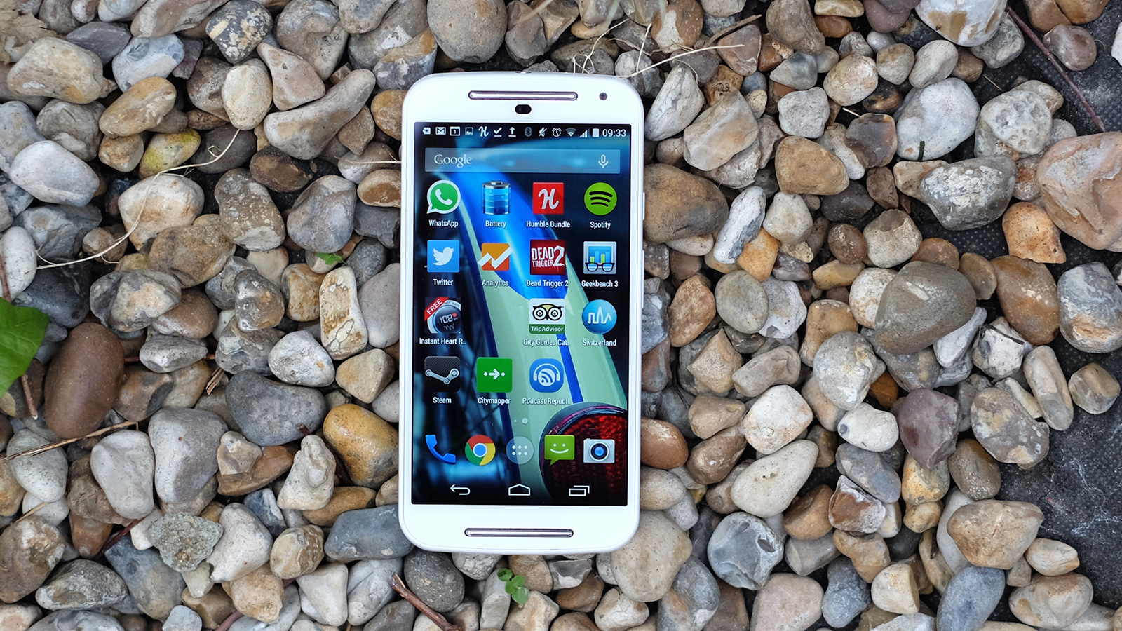
TechRadar Verdict
The 2014 Motorola Moto G doesn't flatten last year's model in every respect. It's bigger and less comfortable to hold but a much-improved camera and larger screen make it a worthwhile update.
Pros
- +
Superb value
- +
Improved camera
- +
Big screen for the price
- +
Decent display quality
Cons
- -
Lower sharpness than 2013 Moto G
- -
Slightly disappointing battery life
- -
A little chunky
- -
Average sound quality
Why you can trust TechRadar
Update: Time has passed, and Moto's latest line of budget-friendly phones is full of better options than the Moto G (2014).
If you're interested in a good all-around smartphone that won't cost a whole lot, check out the Moto G4.
The Moto G4 Plus amps up the performance and adds a fingerprint sensor to the formula for just a little more cash.
Lastly, the Moto G4 Play retains the essentials in the G4 formula, but slashes the price nearly in half. Sure, it isn't as fast or feature-filled as the G4 or G4 Plus, but it's still a heck of a deal.
The best part about the newer devices is that Android Nougat will be available soon. So, the amount of valid reasons to consider an older Moto G, like this phone, are dwindling quickly.
Original review follows below.
The 2014 version of the Moto G has an imposing task ahead of it. To live up to expectations it needs to better one of the most popular smartphones ever made, not to mention the best-selling phone Motorola has ever produced. I am, of course, talking about the 2013 Moto G.
The 2014 Moto G offers a larger 5-inch screen and an improved camera, aiming to clean up some of the few criticisms many had about that budget supremo.
Sure enough, the 2014 Moto G's camera is a whole lot better, and having a 5-inch screen instead of a 4.5-inch visage is great in many situations. It is not a flat-out better phone in every respect though. Its larger frame isn't as palm-friendly, it's not quite as good-looking and battery stamina is worse than the old model.
However, it's not enough to make the new Moto G anything less than one of the top bargains of the year.
The Moto G 2014 is now available SIM-free for around £120 (US$180, about AU$253), which is similar to or slightly more than the 16GB and 4G versions of the smaller, older version, which usually go for around £120 (US$140, about AU$232).
While the Moto G (2014) originally only launched in a 3G flavour, a 4G model has since landed in the UK and that's only slightly more expensive, at around £140.
It's available from Motorola's website, as well as Tesco, Carphone Warehouse, Amazon, Argos, Sainsbury's and Asda.
However Motorola has recently unveiled the Moto G (2015), which could lead to the Moto G (2014) feeling a bit out dated.
The two big upgrades the latest Moto G brings to the table compared to the Moto G (2014) is the camera and design, with the snapper being upgraded to 13 megapixels - the same as the one found in Motorola's (much more expensive) Nexus 6.
You'll also be able to fully customise the Moto G (2015) with the Moto Maker tool, and the next generation Moto G also boasts a textured plastic back.
The Moto G (2015) will launch at £159 ($179, around AU$340), so we should see a further price cut to the Moto G (2014) soon. This could keep the older handset competitive - as it already represents fantastic value for money.
Design
The Moto G (2014) design is very similar to the older model, but also borrows a few new design traits from the original Moto E. You can't miss the primary change of little metal bars above and below the screen.
They're not there for the look and, let's be honest, they don't really look all that great. But they do mark where the front stereo speakers live. The original Moto G used a single mono speaker on the back.
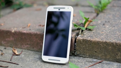
I do find this a real downgrade in looks, as much of the immediate design purity has been lost by sticking these not-exactly-subtle metal bits on the front. Otherwise, the looks of the newer and older Moto Gs are pretty familiar.
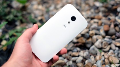
The back is a curved piece of matte-finish plastic, which meets a glossy screen surround. Its contours are nice and smooth, and there's a little indent on the back where the Motorola logo lives.
It's not just looks that have taken a hit in the new model, though. The 2014 Moto G is also not quite as easy to handle, because of its sheer size.
In a 4.5-inch screen phone you really don't have to pay too much attention to how slim a phone is – there's plenty of leeway to play with before size becomes an issue. However, now that it's bigger the fairly chunky Moto G is a bit more of a handful than, for example, the much slimmer Samsung Galaxy S6.
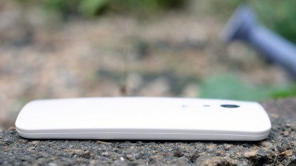
For a closer look, the 2014 Moto G is 70.7mm wide and 11mm thick. The thickness in particular is quite hefty for a phone of this size.
Yes, that's 0.6mm thinner than the old model, but as it's also just under 5mm wider, using it will feel a bit clumsier for most hands. It shouldn't be a deal-breaker, but means you need to think about whether to go for the larger-screen version or not while the older version is still on shelves.
The Moto G 2014 is slimmer than the new Moto G 2015, however, as the latest version is 11.3mm at its thickest point. The Moto G 2015 is slightly shorter than the Moto G 2014, at 141.5mm in length, compared to last year's 142.1mm.
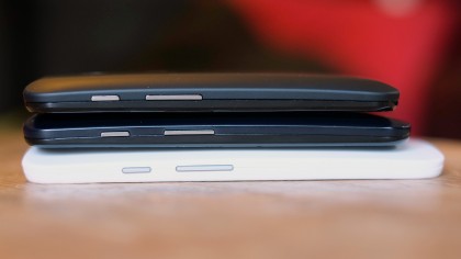
Motorola has finessed the design in parts this year, though. For example, the plastic screen surround stuck out a bit more in Moto G 2013 version, and as such attracts obvious dings and scratches after a few months' use.
In the 2014 version the plastic edges stick out far less, for a smoother finish that's actually a bit more like the old, refined Moto X.
The 2014 Moto G comes in white and black shades, with additional backs available should you want a jazzier look. Having seen both, I recommend avoiding the white one. It looks cheaper, more toy-like, than the black one.
Also it makes the front camera and ambient light sensor (which are black, therefore more-or-less invisible in the black model) far too apparent.
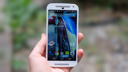
Both models feel well-made, though. While largely plastic, there's no obvious flex because the battery cover sits right on the actual frame underneath, and the entire top layer of the screen and surrounding area is covered with Gorilla Glass 3.
In the last year or two we've seen this slip down from being something to brag about to something used in absolutely masses of phones of all prices. But that doesn't mean it's not still great.
It means that unless you get your phone near sand or hard grit, scratches and wear are more likely to appear on the back of the phone than on the screen, where they really matter. It's also good to see that the little bits on the Moto G that look like metal are indeed metal, rather than metal-effect plastic.
The speaker bars, the volume/power buttons on the side and the little ring surrounding the headphone jack are all made of the harder element. I'm hoping this means we can expect this to be a hard-wearing phone in the long-term. Although only the next six months or so of use will tell.
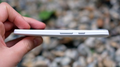
Like the 2013 Moto G, the newer model also has a sealed-in battery. By keeping the power contacts away, the battery is much less likely to get fried should the phone get a little wet.
It is not waterproof, though. Given the limitations of waterproof phones – they still can't really be used underwater – and that at this price you'd almost certainly have to deal with a load of rubber flaps, I'm glad Motorola didn't try to rope it in.
Having said that, the Moto G 2015 has both the older Moto G handsets licked when it comes to robustness, as it features a body with a water-resistant rating of IPX7, which means it can be submerged in up to one meter of water for as long as 30 minutes.
You will find a new feature under the hood of the Moto G (2014), though. The UK version has dual SIM slots, both microSIM-size. We don't often get dual-SIM phones in the UK, but it is a handy feature if you want a mobile to double as a work phone, or if you live a secret second life on the weekends.
(Pro tip: if the latter is the case, you might want to think about a second phone.)
The Motorola Moto G (2014) also has a microSD memory card slot, which will be very welcome to those sad about the lower internal capacity.
The very first Moto G didn't have one, although the newer 4G edition does. This lets Motorola get away with packing-in just 8GB of internal storage, however while this small amount may be enough for people who only use a few apps and don't use their phone to store music, others may find constant snapping and an accidental download of a larger app will see the internal storage sucked up in no time.
As such, the expandable memory slot is a must to make this a decent phone.
Screen
As well as having some negative effects on the size of the phone, upping the screen size in the Motorola Moto G also has some negative effects on image quality.
To explain: both the 4.5-inch and 5-inch versions of the Moto G have 720p resolution screens, meaning you get far fewer pixels per inch in the larger model. The original Moto G offers 326ppi, the 5-inch version 294ppi. Do you notice the difference of those 32ppi? Unfortunately you do.
I find the 2014 model to have a slightly softer screen, and when you get your eyeball close to the screen, you can see the individual pixels much more clearly. When the Moto G first came out, I was gobsmacked at the display quality you got for the price. It was a case of "where's the compromise?" when budget phones universally had a clear issue of low quality in their displays.
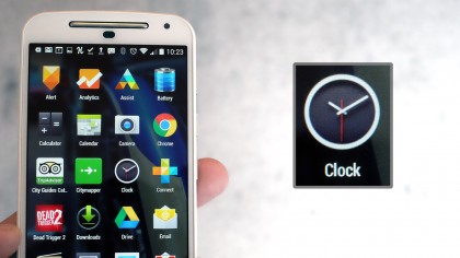
The Motorola Moto G (2014) screen doesn't seem quite as flawless, but once you get over the fact you can see the pixels, the extra size outweighs the sacrifice in a lot of different applications.
For watching videos or playing games the extra 0.5 inches of screen space makes a big difference. Games in particular feel a lot more immersive. The screen is still fairly sharp, just not perfectly clear.
Aside from the sharpness issue, display quality is pretty similar between the two generations of phone and that's fantastic for the price.
The Moto G uses an IPS-type display, a variant of LCD designed to offer much better off-angle viewing than traditional LCD screens. There's a bit of brightness loss at an angle, but it's several light years ahead of the screen experience you get from something like the Nokia Lumia 630, which has a TN-type screen panel.
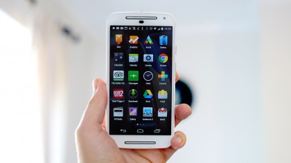
For a closer look at whether the screen quality has changed in other areas, I put the new phone next to an original Moto G. There were a few little differences. Colour saturation was slightly lower in the new model, and the white balance was a fair bit cooler – with whites looking slightly bluer than the original G's slightly warm/orange-tinged ones. The older phone looks marginally nicer.
However, things like this can differ between batches, especially as popular phones often use panels from more than one manufacturer.
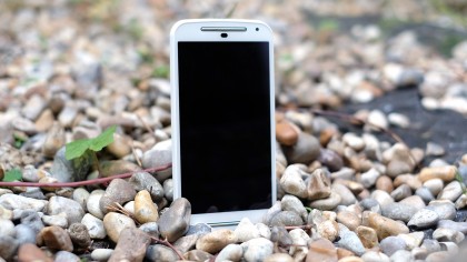
In a darkened room, you can tell that the Moto G (2014) has only a mid-range display (although still IPS, a better screen tech than bog-standard LCD) rather than a high-end one.
Black levels are not close to something like the Sony Xperia Z3, and when examined in these conditions blacks do take on a slightly blue tinge (the original Moto G's were more grey than blue). However, the only quality limitation most people are going to notice in normal use is the resolution.
Outdoors visibility in the Moto G (2014) is reasonably good, especially for an entry-level phone. However, I did notice that the old models seem to use a more advanced/effective anti-reflective coating than the new one.
This may be one of the ways Motorola has managed to pack a better camera and much larger screen into the new version without really adding much to the price.
Andrew is a freelance journalist and has been writing and editing for some of the UK's top tech and lifestyle publications including TrustedReviews, Stuff, T3, TechRadar, Lifehacker and others.
