TechRadar Verdict
Moto X 2nd Generation gives pure Android fans a reason to opt for this budget-friendly phone with a 1080p display and premium design. The camera isn't perfect and its features aren't as exciting as other cheap phones, but it's still stylish as ever.
Pros
- +
Great 5.2-inch screen
- +
Moto Maker customizations
- +
Aluminum frame
- +
Cheaper than rivals
Cons
- -
No micro SD slot
- -
Leather back bruises easily
- -
Camera inconsistent
Why you can trust TechRadar
Update: Moto X 2nd Generation remains one of the most stylish Android phones we've ever tested, right into 2017, and it now runs Android Marshmallow, and while it won't ever get Android 7.0 Nougat, it and has a much cheaper price if you can find it. Our review reflects all of those changes.
Original review
The Moto X name didn't change in 2014, but rest assured, this updated Android smartphone packs enough new specs to deserve its own Moto X+1 or Moto X2 title.
With a larger 5.2-inch screen, a better but not perfect camera, surprisingly useful first-party apps and, of course deeper customization, the original Moto Maker returns with a competitive price.
It's on sale, with the lowest price bouncing around $159 in the US and £183 in the UK. That's a deal after being $499 (£300, around AU$500) SIM free for all of 2015. Don't let Motorola's low ball price fool you. Like its low-key name, the Moto X 2nd Gen has a deceptive asking price.
Motorola's flagship phone is slightly bigger in every sense, enough to make it one of the best Android premium phones next to the more expensive Samsung Galaxy S6 and HTC One M9. Though not groundbreaking like the curved Samsung Galaxy S6 Edge, it's still one of the most stylish phones in 2016 and, in the US, part of our best cheap phones list.

Price and release date
The Moto X 2nd Generation launched on September 16, 2014, but that was the AT&T release date in the US. It came out for Verizon on September 26. Both carriers sold the 16GB phone on-contract for $100 and 32GB version for $150.
On sale, it was reduced to $1 during Black Friday by some retailers, and Motorola eventually followed suit on its Moto Maker website in December. The unlocked price began at around $499. Discounted from Motorola, you can find it even cheaper on Amazon right now.
In the UK, the new Moto X GSM unlocked edition became available at the end of September 2014 for £420 through Motorola's official website. Bumping the internal storage from 16GB to 32GB took it to £460.
Wood and leather always added to the price. Moto X 2nd Generation with a premium back costs $425 and £439 for the 16GB version and $175 and £479 for the 32GB edition, based on the original pricing.
Moto X 2nd Gen has been updated to Android Marshmallow, which should be the last update it sees. It debuted with Android 4.4.4 KitKat, so don't expect this phone to ever make the jump to Android Nougat.
Nexus 6, by comparison, launched with Android Lollipop from the get-go, and a larger 6-inch screen, a camera with optical image stabilization, dual front-facing speakers and a bigger battery. But was also much more expensive at $650 (£499) for the 32GB base model and it loses that one-handed appeal.
Display
There's more to the Moto X 2014 now that the display literally measures up to its competition. It's 5.2 inches, the same size as the Sony Xperia Z3 and a hair larger than the 5.1-inch Galaxy S6.
That's up half an inch from last year's 4.7-inch Moto X, a size that Motorola left to the likes of Apple and its, by comparison, pint-sized iPhone 6 display.
With a little reach and large enough fingers, the new Moto X is still a one-handed phone that almost ventures into two-handed territory. Yet it doesn't compromise much on the display when compared to a phablet.

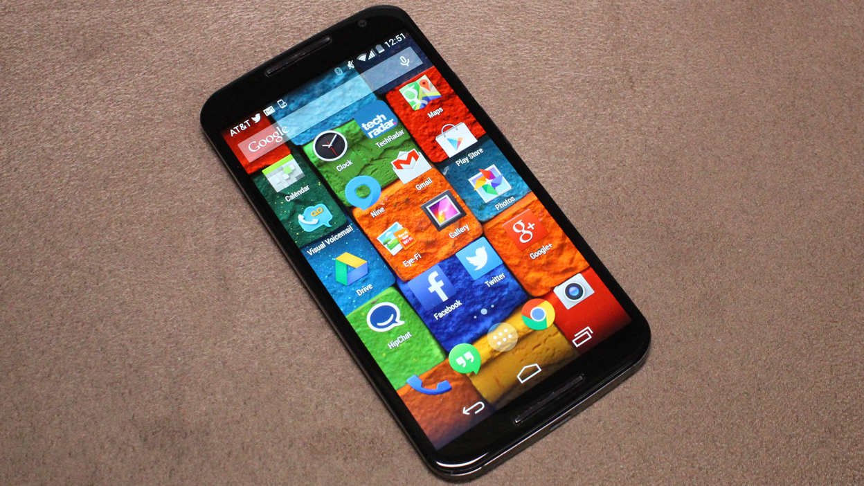
It's again protected by Corning Gorilla Glass with the same AMOLED technology behind it, but the 1080p Full HD resolution makes for a much crisper screen with 423 pixels per inch. You won't want to go back to the original's 720p and 316 ppi display specs, that's for sure.
This sharper display is put to the test as soon as the new Moto X is booted up thanks to the bright and colorful default wallpapers that Motorola included with the handset. It really sets the tone for this premium smartphone experience, especially next to the still 720p Moto G 2014.

It stands bezel-to-bezel with the Samsung Galaxy S5 in this regard, though it lacks the Super AMOLED display and has since been beaten by the QHD Galaxy S6. In a few cases, we also found the Moto X screen harder to read outdoors. But keep in mind that Motorola has made its smartphone much cheaper than anything in its class.
The Moto X 2014 makes up for its direct sunlight shortcomings with a better way to conserve battery life by default. The return of the extremely efficient Motorola Active Display means that waving your hand over the phone or taking it out of your pocket brings up the current time and simple notification icons in white. The rest of the screen remains off. The popular, always-on microphone is here as well, giving you a way to cut to the chase with voice commands.

Tapping an Active Display icon reveals more information about the notification, like the gist of your latest emails or Hangout messages. It's a great use of AMOLED's ability to selectively light up individual pixels and it sure beats an ambiguous blinking status light on a phone.
Design
An all-new aluminum metal frame means that Moto X 2nd generation is stronger than its predecessor, not just bigger than before. Plastic is no longer binding together Motorola's flagship device. It's closer to the build material of the iPhone 5S, sturdier than the pliable iPhone 6 Plus and, most importantly, doesn't feel as cheap as the metal-looking polycarbonate Samsung Galaxy S5.
What's surprising is that despite the Moto X's naturally larger size care of the 5.2-inch display, Motorola once again used tricks to minimize the overall dimensions, and it worked in its favor. For example, there's very little bezel around the edges and the soft buttons are on-screen, as opposed to the capacitive buttons used by Samsung devices.

This makes the Moto X 2014 roughly the same size as the Galaxy S5 and, remarkably, even the iPhone 6. Its official measurements are 2.9 in (72.4 mm) x 5.5 in (140.8 mm) with a sloped 0.2 in (3.8 mm) to 0.4 in (9.9 mm) curve.
The S5's width and height are 2.9 in (72.5 mm) x 5.5 in (142 mm) with a narrower overall depth of 0.3 in (8.1 mm). iPhone 6 is nearly as big: 2.64 in (67.0 mm) x 5.44 in (138.1 mm) x 0.27 in (6.9 mm). As much as I appreciate the iPhone's home button and Touch ID, it has half an inch less screen real estate to show for its almost-as-tall dimensions.


Moto X's premium frame thins out along the corners, but forms a fairly thick bow shape at the center for a curved back. This leaves plenty of room for a top-center 3.5mm headphone jack, an adjacent nano-SIM card slot and bottom-placed micro USB port. Along the thinned-out sides, there's just enough depth for a volume rocker that's smooth and power button that's accented with ridges. This makes it easier to tell the two stainless steel buttons apart in your pocket.
Moto Maker returns with additional customizations to match the now-premium Moto X with even more personalization. Leather, for example, is now among the choices that can back your phone in one of four colors. It joins last year's four wood options and 17 plastic colors. Black or white fronts and 10 accent colors for the front-facing speaker grills and rear Motorola logo dimple round out the most pressing Moto Maker decisions.

Cradling the Moto X backed in soft leather is a delight, but it's also the most delicate material within Moto Maker. Yes, the Moto 360 smartwatch uses the same genuine leather sourced from Horween Leather Company, but the supple material bruised more easily in our pockets than on our wrists. That's what's great about Moto Maker, though. It's filled with more options than your standard one-size-fits-all smartphone in case that doesn't work for you.
The new Moto X weighs in at 144 grams vs the original's 139 grams. Considering the aluminum metal frame and 5.2-inch screen, that's a worthy trade-off. Of course, there are beefier specs too.
Current page: Introduction, display and design
Next Page Specs, performance and interface