TechRadar Verdict
Pros
- +
Great camera
- +
Slim design
- +
Good battery life
Cons
- -
Windows Phone 8 app ecosystem
- -
No expandable memory
- -
$299 is a little pricey
Why you can trust TechRadar
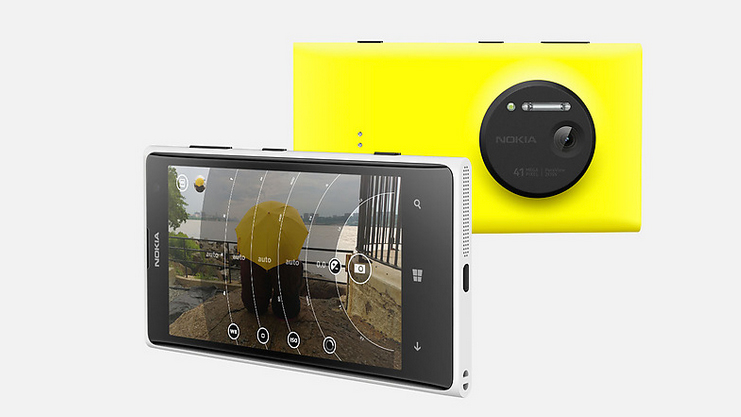
To review the Nokia Lumia 1020 is to review a compact camera that happens to have some phone features tacked onto it. Essentially, you would only buy this thing for its 41MP PureView camera with Xenon flash. If you weren't already a Nokia fan, why buy Windows Phone 8?
When we first heard about the 41MP smartphone camera in the Nokia PureView 808, our initial thoughts were, "What a shame to put such a nice camera on a Symbian device." Now that the camera is coupled with a marginally better platform, we can breathe a small sigh of relief.
If you're familiar with the Lumia line of phones, the 1020 shouldn't look that foreign to you. Its curvature and overall shape are reminiscent of the Lumia 920, and the smaller Lumia 820.
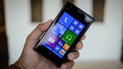
On the face of the device, you'll find a 4.5-inch 1280 x 720 touchscreen display. The left edge of the device, if you're facing the screen, is clean and free of any buttons or ports. The right side has a volume rocker, power/standby button and a dedicated camera button.
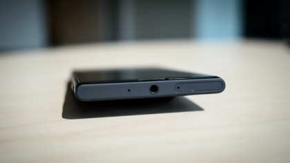
At the base of the device you'll find the micro-USB charging port and speaker/microphone. Up top, there is a SIM card tray, 3.5mm headset jack and another microphone for noise cancellation.
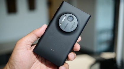
The back of the device is perhaps the most noticeable, with its large camera module, Xenon flash, LED light and camera lens. It protrudes enough from the device that it never lays flat on its back.
The following video is sponsored and made by O2 Guru
Even without the bulky camera, it's a substantial device as far as modern smartphones go. It's not the slimmest or lightest by any means, but it is somehow slightly slimmer and lighter than the Lumia 920.
To give you an idea of its dimensions, this Lumia phone is 130.4mm tall, 71.4mm wide and 10.4mm thick and weighs 158 grams. As you can see, it's pretty wide and bloated by today's smartphone standards.
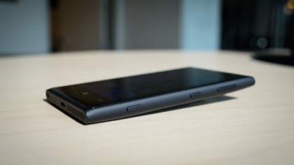
Despite its size and weight, you eventually get used to maneuvering your way around the device. It's the camera that makes it tricky to hold. Do you keep your fingers around it, or grip the phone right over the camera? Decisions, decisions.
Our review model came in matte black, and it's slightly more slippery than its glossy predecessors. The Lumia 1020 also comes in yellow and white.
For those of you interested in internals, there is a Qualcomm Snapdragon dual-core 1.5GHz processor, 2GB RAM, 32GB on-board storage and a 2,000 mAh battery.
Interface and performance
Windows Phone 8 resides inside the Nokia Lumia 1020, and if you've ever used Windows Phone before, it will be incredibly familiar to you.
This version of Windows Phone 8 is called Amber, available only to Nokia devices, and it's the latest version of the Microsoft platform. It adds a few nifty new features to the software, but it's not a major overhaul of the platform or anything.
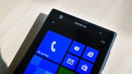
You can do new things with the Amber update like double tap the display to turn it on, or flip your phone over to silence it. And if you love customizing your device, there are a handful of new wallpapers added.
Otherwise, it's just plain old Windows Phone 8. The live tile system works pretty nicely to give you app updates and any other relevant info you might want to see. The tiles are also customizable in size, so you can make them large or small and arrange them into clusters when you shrink them down.
If you swipe to the right from the main screen, you'll see a list of all your apps, including the settings. It's a mostly intuitive platform, but what it's seriously lacking is third-party app support.
Most of the big-name apps are on Windows Phone 8, like Facebook, Twitter, CNN, Foursquare and more. But it's also missing incredibly popular apps like Instagram and Vine. This lack of app support is what usually turns people off from adopting the Windows Phone platform.
Another sorely missing feature is a centralized notification system. With iOS and Android, you can see all your notifications and updates in a drop-down pane, whereas Windows Phone 8 leaves you guessing with the live tile system. If you get a notification for an app that isn't immediately within view of the display, you have to scroll around just to make sure you haven't missed anything.
In terms of everyday performance, I experienced no lag or hiccups at all. Well, other than the camera, but we're going to cover that issue. Scrolling through the home page or within apps is smooth, unlike the Android experience on some handsets. The apps and tiles have cool animations, too, when you're opening or closing them or watching your notifications.
