TechRadar Verdict
The Lumia 1320 suffers for the fact that it's nowhere near as capable as the Lumia 1520, yet it's not significantly cheaper either. Despite being a capable performer, the Lumia 1320 is somehow already obsolete.
Pros
- +
Decent screen
- +
Superb battery life
- +
Fluid performance
Cons
- -
Not the bargain it seemed
- -
Mediocre build quality
- -
Lacks Nokia camera enhancements
Why you can trust TechRadar
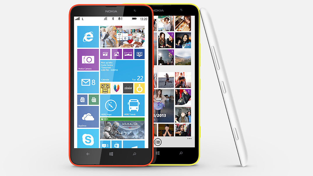
After packing every high-spec component it could into the range-topping Nokia Lumia 1520, Nokia's Lumia 1320 comes as a similarly impractically proportioned yet altogether more practically priced alternative.
The Lumia 1320's recommended price of around £300 ($340, AU$450) is all very well, but I do wonder if those seeking a super-sized Windows Phone 8 experience will be willing to accept its shrunken performance.
It was impossible not to be impressed with the Lumia 1520. It felt excessive in almost every way, but there was an undeniable thrill to having the biggest and fastest components (or so it seemed) locked up in a gaudy all-in-one suit.
This was Microsoft's Windows Phone 8 champion, and it wanted you to know about it.
So where does that leave the Nokia Lumia 1320, announced at the same time as the 1520 and gradually rolled out in its wake?
It features a similarly sized 6-inch display, but with a much lower 720p resolution. It has a Snapdragon CPU, but only a dual-core model running significantly slower.
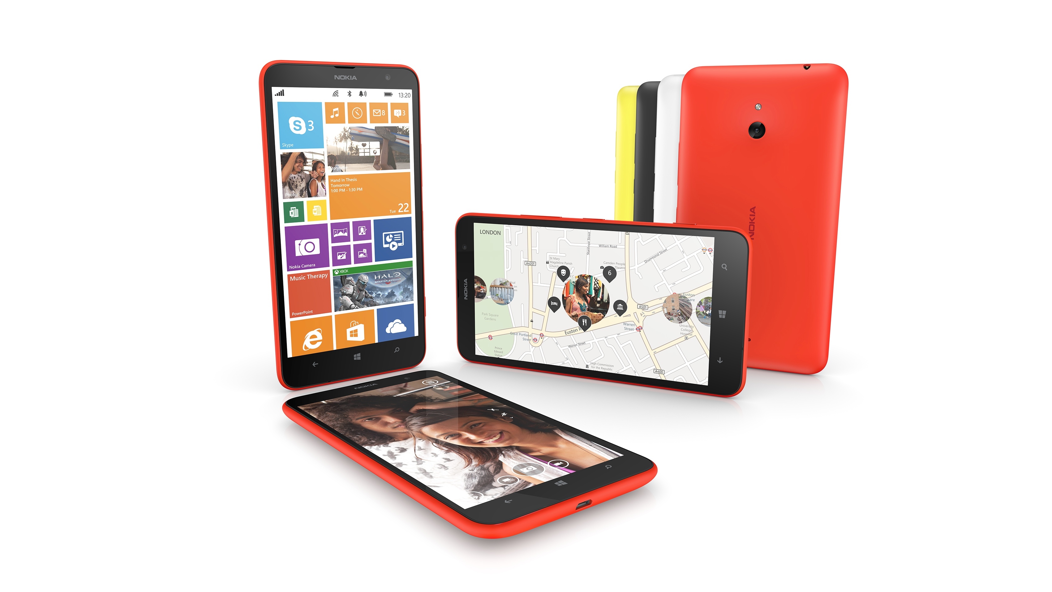
Even the camera seems like an ordinary 5MP model with no hint of PureView gloss. And one thing Nokia phones rarely have is merely ordinary cameras.
The result is a phone that fails to excite or wholly convince, but which arguably feels more comfortable with the Windows Phone 8 OS than its brash brother.
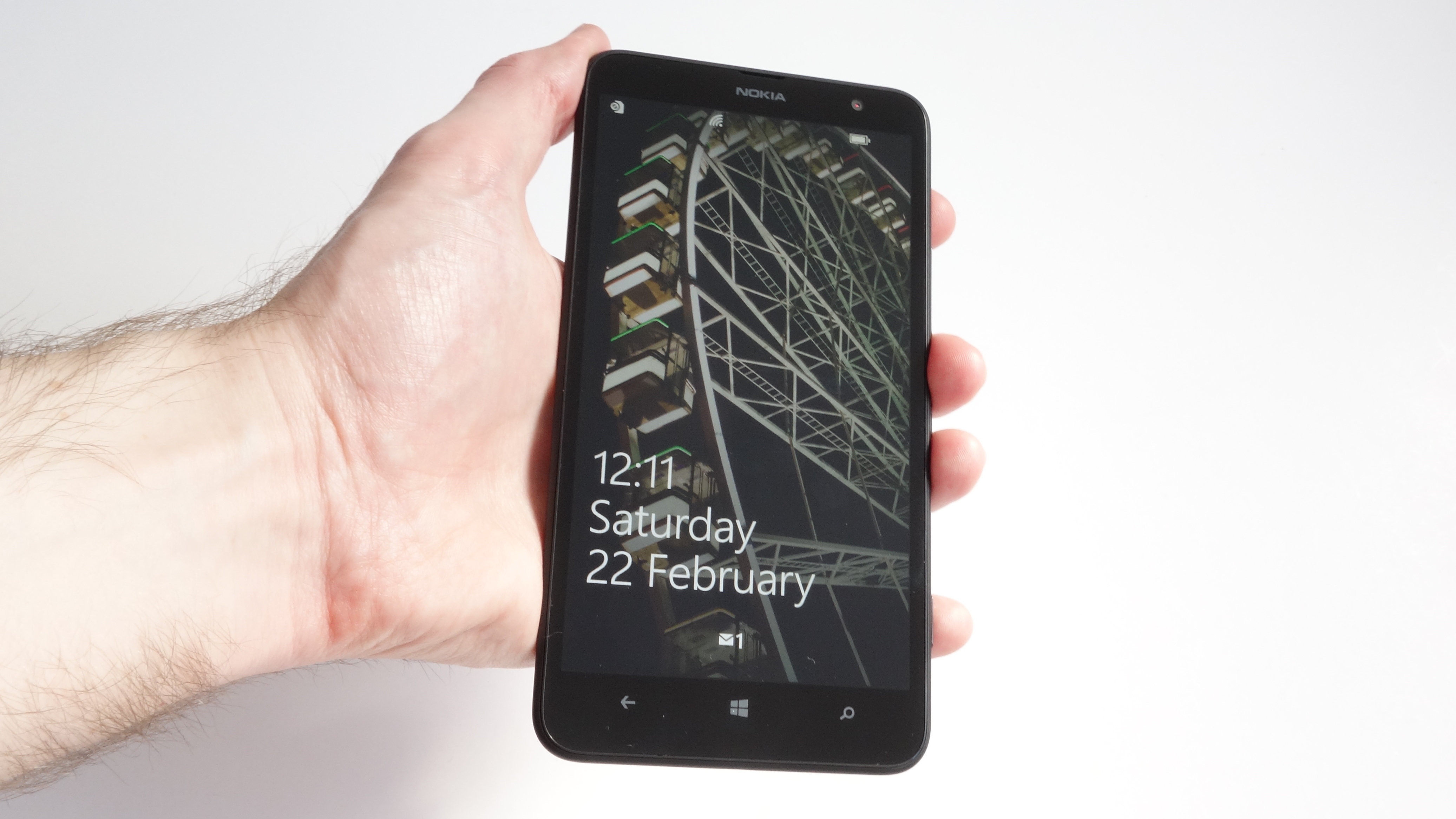
You thought that the Nokia Lumia 1520 was big? The Nokia Lumia 1320 is even bigger.
At 164.6mm tall, it's roughly 5mm longer, while it's more than a millimetre thicker at 9.79mm. You'd better reinforce those pockets, because the Nokia Lumia 1320 weighs a hefty 220g – 11g more than its heavyweight sibling.
It somehow feels less imposing than the 1520, however. Nokia has filed off the sharp corners and gone with more traditional design, while my test model's plain-black colour scheme doesn't exactly demand your full attention.
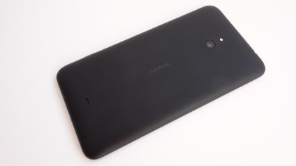
Unlike the 1520, the Nokia Lumia 1320 comes with a removable back section, which folds right around the side of the device and meets up with the all-glass front.
This makes for a generally solid-feeling device, aided by the rear cover's matte finish, though I did detect some creakiness around the power and volume keys on the right-hand edge.
Speaking of which, these keys – along with the dedicated camera shutter key further down the same side – are of a pretty typical size and shape, with little definition and nothing much to set them apart from each other. They're rather Samsung-esque in their nondescript shape and feel.
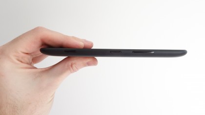
The volume key falls naturally to hand – or rather, to thumb – when holding the phone in your right hand, while it falls below your forefinger when held in your left.
The power key is a little trickier to press from a one-handed grip, requiring a subtle realignment of your grip – something that can be a little precarious with such a sizeable device.
As ever with all Nokia phones, though, the Lumia 1320 feels like it could survive most spills of this nature. It's especially assuring to note that Nokia has included Gorilla Glass 3, which is something the Lumia 1520 was missing.
Nokia may have downgraded the Nokia Lumia 1320's display from the 1080p beauty of the Lumia 1520, but it certainly doesn't feel like a substandard component. This is a 6-inch LCD IPS display, which means that it's crisp and bright even when viewed from an angle.
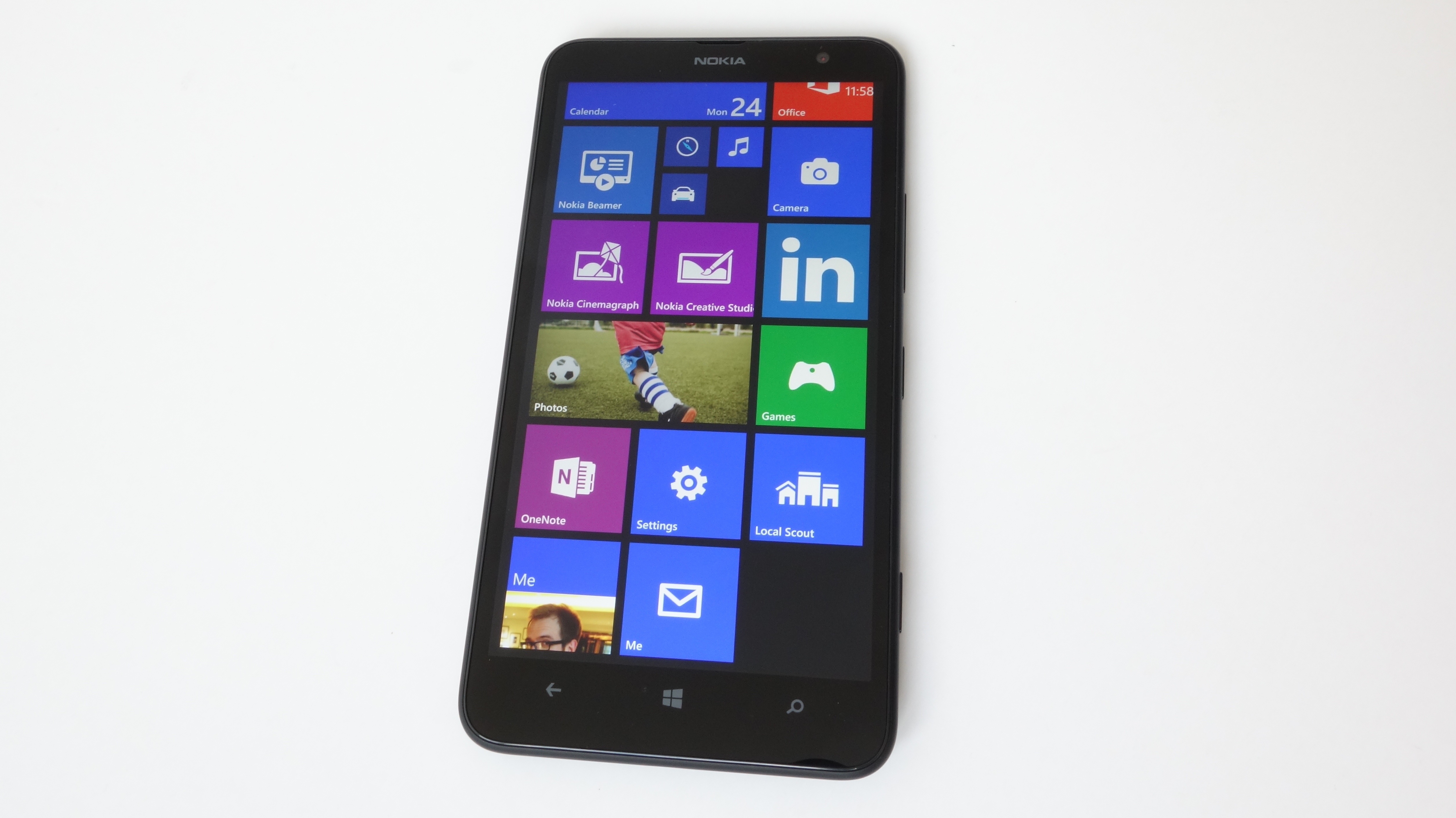
Still, the lack of a Full HD display is noticeable in general usage. On such a large and bright display, how could it not be? Small text on web pages is slightly blurry, and images are that little bit less sharp.
Of course, if you've never used the 1520 or similar – as I'd guess most potential Lumia 1320 owners won't have – you probably won't notice the drop in quality.
I'll discuss it more in the appropriate section, but the Windows Phone operating system itself doesn't massively suffer for the drop in resolution. The current iteration of Microsoft's mobile OS was designed with 720p as the standard, so it looks and handles just fine here.
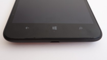
On the front of the device you'll find the usual three capacitive button set-up – back (which can also be used to access multitasking), Windows, and search, and they're as usable as on every other Windows Phone handset.
Nokia phones typically look and feel very good for their price, but the Nokia Lumia 1320 arguably doesn't.
Its plain looks and creaky plastic feel are more reminiscent of one of the company's entry-level phones, like the Lumia 520. But at an RRP of £300 (which already appears to be dropping), it's not priced accordingly.
Compromises have clearly had to be reached in spite of this upp-mid-range pricing. That's evidently the cost of including an expensive-to-produce 6-inch display.
