TechRadar Verdict
Pros
- +
Solid construction
- +
Clear display
- +
Fast, smooth Android
- +
Clever Facebook integration
- +
Nice music player
Cons
- -
Awful 720p video
- -
No SD card slot
- -
Only 4GB storage
- -
Browser looks dated
- -
Stiff camera button
Why you can trust TechRadar
The Sony Xperia U sits at the cheaper end of Sony's range of Android smartphones, using similar styling to the much larger Xperia S and the slightly larger Xperia P and Xperia Miro, setting it apart from Sony's rounder phones, including the rugged Sony Xperia Go and budget Xperia Tipo.
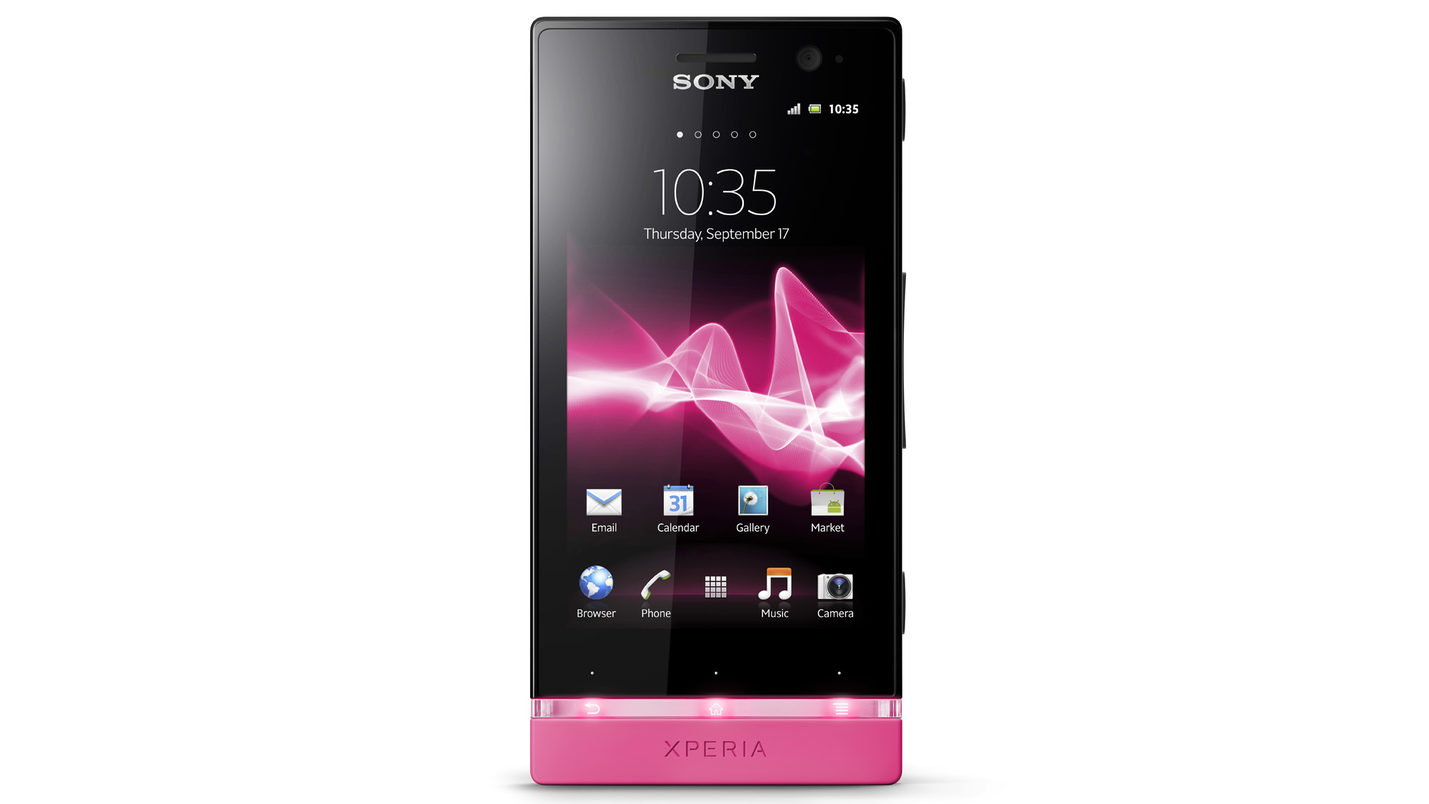
The Sony Xperia U is the smallest of the three handsets, offering a 3.5-inch TFT display inside the same angular, black case as the Xperia S and Xperia P, and an odd transparent plastic strip acting as part design feature, part information panel and part silly light-up novelty.
Prices are relatively modest for a modern smartphone that says "Sony" on it, with the Xperia U popping up for £189 in the UK, or $340 in the US, SIM-free. But can you really get the style of the Xperia S on a budget?
It's pretty close. The Sony Xperia U is small and solid, offering much the same in balance and build quality as last year's excellent Sony Xperia Ray, with Sony putting three capacitive touch buttons beneath the display, indicated by tiny silvery dots.
There's an explanatory icon embedded in the transparent strip, telling Android newcomers these buttons are, from left to right, Back, Home and Menu.
The touch areas are big and very sensitive to presses, meaning it's easy to use the phone without thinking too much about your actions or having to aim your button stabs.
The smaller 3.5-inch display makes the Sony Xperia U fit the hand well, so one-handed use is possible with ease, too.
Above the screen sits the front-facing VGA camera, which can be toggled and selected within the camera app, producing low-res images that emerge from the camera at 640 x 480 resolution.
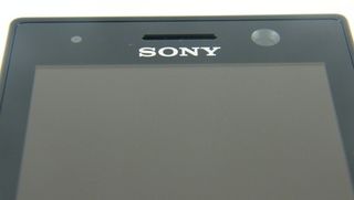
There's also a proximity sensor up here so the phone knows if you're holding it to your head and can dim the screen accordingly.
The sides are black with rather flimsy and plasticky buttons, with the 3.5mm headphone jack up top and the USB connector top left.
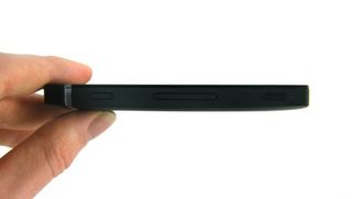
The right-hand side of the Sony Xperia U is where the party starts, because this edge houses the power button, which is nice and easy to find at the top right, along with the volume up/down rocker in the middle, then the camera button bottom-right.
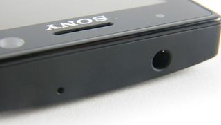
The chunky power button's easy to find and the physical camera shutter button is always a useful thing to have, especially since the latter brings up the camera app when held down for a second or two, even when the phone's in standby.
The camera button is quite flat and well recessed into the Sony Xperia U's case, meaning you have to press it pretty hard to make it focus and register. We tended to end up using the on-screen button to take shots instead, because it's just easier.
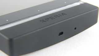
And there's your big, exciting design feature - the strip lights up. In more than one colour. It's quite cool, especially when viewing photos in the gallery, because the Sony Xperia U detects the most prominent colour in the shot, then alters the colour of this strip accordingly.
It's hard to take a photo of. The strip's much brighter and more colourful to the human eye, more so in the dark.
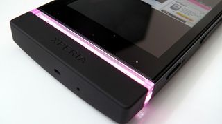
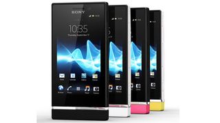
And if you're even more colour obsessed, the black plastic beneath the see-through strip can be unclipped and replaced with something brighter. White. Or Pink. Or yellow. Which is great, if you're a child.
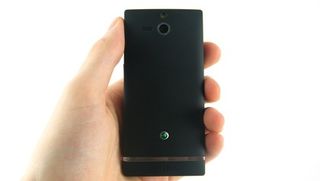
Removing the back is a rather hard and worrying experience. You have to press it down and push it up, which means squeezing the phone quite tight and putting a lot of pressure on the display.
We were quite worried we'd end up breaking the display from the pressure. But we didn't. We should probably stop worrying so much.
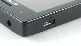
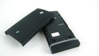
Inside the Sony Xperia U sits a full-size SIM card slot, although there's no SD support in here, so you're stuck with the relatively tight 4GB of accessible storage space Sony has put in here.
That's a bit of a shame, but at least the battery is replaceable, which will earn the Sony Xperia U some brownie points in this age of sealed, non-accessible phones, such as the iPhone.
All of this comes together to give the Sony Xperia U a quality, well-made feel, that apes the design of the high-end Sony Xperia S well.
It feels tough and durable, the display and buttons are sensitive, while the smaller 3.5-inch screen is bright and clear, so much so that it could be considered a worthy replacement for many bigger, more costly Android models.
Thanks to Three for sending us the phone
