Why you can trust TechRadar
In the old days, you bought a phone for calls. You bought a tablet for any other business. What do you do now? You buy a phablet for both.
The majority of people who buy the Xperia Z Ultra will not, we would venture, be making many phone calls on theirs. At least, not in the traditional sense of the word. There may be headsets, there may be Bluetooth hands free kits. There is unlikely to be much holding this up to the ear.

OK, OK. So it does make phone calls. We'll get that bit out of the way. And you know what, it does it well.
We tried a few calls from the privacy of our own home with the curtains firmly closed and hiding behind the sofa just in case anyone saw. And we'll report back that audio quality is quite good. What's more, the Xperia Ultra kept a signal well.
Let's face it, you won't be walking around the street holding this up to your ear like an iPhone for two reasons: firstly, because you'll be a mugger's dream and secondly, because you'll get laughed at everywhere you go... and with good reason.
Pair the Xperia Z Ultra up to a Bluetooth headset, however, and you're in a much better position. We managed that easily enough and were able to make and receive calls like a dream. Most headsets are compatible. We tried a couple we had lying about, plus the car radio, and all worked flawlessly.
Unfortunately, if you plan on taking your calls using the loudspeaker, you may not be so happy with the results. The loudspeaker crucially lacks the one thing that makes it what it is: loud. It's a singular speaker at the bottom that is paltry at best.
Not only that, the quality is tinny and budget-sounding. Definitely not one of Sony's better offerings. Accidentally put your finger over it (which admittedly, considering the size of the Xperia Z Ultra, would be a major fluke) and you'll soon lose any sense of audio.

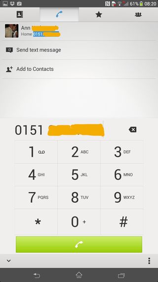
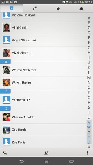
Contacts are accessed by going into the phone app (a shortcut for which is on the dock at the bottom of the screen) or opening the app drawer and going into 'Contacts'.
It's pretty bog standard really. Sony hasn't done anything massively creative here. It's taken the standard Android contacts app and changed the colour. That's pretty much it. It works well, so there's so no point in changing it for the sake of doing so.
Contacts can be accessed through smart dialing, the general phone book or the favourites list. Avatars are synced with Facebook and the phonebook is synced with Google.
If you've ever used a smartphone to make calls, you'll get it. Only difference here is that the on-screen buttons are huge because the screen is so big, which makes it all look slightly comical.

Gareth has been part of the consumer technology world in a career spanning three decades. He started life as a staff writer on the fledgling TechRadar, and has grown with the site (primarily as phones, tablets and wearables editor) until becoming Global Editor in Chief in 2018. Gareth has written over 4,000 articles for TechRadar, has contributed expert insight to a number of other publications, chaired panels on zeitgeist technologies, presented at the Gadget Show Live as well as representing the brand on TV and radio for multiple channels including Sky, BBC, ITV and Al-Jazeera. Passionate about fitness, he can bore anyone rigid about stress management, sleep tracking, heart rate variance as well as bemoaning something about the latest iPhone, Galaxy or OLED TV.
