TechRadar Verdict
Windows 10 Mobile is a major step forward for Microsoft's usually overlooked operating system, but it's not the step forward we all hoped for.
Pros
- +
Lots of customization
- +
Intuitive new settings menu
- +
Smart Universal app collaboration
Cons
- -
Microsoft Edge isn't great
- -
Transfer My Data isn't good
- -
Real lack of apps
Why you can trust TechRadar
Microsoft's new Windows 10 operating system for PCs was one of the biggest technology releases of 2015 – and it split opinion down the middle, with some Windows fans loving the new look and features, and others complaining about such issues as the absence of OneDrive support, floppy drive support, and various games and desktop gadgets.
Here in mobile phone world we sat idly by in the weeks following the July release of Windows 10, waiting for Windows 10 Mobile. It finally appeared just in time to sneak in as a 2015 release, and its availability is still fairly limited – as are some features.
Microsoft first launched the mobile OS on the Lumia 550, before rolling out two new flagship phones in the form of the Lumia 950 and Lumia 950 XL. Microsoft has said it will update the Lumia 430, 435, 532, 535, 540, 640, 640 XL, 735, 830 and 930, and we expect that update to be free.
We hope that as Windows 10 Mobile lands on more devices in the coming months Microsoft will keep the software updates coming to improve the user experience. Right now, though, we don't know when it's coming to more devices – Microsoft still hasn't announced a schedule for the roll-out.

Windows 10 Mobile is make or break time for Microsoft in terms of its aspirations in the mobile phone market – it's a matter of succeeding with the new OS or dropping out of the phone game altogether.
Windows Phone has been slipping further and further behind iOS and Android as more people jumped ship from the flailing platform. Microsoft badly needs to stop the rot, keeping what users it still has and trying to hook a few million more in the process.
Microsoft sees the key to success as creating a consistent and cohesive software experience across your devices – it wants you to have one OS running across your PC, your phone, your games console and maybe even wearable tech like the Hololens, when it finally comes out.
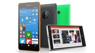
So does the Windows 10 Mobile software live up to the hype? We've been playing around with it on different devices to pick out the highlights and lowlights, and to see how it compares to the previous version of Microsoft's mobile OS, Windows Phone 8.1.
Design
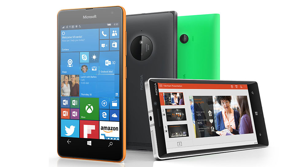
If Windows 10 Mobile has got anything right, it's the design element. The mobile operating system has finally fully embraced the tiled design by enabling it to be fully customisable.
The last Windows Phone update enabled you to change the size of the tiles, but Windows 10 Mobile brings with it even more personalisation.
You can now add a photo as the background on your device, or add photos to the tiles themselves. You can even adjust the transparency of the tiles, enabling you to choose how prominent you want the tiles, and your photos, to be.
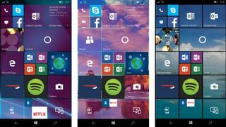
I particularly like setting a photo as the background and then setting the transparency on about 75%, so that I can just about see the tiles. There's plenty of flexibility here, and you can also choose the colours to really make your home screen your own.
Changing the colour of particular tiles will also change related icons elsewhere in the OS, such as the key software apps in the Start menu.
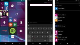
Compared to the previous version of Windows Phone, this new update is very good at the personalisation elements. It offers just as much as Android does in terms of customisation, and much, much more than iOS offers.
I really like playing around with the various options to create my own designs, in a way that I don't with other phone operating systems.
Widgets are still missing though – and that's one of the reasons Windows can't compete with Android. The tiles do offer more information than before, but you can't customise what information they show.
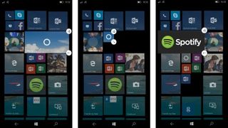
The Outlook app, for example, will show you a little preview of your unread messages, but you can't decide how much it shows, or when it shows it – it's just on a loop. You'd be able to customise an email widget on Android so that it showed, say, four emails.
But it's pretty hard to go wrong here – you're always going to have an easy to use homepage. Some of the menus are still difficult to navigate, but that's made up for to a degree by the handy search facility, which you'll find at the top of the Start menu.
Everything in Windows 10 Mobile feels more aligned now. The OS follows a simple design philosophy, with those welcome levels of customisation thrown into the mix. There's no escaping tiles, but their design is greatly improved over what came before.
However, if you weren't a fan of Windows Phone 8, you're unlikely to like the design here.
James is the Editor-in-Chief at Android Police. Previously, he was Senior Phones Editor for TechRadar, and he has covered smartphones and the mobile space for the best part of a decade bringing you news on all the big announcements from top manufacturers making mobile phones and other portable gadgets. James is often testing out and reviewing the latest and greatest mobile phones, smartwatches, tablets, virtual reality headsets, fitness trackers and more. He once fell over.

Midjourney V7 gives the AI image-maker power, speed, and correctly shaped hands

This Ryzen-powered NAS is barely bigger than a shoe box and can hold 11 SSDs and HDDs, delivering more than 500TB of storage

This is the world's first 1TB microSD Express card to go on sale, just in time for the launch of the new Nintendo Switch 2
