TechRadar Verdict
The Skagen Falster makes a tremendous first impression, looking like it should easily cost twice its $275 price tag. But middling battery life and a lack of distinguishing features put form a bit too far ahead of function.
Pros
- +
Unmatched design
- +
Works with both iOS and Android
- +
More affordable than it looks
Cons
- -
Very feature-light
- -
Poor battery performance
- -
Button doesn’t offer tactile ‘click’
Why you can trust TechRadar
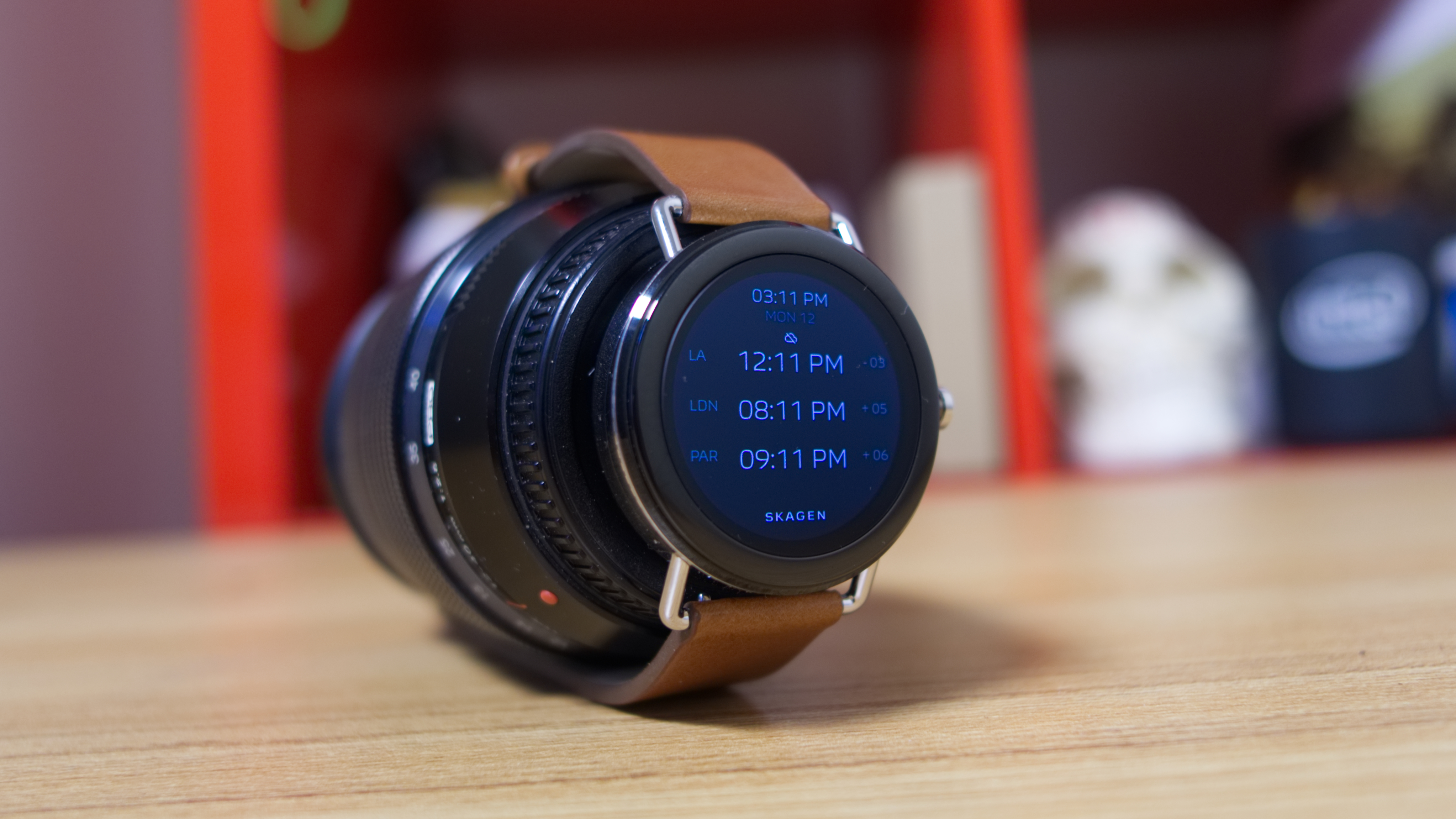
As far as first attempts go, Skagen’s Falster is quite an impressive smartwatch. Nailing a look so refined is something that some larger manufacturers, like Moto and Huawei, have yet to figure out in the wearables game – and maybe never will. But as we’ve seen with competitors that have come close, looks aren’t everything.
The Falster achieves some minor miracles for Android Wear 2.0, like packing the experience inside one of the thinnest, slickest watch bodies we’ve seen yet. Its retail price, starting at $275 (£279, about AU$350), defies its stainless steel and leather-clad design. But without expected hardware essentials like a heart rate sensor, built-in GPS, or a speaker to take calls sans wireless headphones, this watch is unfortunately a tough thing to recommend outright.
Skagen Falster price and release date
The Skagen Falster smartwatch is now globally available through its website, as well as e-retailers serving the US, UK and Australia. It’s not currently on sale via traditional retailer avenues like Amazon or Best Buy, but it will likely end up there at some point.
Skagen’s first smartwatch starts at $275 (£279, about AU$350) for two color stylings: brown leather and black leather. If you’re looking to upgrade to a steel mesh strap, available in steel color and rose gold, it will cost $295 (£299, about AU$375).

Design
At this point in time, there’s little that hasn’t been at least attempted by manufacturers to replicate the intrinsic qualities of an analog watch. The Samsung Gear S3 has a rotating bezel, the Apple Watch 3 has a knurled crown.
Those watches succeed, by and large at capturing the essence, but leave it to an actual watch brand like Skagen to make such a difficult task look easy. The Falster smartwatch sits at almost perfect parity with peak “dumb” watch style, it’s just a bit thicker, but the illusion is still intact.
Available in four color styles and an equal number of straps, there’s likely a Falster to match your aesthetic. Skagen sent us a brown leather model for review, but you’ll also be able to pick up this watch in a shade of stainless steel that matches in color with black leather, steel mesh, or rose gold mesh. The latter two models will set you back a bit more money, $295 (£299, about AU$375).
There are quite a few smartwatches that feature a round chassis – salvation for iPhone users looking for an alternative to the square Apple Watch 3 – and Falster gets added onto that pile, though it has a few extra design details that are appreciated.


The steel lugs branching out from the body give it a distinguished look, aided further by the supple leather band. I usually toss a set of Google’s MODE watch bands onto review units we receive, but the Skagen is the first Android Wear smartwatch that looks and feels good enough to just leave alone – another perk to chalk up to Skagen’s heritage in making watches.
A thick, shiny bezel surrounds the circular AMOLED display featured on this watch. The fact that the screen sits within two layers of bezel makes it look a bit cramped, but the pixel density is high enough for text to pop with clarity. The rich colors and contrast afforded by the screen tech shows its stuff nicely here, too.
The only swing-and-miss aspect of Skagen’s design is the button used for navigating Android Wear menus. Pre-release hardware we’ve tried seemed alright, but our review unit’s button doesn’t yield the telling feedback when pressed straight on. From an awkward angle, we’re able to get the “click” response, but it’s not well implemented on our model, at least. To add a little salt to the wound, the button doesn’t allow for easy scrolling through the operating system like we saw (and loved) with the LG Watch Style.
Cameron is a writer at The Verge, focused on reviews, deals coverage, and news. He wrote for magazines and websites such as The Verge, TechRadar, Practical Photoshop, Polygon, Eater and Al Bawaba.
